Signage
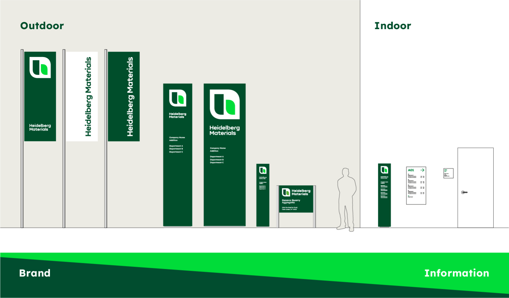

In order to be consistent in spatial communication within the space as well, the elements of the guidance system have been adapted to the new appearance. A distinction is made here between communication outside and inside a building.
Outdoors
In outdoor areas, the long-distance effect is particularly important. Even from distances of more than 50 m, the brand should be visible to provide orientation for visitors, suppliers and employees. For maximum visibility, the logo size should be maximised on the respective medium.
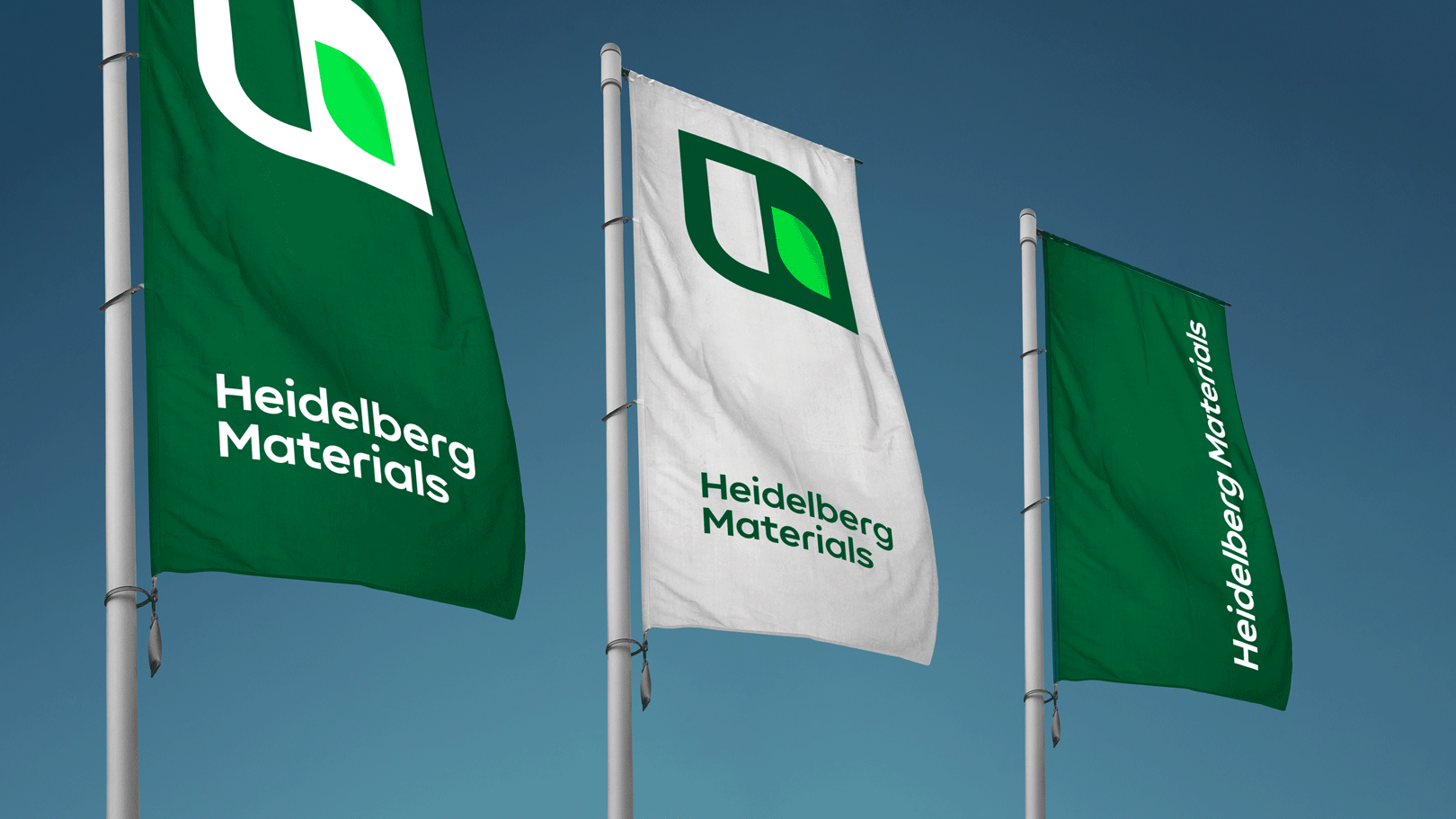
Flags
- Long-distance visibility
- Clear branding with logo and primary colours
- In case of more than one flag, the layout variants may be used.
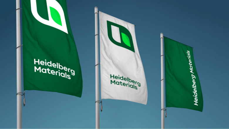

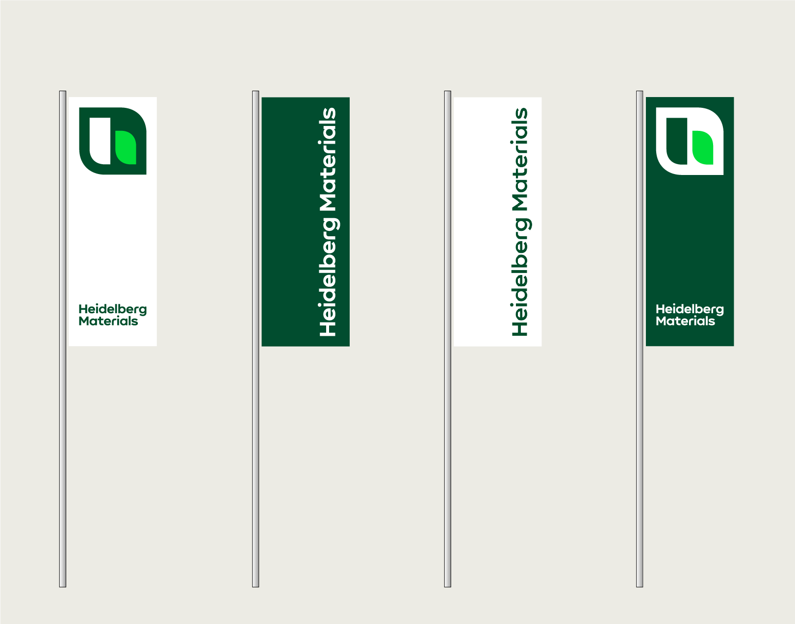

Variants of flags
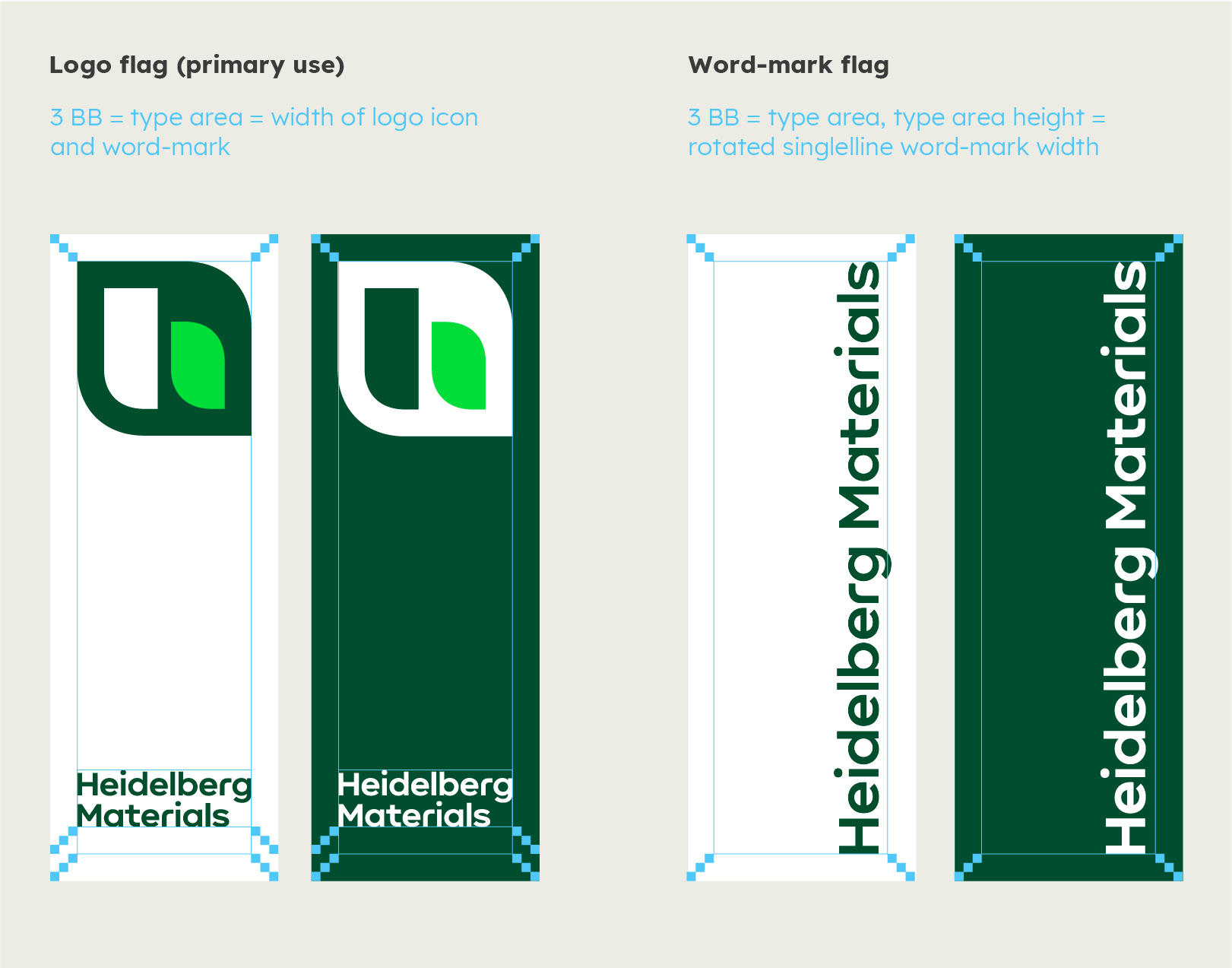

Dimensioning of the flags
Flags cntd.
Dos and don'ts
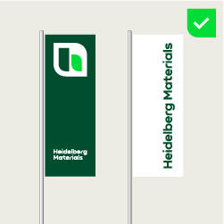

Combine logo flag and word-mark flag.
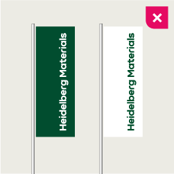

Do not use the word-mark flag without the logo flag.
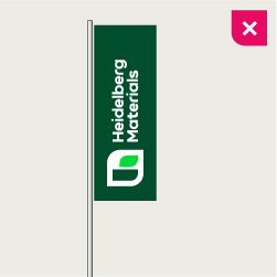

Do not rotate the logo – no exceptions.
Monoliths
Monoliths
- Long-distance visibility; the main task is the branding of a place.
- Branding with logo and primary colours, and possibly additional information
- Big monolith: confirmation of destination for truck and car drivers
- Small monolith: confirmation of destination for people
Big and small monoliths
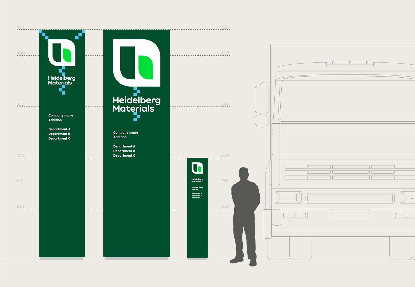

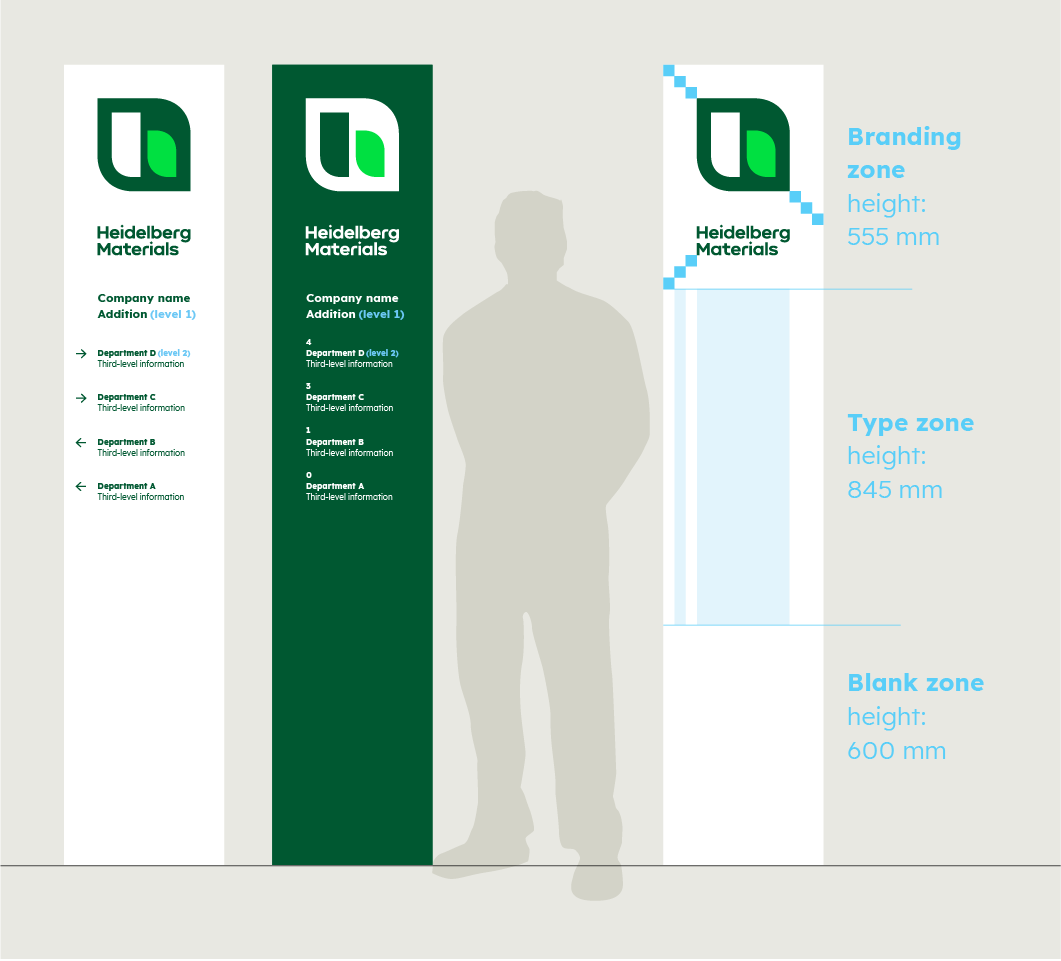
Monolith variants and their visibility for different users.
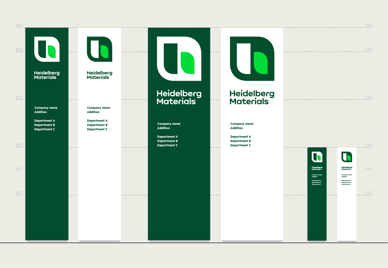

Colour options for monolith variants.
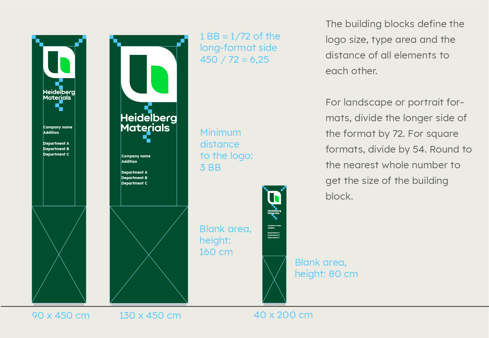

Construction with building blocks, example formats.
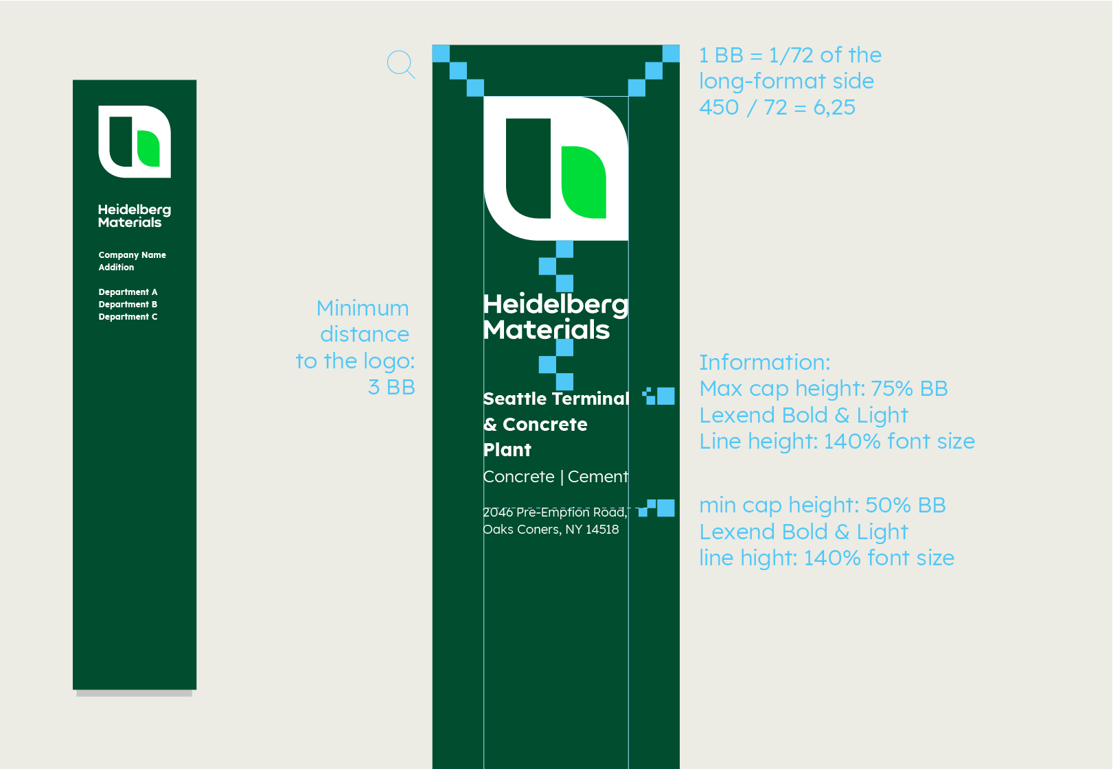

Additional information on font sizes.
Signs
Signs
- Middle-to-close-distance visibilities; the main task is the branding of a building.
- Branding with logo and primary colours, and possibly additional information
- Conformation of destination for people
Visibility of signs
Signs for entrance areas or building markings are viewed from a distance of 5 to 1 m. They often have a branding and informational purpose.
Logo size
The logo size should be as large as possible, but it depends on the sign size and viewing distance, which, in turn, is contingent on the location of the sign and the information to be displayed.
Therefore, a maximum size and a minimum size are defined for the logo. The logo can be freely scaled between the specified limits, depending on the space required for the additional information.
Logo position
The logo is left-aligned and aligned at the top of the type area. The type area is made up of 6 building blocks depending on the format.
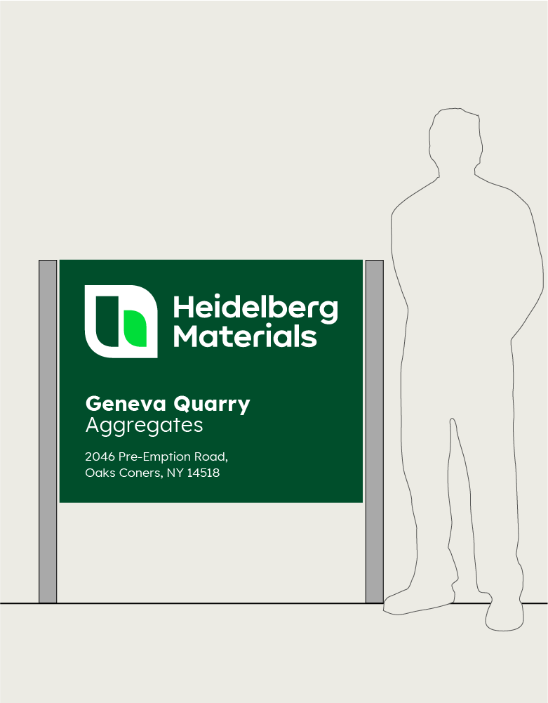

Sign layout
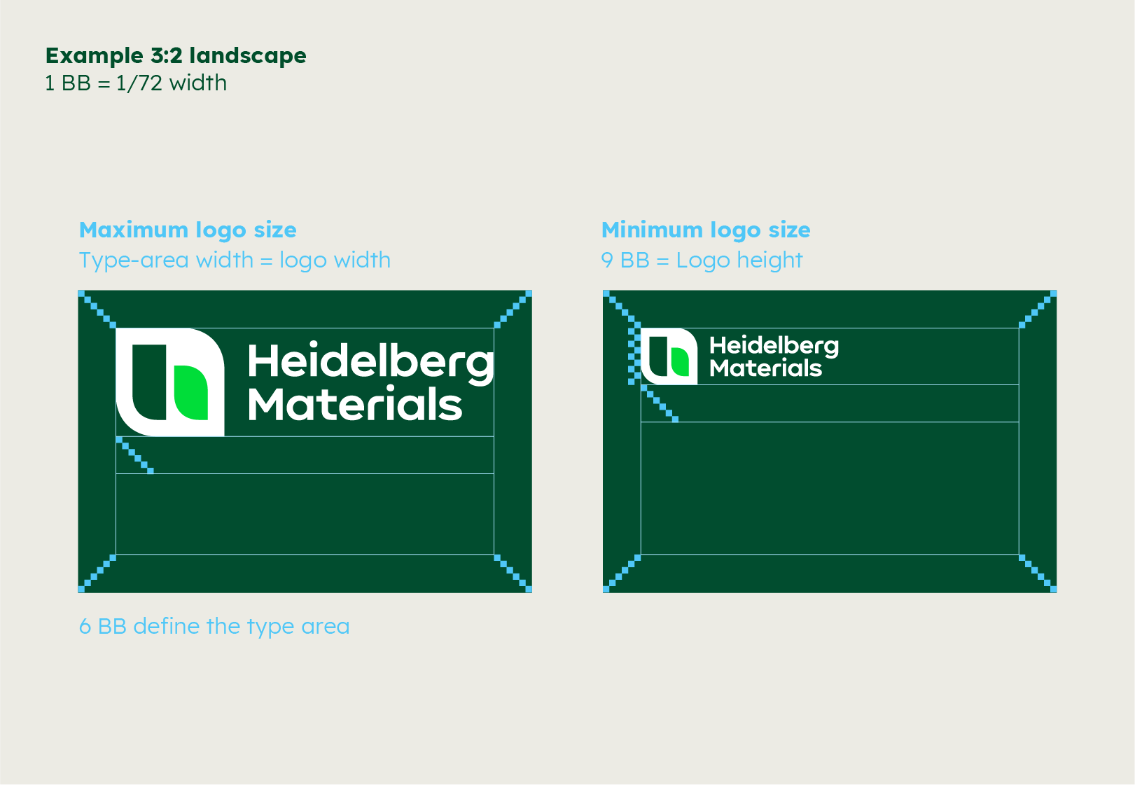

Maximum and minimum logo size
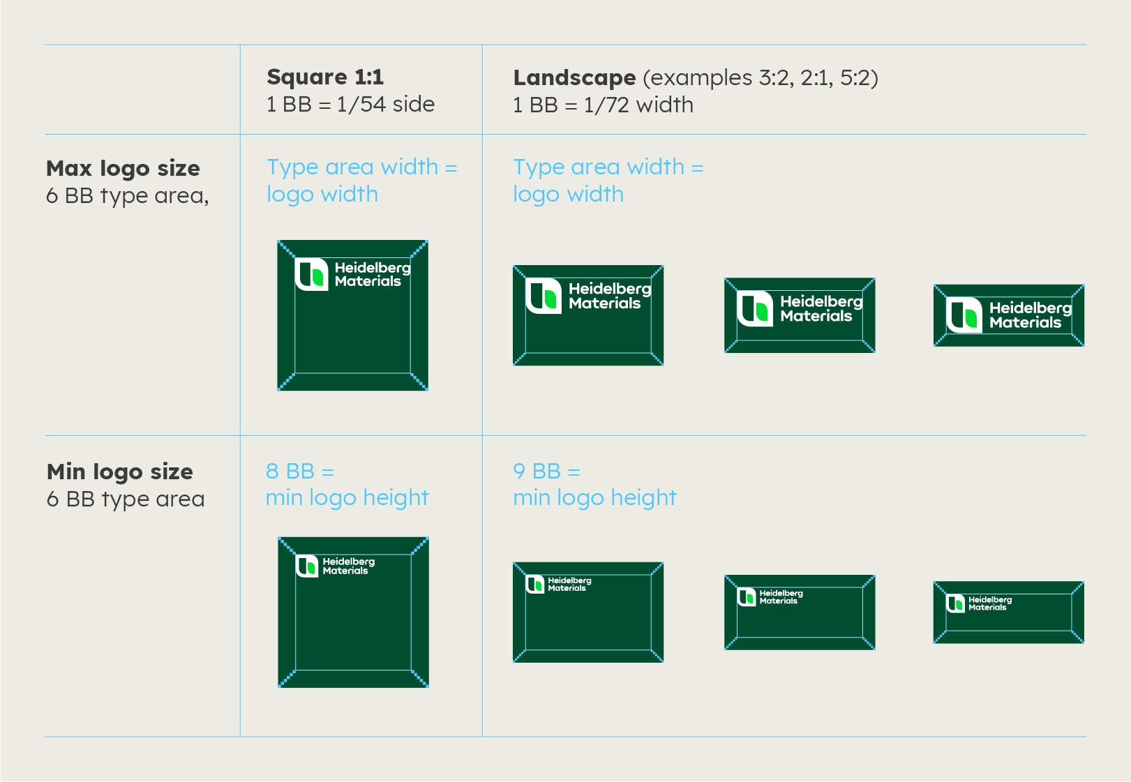

Maximum and minimum logo size. If structural conditions, lighting or better visibility require it, the logo can also be centred in height.
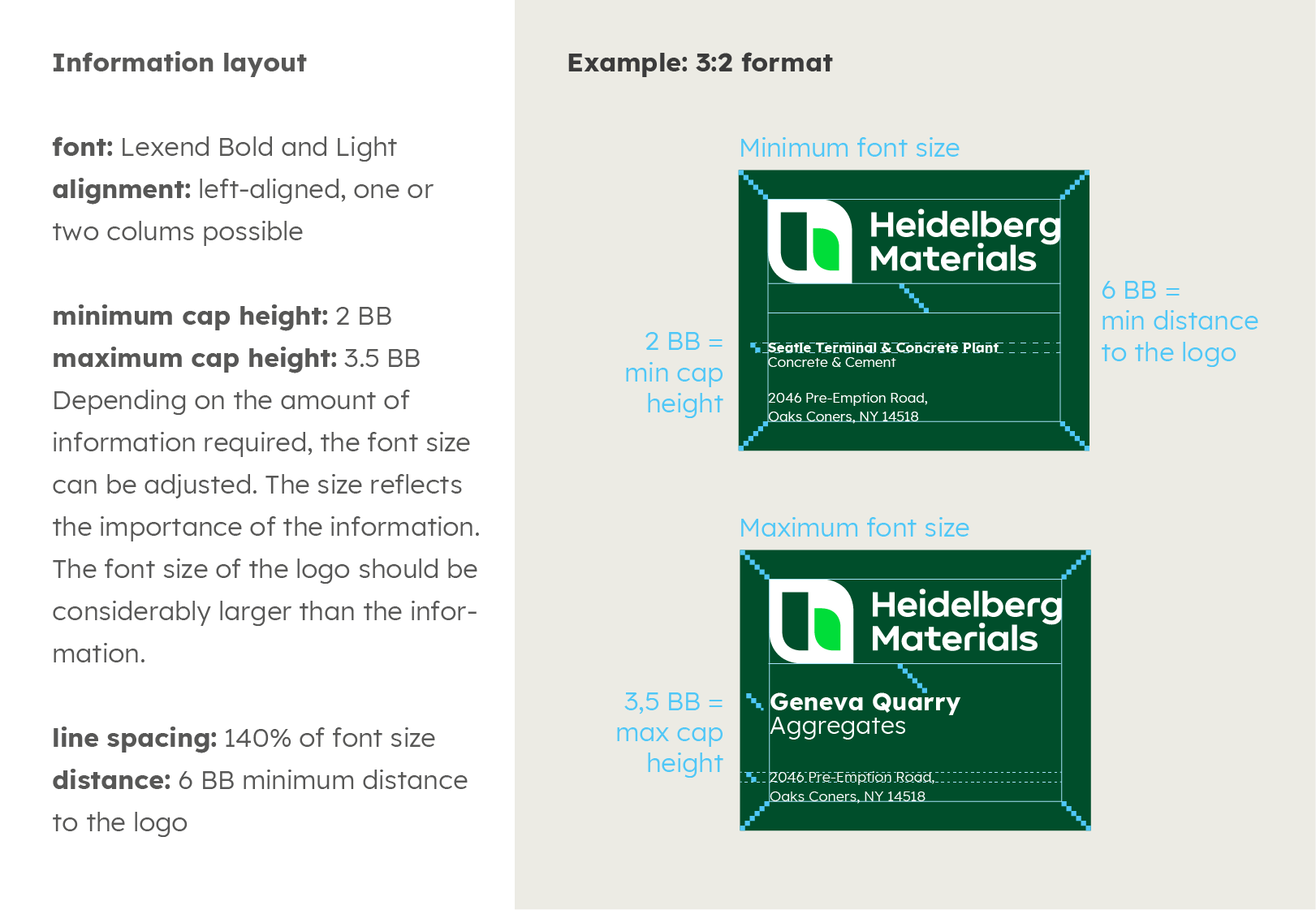

Information on layout, fonts and sizes
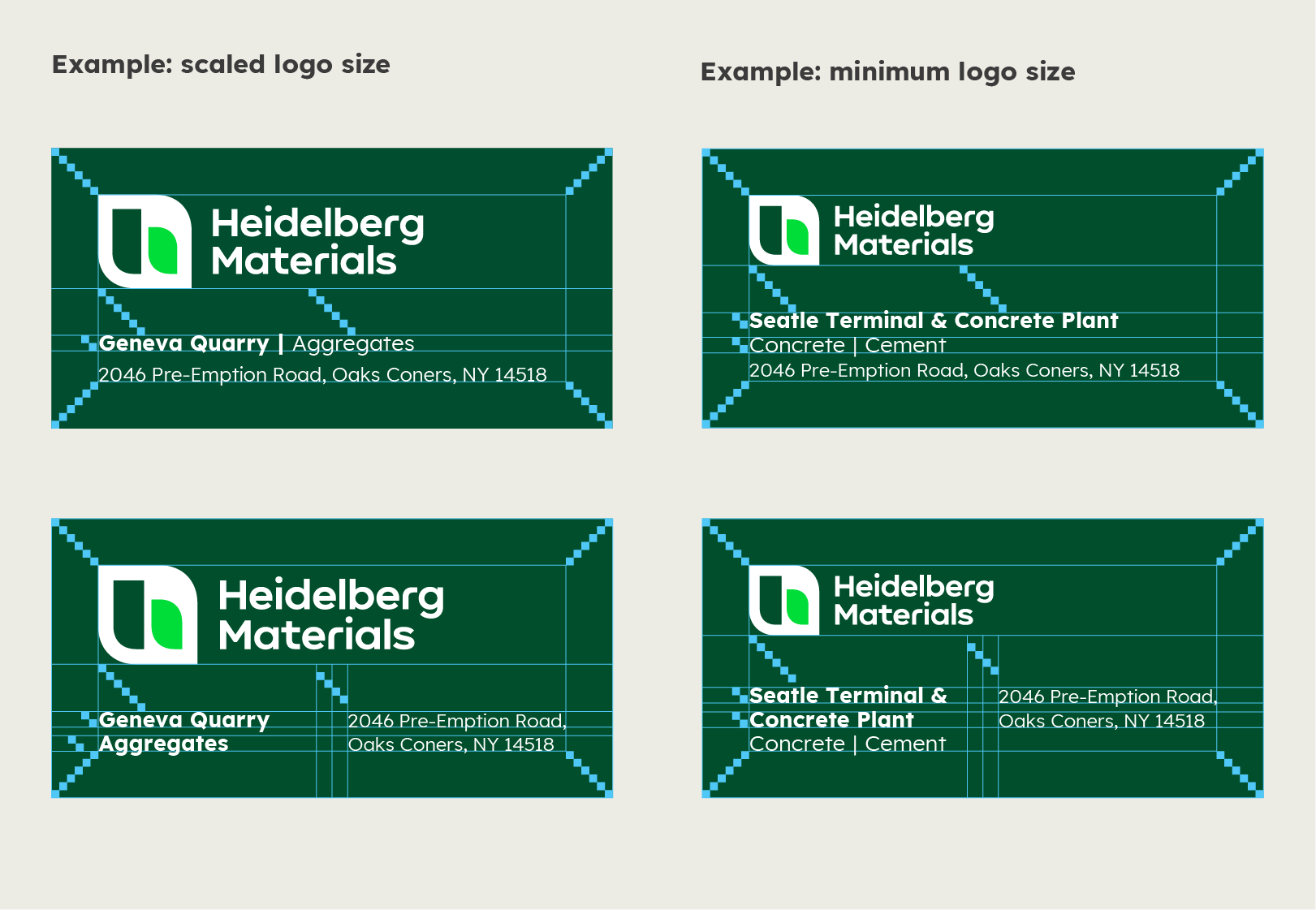

Example layouts
Horizontal and vertical centring of the logo
In some cases, in order to maximise visibility or to aesthetically harmonise with the architecture, it may be necessary to centre the logo in the height or width of the format.
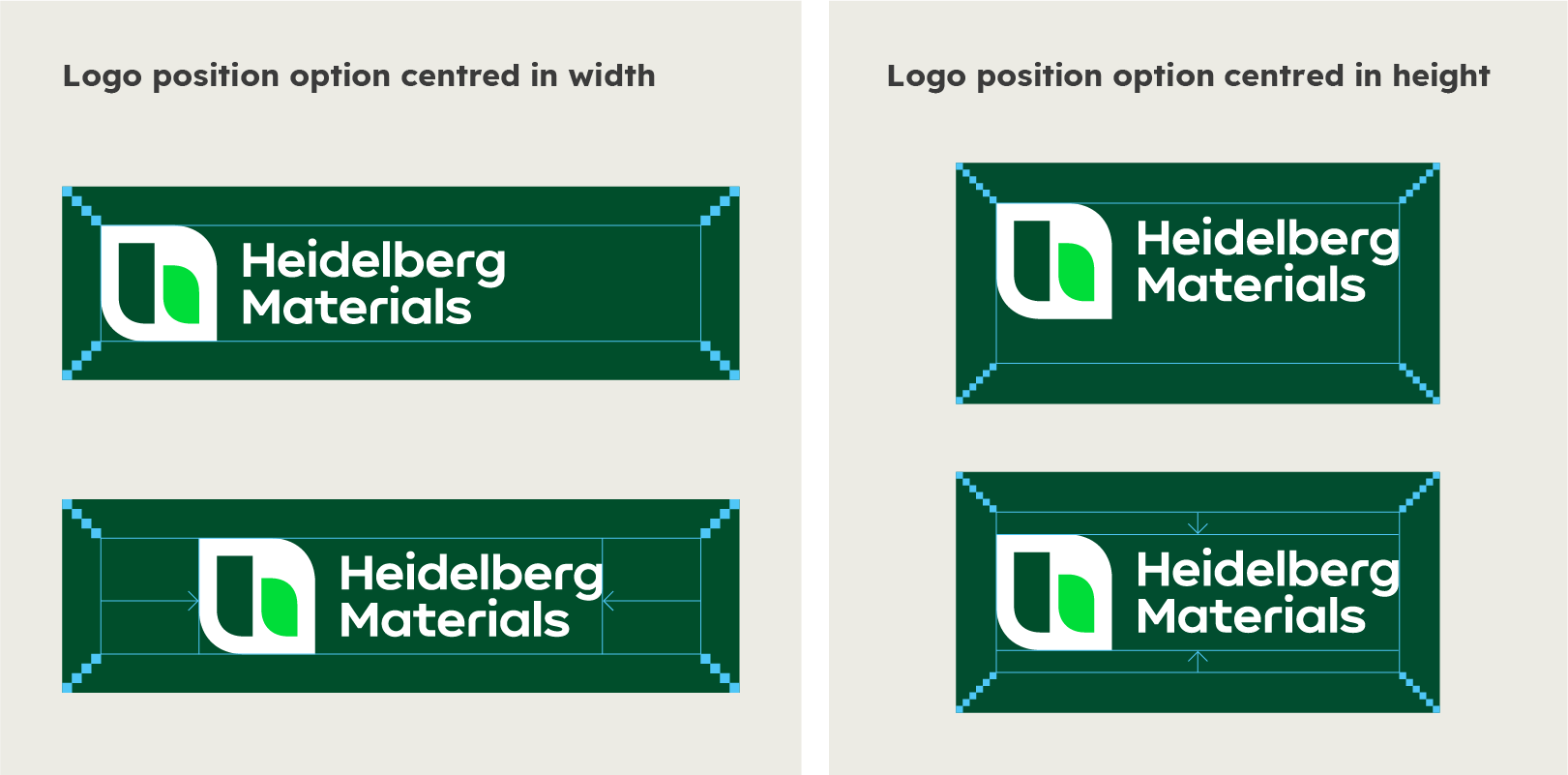

Special cases: extreme landscape formats
Architectural conditions or external specifications sometimes require a logo placement in extreme formats. For landscape formats with an aspect ratio higher than 4, the exceptional logo variant “Logo single line” may be used for maximum brand visibility.
The decisive factor in the design is whether maximum visibility is necessary or whether the design should blend in aesthetically with the environment.
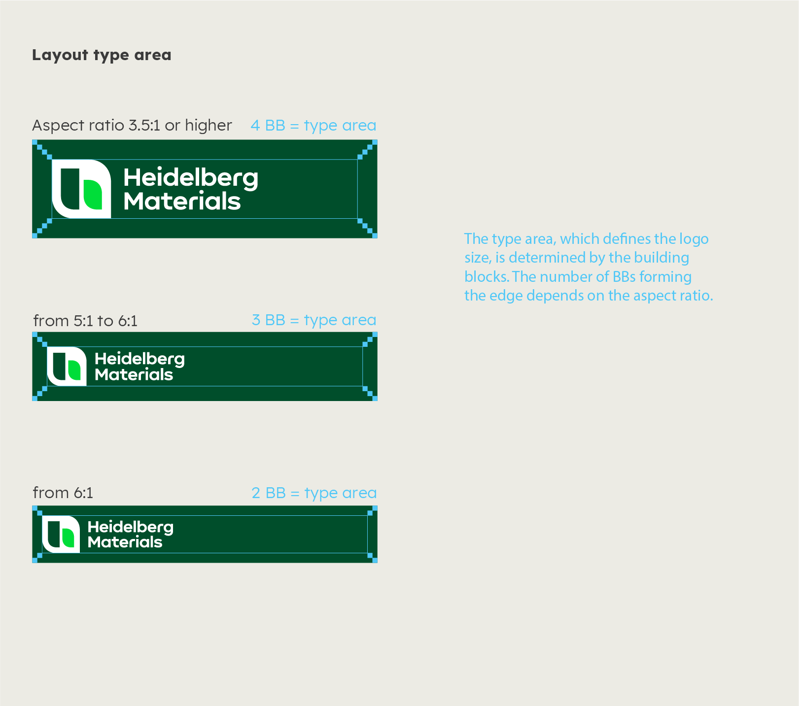

The type area defines the maximum height or width of the logo.
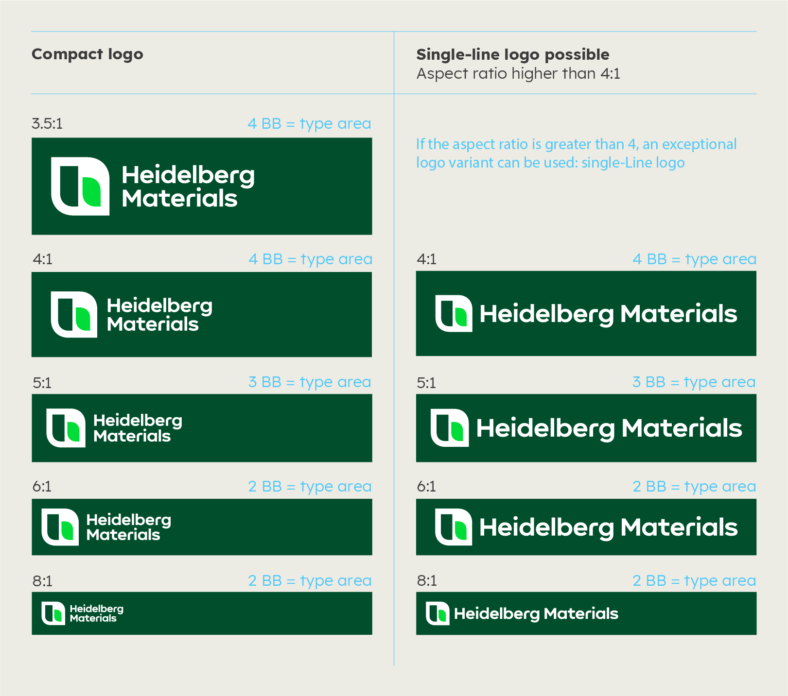

For maximum visibility, the single-line logo can be used. The environment may require a symmetrical sign layout, for which the logo may be centred in height or width. See “Horizontal and vertical centring of the logo”.
Please note: the single line logo is only to be used in special cases. Please only use it as described in the guidelines.
Silo branding
When redesigning silos, it is important to ensure that the wordmark is clearly legible. Due to the many different types of construction, the branding must be designed individually for each building. The size of the icon or word mark can be varied according to the intended effect.
Brand mark highlighted
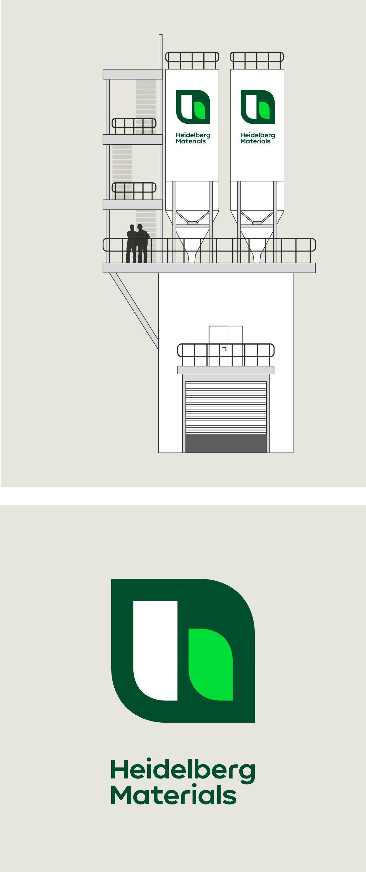

The brand mark is the focus of the desired long-distance effect.
Construction with Building Blocks
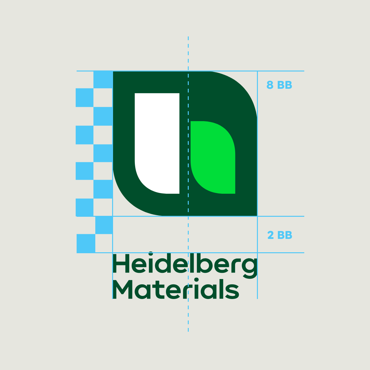

The word mark is left-aligned and centred to the
brand mark. The width of the word mark is the
same as the width of the brand mark.
Word mark highlighted
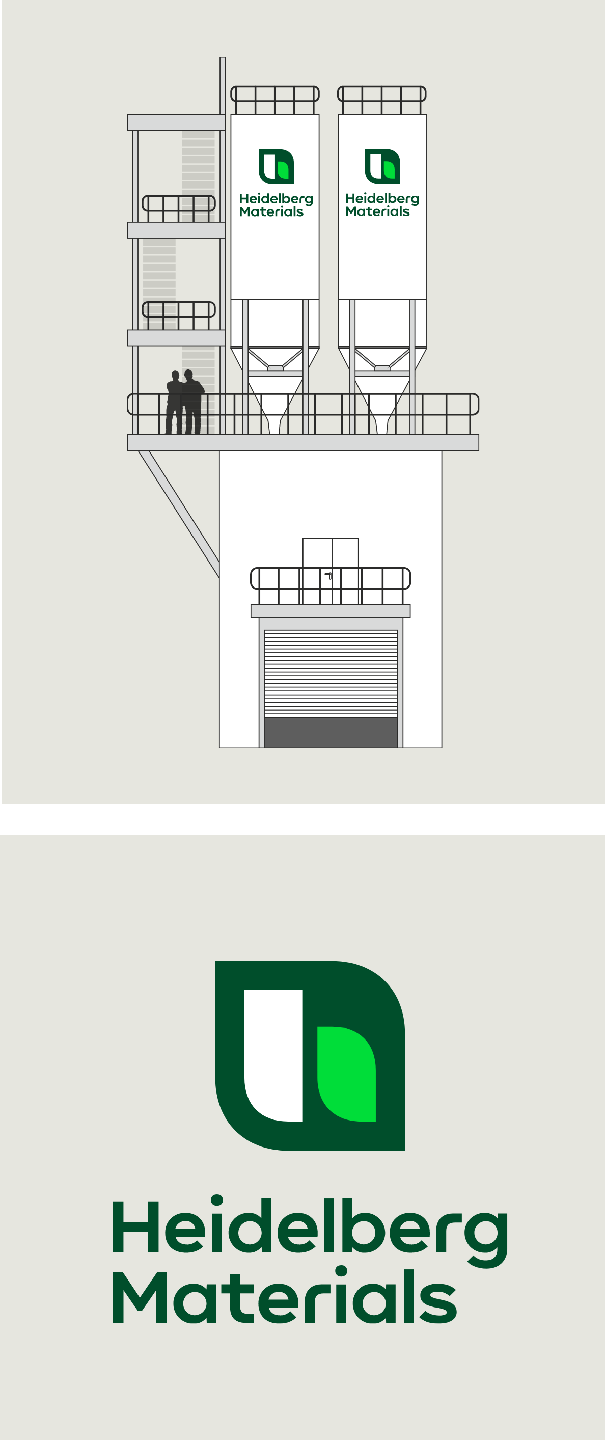

The word mark is the focus of the desired long-distance effect.
Construction with Cap Height of word mark
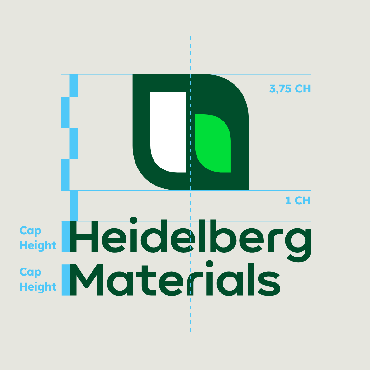

The brand mark has a height of 3.75 of the cap height. The word mark is left-aligned and centred to the brand mark.
Indoors
Indoors, branding through logos and company names is less important than directions for orientation. Logistical destinations such as elevators, kitchens, canteens or restrooms as well as stairwells, work areas and room numbers need to be easy to find. The corporate design organises the information and guides the user through the building but can also accentuate the space and thus increase the internal brand perception.
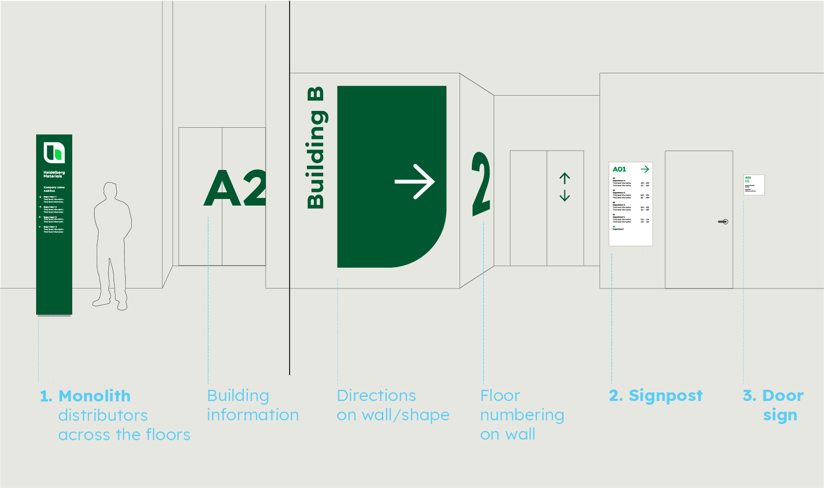

Entrance - monolith or wall sign

Signpost / Directions
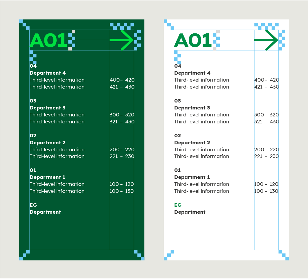

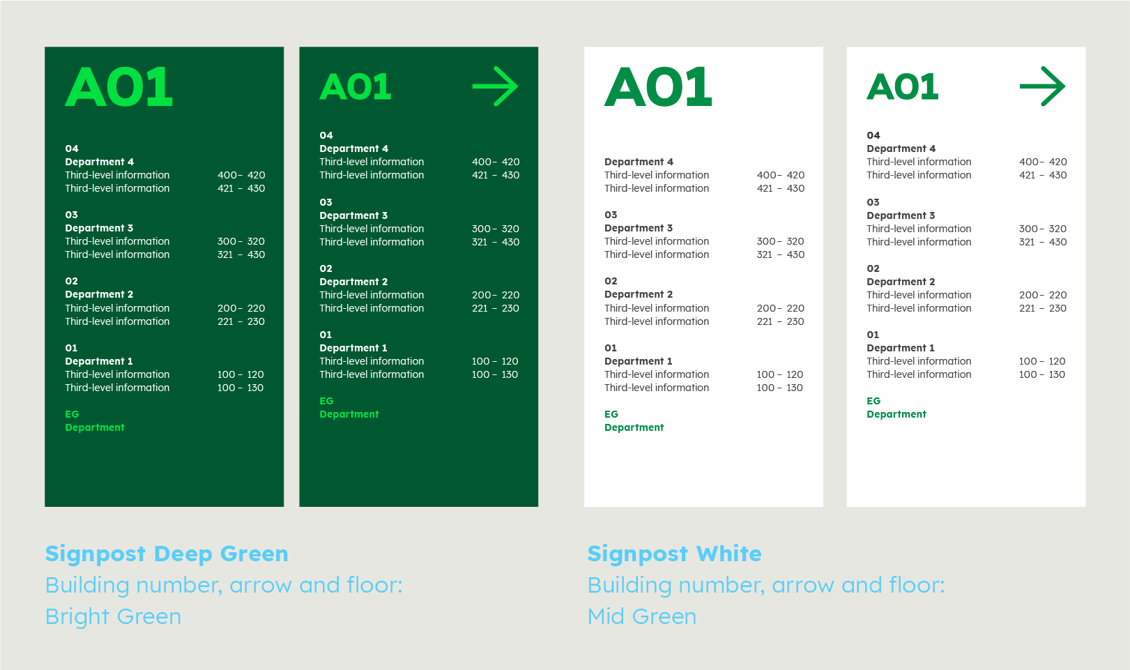
Signpost examples

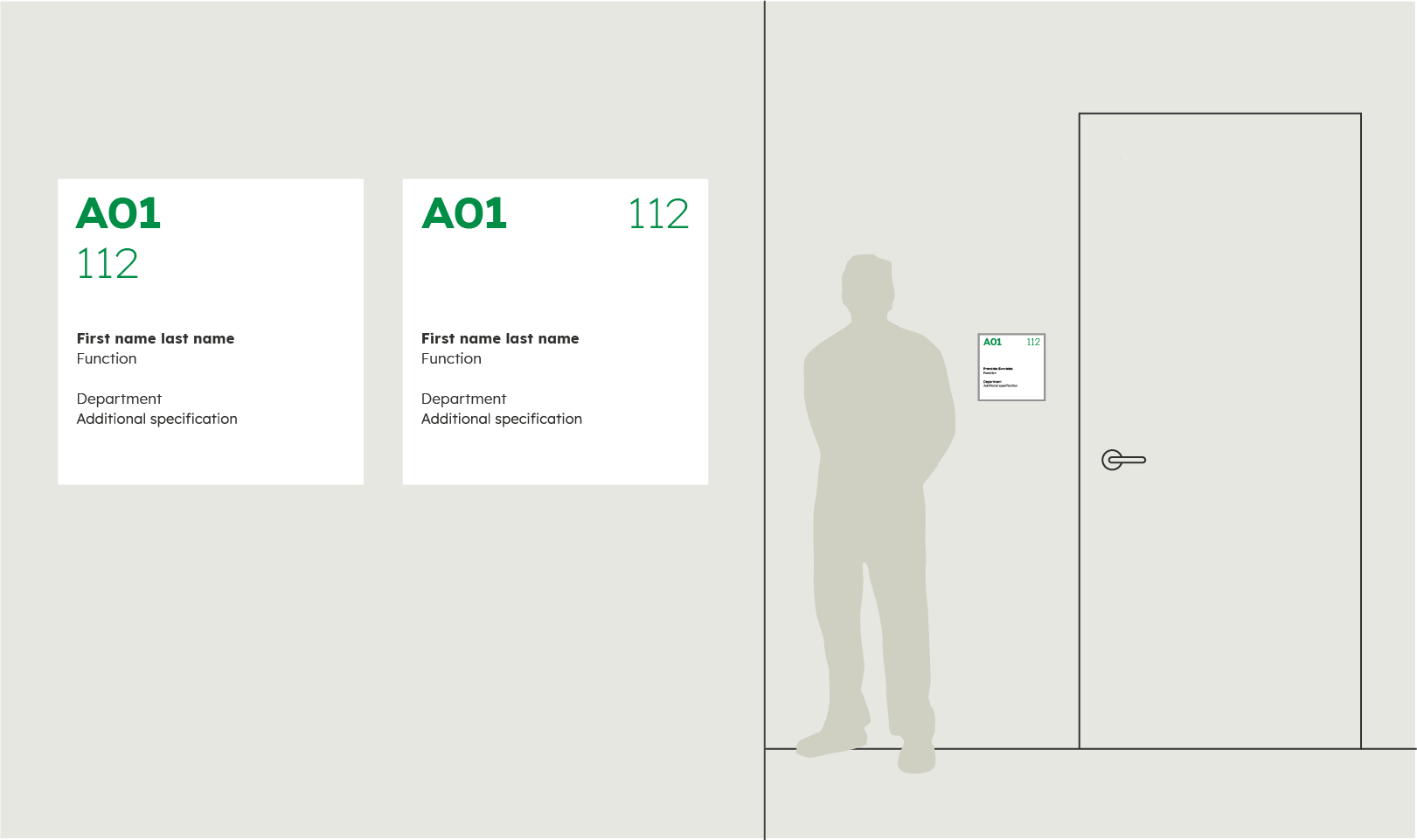
Door signs
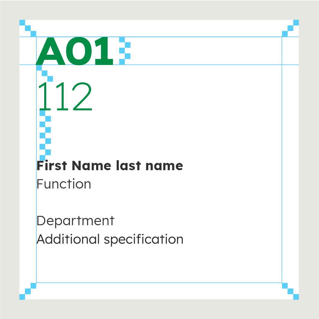

Door sign examples

Dos and don'ts
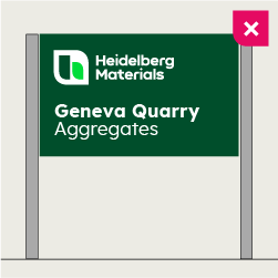

Make sure that the font size of the information is not larger than the font size of the logo.
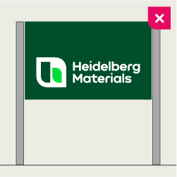

Do not place the logo at the bottom. Follow the rules for minimum and maximum.
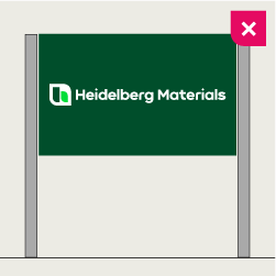

Do not use the single-line logo unless it is absolutely necessary.
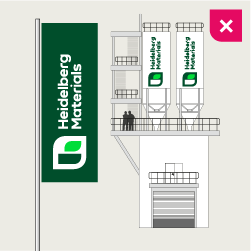

Do not rotate the logo – no exceptions.
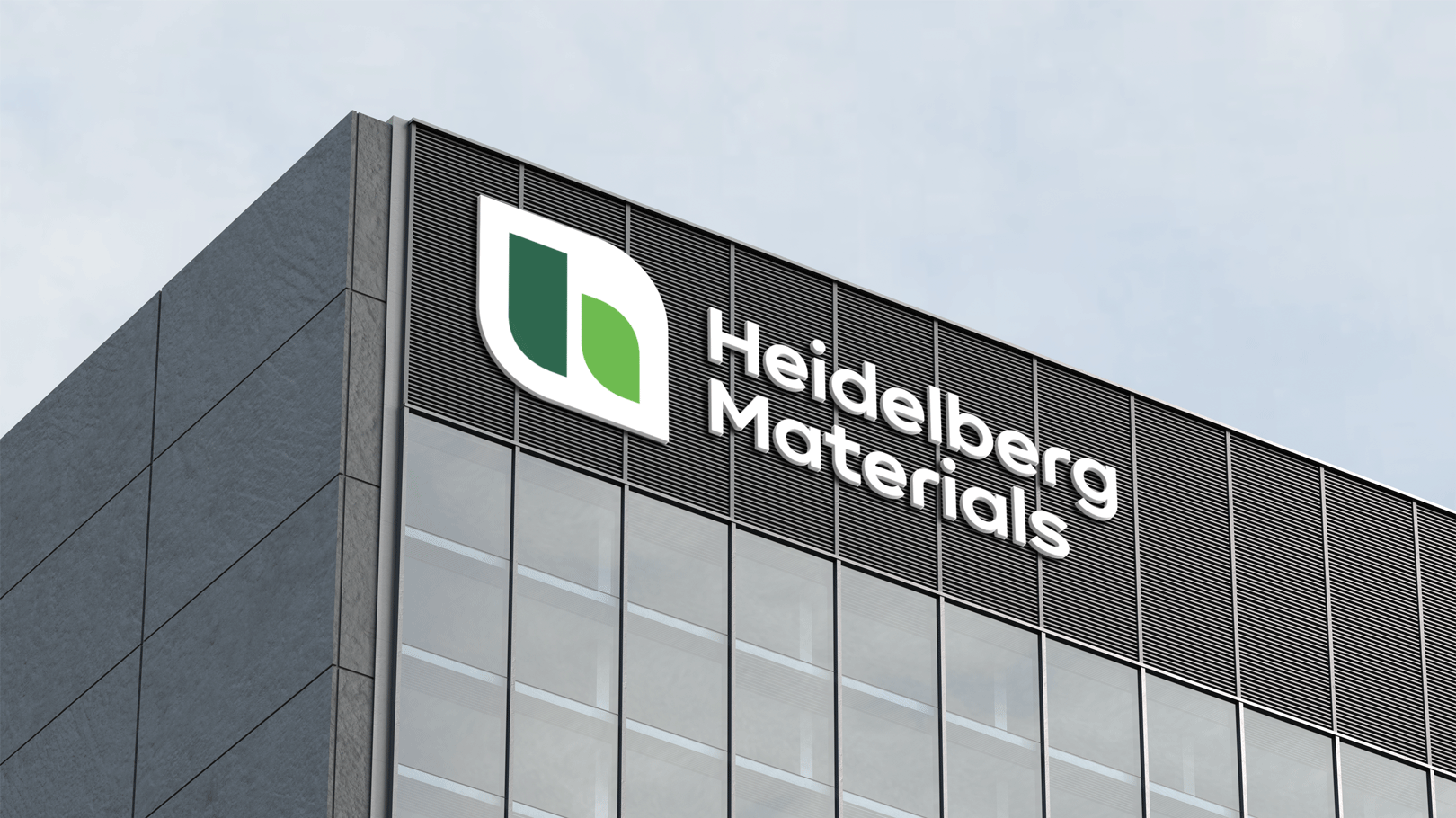
Signs in use


Contact
Any questions about our guidelines?
Contact us.
- N Support
- T + 49 211 690787-200
- E support@Brandhub.heidelbergmaterials.com