Colours


Green and colourful
We remain true to our tradition. We updated our distinctive, clearly recognisable green and added two more shades to give the brand a more modern, self-confident look. Ensure balanced line lengths to ensure good reading quality. At the same time, we are expanding our colour world with bright hues to make our communication more emotional and inspiring.
Primary colours
Traditional and instantly recognisable, with new nuances.
Deep Green


HEX: #004E2B
RGB: 0 | 78 | 43
CMYK: 77 | 0 | 72 | 70
PMS C: 3537 C
PMS U: 342 U
HKS K: 61 K
HKS N: 61 N
RAL: 160 30 25
Pantone® 19-6050 TCX Eden
Mid Green


HEX: #00843D
RGB: 0 | 132 | 61
CMYK: 90 | 0 | 100 | 10
PMS C: 355 C
PMS U: 355 U
HKS K: 57 K
HKS N: 57 N
RAL: 6037
Bright Green


HEX: #00DD39
RGB: 0 | 221 | 57
CMYK: 68 | 0 | 98 | 0
PMS C: 2271 C
PMS U: 2271 U
HKS K: 65 K
HKS N: 65 N
RAL: 6038
Usage
The Primary colours have certain functions. This overview shows which colour should be used and how.
Backgrounds
Backgrounds


Use Deep Green as a solid background colour in all media and formats.


Use Mid Green as a solid background colour only for special touch points like vehicles or helmets.


Use Bright Green as a solid background colour only for CTAs.
Shapes
Shapes


Use Deep Green for fixed or floating shapes.


Don't use Mid Green for fixed or floating shapes.
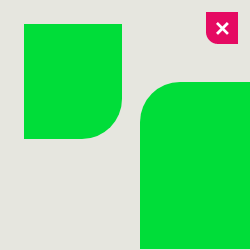

Don't use Bright Green for fixed or floating shapes.
Text
Text


Headlines and sublines may be Deep Green. It provides enough contrast to make this text easy to read.


It's possible to mark up or highlight texts with Mid Green. Especially in digital media.


It's possible to mark up or highlight texts with Bright Green, but only on a Dark Green background.
Neutral colours
Neutral colours bring calm and practicality to our overall look.
Neutral colours
White


HEX: #FFFFFF
RGB: 255 | 255 | 255
CMYK: 0 | 0 | 0 | 0
PMS C: —
PMS U: —
HKS K: —
HKS N: —
RAL: 9016
Sandy Grey


HEX: #E6E6DF
RGB: 230 | 230 | 223
CMYK: 0 | 0 | 5 | 10
PMS C: COOL GRAY 1 C
PMS U: COOL GRAY 1 U
HKS K: 89 K (20%)
HKS N: 89 N (20%)
RAL: 9002
Dark Grey


HEX: #3B3B3B
RGB: 59 | 59 | 59
CMYK: 0 | 0 | 0 | 80
PMS C: COOL GRAY 9 C
PMS U: COOL GRAY 9 U
HKS K: 88 K (80%)
HKS N: 88 N (80%)
RAL: 000 20 00
Black


HEX: #000000
RGB: 0 | 0 | 0
CMYK: 0 | 0 | 0 | 100
PMS C: BLACK 6 C
PMS U: BLACK 6 U
HKS K: 88 K
HKS N: 88 N
RAL: 000 15 00
Usage
Usage
Neutral colours have certain functions. This overview shows which colour should be used and how.
Backgrounds
Backgrounds


You may use White as a solid background colour in all media and formats.


You may use Sandy Grey as a solid background colour in all media and formats.


Don't use Dark Grey as a solid background colour in any media or formats.


Don't use Black as a solid background colour in any media or formats.
Usage
Shapes
Shapes


Don't use White for fixed or floating shapes.


You may use Sandy Grey for floating shapes.


Don't use Dark Grey for fixed or floating shapes.


Don't use Black for fixed or floating shapes.
Usage
Text
Learn more about our new typeface in the Typography section.
Text


You may use White for text. Please make sure there is enough contrast.


Don't use Sandy Grey for text.


You may use Dark Grey for text in digital media. Please make sure there is enough contrast.


You may use Black for text in print media. Please make sure there is enough contrast.
Inspiring colours
Inspiring colours attract attention and add variety to our media. They should be used as a highlight to not appear too obtrusive. Always pay attention to WCAG (Web Content Accessibility Guidelines) compliance!
Inspiring colours
Spark Yellow


HEX: #FAFA64
RGB: 250 | 250 | 100
CMYK: 10 | 0 | 75 | 0
PMS C: 3935 C
PMS U: 3945 U
HKS K: 2 K
HKS N: 2 N
RAL: 1016
Warm Orange


RGB: 255 | 100 | 78
CMYK: 0 | 70 | 60 | 0
PMS C: 178 C
PMS U: 178 U
HKS K: 13 K (80%)
HKS N: 13 N (80%)
RAL: 040 60 60
Punchy Red


HEX: #E50A62
RGB: 229 | 10 | 98
CMYK: 0 | 100 | 30 | 0
PMS C: 2040 C
PMS U: 2040 U
HKS K: 25 K
HKS N: 25 N
RAL: 010 40 53
Vibrant Purple


HEX: #873CFF
RGB: 135 | 60 | 255
CMYK: 60 | 65 | 0 | 0
PMS C: 266 C
PMS U: VIOLET U
HKS K: 36 K (80%)
HKS N: 36 N (80%)
RAL: 310 40 40
Usage
Usage
Inspiring colours have certain functions. This overview shows which colour should be used and how.
Backgrounds
Backgrounds


Use Spark Yellow as a solid background colour for bold, inspiring messages.


Use Warm Orange as a solid background colour for bold, inspiring messages.


Use Punchy Red as a solid background colour for bold, inspiring messages.


Use Vibrant Purple as a solid background colour for bold, inspiring messages.
Usage
Shapes
Shapes


You may use Spark Yellow for floating shapes on a Deep Green background.


You may use Warm Orange for floating shapes on a Deep Green background.


You may use Punchy Red for floating shapes on a Deep Green background.


You may use Vibrant Purple for floating shapes on a Deep Green background.


When you use Spark Yellow for the background, the floating shape must be Deep Green.


When you use Warm Orange for the background, the floating shape must be Deep Green.


When you use Punchy Red for the background, the floating shape must be Deep Green.


When you use Vibrant Purple for the background, the floating shape must be Deep Green.
Usage
2 Shapes
When using inspiring background colours and two shapes, there are 10 possible colour combinations. One shape always has to be Deep Green.
2 shapes




















CTA
Do not use three shapes on inspiring background colours!
Usage
Usage
Text
Text


Don't use Spark Yellow for text.


Don't use Warm Orange for text.


Don't use Punchy Red for text.


Don't use Vibrant Purple for text.
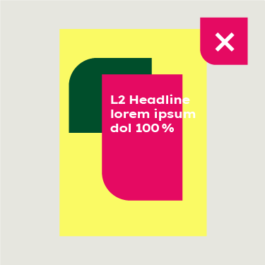

Don't use overlapping text with a Spark Yellow background.
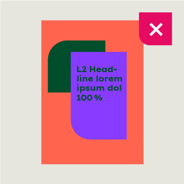

Don't use text in Deep Green on any coloured shape apart from Spark Yellow.
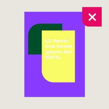

Don't use white text on a Spark Yellow shape.
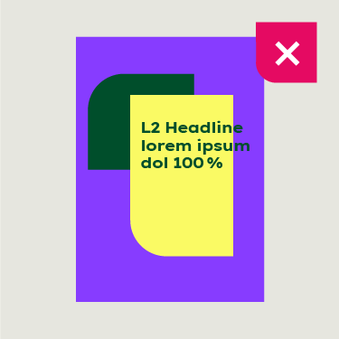

Don't use overlapping text on a Spark Yellow shape.
Functional colours
An extended colour palette with colour gradients is available for charts in business reports or PowerPoint presentations. Learn more in the respective chapters and in the template toolboxes.
Accessibility
The Web Content Accessibility Guidelines (WCAG) specify certain ratios that achieve the minimum contrast required for readability. If colours are not distinct enough, either in terms of brightness or difference in hue, visually impaired users may have difficulty recognising letters and graphic elements.
Dos and don’ts
Please have a look at the dos and don’ts for our multicolour approach.
Dos and don’ts


Our primary green is Deep Green. Use Bright Green for highlighting.
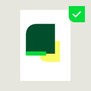

Green should always be an important visual part of the colour scheme.


You may use inspiring colours in the floating shapes (always in combination with a green visual part).


You may use two inspiring colours with a green background colour or a green subject in the background


Don’t use three shapes on inspiring background colours and don't forget one shape should be Deep Green.


Don’t use Bright Green for backgrounds or Deep Green for CTAs.
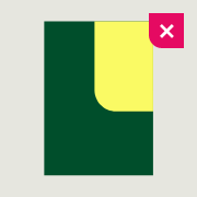

Don't use inspiring colours for fixed shapes.


Don't use two inspiring colours without a green background colour or green subject in the background.


Don't use the same colour for background and shape.


Don't use the same colour for two shapes.


Don't use another colour apart from Bright Green for the call to action.


Don't use a shape in Punchy Red on a Warm Orange background or the other way round.
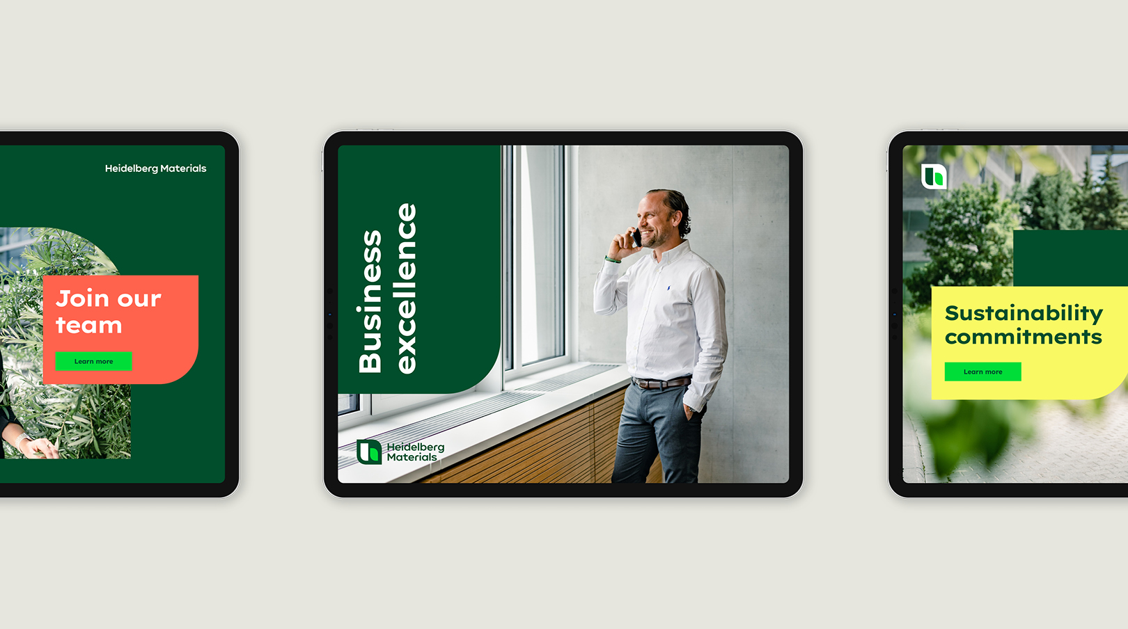
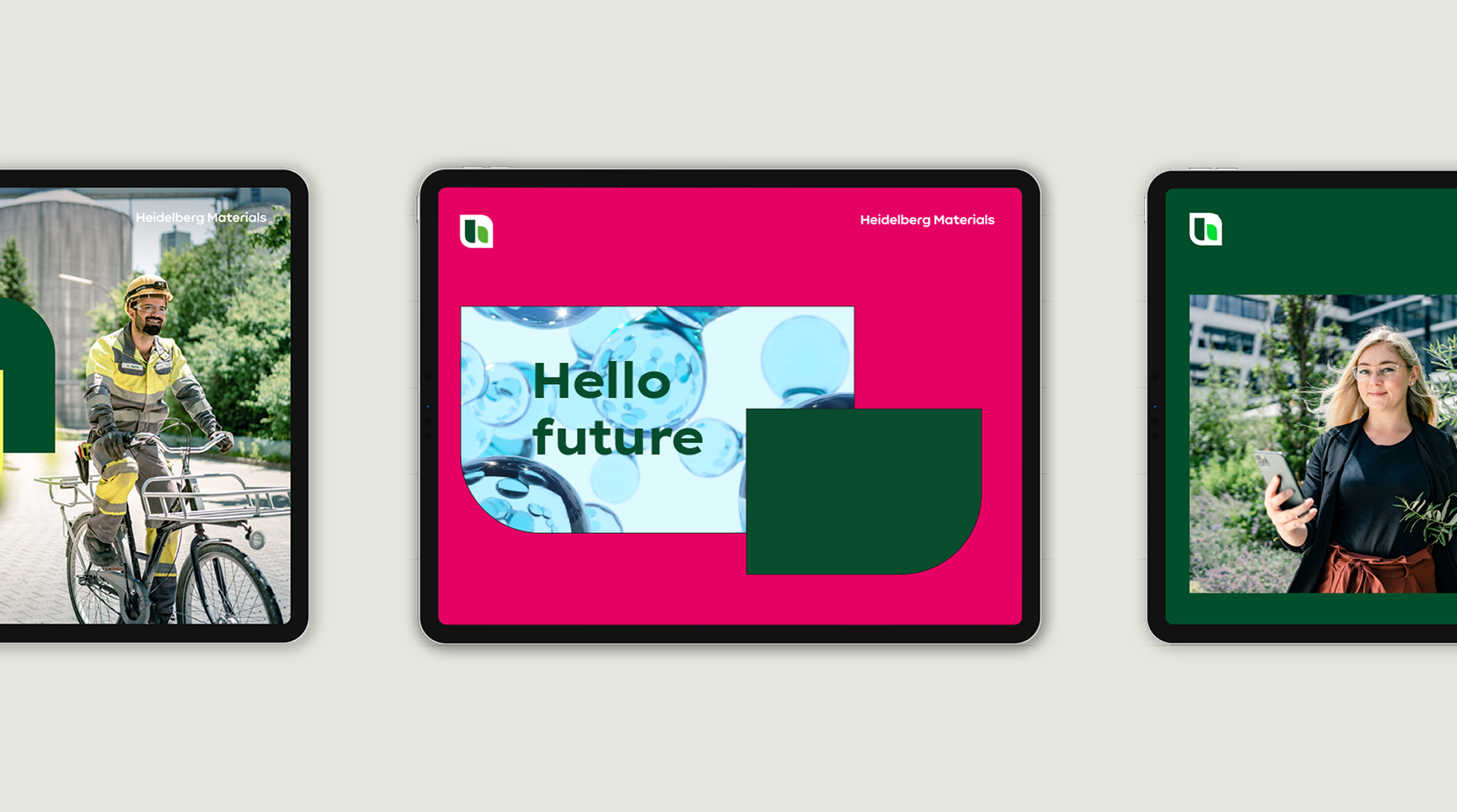
Colours in use


Downloads
Important Note Regarding Login
Due to the transition to our new website, all users must
set a new password the first time they log in.
To do so, please use the “Forgot Password” feature and
follow the instructions.
Thank you for your understanding.
Contact
Any questions about our guidelines?
Contact us.
- N Support
- T + 49 211 690787-200
- E support@Brandhub.heidelbergmaterials.com