Icons


Our icon designs correspond to the formal language of the logo. They apply our corporate design to the content and provide a friendly introduction to texts or dry, technical topics. The number of icons is constantly growing, and the themes and the information they convey can be expanded indefinitely. This guideline helps with the creation of new icons to ensure that despite their diverse contents, all icons can be recognised as belonging to the same group and thus to the brand.
Please note: Our icon set is constantly being expanded. Make sure you are working with the latest version of the set. Either always download the ZIP with the latest icons or work with the Adobe Library - where the icons are updated automatically.
Style/derivation
The Heidelberg Materials icon style
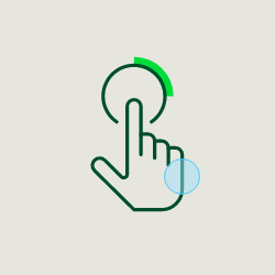

One stroke weight for all icons
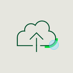

Each icon features a detail with a rounded corner emphasized through the use of Bright Green.
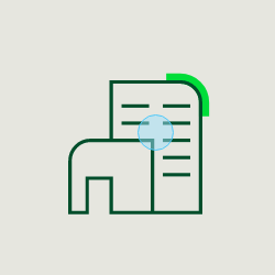

A complexity that allows details and abstractions but is not overloaded.
Variants
Each icon is available in two colour options and two variations:
- Deep Green for light backgrounds, with or without the corner accent
- White for dark backgrounds, with or without the corner accent
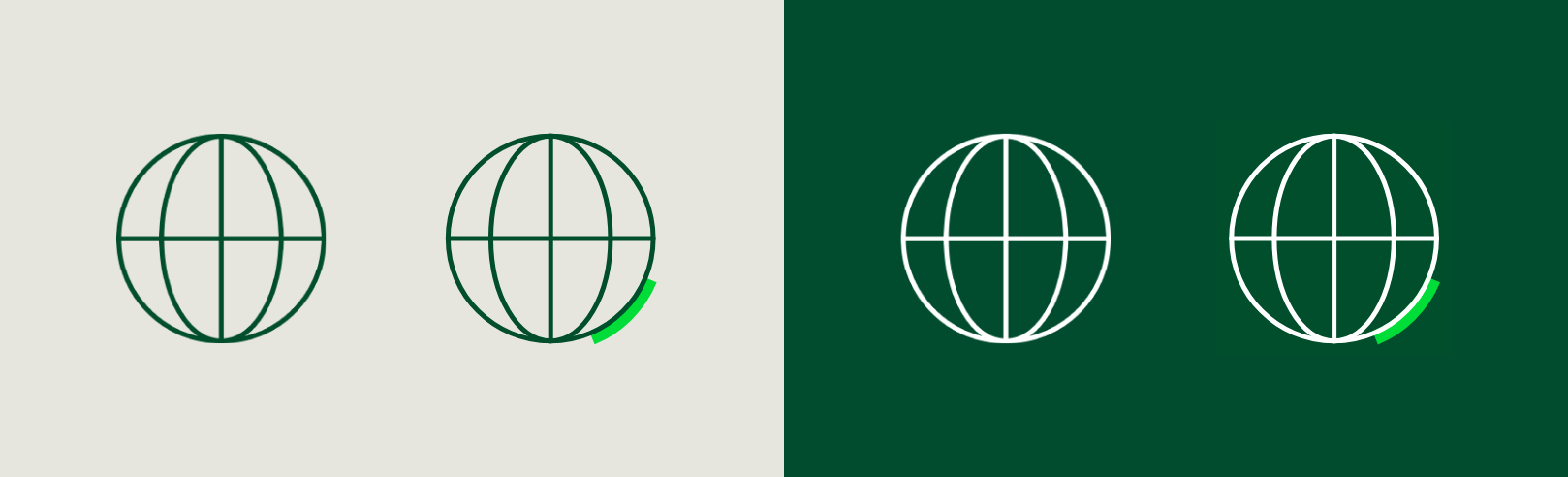

The main colour is the colour of the strokes: “Deep Green”. Bright Green may be used for the corner accent. The corner accent quotes on the shapes and establishes a visual connection to the logo.
Usage
Normally, the icon variant with the corner accent is used. In particularly small representations or with single-colour printing processes, the variant without corner accent is used.




Illustrative and UI icons
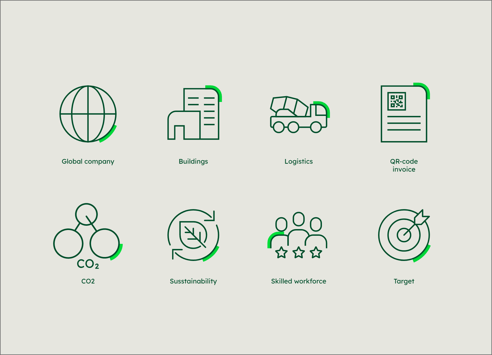
Illustrative icons


UI icons
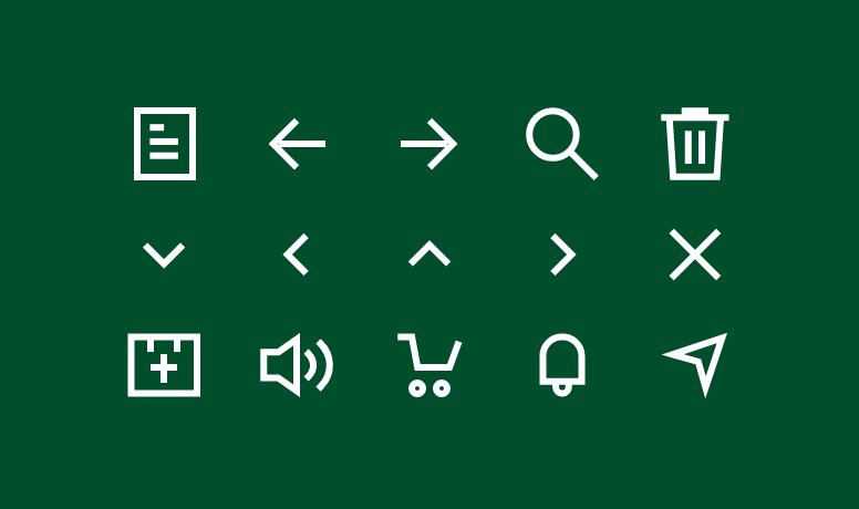

The difference between illustrative icons and UI icons are their functionalities. UI icons are designed in such a minimalistic way that they can fulfill their function even in the smallest representations without any explanation. Due to this functional requirement, they are limited in their design. Illustrative icons serve a brand-representing as well as entertaining purpose. They can also be used in a greatly enlarged form and do not have to be self-explanatory.
Icon library
In order to create new icons for the constantly growing pool of Heidelberg materials icons, the first icons shown here serve as inspiration and template. Individual elements, such as the representation of people, vehicles or stars, can be used in new icons.
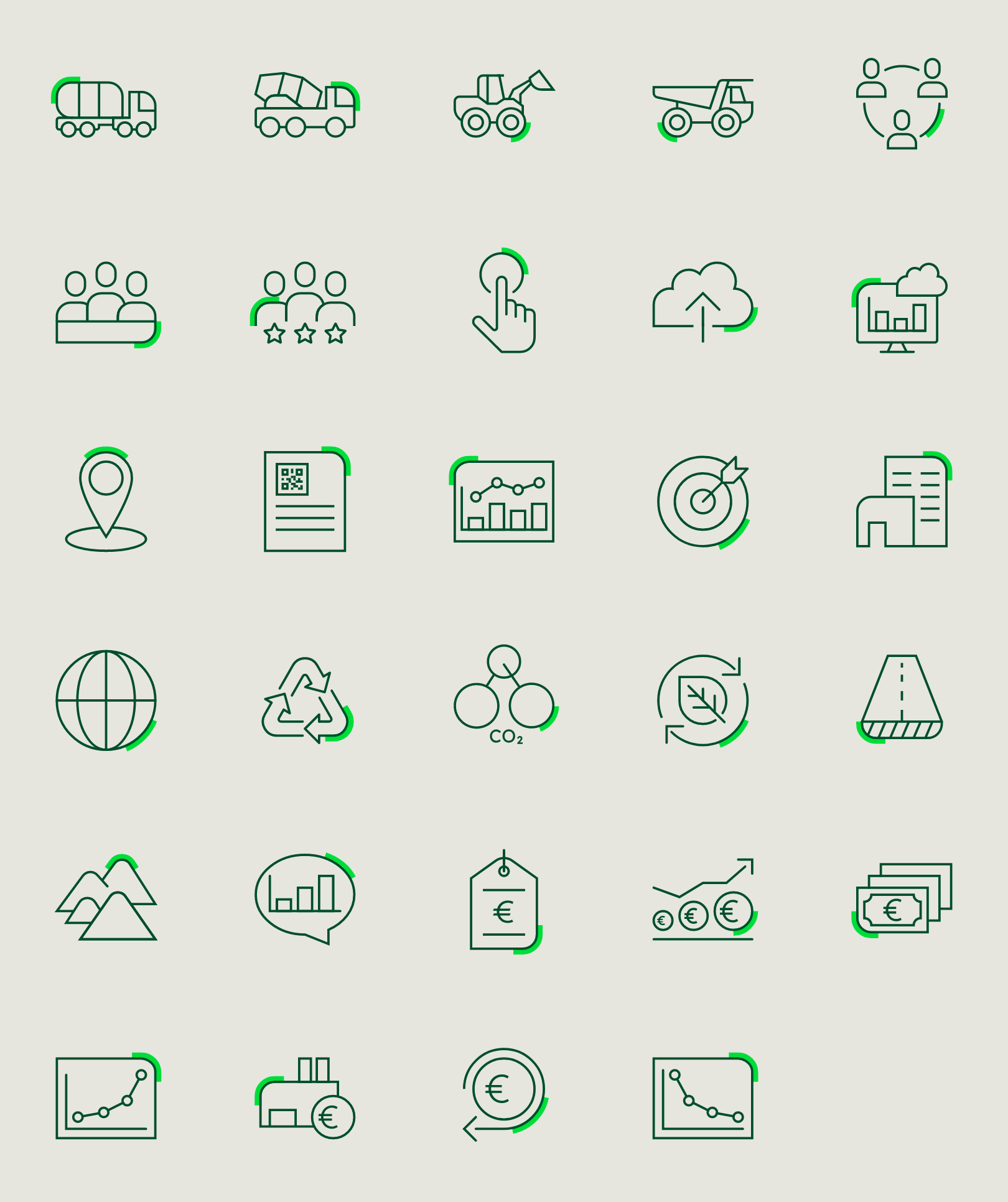

All icons are available for download in the Download section.
Artboard and grid
To ensure a uniform appearance, the same grid was used for all icons.
Icons are drawn on a 96 x 96 px artboard with a 48 x 48 grid. The grid lines are used as basic guideline to snap the stroked line-work of the design elements.
The grid contains a 6-px padding and all icons are centred.
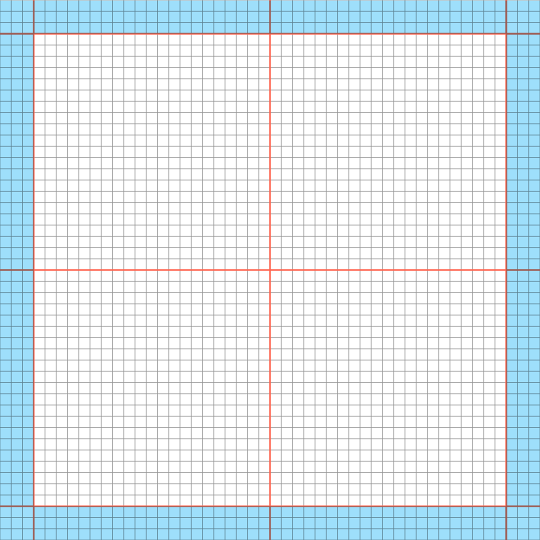

96 x 96 px artboard, 48 x 48 grid, 6-px padding and additional guides, one grid unit is 2 x 2 px.
Key shapes
The key shapes provide a framework that is adhered to as far as possible. They create a uniform icon language that can be extended indefinitely.
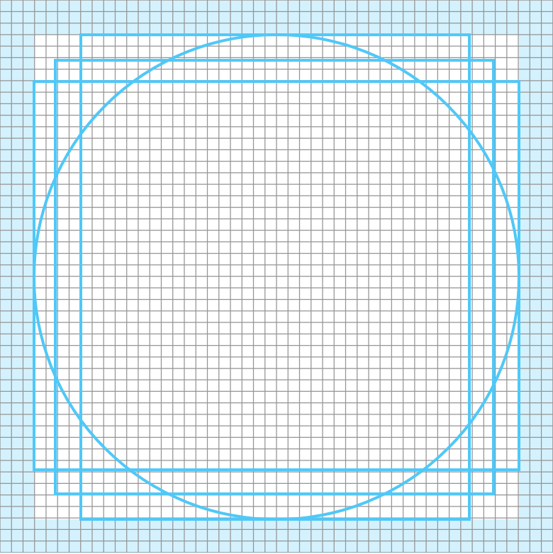

The 4 key shapes create consistent sizes and propotions for all icons in the set. The grid, the guides and the key shapes have already been created in the master template. The icon master template is available in the Download section.


The four key shapes (circle, square, portrait and landscape) give the maximum dimensions for an icon. Depending on the motif, the key shape most suitable for the content is selected.
Examples
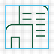

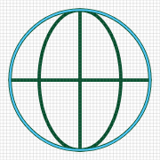

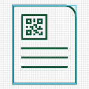

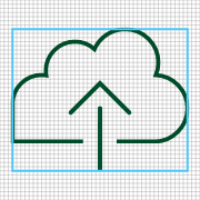

Examples
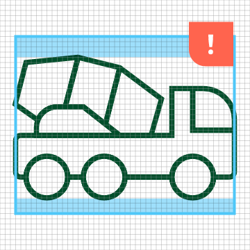

Exception
If the motif cannot be adjusted to the height and width of the key shape without being distorted, it should be adjusted to the width of the key shape.
How to design icons
Please note: Due to consistency it is mandatory to use the master file to design an icon. You will find it in the download section.
Icon construction
For all icons a few basic design parameters apply to keep the quality and the type of display consistent.
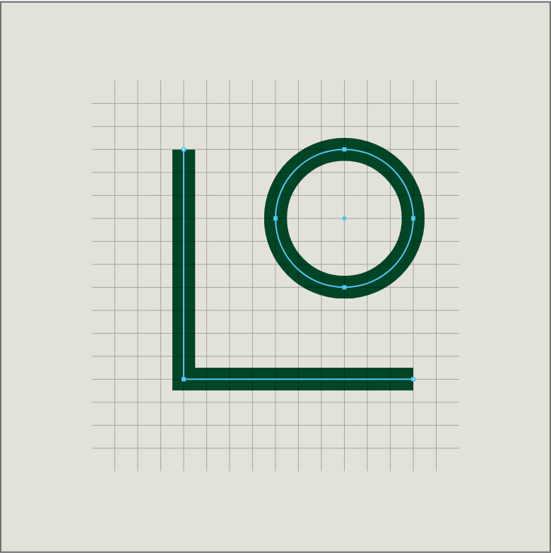

Paths and centre points are aligned on the strokes of the grid.
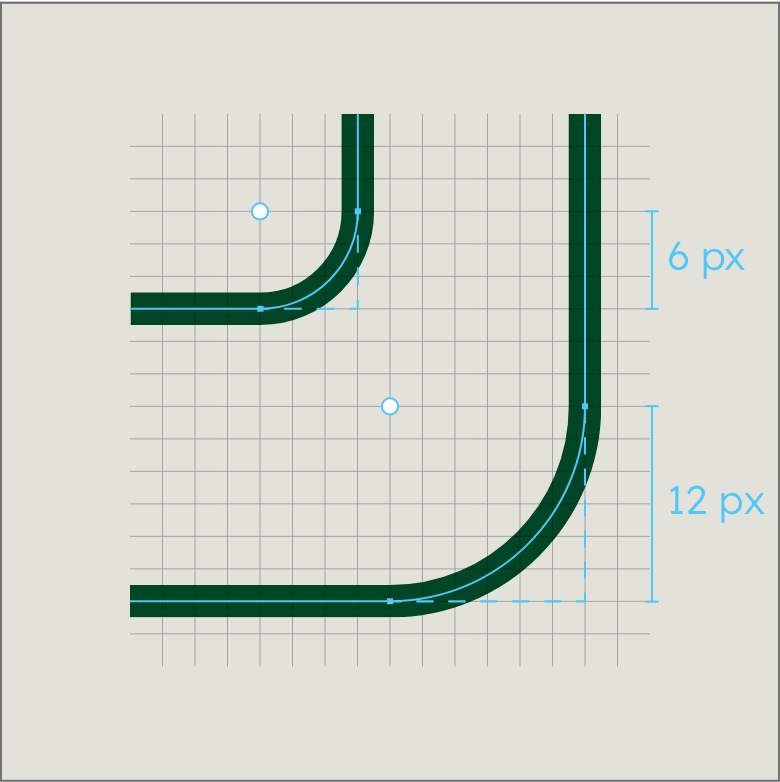

The radius of rounded corners has a maximum of 12 px and can be reduced in increments of 2 px.
Four steps towards a new icon
Four steps towards a new icon
Step 1
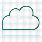

Use the grid to build the form out of basic geometric shapes.
Step 2
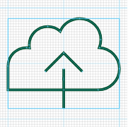

The icon should fill one of the four key shapes. The basic shapes are joined to create the composition.
Four steps towards a new icon
Step 3
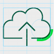

Details such as the openings and the roundings of path endings as well as the corner accent option are added.
Step 4


Create the four colour options for the icon and save them using the correct file name and colour scheme for RGB and CMYK.
Corner accent
The corner accent in Bright Green is an essential part of each icon and must be considered in the design of each new motif. The line in Bright Green always follows a curve of the icon at a distance of 2 px. The position should be chosen at the bottom on the right, if possible, but may be chosen depending on the motif. The visible line thickness is 4 px and thus twice as strong as the icon stroke.
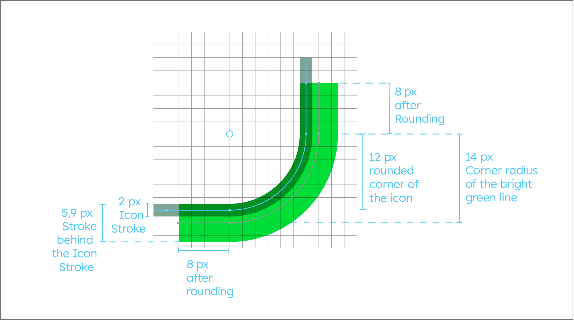

The corner accent has a stroke width of 5,9 px, with only 4 px being visible due to the line being behind the icon stroke.
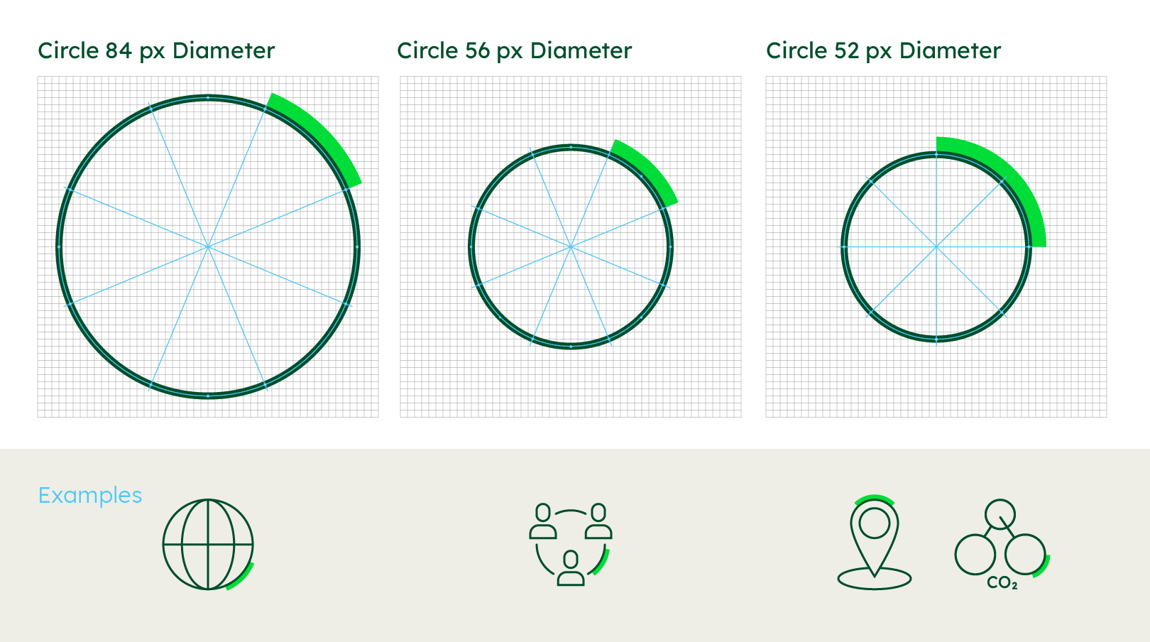

One eighth arc for circles with 84 - 56 px diameter, one-quarter arc for circles with 52 px diameter or less. The position of the corner accent can be aligned to every segment of the circle.
Icons with typography
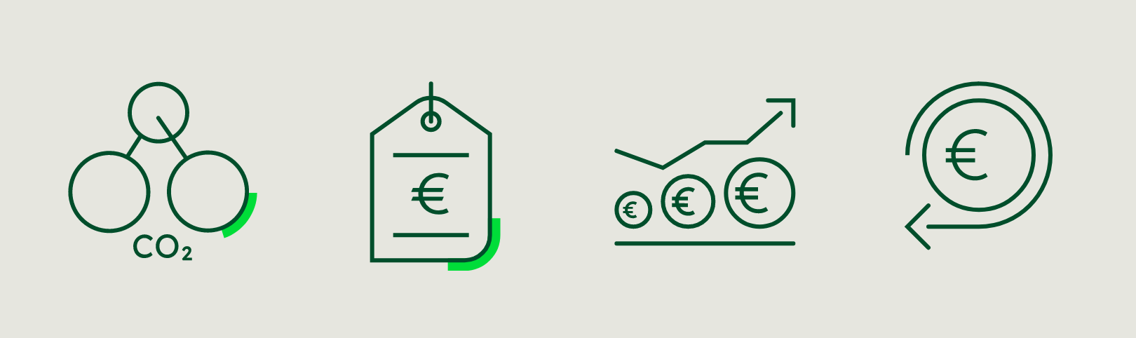

With some icons, it is necessary to use font. The approved font is Lexend. In order for the font and the character to form a unit, it is necessary for the thickness of the font to be the same as the stroke width of the icon. To this end, it may be necessary to use additional font styles, such as bold and light. This is particularly clear in the case of Icon 3: the Euro characters are all used in different font styles, but the impression of the same stroke width is maintained through the use of different sizes.
Master file
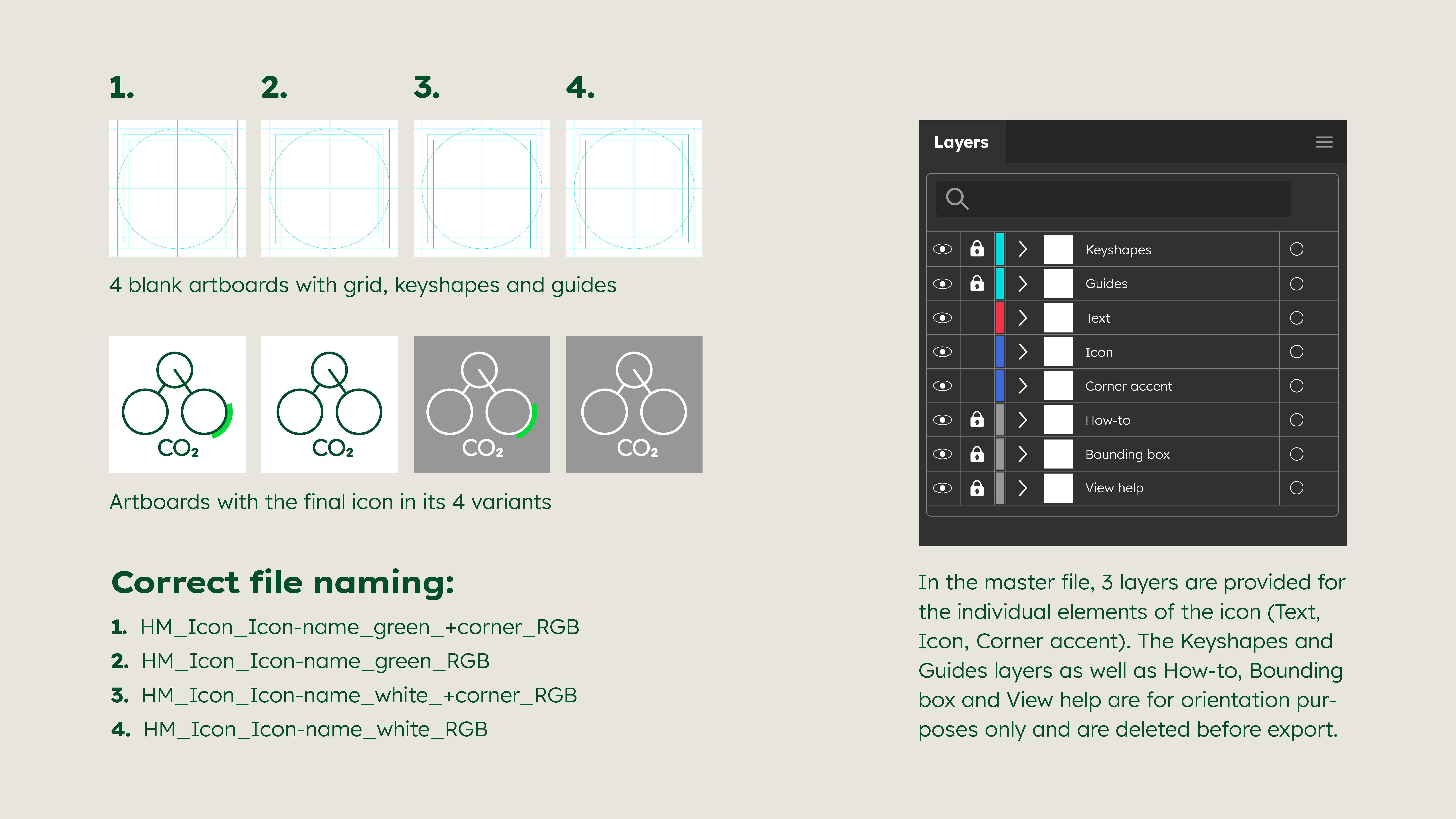

A master file is available for download for the creation of qualitatively and technically flawless icons. The icon master is available in the Download section.
Dos and don’ts
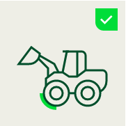

If necessary, some icons may also be mirrored.


Use white variants for dark backgrounds.


Use green variants for bright backgrounds.
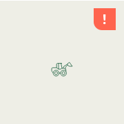

The icons should not be smaller than 30 x 30 px.
Dos and don’ts
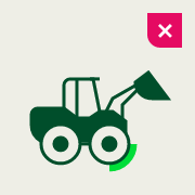

Do not work with filled areas.
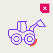

Do not use any other colours than Deep Green, White and Bright Green.
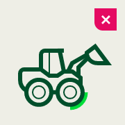

Do not use greater or narrower line widths.
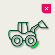

Do not use effects.
Supply and availability
Icon library
Our library is constantly updated and contains ready-to-use icons on a wide range of topics. Before you create new icons, please check the inventory. If your desired icon is not included, stick to existing, similar icons when creating a new one. For creating new icons, download the template and follow the guidelines.
There are two ways to use the library, online in the browser or in your Adobe applications.
Downloads
Important Note Regarding Login
Due to the transition to our new website, all users must
set a new password the first time they log in.
To do so, please use the “Forgot Password” feature and
follow the instructions.
Thank you for your understanding.
Any questions about our guidelines? Contact us.
- N Support
- T + 49 211 690787-200
- E support@Brandhub.heidelbergmaterials.com