Buttons
Buttons are used to attract attention and to trigger action. The labelling should always be striking and express what action is to be performed as soon as the button is pressed.
Types


The Call-to-Action button should generate maximum attention and should only be displayed once per view port if possible.


The Primary Button should generate maximum attention and should only be displayed once per view port if possible.


The Secondary Button can be used for subtasks on a page without competing too much with the content.


The Ghost Button should be chosen for the least pronounced actions so as not to distract too much from the actual content.
Colour combinations
Colour combinations grid view
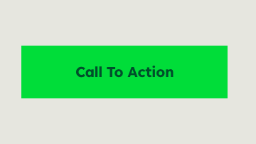

The colour of the Call-to-Action button is always Bright Green on bright backgrounds.
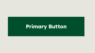

The colour of the Primary Button is always Deep Green on bright backgrounds.
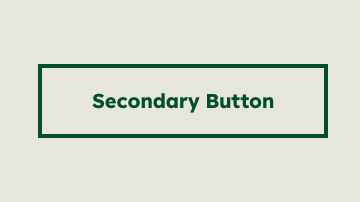

The colour of the Secondary Button is always Deep Green on bright backgrounds.
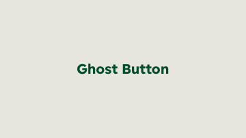

The colour of the Ghost Button is always Deep Green on bright backgrounds.


The colour of the Call-to-Action button is always Bright Green on dark backgrounds.
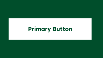

The colour of the Primary Button is always White on dark backgrounds.
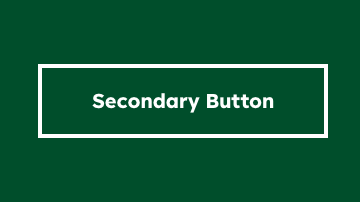

The colour of the Secondary Button is always White on dark backgrounds.
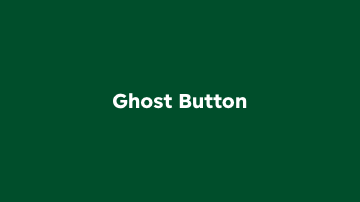

The colour of the Ghost Button is always White on dark backgrounds.
Date plates
Date plates are used to organise and display data efficiently.


Date plate on bright backgrounds


Date plate on dark backgrounds
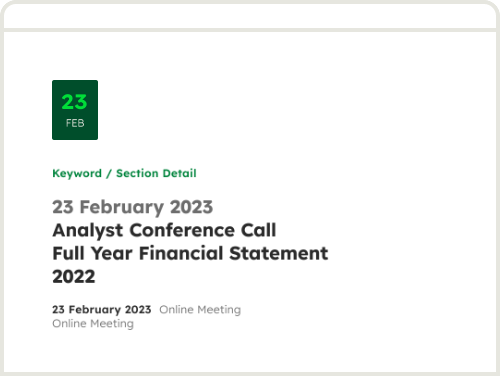

Example
Links
Standalone links
This type is recognisable as a link by its position in the layout and an icon. Standalone links can be used solitary or in conjunction with content.
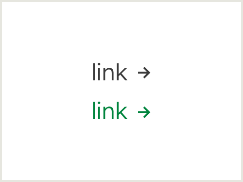

Link
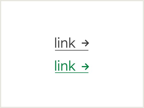

Hover
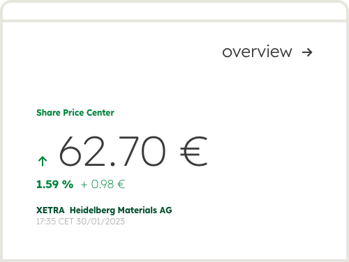

Example
Links
Inline links
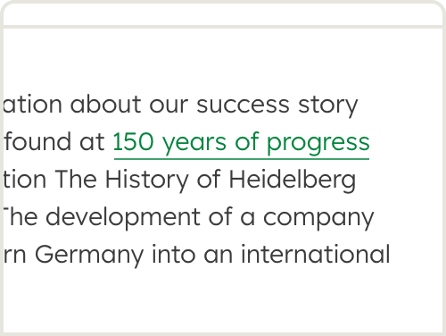
This type is recognisable as a link by underlining and colour. It is used within a paragraph of text.
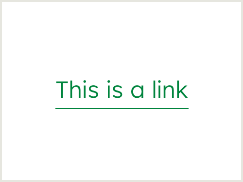


Tabs
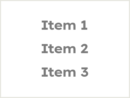
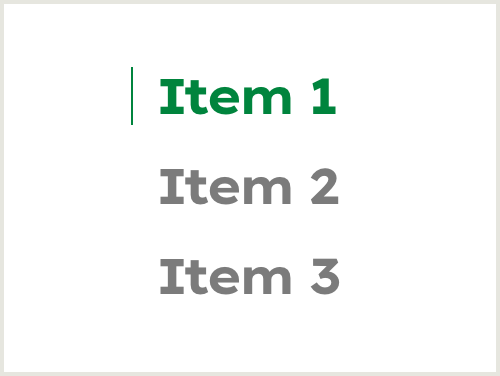
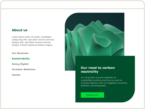
Tabs are used to organise related content.

Tabs

Selected

Example
Tags
Tabs are used to organise related content.


Tag


Hover


Example
Search
Tabs are used to organise related content.
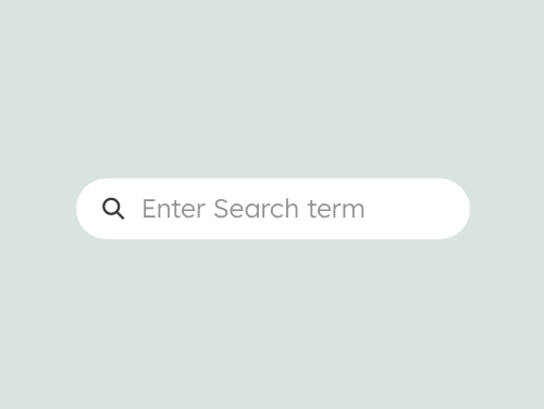

Placeholder text is displayed in grey.
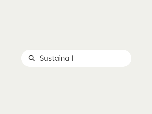

Inputted search text is displayed in black.
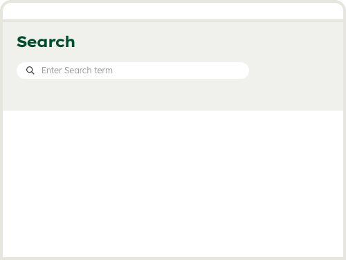

Example
Contact
Any questions about our guidelines?
Contact us.
- N Support
- T + 49 211 690787-200
- E support@Brandhub.heidelbergmaterials.com