PowerPoint
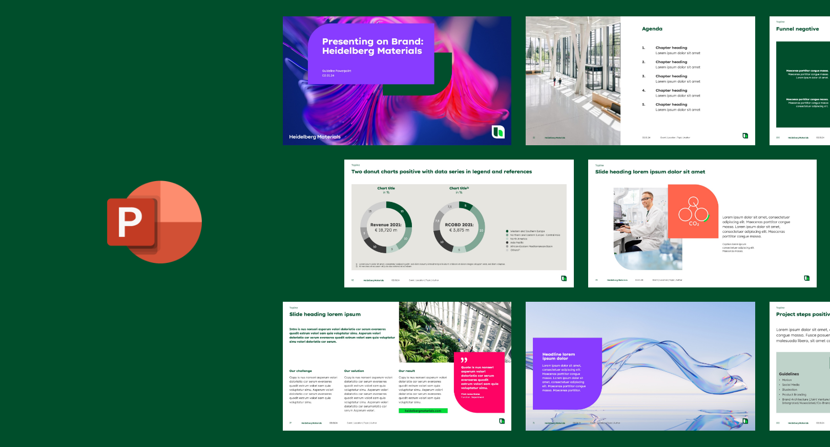

The preparation of information contributes significantly to whether and how well it is understood. The Heidelberg Materials PowerPoint Master offers a wide range of options for creating customised presentations for your content and bringing our brand design to life.
Presentation purpose
How will your presentation be used and who is it addressed to? To be successful, a presentation’s setting and audience must be taken into account when it is created.
Presentation in front of a (large) audience with a speaker leading through the topic.
Published presentation where information is shared with external parties.
Make sure to use bold and striking visuals while keeping the displayed information and content short and to the point.
The presentation must include all information necessary for external use and consist of self-explanatory content.
Overview
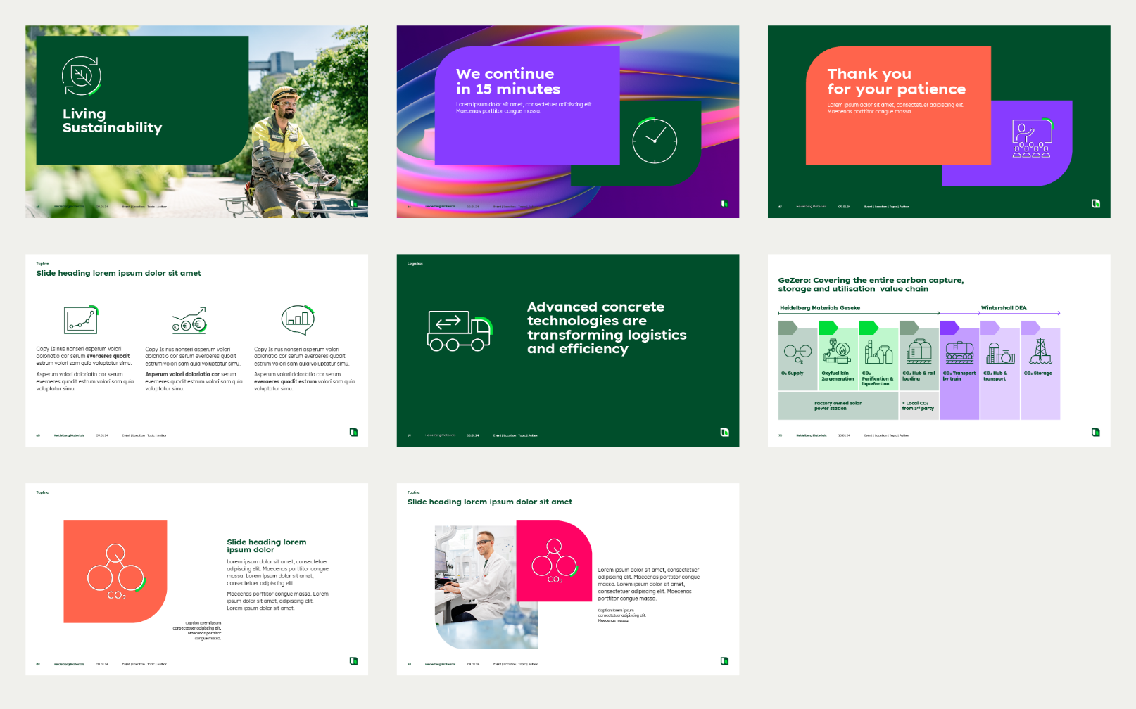
Overview master slides
We are a green brand, which should become evident through the presentation design. Please check your presentation colour scheme regularly to ensure that the correct colours have been applied. Our green brand colour should always be clearly reconizable throughout the whole presentation.
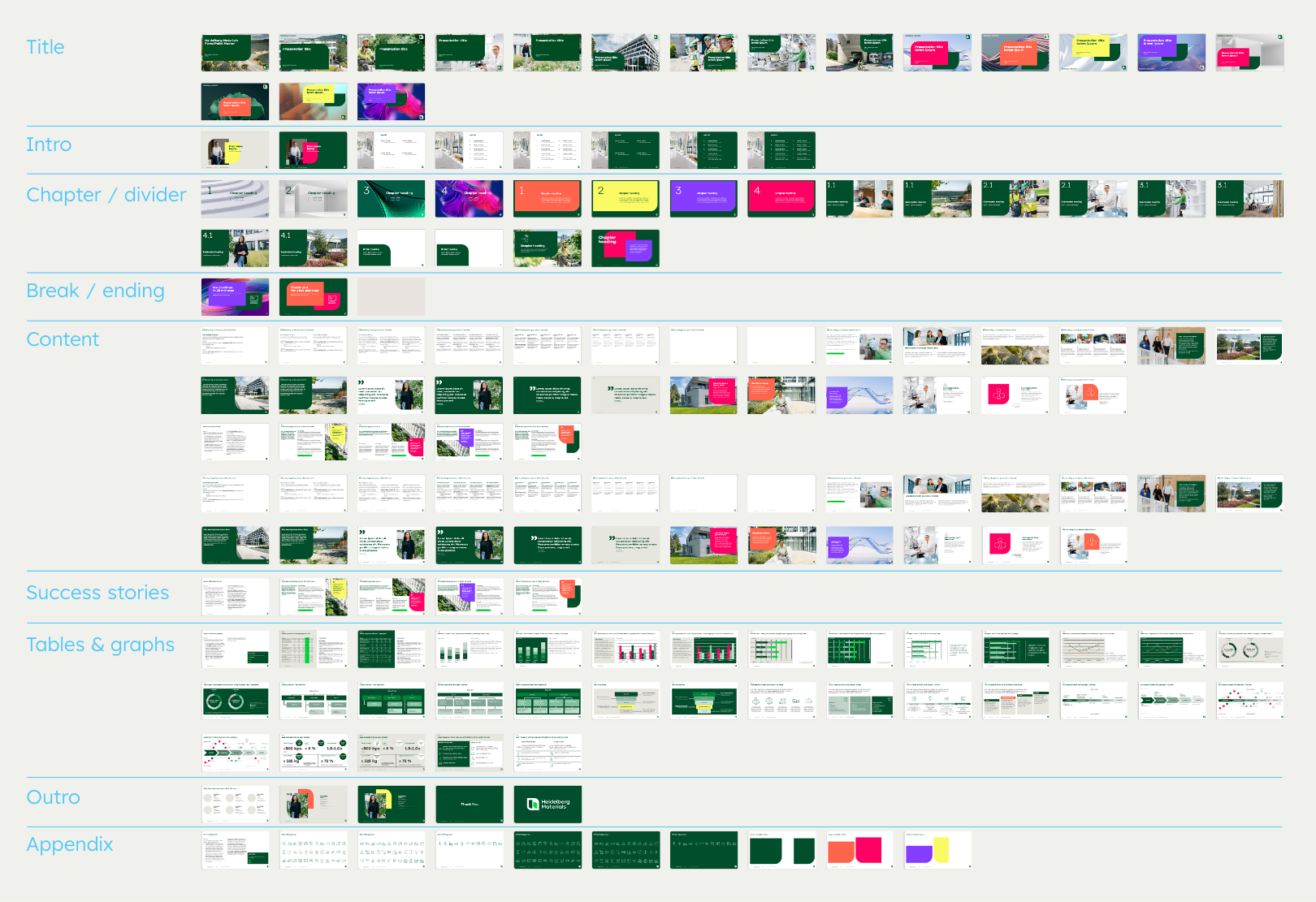

The PowerPoint Master offers a large number of slides with design and content options.
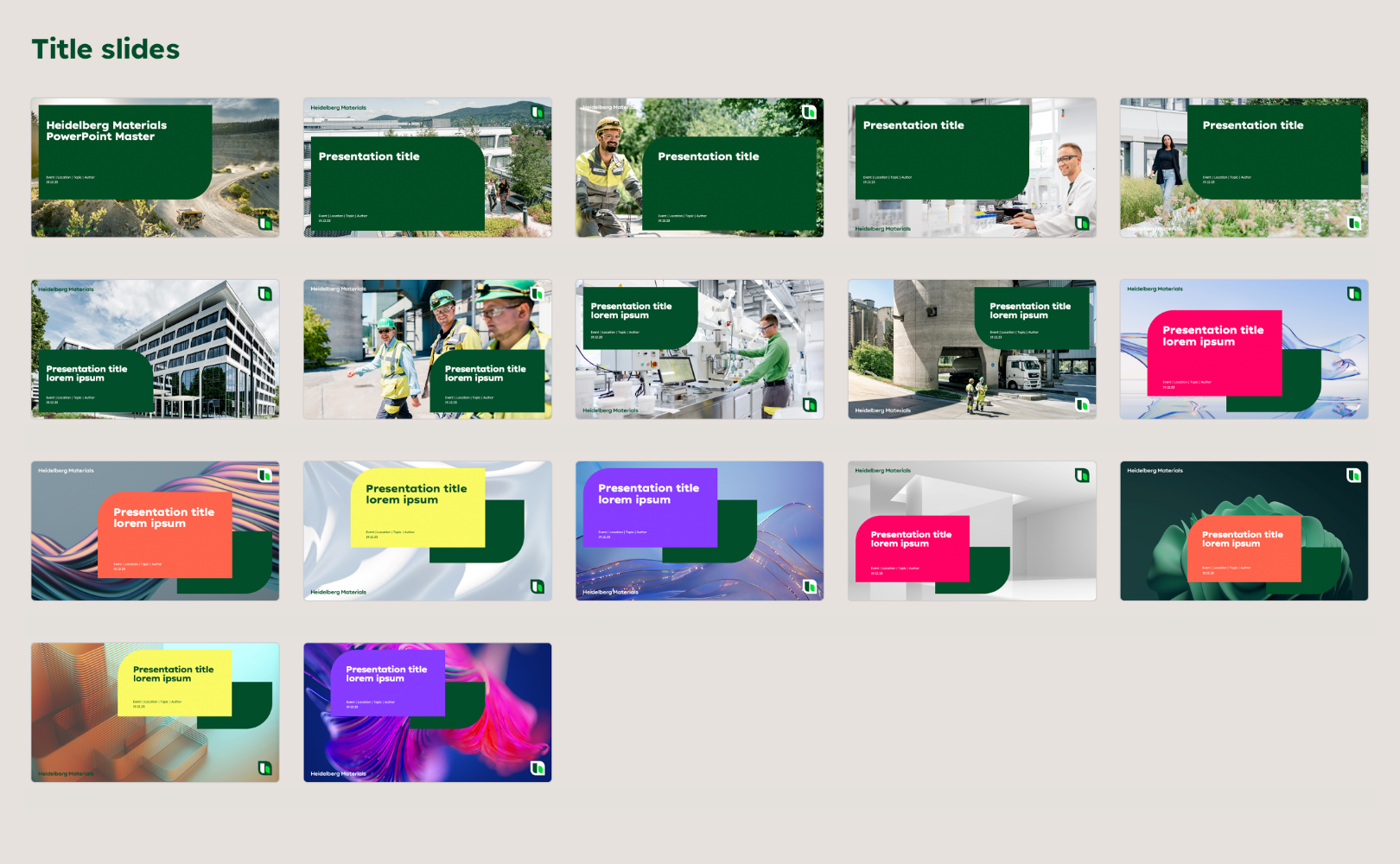

There are different title slides with inform and inspiring layouts. Images and abstract visuals can be replaced with other motives.
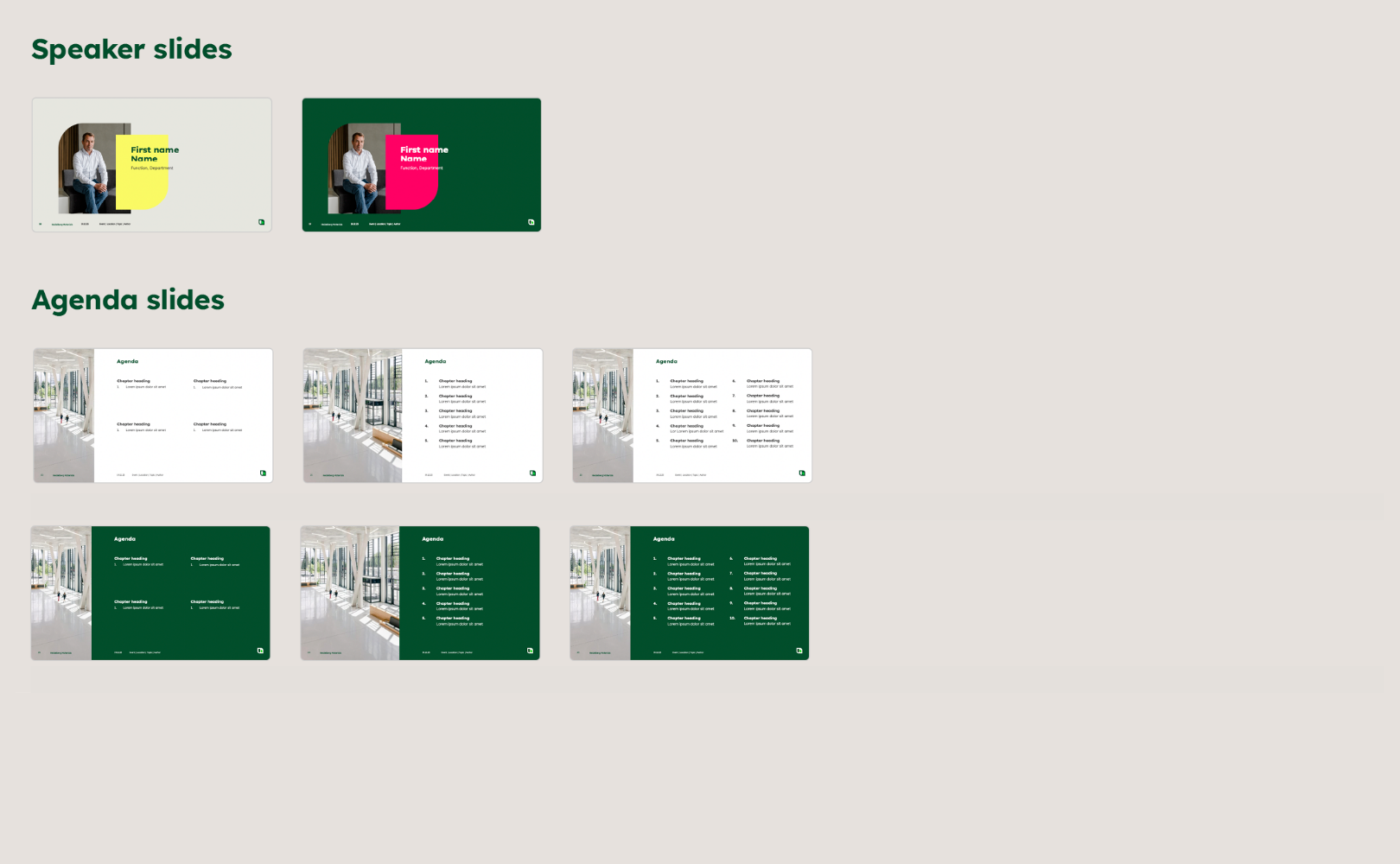

Depending on the type of presentation and the audience, it may be necessary to introduce the presenter. Every presentation should include an agenda.
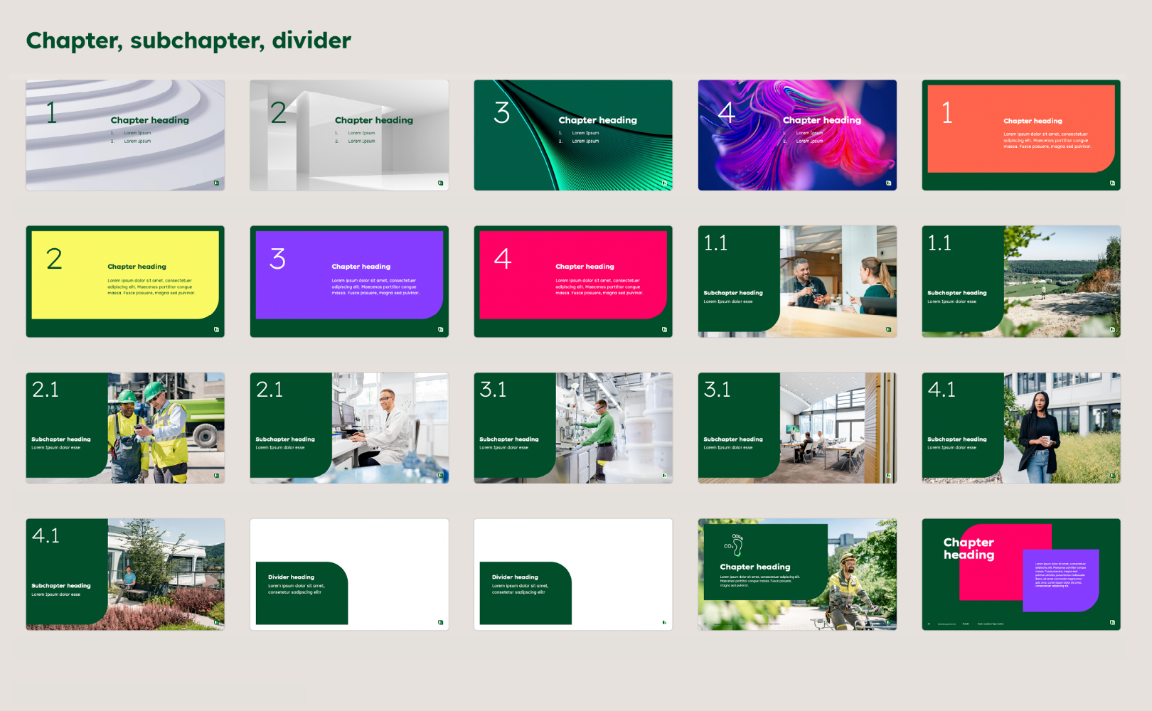

Longer and more complex content in particular should be structured in a comprehensible way. There are chapter and subchapter templates for this purpose.
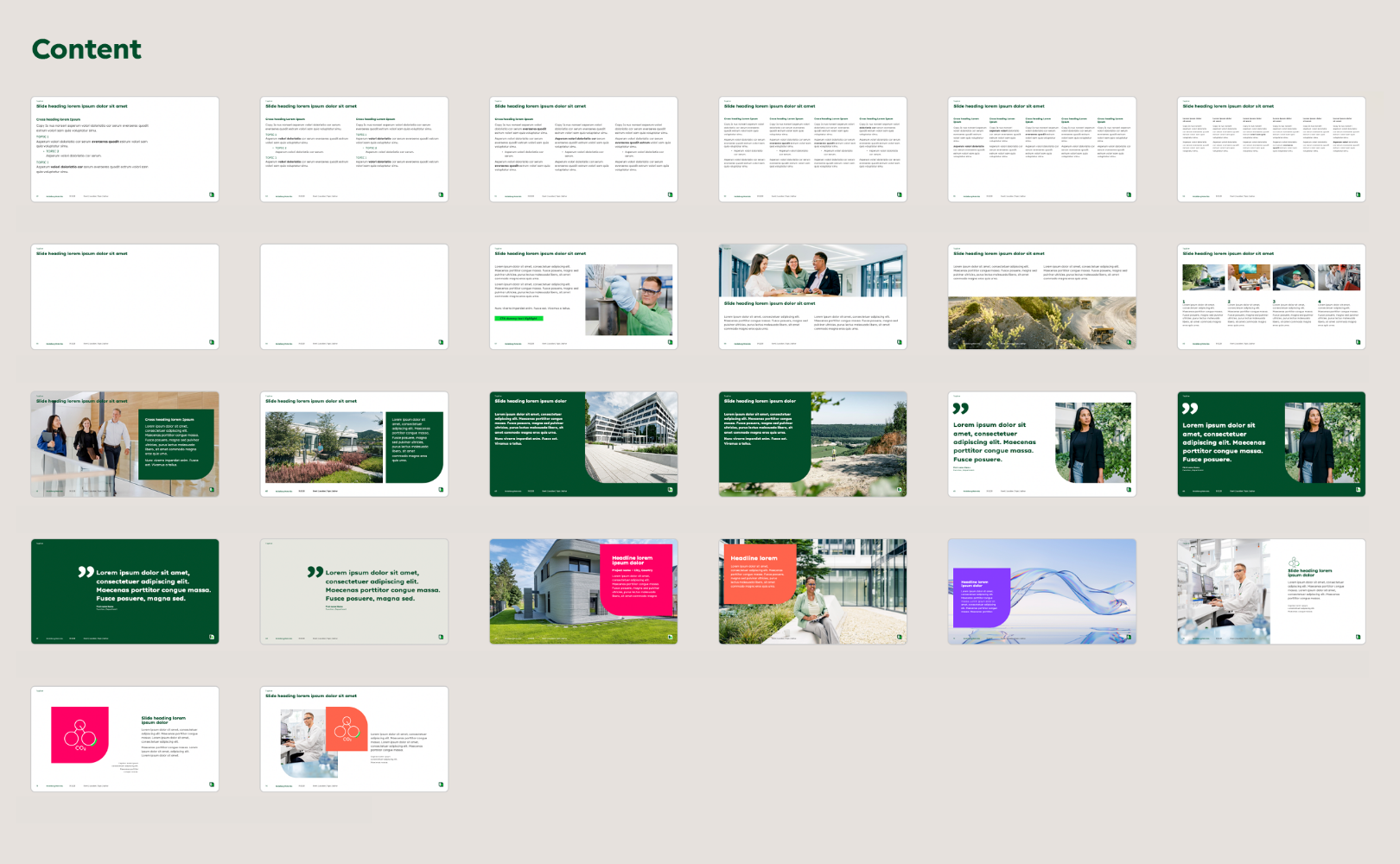

There is a variety of content slides to cater for a wide range of content and text volumes.
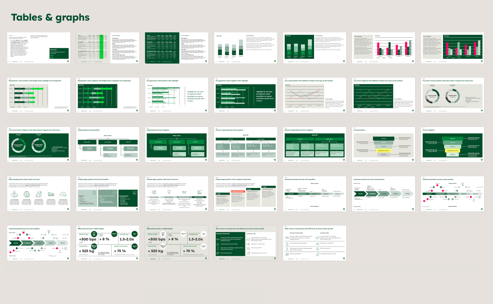

Tables and diagrams in the correct colour scheme are also included in the master. They can be edited or used as a template to adapt your own content to the brand design.
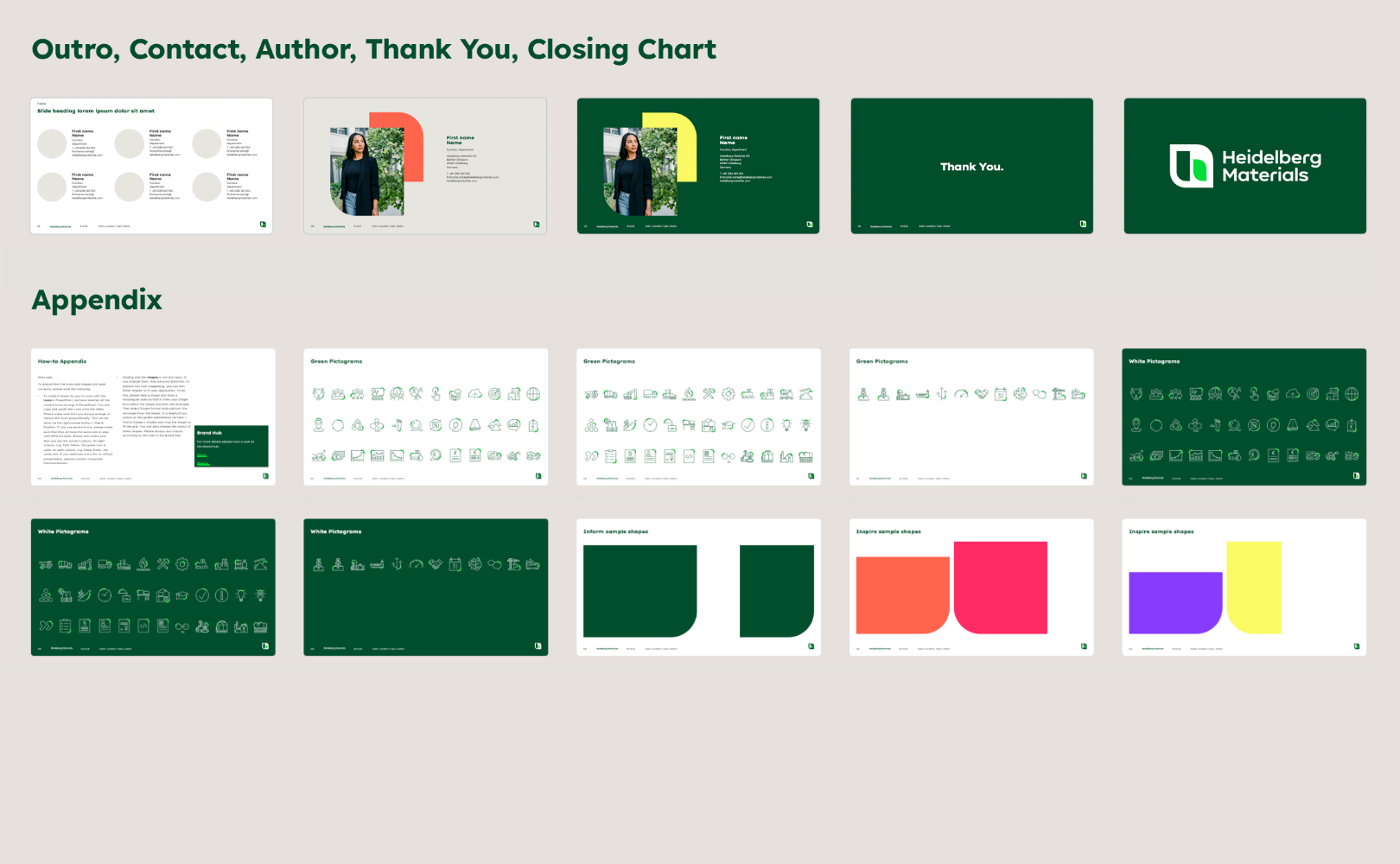

Various options are available for the end of a presentation, but the Thank You and Closing chart should always be used. In the Appendix section you will find various elements such as icons and shapes to design your own layouts, as well as a How-To to help you with this.
Our PowerPoint master contains various title slides from the "Inform" and "Inspire" design fields. Choose the layout that best suits the content of your presentation. For ease of use, there is no need to make a strict distinction between "Inform" and "Inspire" design in a PowerPoint presentation. A PowerPoint presentation can therefore contain charts from both design fields. For general information about our design fields, please visit the chapter Brand Design Fundamentals.
Presentation Structure
Each topic places individual demands on the presenter, the audience and the presentation. But the basic structure for conveying information is always the same: introduction, body, conclusion. For complex content, the overview comes first, then the details. Summaries make it easier to remember the most important content.
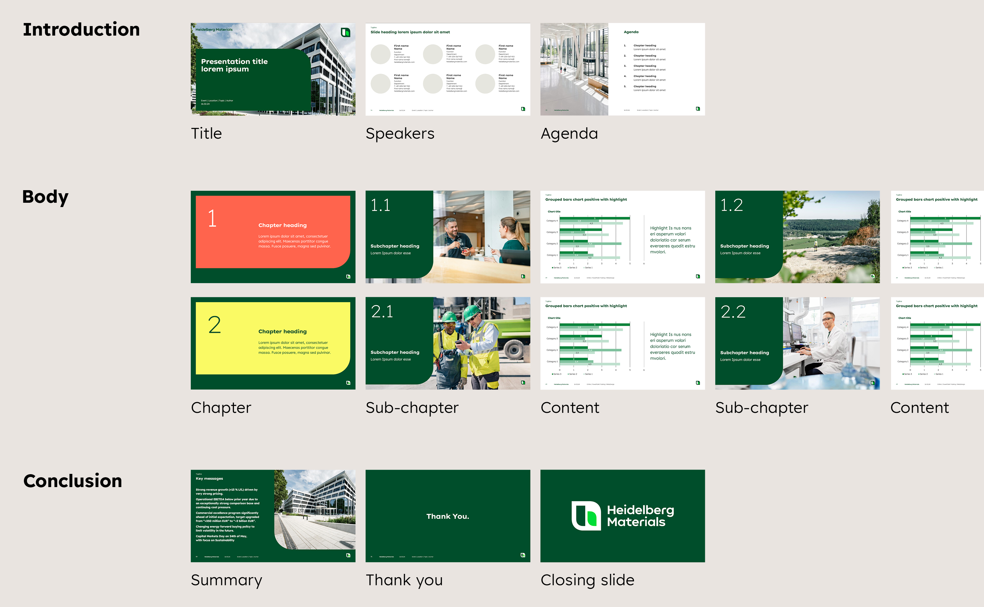

Example of a basic presentation structure. Various layout options are available for the individual slides, choose the ones that suits your presentation best.
Slide construction
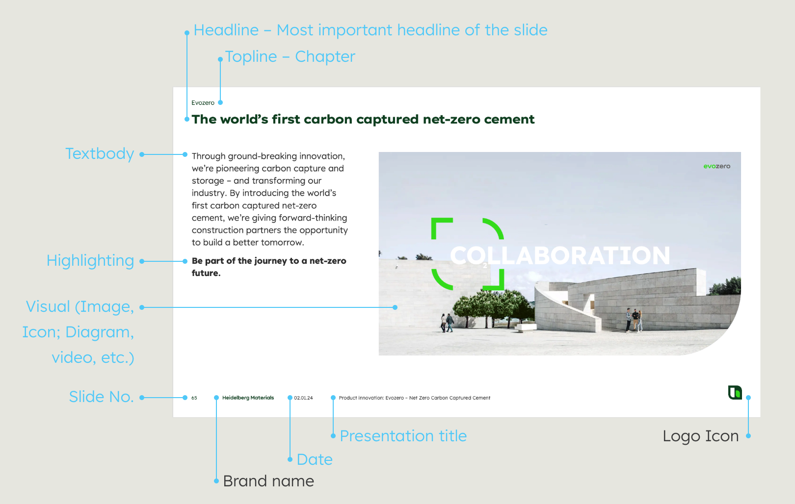

Apart from the brand name and logo icon, slide elements can all be customised.
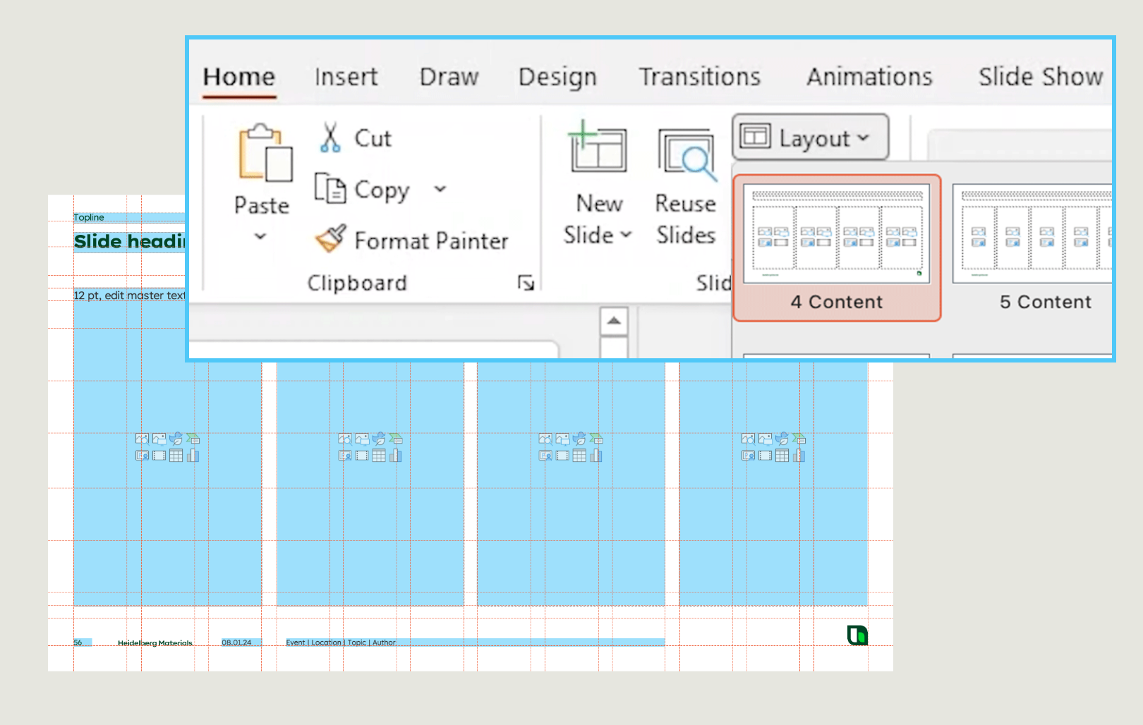

To change the layout of your slide, switch to tab “Home” and klick “Layout”, at the dropdown you see all options, choose one which fits to your content.
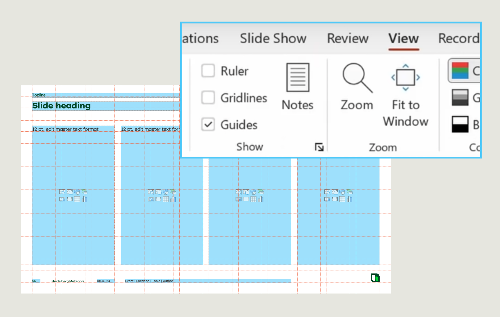

All layouts are created in a grid. To display the grid, switch to the View tab and select “Guides” from the Show menu.
Please note: When copying slides, ensure to remove any foreign master styles from old or external presentations.
Text and typography
Our typeface is an important part of our design system and contributes to the recognition of our brand. Therefore, the use of the correct fonts is essential for on-brand presentations.
Unfortunately, copy and pasting texts from other applications or presentations in PowerPoint can lead to the integration of foreign fonts. In this case, the affected texts must be manually changed to the correct font.
Please note: For technical reasons, the headline font embedded in the PowerPoint master is called "Lexend Exa HM Xlight" by default and is set bold using the "Bold" button.
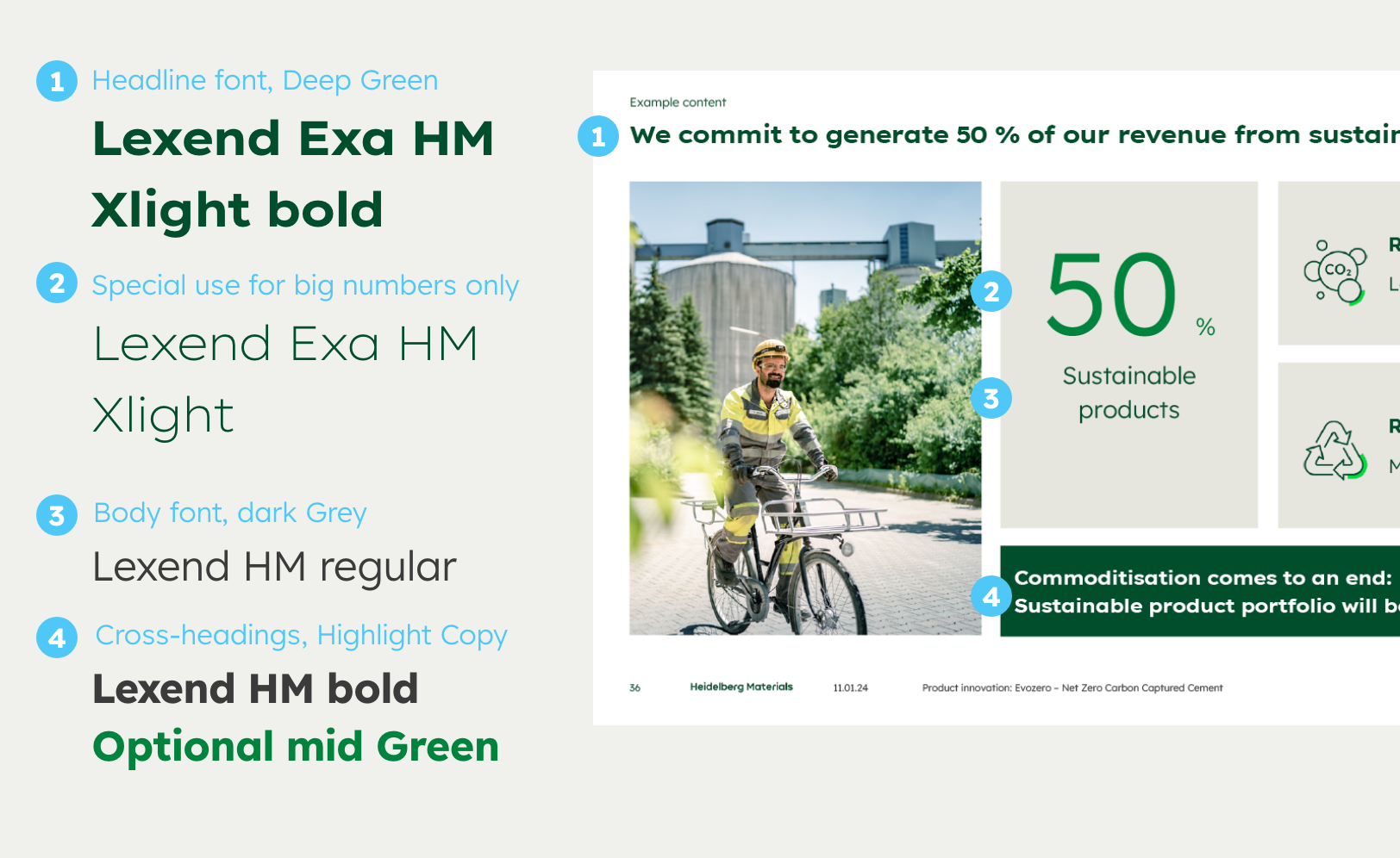

Our corporate fonts are integrated in the PowerPoint master and preset for headlines and body text.
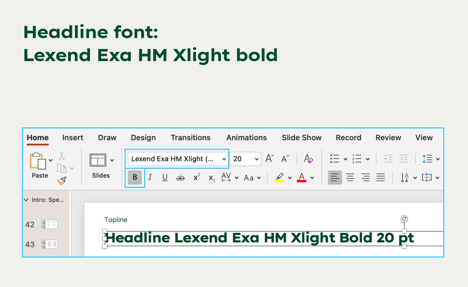

For headlines it is important that they are set to Bold. They are coloured in Deep Green and have a line spacing of 0.9
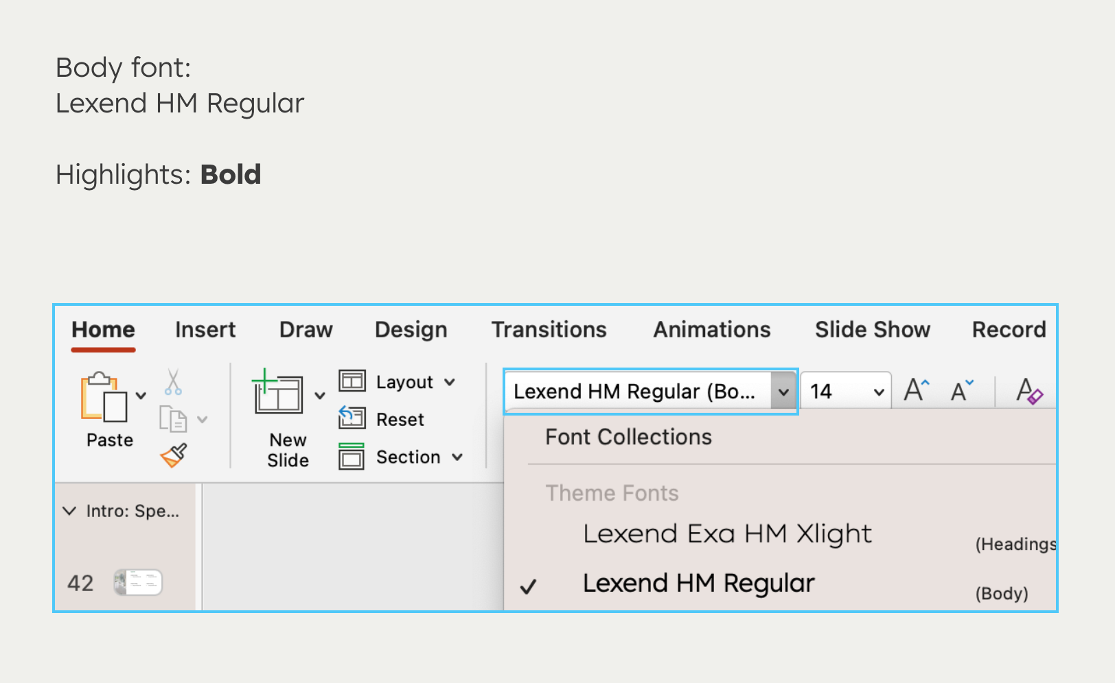

The body texts are set in Lexend HM Regular. Bold style can be used for highlighting and subheadings. Font colour is Dark Grey.
Usage of logos
Usage of Heidelberg Materials logos
In order to clearly communicate the authorship and affiliation of each presentation, Heidelberg Materials is listed as the sender on each slide.
If the Heidelberg logo is shown together with partner logos, the "Partnerships" guideline applies.
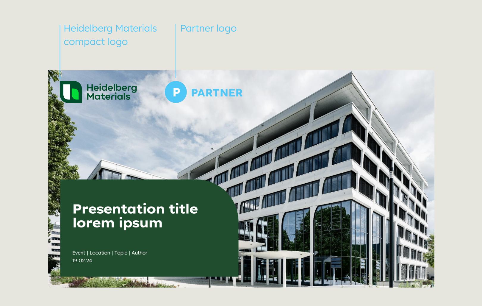

Example: If a partnership between two brands is to be communicated, the logos must be placed according to the partnerships guideline.
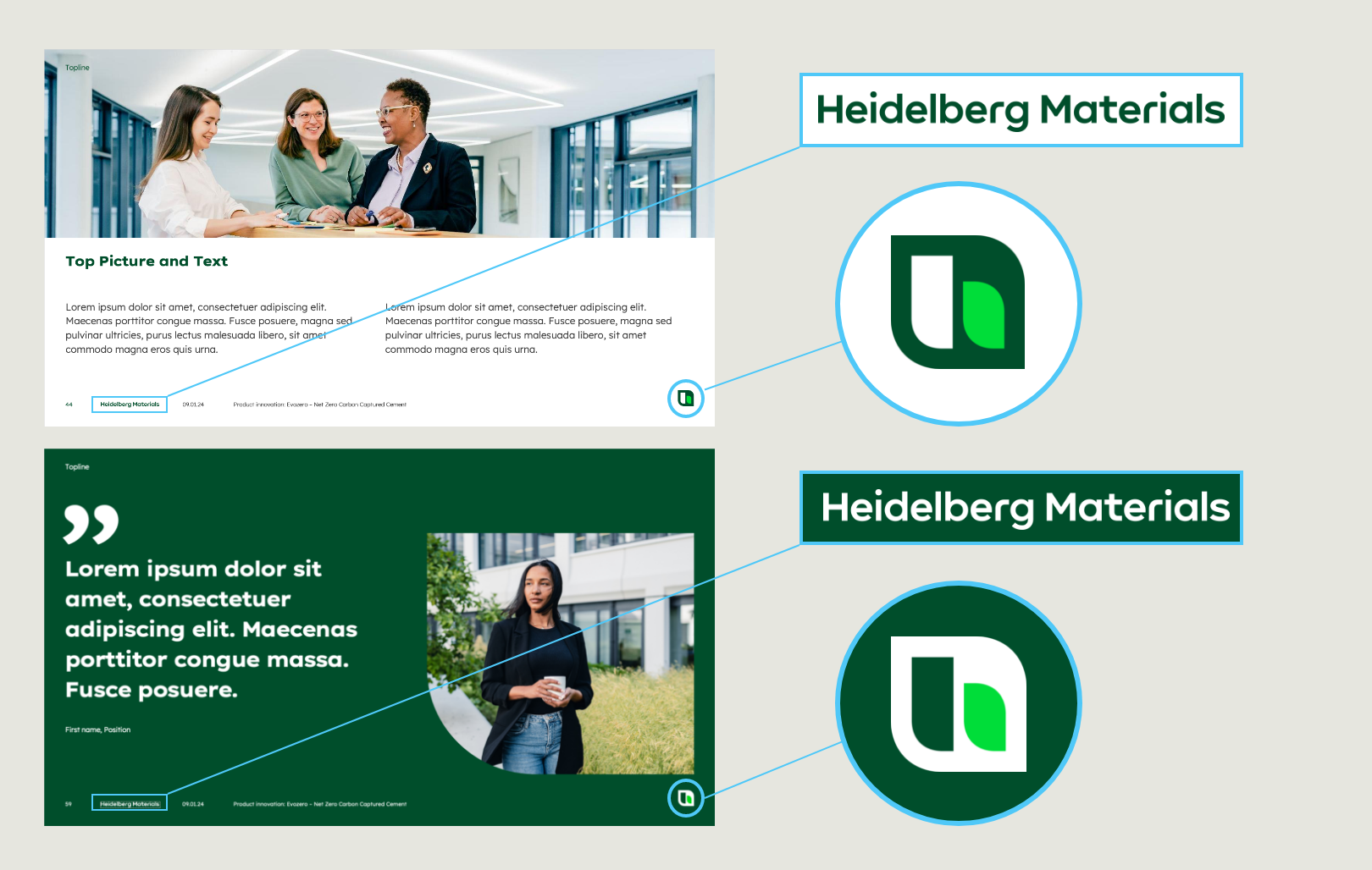

If the background is light/white, the word mark and logo icon are used in Deep Green, if the background is dark, Deep Green both are used in the white version.
Footnote and page numbers
The slide number and footnote are created as placeholders on every master layout. It makes sense to use them, especially for longer presentations and complex content. Even if individual slides are exported or sent individually, the footnote and page number can provide information about where the content comes from.
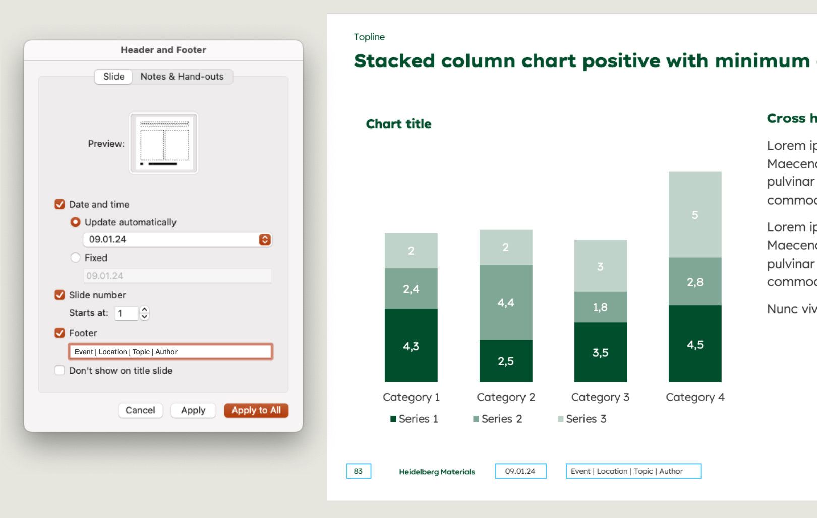

To edit the footer information open the tab Insert and klick on Header and Footer. From the content menu you can change the settings for date, slide number and footer. To ensure that all slides are correctly formatted, you may need to return to this step once the presentation is complete and select ‚Apply to all‘. Even on pages where these elements have been deleted, the slide number, date, and footer information will remain.
Please note: For a harmonized appearance of the footer, please uncheck the ‘Footer’ box and click “apply to all”. Check and “apply to all” once again.
Colour options
Colour options in Powerpoint
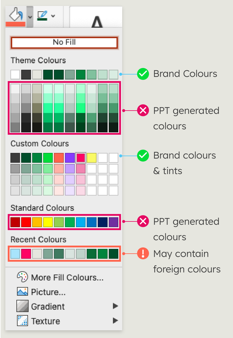

It is possible to make colour adjustments to customise content as long as the colour palette of the corporate design is used. The corporate colours of Heidelberg Materials are implemented, but the PowerPoint colour menu also contains preset system colours that may not be used.
To be sure that you have used the colours correctly in your presentation, you will find all the information about the colours here.
Colour checkup:
- Deep Green, Sandy Grey and White are the dominant colours
- Inspiring colours are used as accents and for highlighting
- Tints are reserved for tables and diagrams
- Headlines are in Deep Green
- Body text designed in Dark Grey or white on a Deep Green background
Placement of visual content
Placement of visual content in Powerpoint
Images, illustrations and videos can enhance presentations in many ways. They can increase attention of your content, create an emotional connection to it, or simply enhance it to make it more comprehensible. At the same time, the material used can also negatively affect a presentation, for example if it is of poor quality, unprofessional or silly, it is better to do without them. The Heidelberg Materials PowerPoint master contains several templates with placeholders for photos or illustrations.
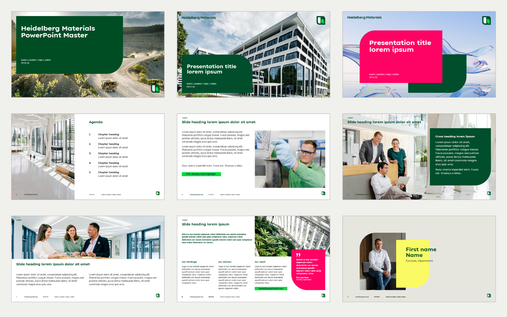

Examples for title and content slides with placeholders for images
Working with images
Working with images
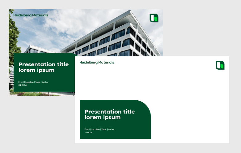

Chose a layout template for your content and delete the placeholder image if there is one.
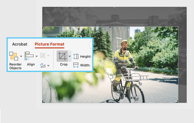

Select the image, switch to tab “Picture Format” and “Crop”. Change size and image section until it fits perfectly.
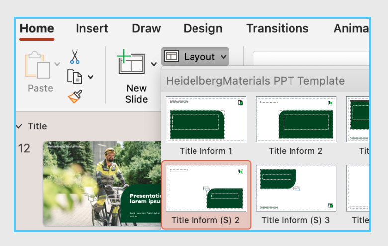

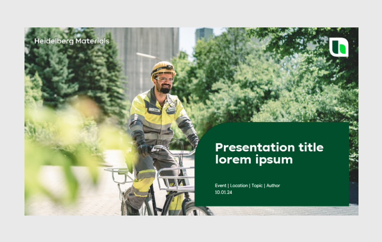
Switch to tab “Home” and open “Layout”. Chose a template with white logos. It may be necessary to edit the viewport of the image again.
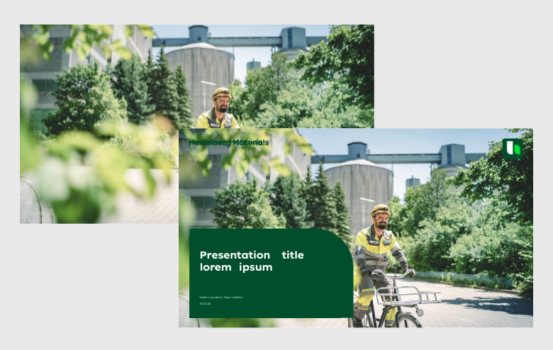

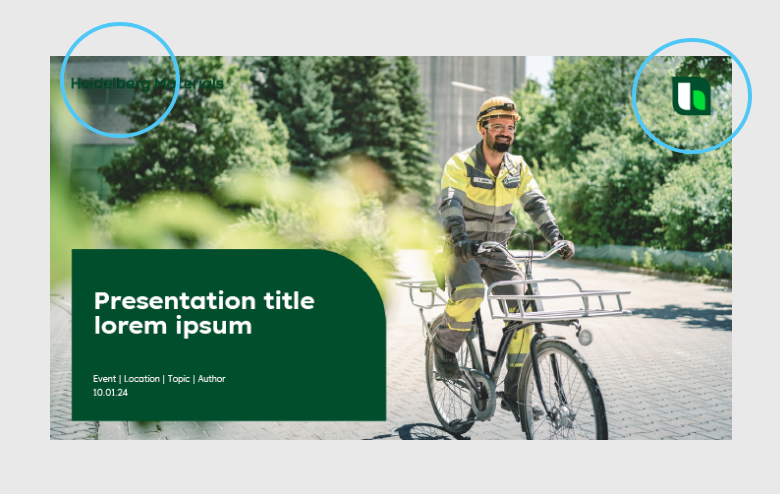

Check the visibility of the logo, if the image section is to dark change the layout to one with white logos.

CTA
Please make sure that the image material used complies with our imagery guidelines. We provide a wide range of on-brand images in our Image Library.
Working with icons
Working with icons
Icons are a nice way to visually break up content. They can replace images or create an additional visual layer. In infographics, icons can make it easier to understand and help with memorisation. A selection of icons is integrated into the PowerPoint master on the appendix slides at the end. However, the icon library is constantly growing and all icons are available here at the library.

Reduction of the file size
Reduction of the file size for mail dispatch


Use SVG and JPG files. SVGs are smallest option, but not possible for photos. JPG files are compressed and much smaller than PNG. Every PNG can be converted to JPGs as long as no transparencies are required.


Reduce the size of images and videos before inserting to Powerpoint if possible. Delete slides and master slides which are not used. If the conditions allow it: instead of placing a video use the online link to the video.


Powerpoint has an integrated Compression function: Choose tab “File” and then “compress pictures”. But first, save the original presentation, this step cannot be undone.
Dos and don'ts
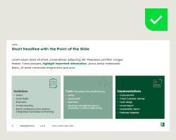

Structure the content and tidy it up. Use bullets instead of long texts.
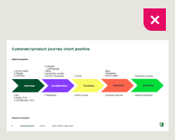

Don’t omit the green colour scheme. Inspiring colours should only set one highlight.
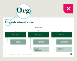

Only use the corporate fonts, Lexend Exa HM and Lexend HM.
Downloads
Important Note Regarding Login
Due to the transition to our new website, all users must
set a new password the first time they log in.
To do so, please use the “Forgot Password” feature and
follow the instructions.
Thank you for your understanding.
Contact
Any questions about our guidelines?
Contact us.
- N Support
- T + 49 211 690787-200
- E support@Brandhub.heidelbergmaterials.com