Fundamentals
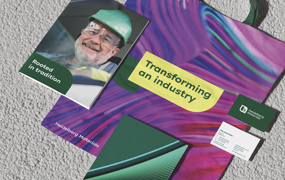

Our brand design ensures a consistent visual identity and strong brand recognition across all touchpoints. At the same time, it provides the flexibility needed to engage our target audiences effectively in every communication context.
One brand, many expressions
Our brand design enables the visual tone to adapt to different communication contexts. From factual and informative to expressive and inspiring, it supports a wide range of creative executions.
Simply choose the level of expression that best suits your message.
Design spectrum

Use of brand elements
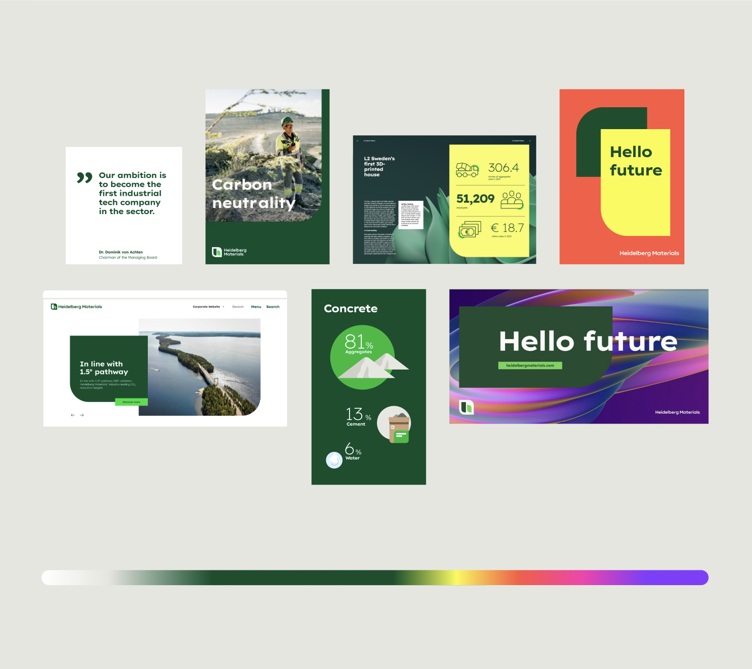
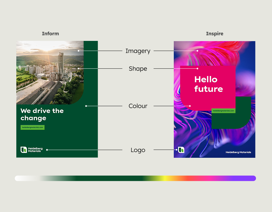
Depending on the intended effect, logo, colour and shape can be applied in different ways to create distinct tonalities and visual styles. To ensure consistency, their interaction follows clear rules.
For guidance, we have grouped the design possibilities into two categories: Inform and Inspire. The appropriate choice depends on the content and communication objective.
Defined options

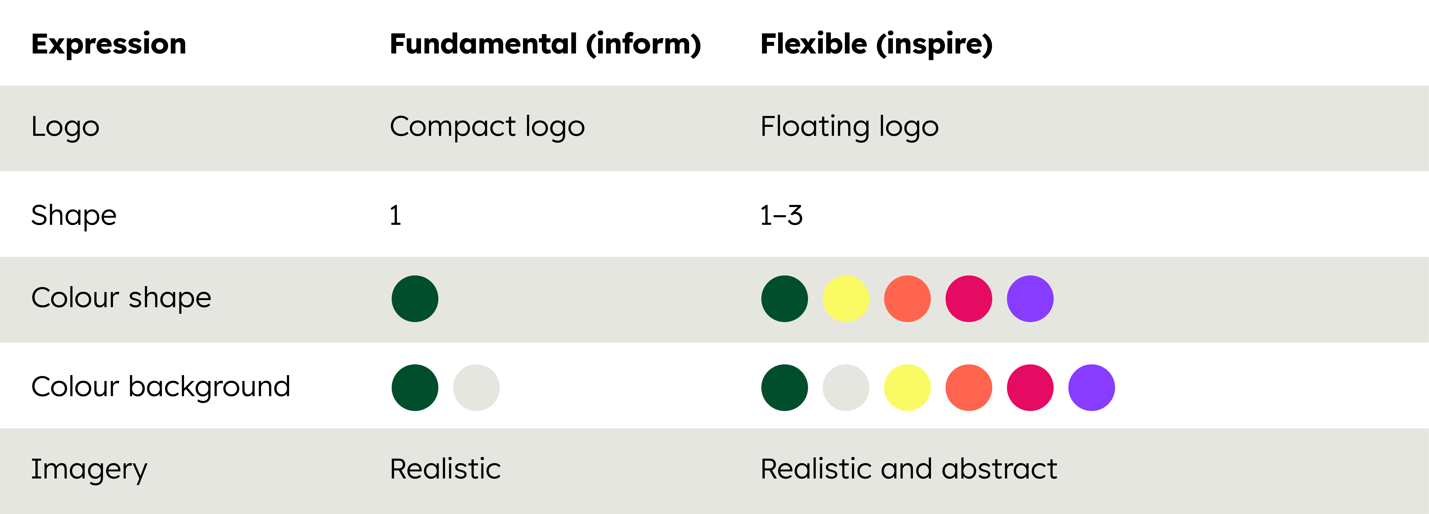
Design possibilities across the fields
Across the fields, a broad range of design possibilities emerges, enabling a nuanced and fluid transition between informative and inspiring design.
Fluid transition
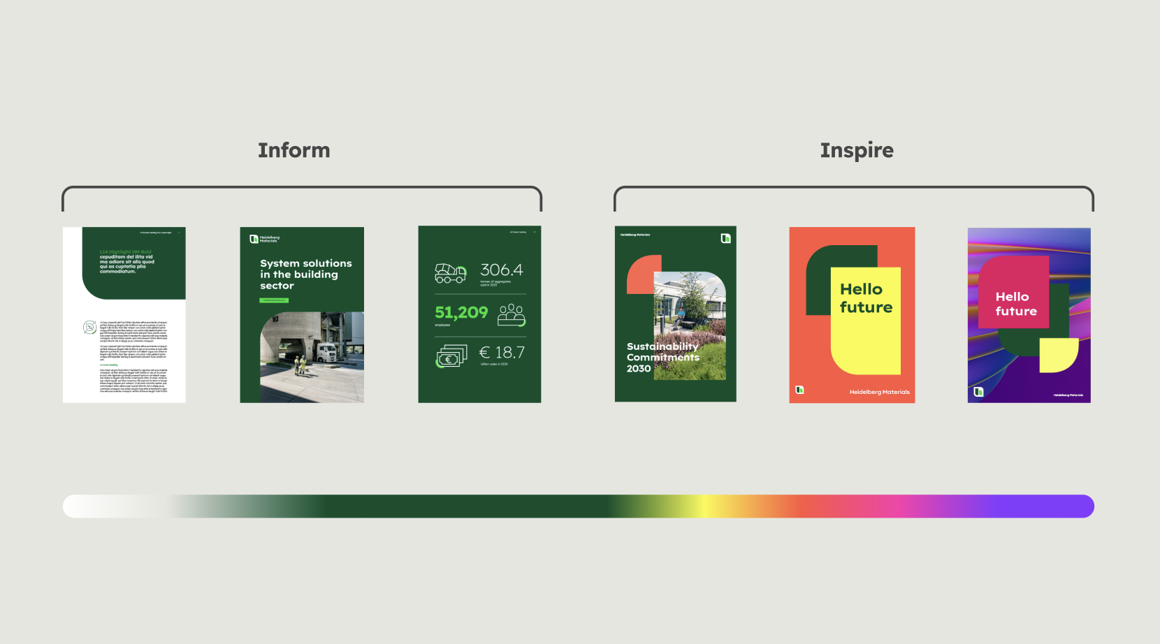

If no design field is named for a specific application, use the design direction "inform".
Main characteristics
Design field 1 offers plenty of space for content and information. Therefore, the design elements in this field are reduced to the essentials and focus on functionality. In contrast, design field 2 allows for more versatile and eye-catching applications in terms of colour, imagery and layout. More detailed information can be found in the respective chapters on individual brand elements.




Colours
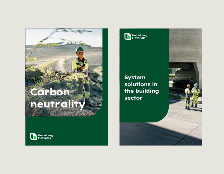

Design field 1
Deep Green is the main colour, secondary colours are only accentuated at the content level.
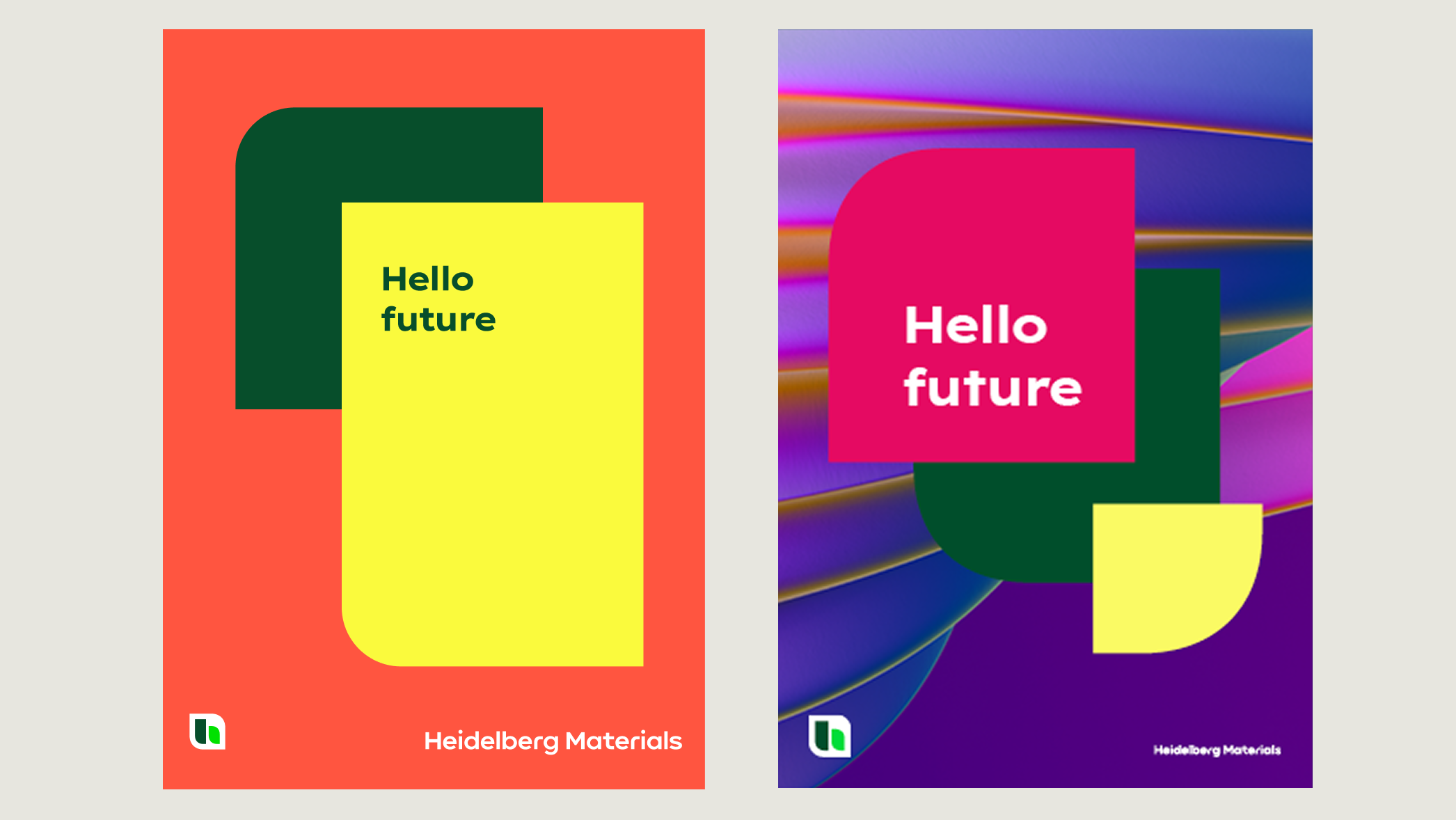

Deep Green is always present, but accompanied by bold secondary colours.
Imagery


Design field 1
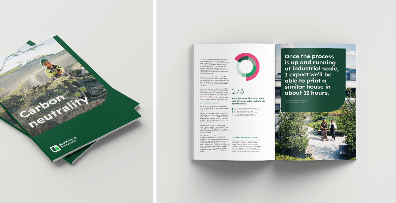
Realistic imagery depicting our people, products and business fields.
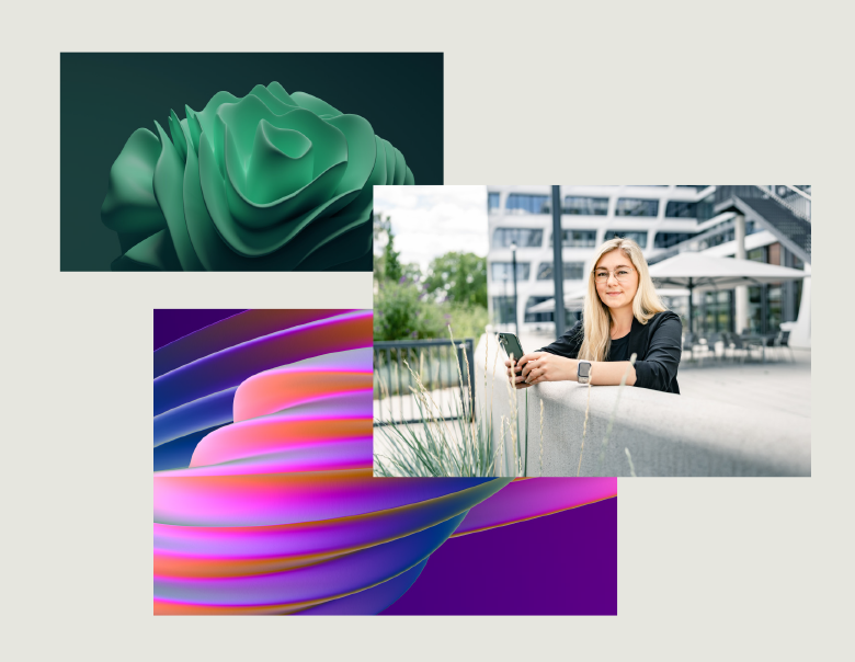

Design field 2
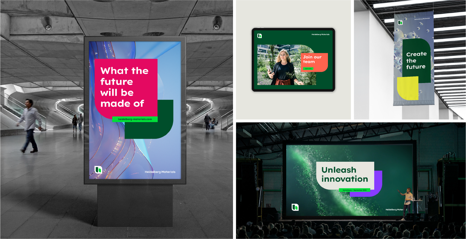
Abstract imagery may be used instead of realistic imagery wherever suitable.
Application
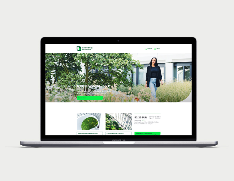

Design field 1
Applicable to all media, especially product information, websites, forms, digital products, signage.


Design field 2
Applicable to all media, especially social media, trade shows, presentations, motion design.
Design elements overview
Detailed guidance on how to use the individual brand elements within each field can be found in the relevant chapters, including Logo, Colour and Design System.

Divider
Design system

The block system
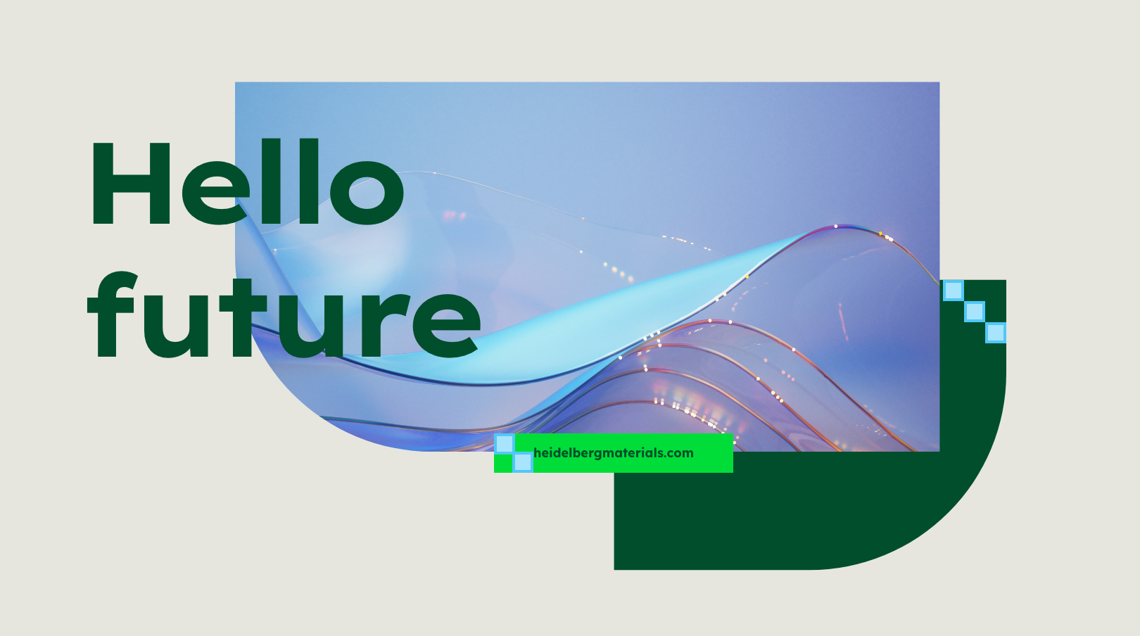
The block system is our flexible layout system and the basis for everything we design. We use it in all formats and media. This simple approach helps us determine the sizes, proportions and spacing of the design elements.
The building blocks
The building blocks determine logo sizes and proportions, as well as margins, safe areas, and spacing between our design elements.
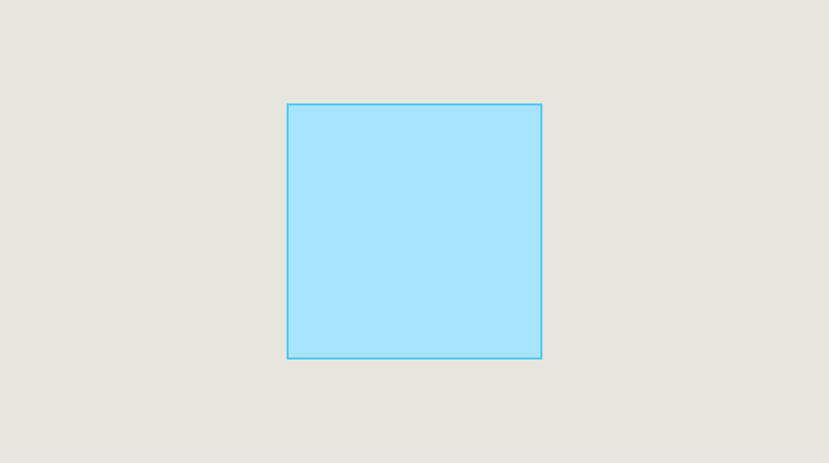

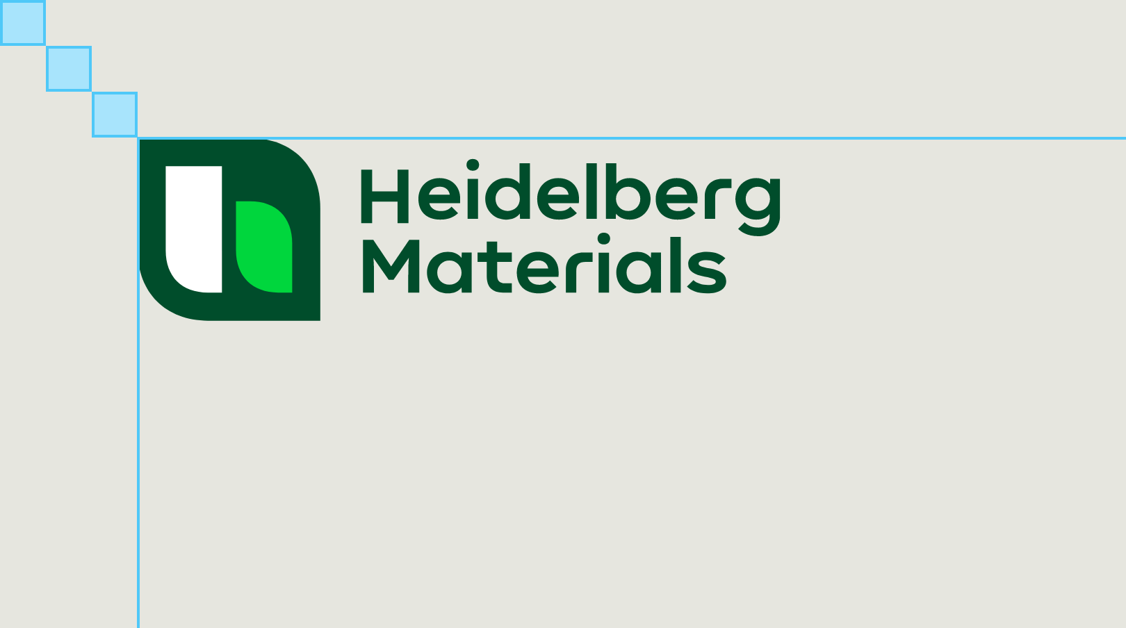
The building block is the base and the smallest unit of our flexible design system.
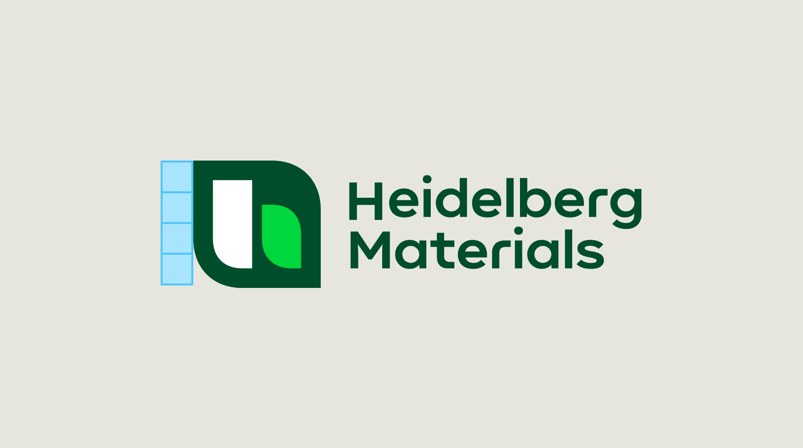

The building blocks are used to determine the logo height for all respective formats.

The building blocks are used to define margins and type areas for all respective formats.
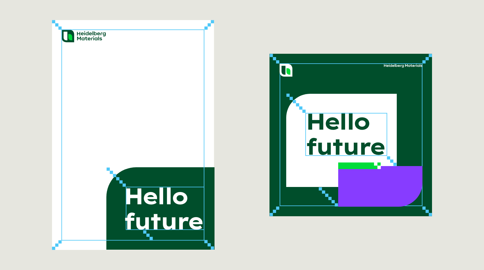

The building blocks define distances for all design elements in the layout in all respective formats.
Building block sizes
The sizes for the most common formats can be found below.
If you can't find your format here, this is how to calculate it:
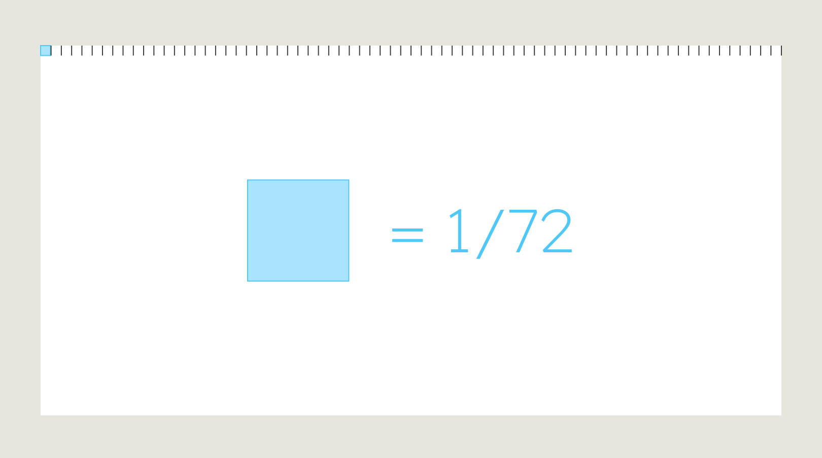
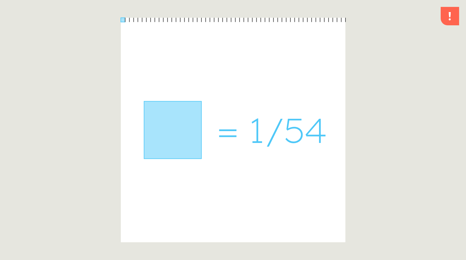
For landscape or portrait formats, divide the longer side of the format by 72. For square formats, divide by 54. Round to the nearest whole number.
This will give you the size of the building block.


The shape
The shape is an important element in our design system. Inspired by the design language of our brand mark, the shape is a strong character element that transports information and guarantees our communications a high recognition effect.
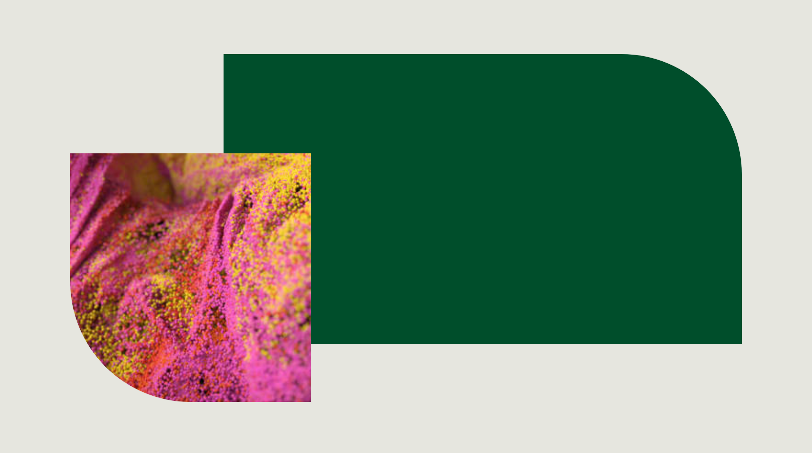

Functionality
We use our versatile shape in two ways in our design system.
Surface
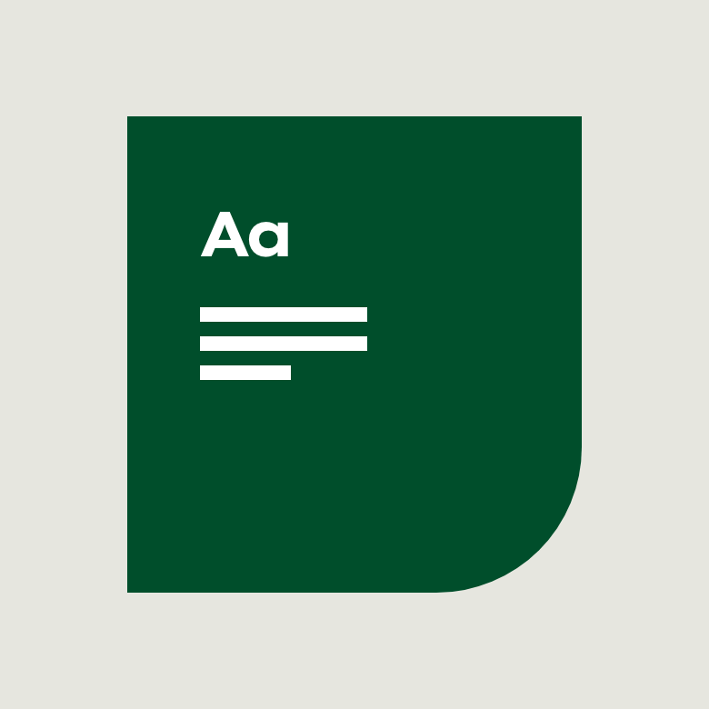

Use the shape as carrier surfaces for content or colour accents.
Container


Use the shape as a container for our images or videos.
Shape rounding
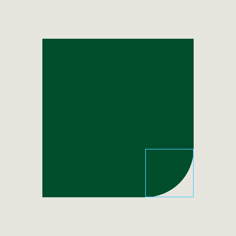

One of the four corners of the shape is always rounded.
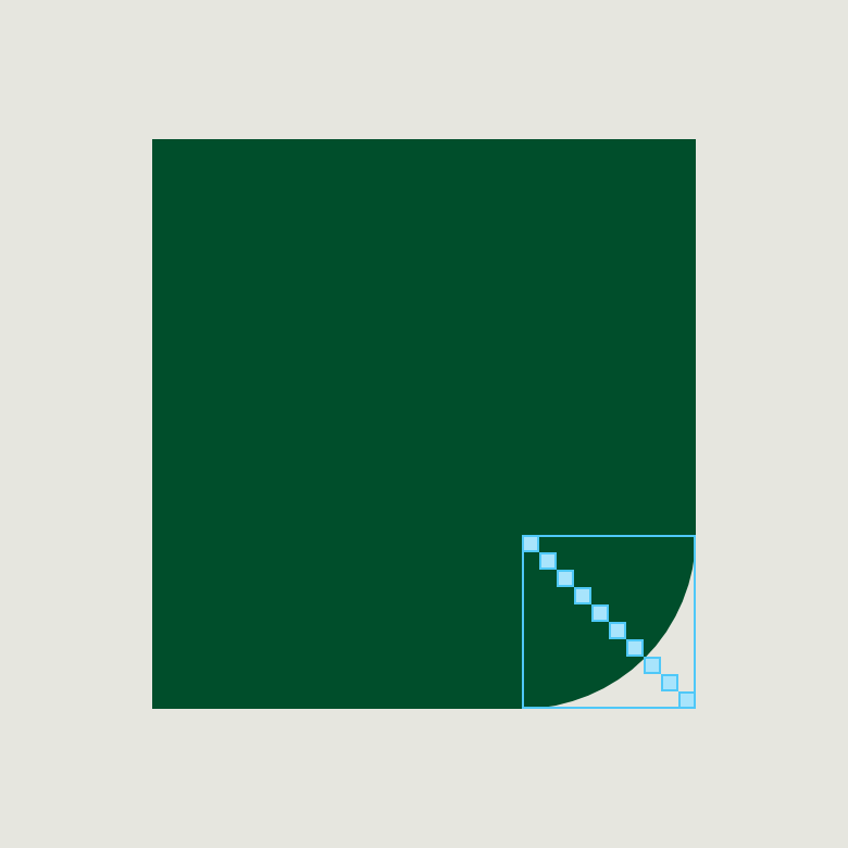

The value of the rounding of the corner is always 10 building blocks of the respective format.
Variety of shapes
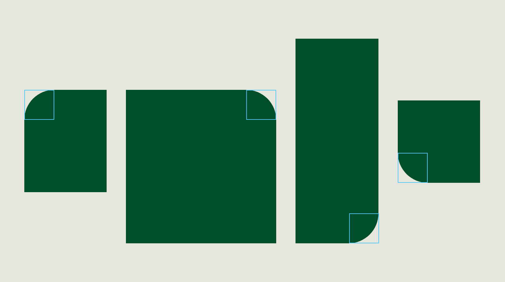

Depending on the content or function of the shape, the position of the rounded corner, the form and size of the shape will vary.
Text placement
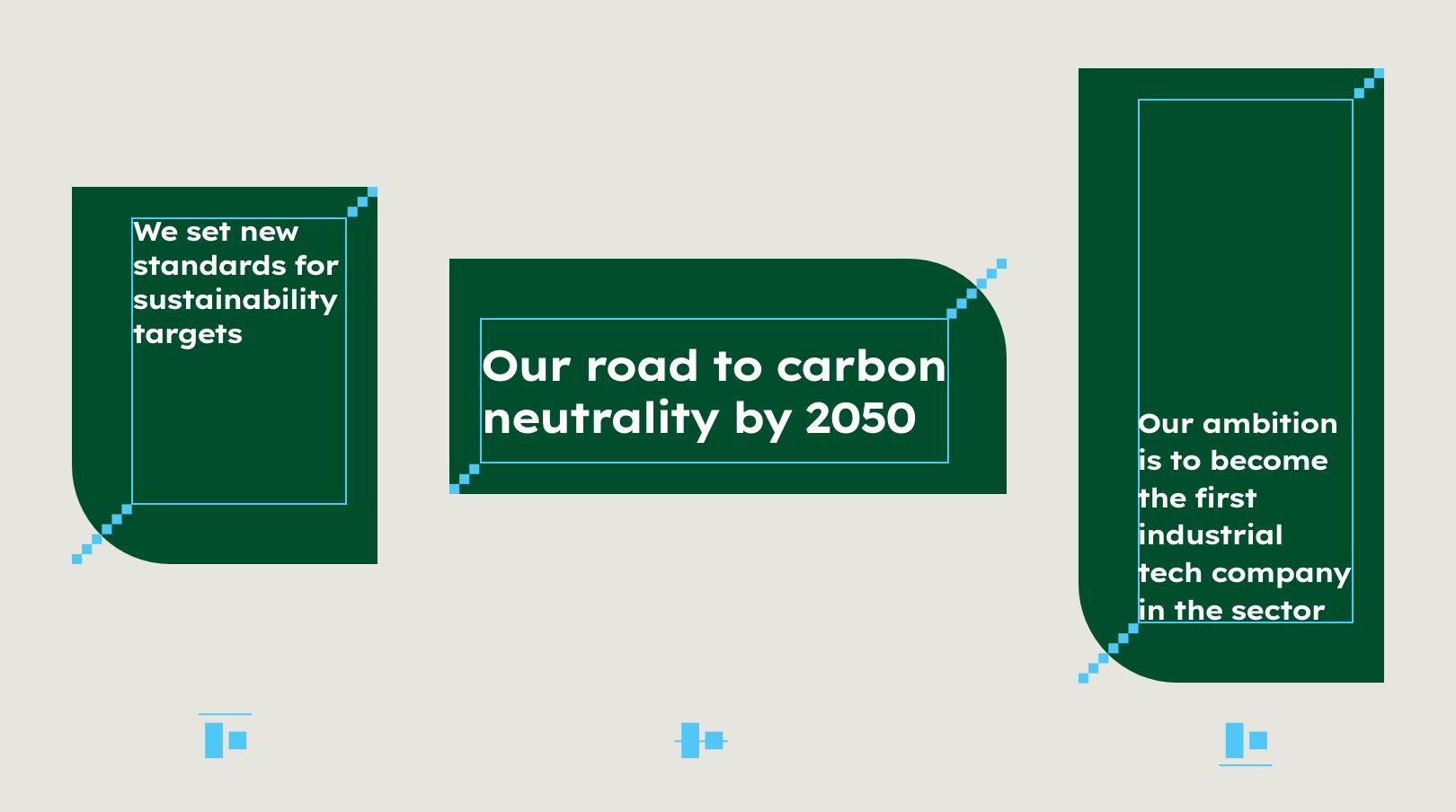

Copy can be aligned at the top, in the middle or at the bottom, depending on the content. It is always left-justified.
Learn more about our dynamic logo in the Logo section.
Layout principles
We align our communication with our brand attributes: “Fundamental”, “Approachable” and ”Aspirational”.
These attributes are found in all communication – but they are more or less pronounced depending on the context in which they are used.
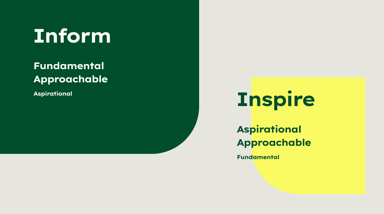

Two different design fields
We derived two different design fields from the various use cases: Inform and Inspire. These two design fields cover all our communication, whether print or digital, emotional or functional. The overarching colour scheme is always green.
Inform
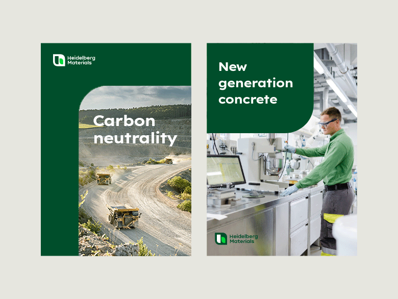

Fact-based messages with a clear reference to our business fields.
Use cases
e.g. product information, forms, signage, websites
Inspire
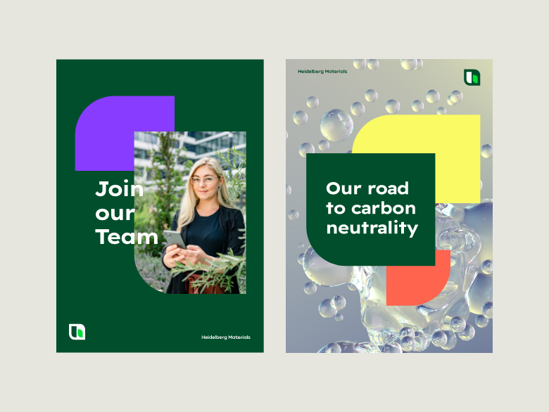

Bold, inspiring messages about overaching themes and our vision as a company.
Use cases
e.g. social media, trade shows, presentations, motion design
Two types of shapes
We use our shape in both design fields, but in different ways.
Fixed shape to inform
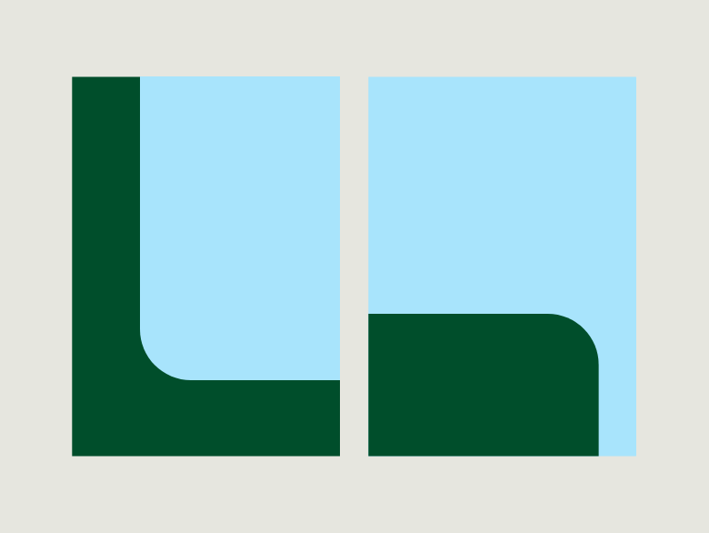

The fixed shape is docked on two edges of the format. Use this shape for informative and fact-based communication.
Floating shape(s) to inspire
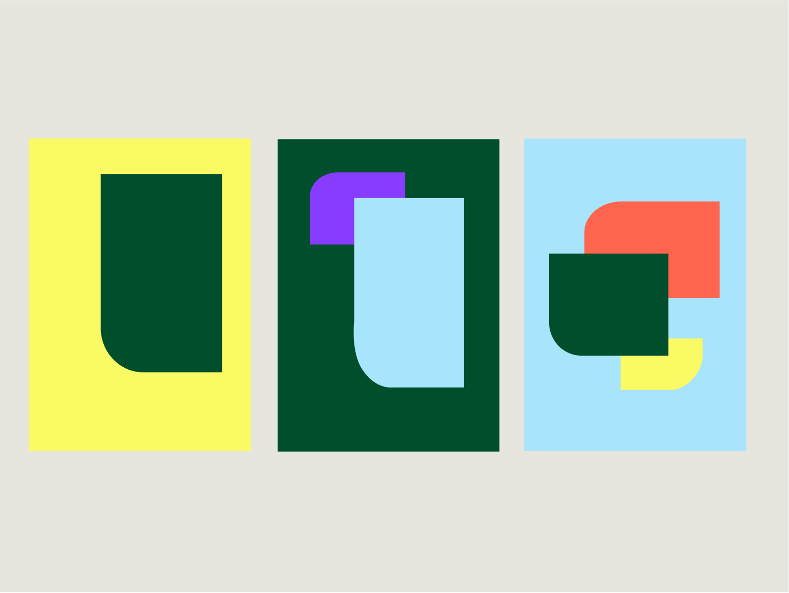

The floating shape(s) move(s) within the type area and overlap other shapes. Use this shape for inspiring and abstract communication.
Number of shapes
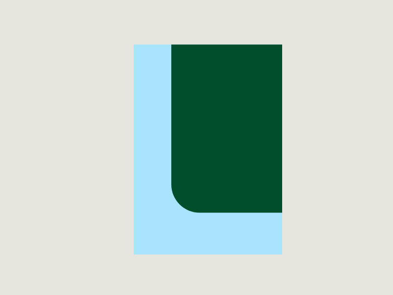

Only one shape is allowed in layouts with the fixed shape. You may choose the two format edges for docking.
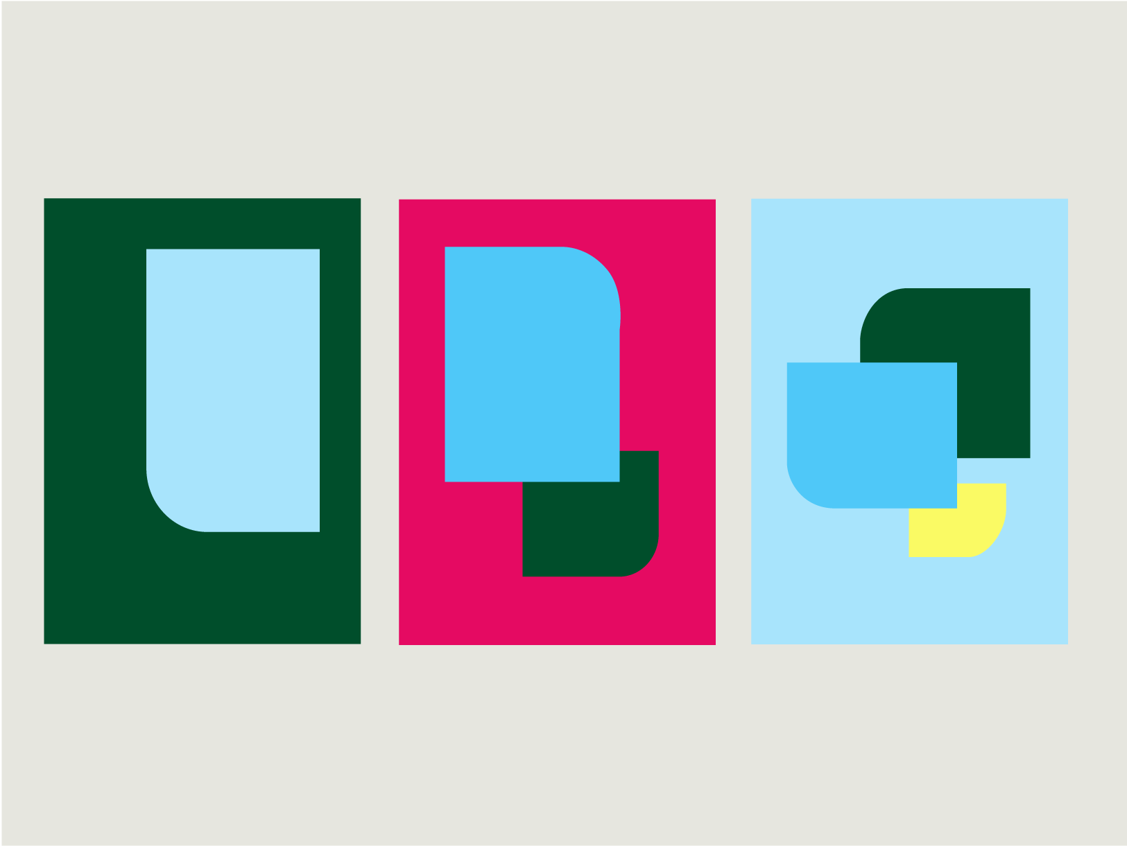

Up to three shapes are allowed in layouts with the floating shape(s). Up to two shapes when using inspiring background colours. The shapes may be arranged and overlapped as desired.
Placement
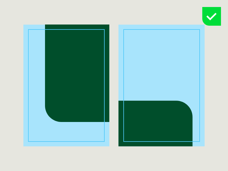

The fixed shape is always docked on two edges of the format. It can be placed at the top or bottom, and the left or right edge. The width or height of the shape are flexible and can vary depending on the content.
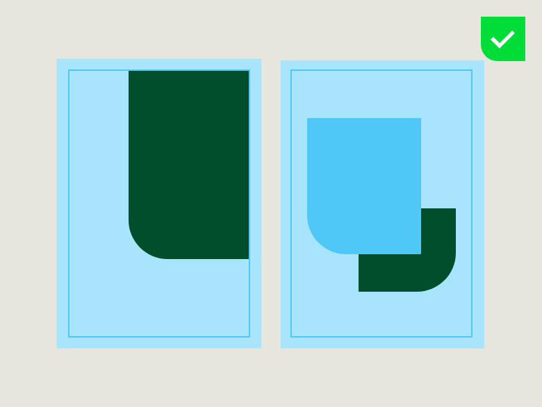

The floating shape(s) move(s) within the type area and can overlap other shapes. It can be placed at the top, right or left sides. The width or height are flexible and can vary depending on the content.
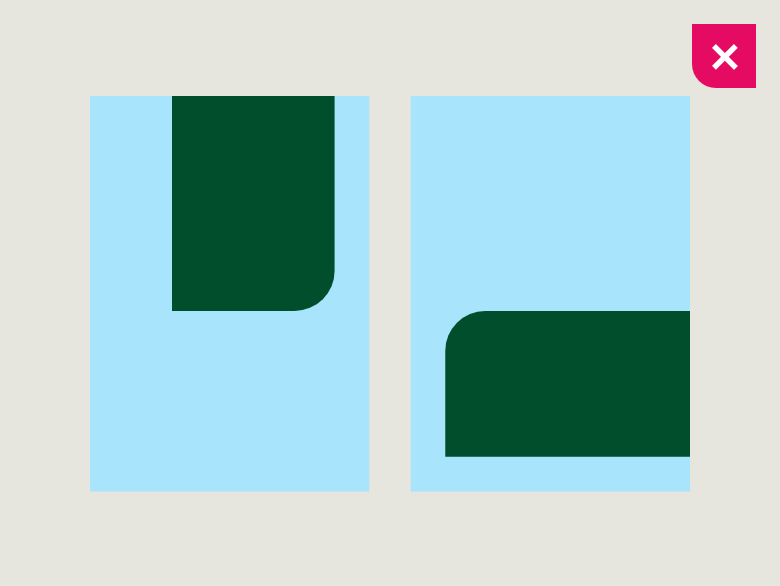

Docking the fixed shape only on one edge of the format is not allowed.
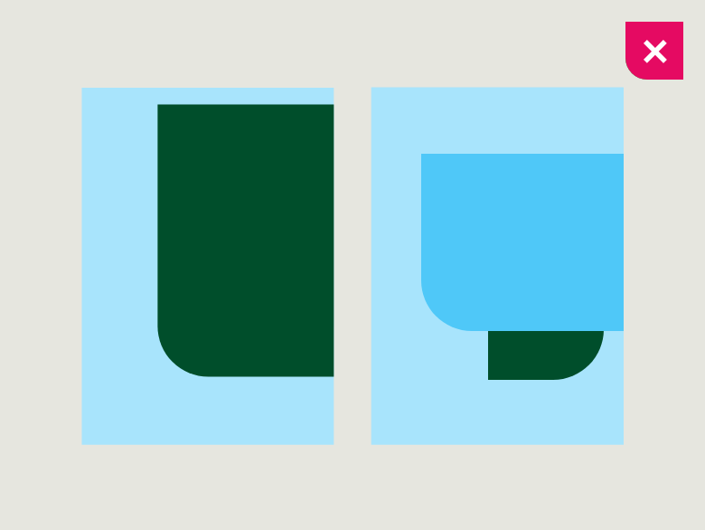

Docking the floating shape(s) on the edge is not allowed.
Minimum sizes
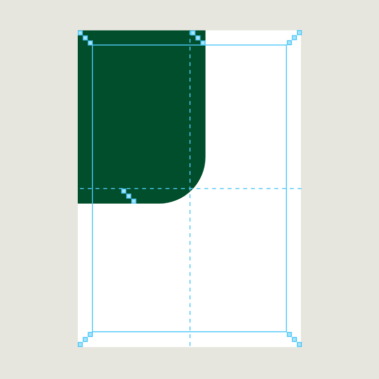

The fixed shape must always extend at least 3 building blocks past the centre line dividing the format width or height. Note: It may not be smaller than 12 building blocks.
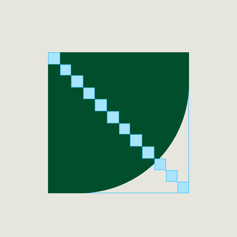

The minimum width or height of the floating shape(s) may not be smaller than 12 building blocks.
Overlapping shapes
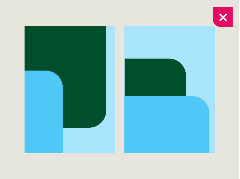

Shapes may not overlap the fixed shape.
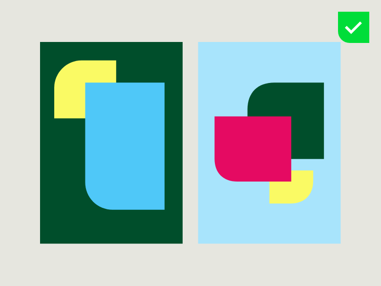

Either two or three floating shapes must overlap.
The “3 to 6” rule for overlapping shapes
The “3 to 6” rule for overlapping shapes
We have defined a simple rule for dealing with overlays. At least one side of the shape must be placed with a distance of 3 building blocks and the other side with a distance of 6 building blocks.
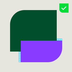

Distance of 3 building blocks horizontally; 6 building blocks vertically.
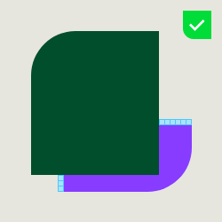

Distance of 6 building blocks horizontally; 3 building blocks vertically.
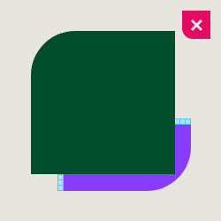

Distance of 3 building blocks horizontally; 3 building blocks vertically is not allowed.
Colours


The fixed shape is always Deep Green.


Floating shapes may be Deep Green, Sandy Grey or any of the inspiring colours. Be sure that at least one shape in the format is Deep Green or the background is green overall.
Using the logo
Using the logo
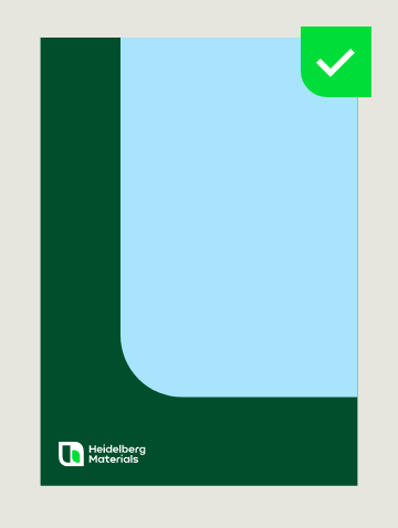

Always use the compact logo with the fixed shape.
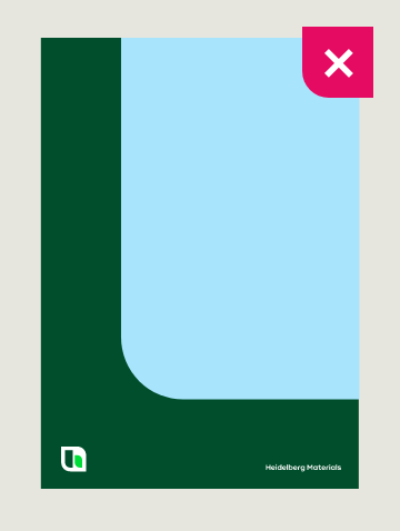

Don’t use the floating logo with the fixed shape.
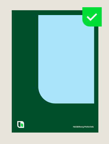

Always use the floating logo with the floating shape(s).
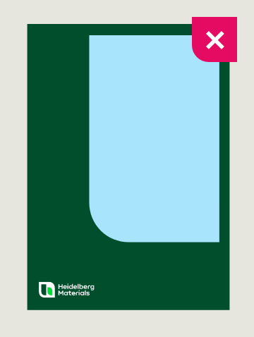

Don’t use the compact logo with the floating shape(s).
Logo placement
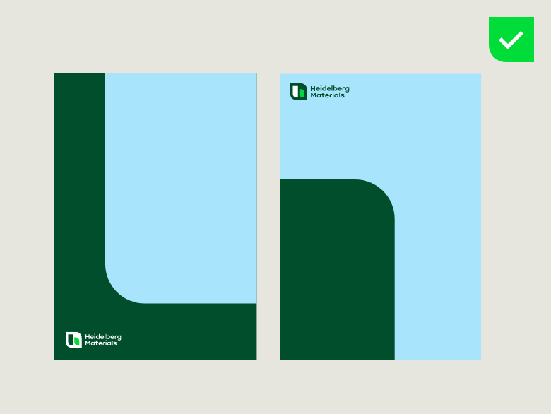

Always place the compact logo to the left of the type area. It may be at either the top or bottom of the format.
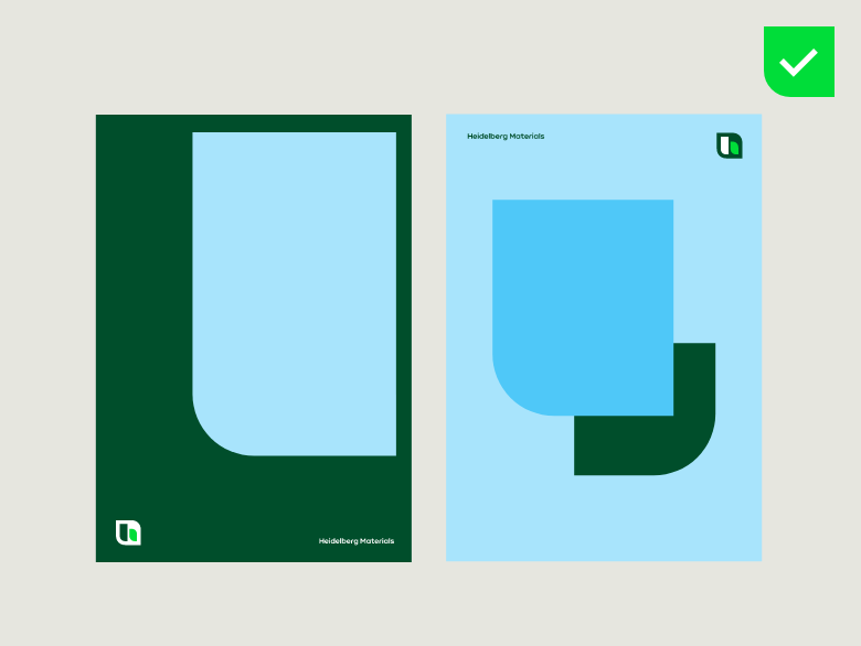

The dynamic logo can be placed at the top, bottom, left or right of the type area. The brand mark and the word mark should always be aligned.
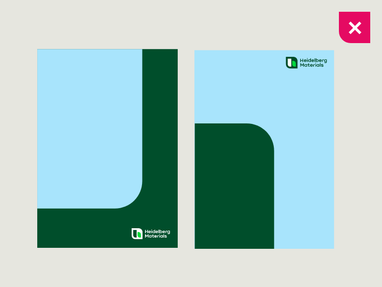

Don’t place the compact logo to the right of the type area.
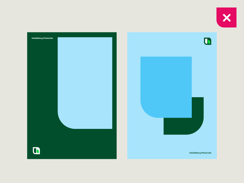

Don’t place the brand mark and the word mark on top of each other.
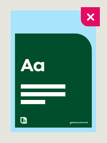

You may not use the logo in combination with content on the fixed shape.
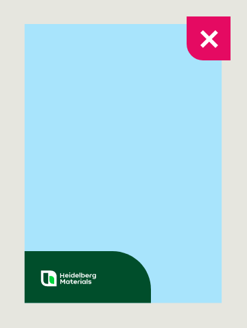

You may not use the logo on its own on the fixed shape.
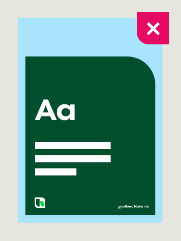
You may not use the logo in combination with content on the floating shape(s).
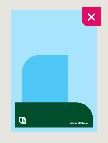

You may not use the logo on its own on the floating shape(s).
Text placement
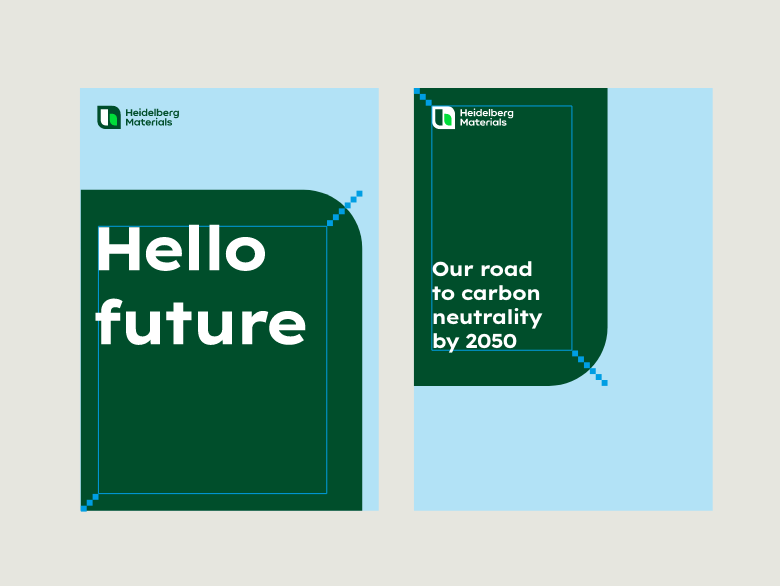

Copy can be placed at the top, centre or bottom of the shape, depending on the content.
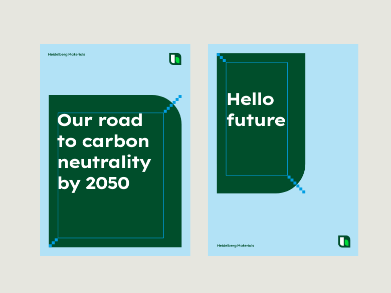

Copy can be placed at the top, centre or bottom of the shape, depending on the content.
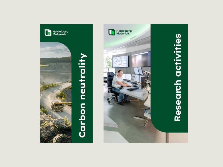

You can run copy vertically along one edge of the fixed shape to make the image more expressive.
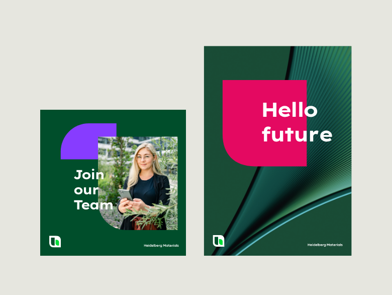

Imagery


Fact-based business fields


Creative and abstract business fields


Tangible employee stories


Emotional employee stories
Call-to-Action
Our Call-to-Action (CTA) buttons serve as activating and directing elements that contain a URL or other Call-to-Action content. They can be used optionally. For flexible use, we have defined two sizes that can be selected depending on the medium or message.
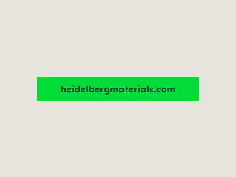

CTA button, small


CTA button, big
Construction
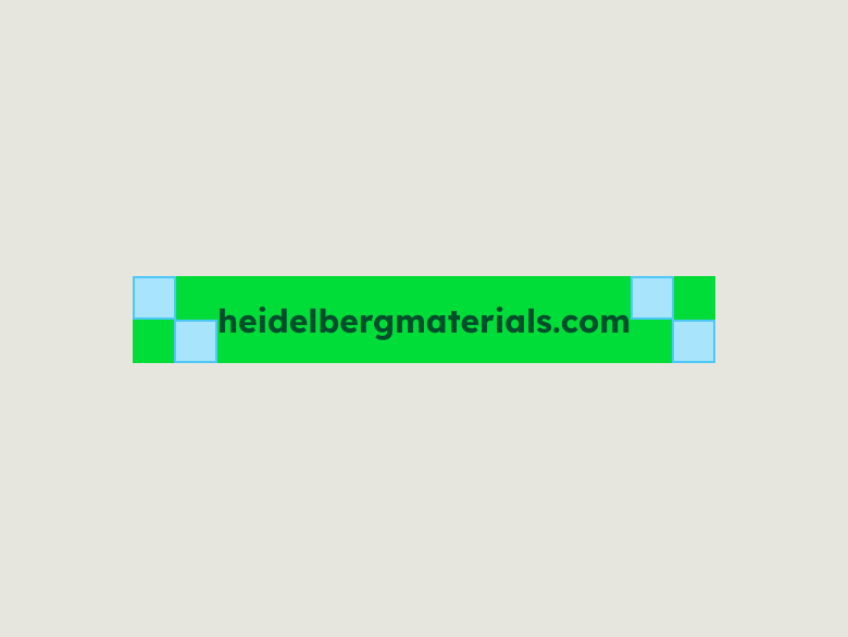

The left and right padding of the button equals 2 building blocks. The CTA itself has a height of 2 building blocks.
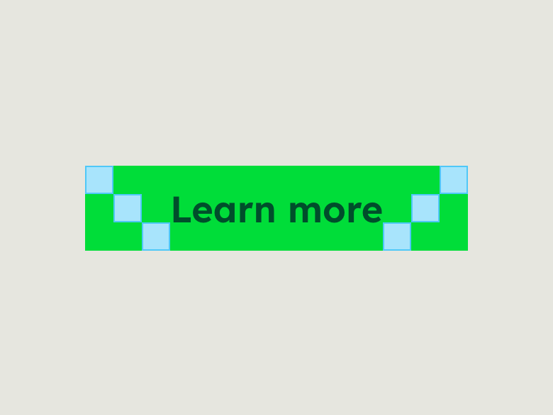

The left and right padding of the button equals 3 building blocks. The CTA itself has a height of 3 building blocks.
Colours


Button = Bright Green
Text = Deep Green


Button = Bright Green
Text = Deep Green
Text sizing
Sizes print
| Format | Text size | ||
|---|---|---|---|
| DIN A6 | 105 x 148 mm | 8 pt | |
| DIN A5 | 148 x 210 mm | 10 pt | |
| DIN A4 | 210 x 297 mm | 12 pt | |
| DIN A3 | 297 x 420 mm | 16 pt | |
| DIN A2 | 420 x 594 mm | 24 pt | |
| DIN A1 | 594 x 841 mm | 32 pt | |
| DIN A0 | 841 x 1189 mm | 44 pt | |
| Citylight | 1185 x 1750 mm | 60 pt | |
| 18/1 | 2520 x 3650 mm | 120 pt |
Sizes digital
| Format | Text size | ||
|---|---|---|---|
| Size S | Width or height ≤ 250 px | 12 px | |
| Size M | Width or height ≤ 500 px | 14 px | |
| Size L | Width or height ≤ 1,000 px | 20 px | |
| Size XL | Width or height ≤ 2000 px | 24 px |
Placement
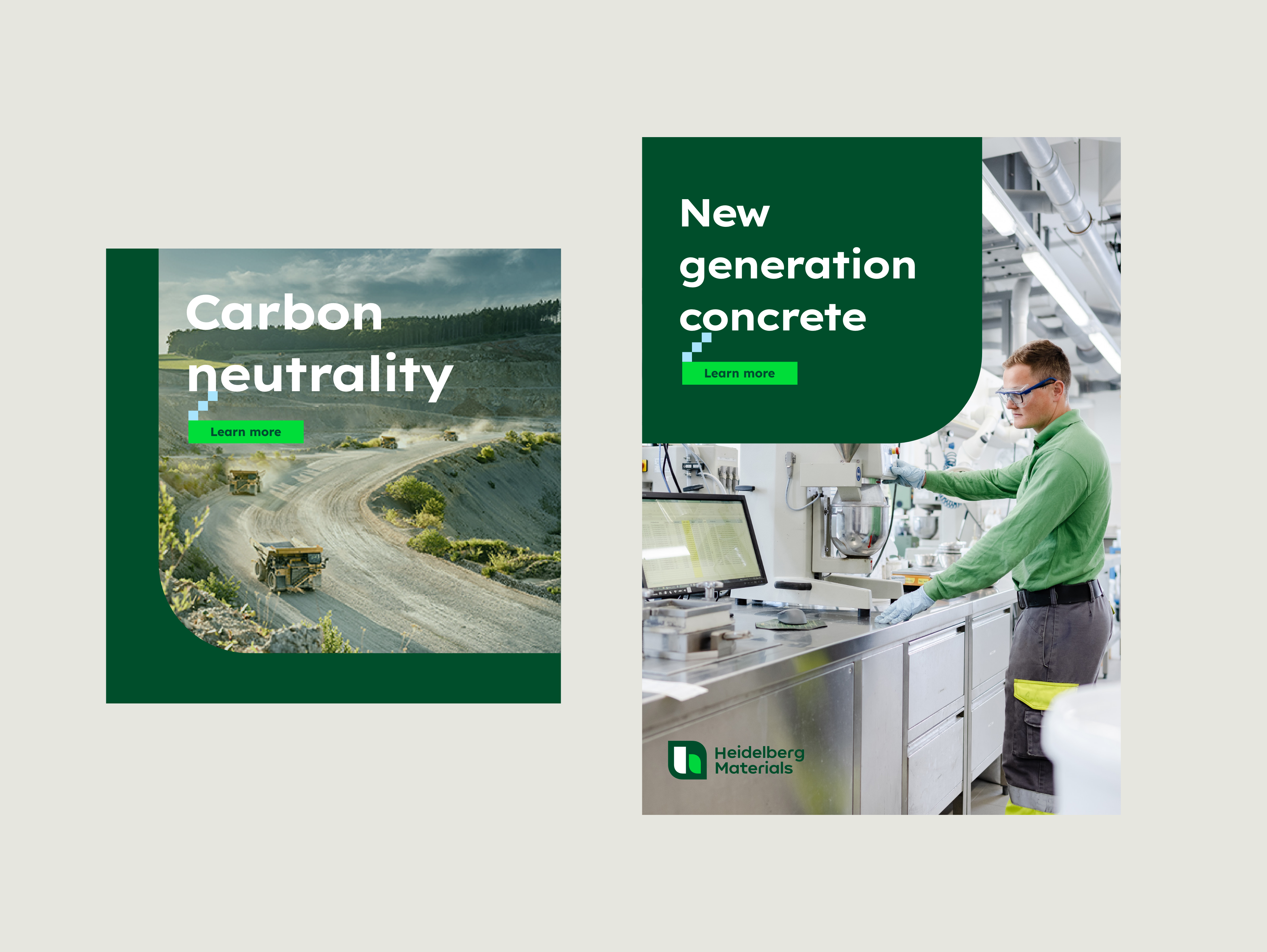

Please ensure sufficient contrast and at least 3 building blocks distance between CTA and other elements.
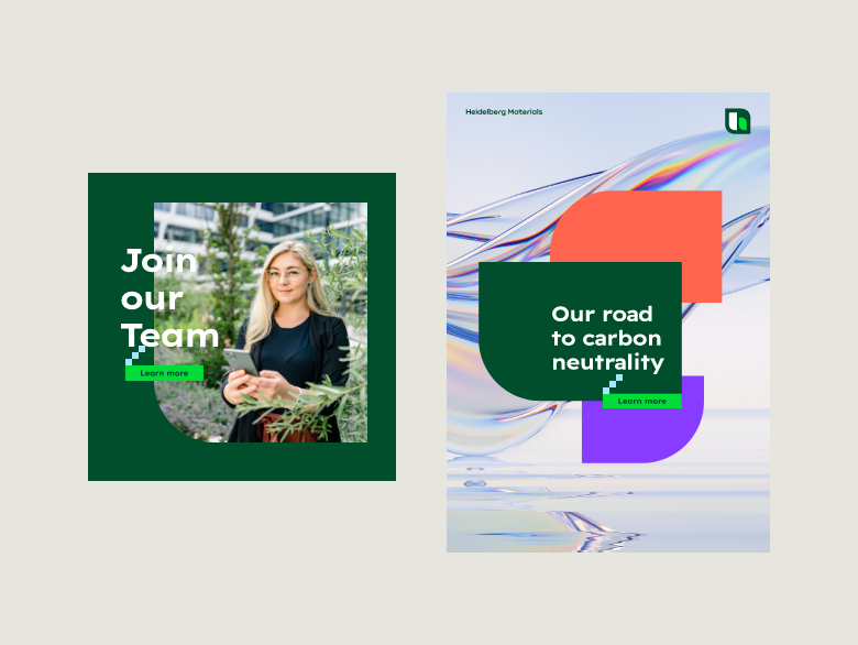

CTAs are allowed to be aligned below the headline. If more than one shape is used, the CTA is placed in the center of the shape‘s border.
CTA on shapes
CTA on shapes
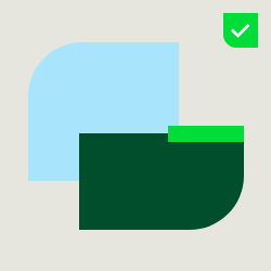

Place the CTA in the centre of the edge of the shape.
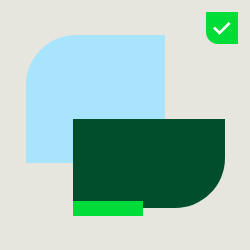

Variable alignment (left, centre, right or top, bottom) on the shape(s) is flexibly selectable.
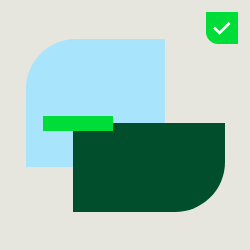

Dynamic overlays of CTA and the shape(s) are possible.
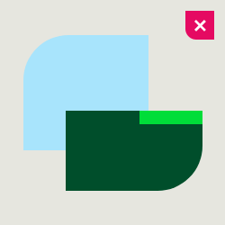

Never place the CTA flush with the edge of the shape.
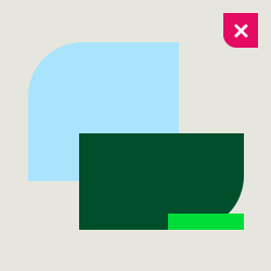

Never place the CTA on the rounded corner of the shape.
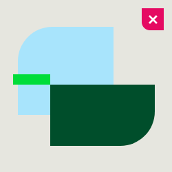

Never place the CTA corner to corner with the shape.
Dos and don'ts
Please have a look at the dos and don’ts of our new dynamic design system.
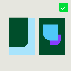

Make sure that you use the correct radius of the curves for the respective format.
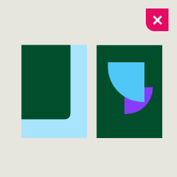

Don’t use the wrong radius of the curves. This would result in different curves that do not reflect the brand character.
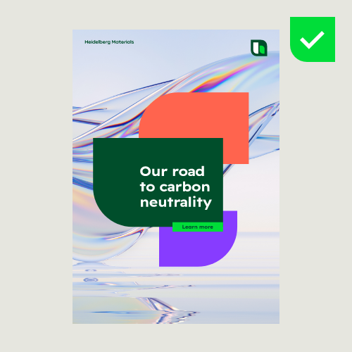

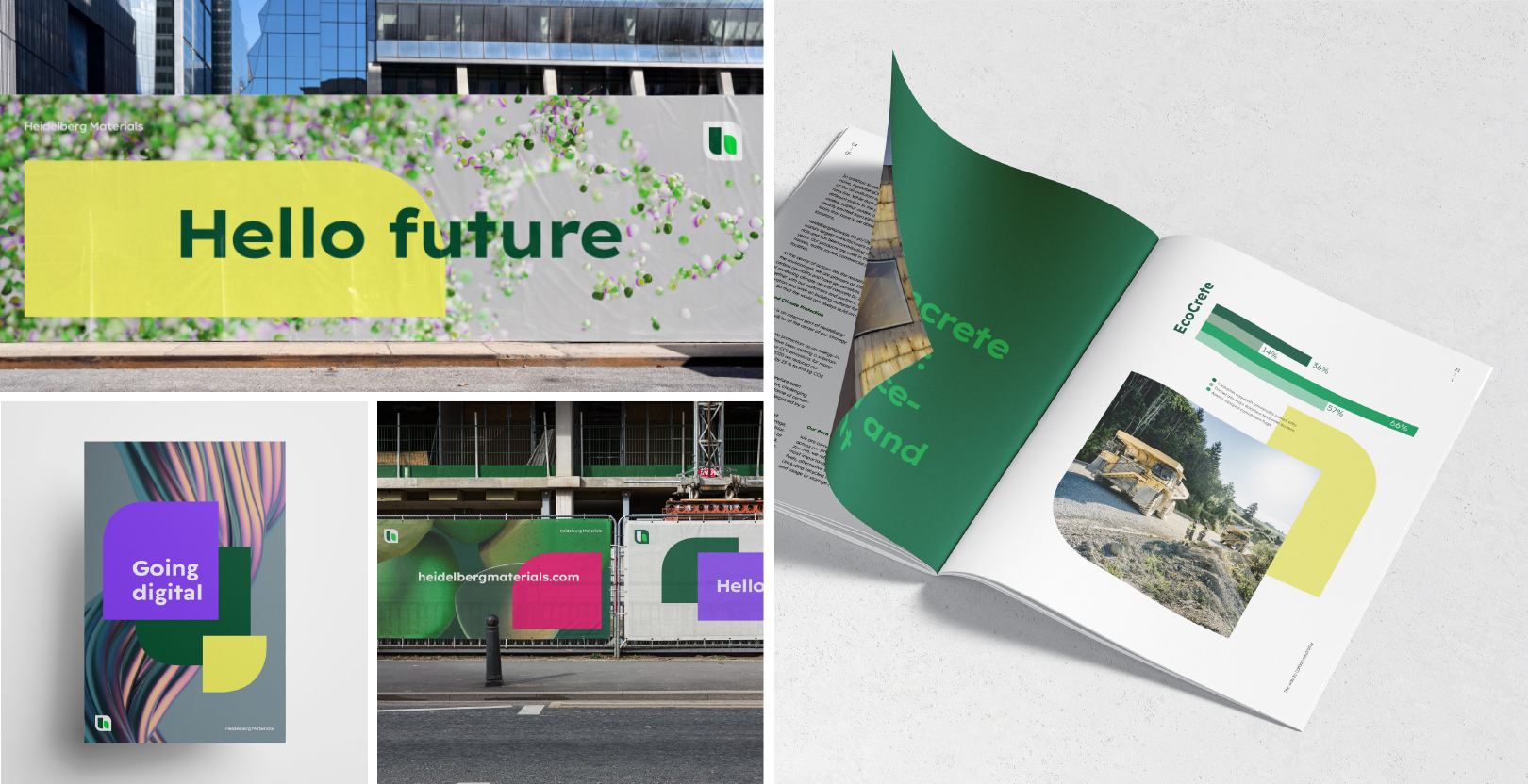
Use the floating shape(s), abstract imagery, and our inspiring colours at our design field “Inspiring”.
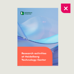

Don’t use the fixed shape, abstract imagery, and our inspiring colours at our design field “Inform”.
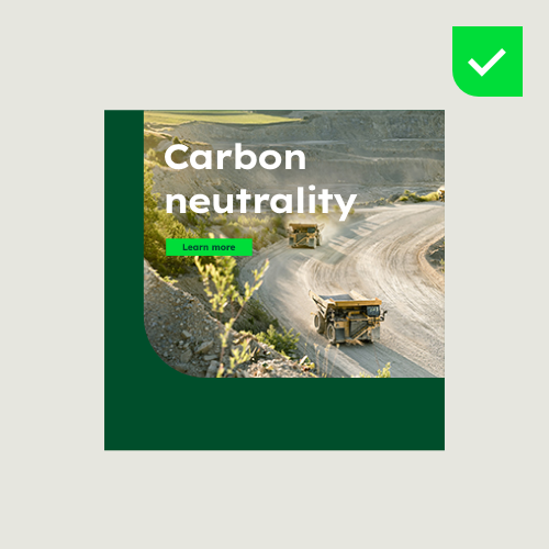

When placing text on imagery, legibility should always be ensured.
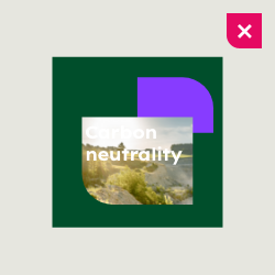

Don’t place text on images of which readability cannot be guaranteed.
Our design system in use
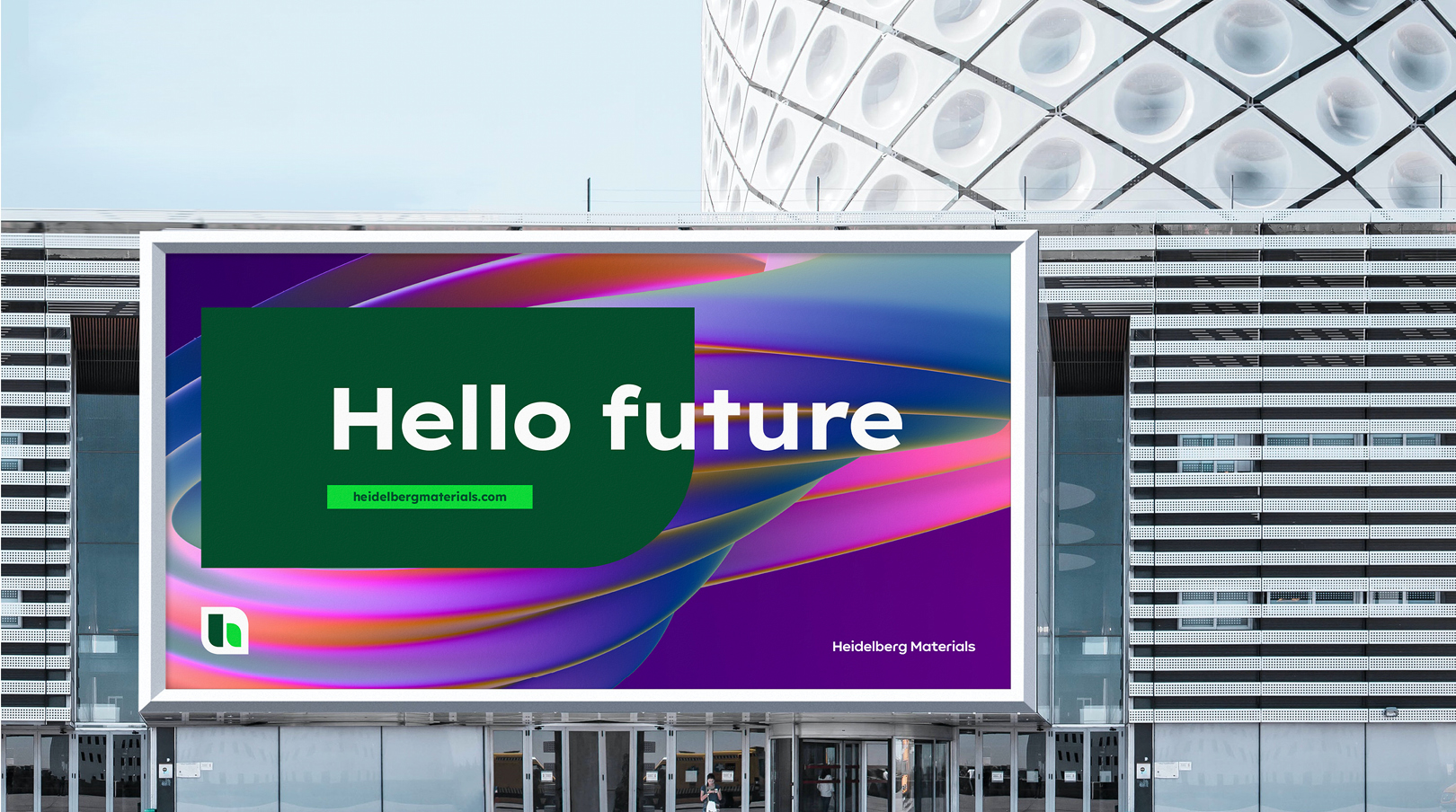

Discover the possibilities of our new design system.
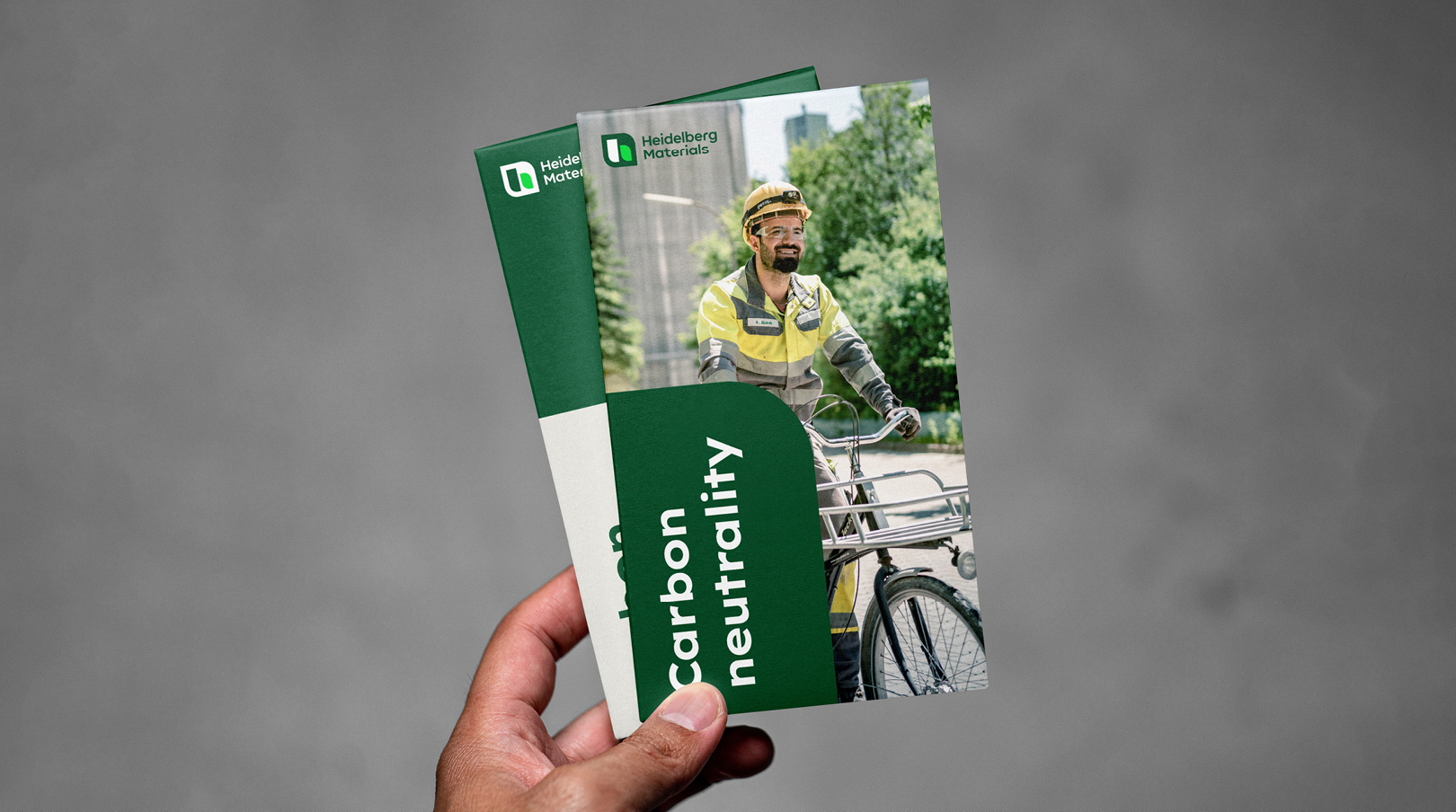

Discover the possibilities of our new design system.
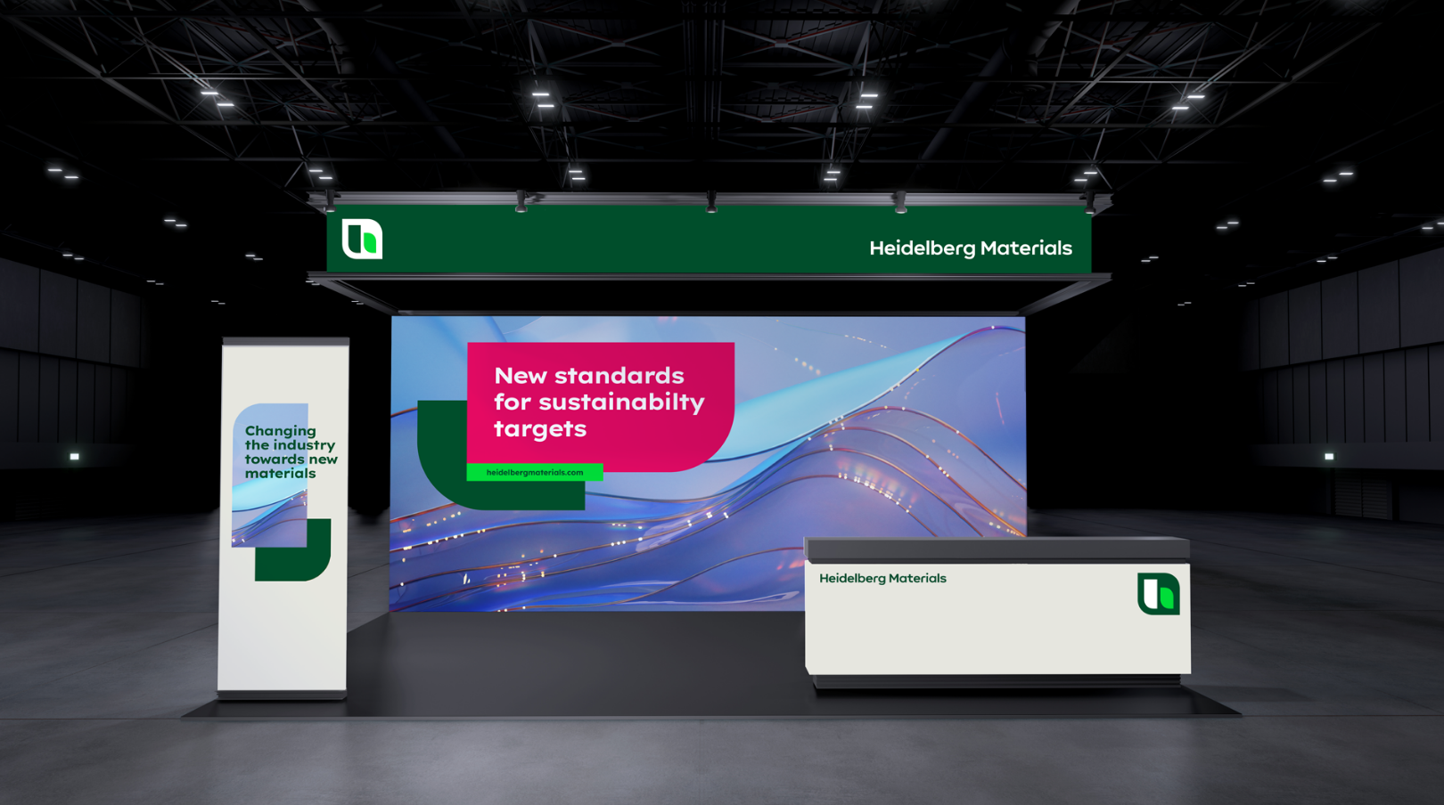

Discover the possibilities of our new design system.
Contact
Any questions about our guidelines?
Contact us.
- N Support
- T + 49 211 690787-200
- E support@Brandhub.heidelbergmaterials.com