Infographics
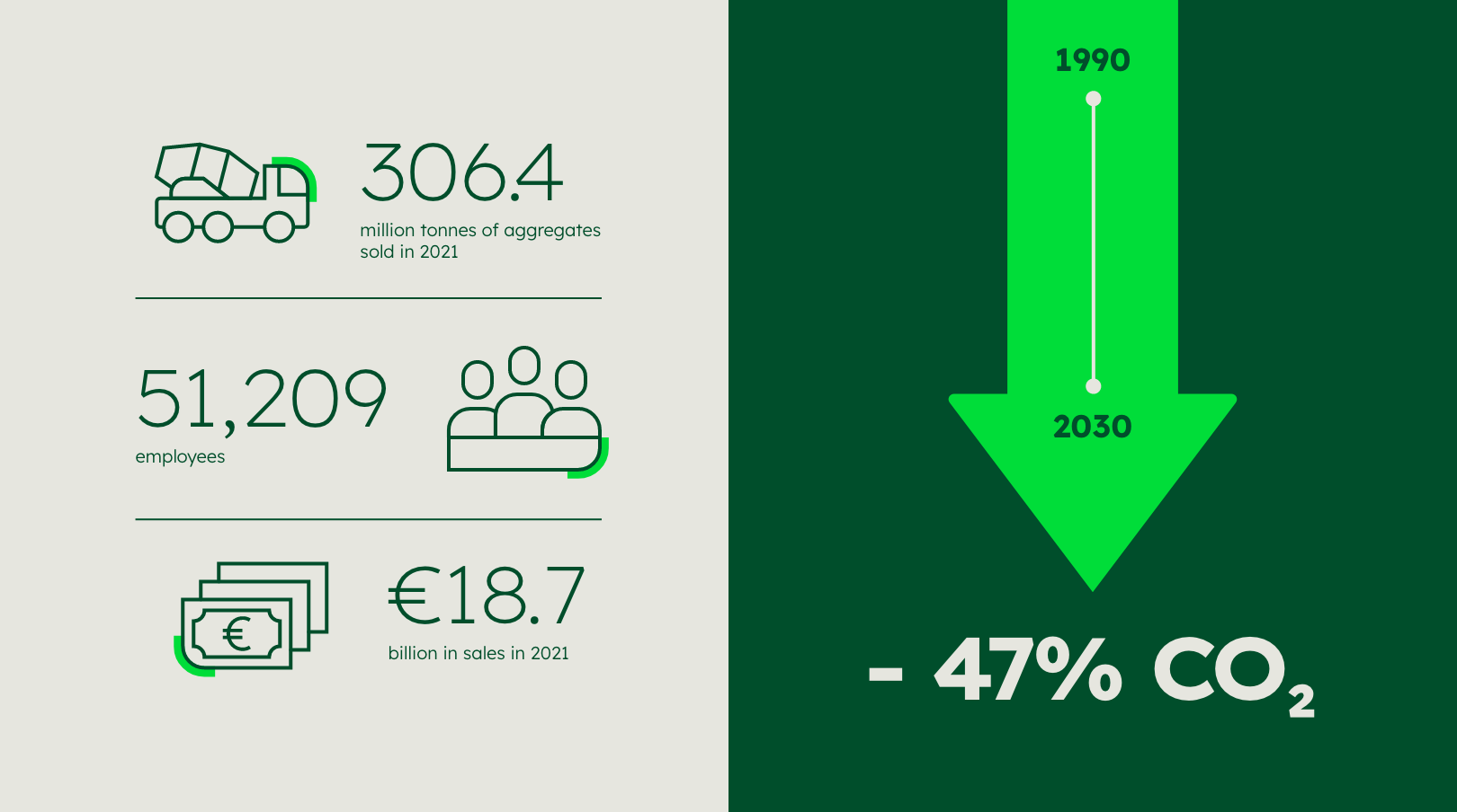

Infographics can be used to convey information such as complex data, processes, procedures or simply an idea with ease and fun. From simplifying complex information to creating emotional design, infographics tell stories and hold the reader’s attention.
Infographics are employed to inform users throughout branding, which implies both: design field 1 and design field 2.
Infographic variants
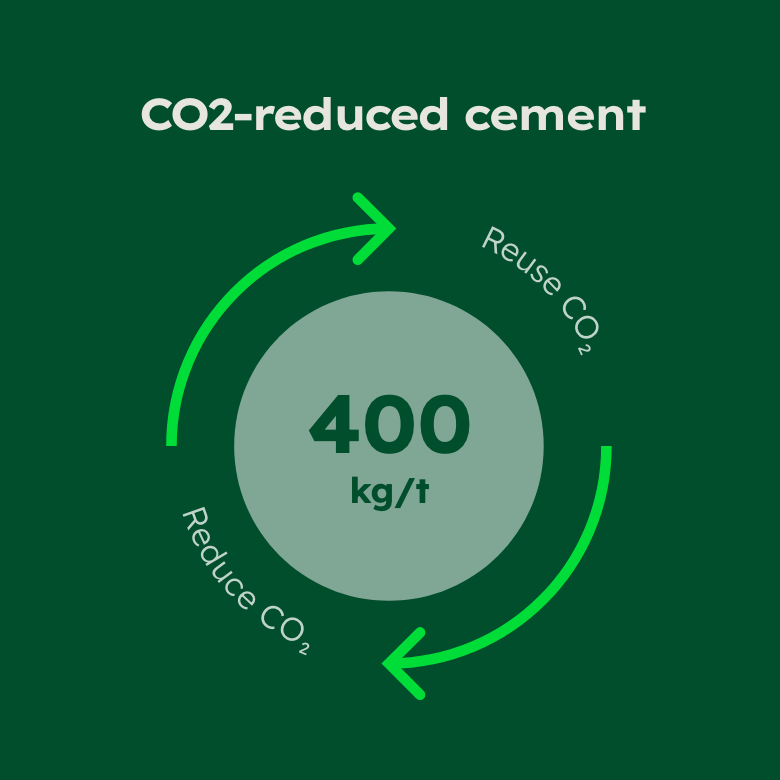
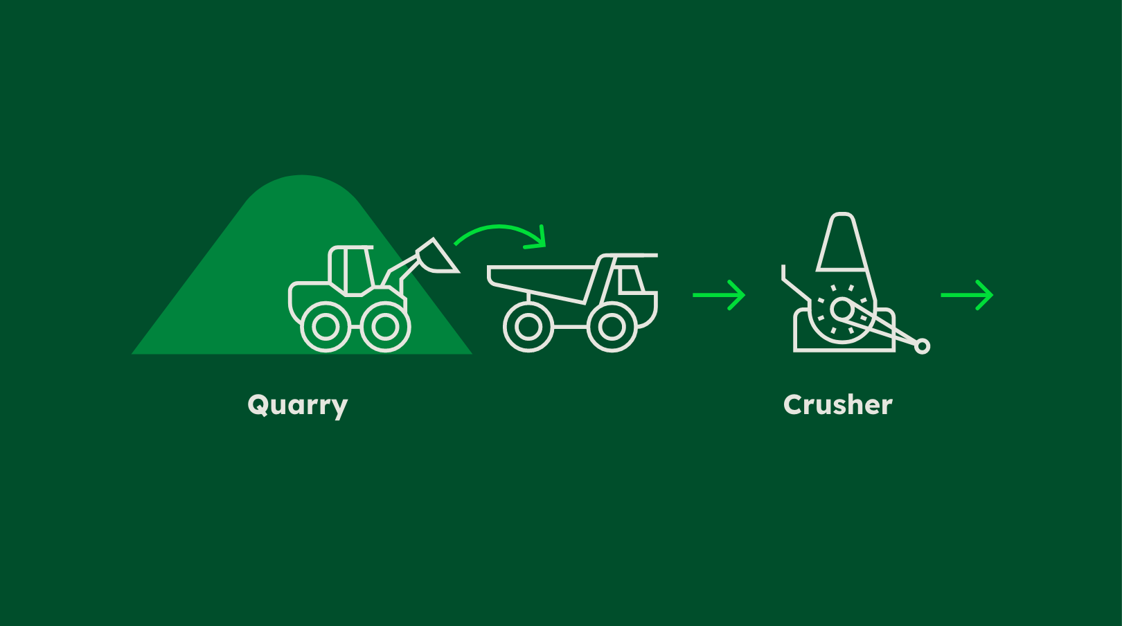
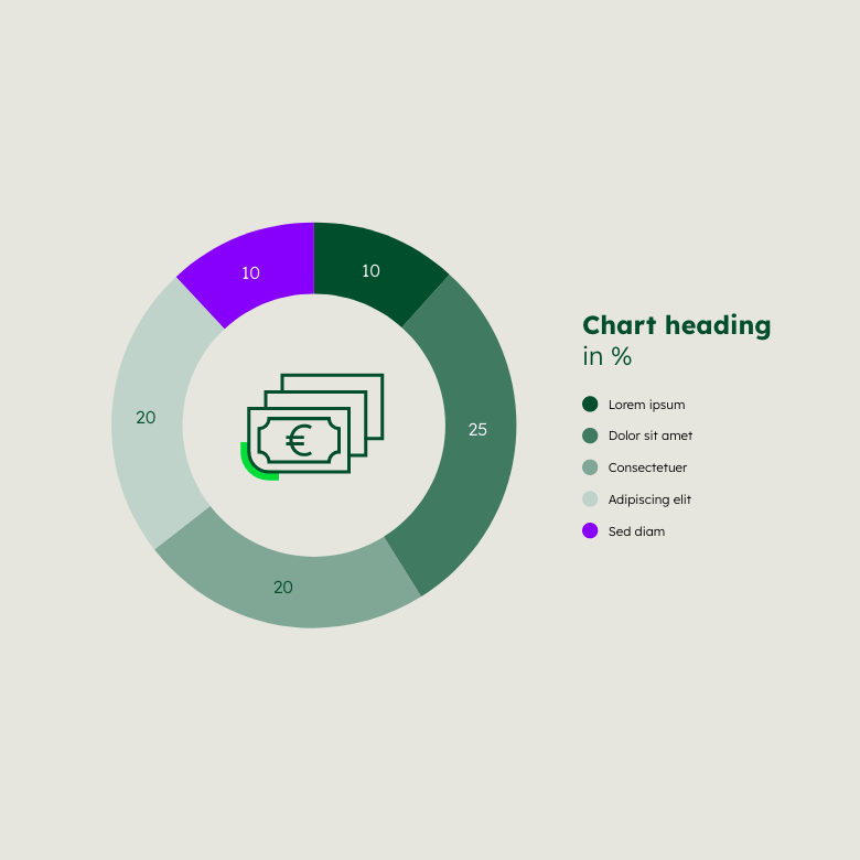
As diverse as information and its point of use can be, so are the visualisation options: They can be simple, complex, typographic, abstract or illustrative. Here are some inspirations:
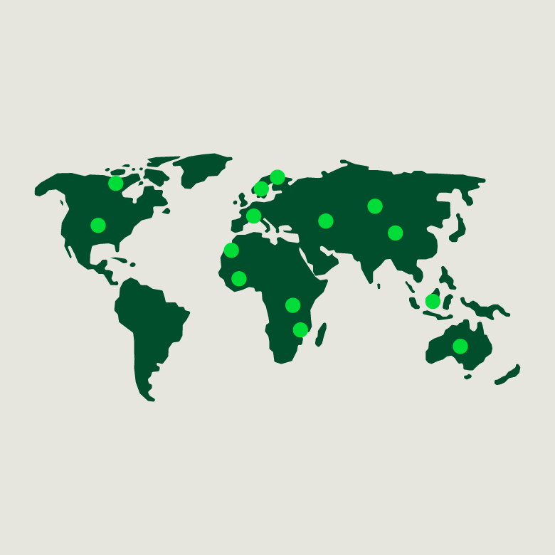

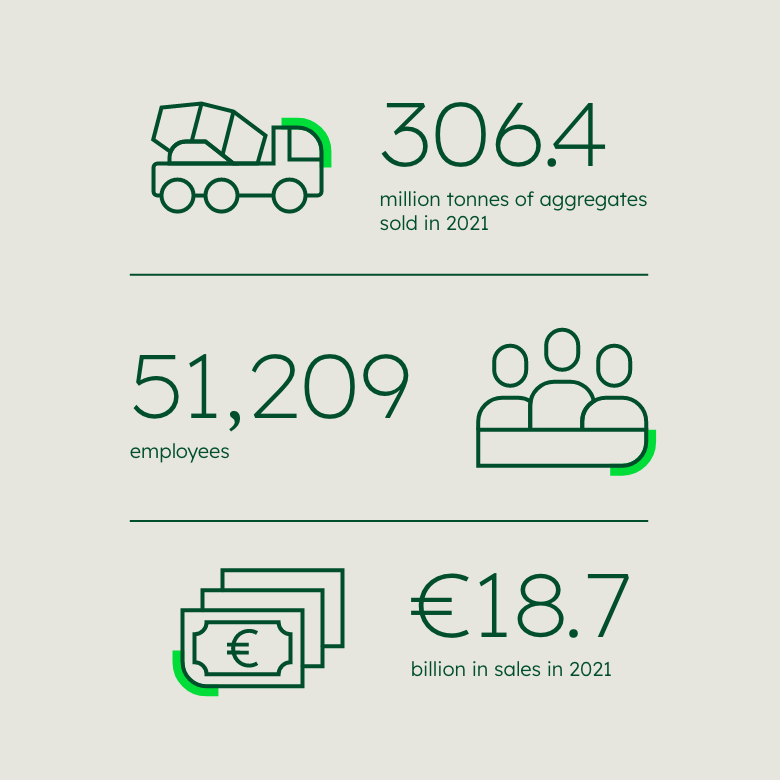

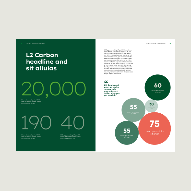




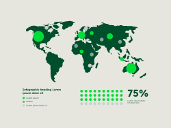
Level of detail
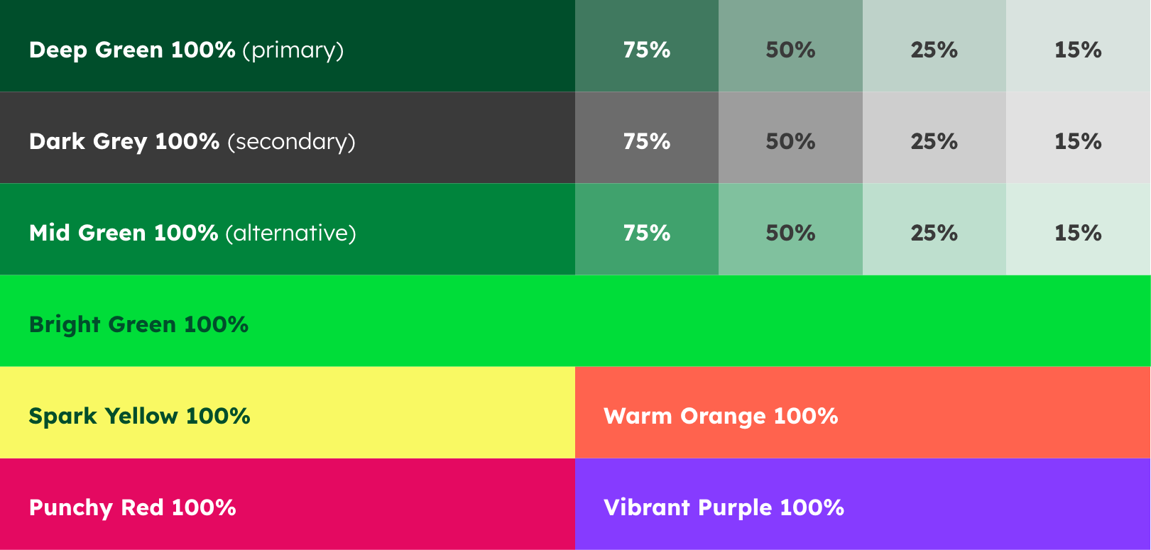
The more complex infographics become, the more colours or colour shades are used. A clear focus with a highlight colour is important – this can be either Bright Green or an inspiring colour.
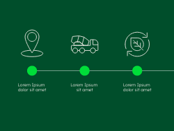
Low
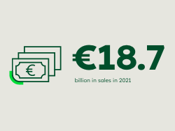

The more basic an infographic is, the larger individual elements can be placed. Individual statements are thus particularly in focus.
Medium

High

Extended colour palettes


Style
Even though infographics leave a lot of flexibility and options, they should still speak the same visual language. The other guidelines from the Brand Hub are to be adhered to on all accounts.
Icons
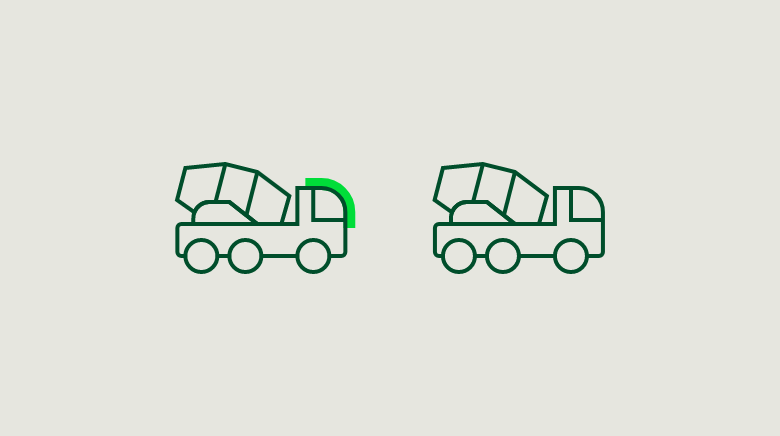

Icons can help visualise information. They can also be used illustratively to depict processes. Learn more about Icons.
Text on colour
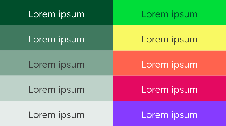

When labelling positions, use white text on 100% and 75% shades, and Dark Grey text on lighter shades and Spark Yellow.
Arrows


A consistent arrow design is important for a consistent look and feel. There are two types of arrows that can be used: a linear version and a filled version, which can also serve as a platform for elements. Please note the details in the arrows: They both have rounded elements.
Matching elements
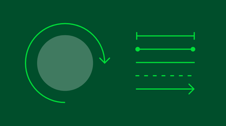

Infographics can consist of surfaces and lines. Please use either the same line thickness in similar elements within one layout or completely different strengths to differentiate between elements.
Choose the elements as geometric (e.g. circle) as possible and incorporate the style of the shapes where appropriate.
Typographic use
Typographic use
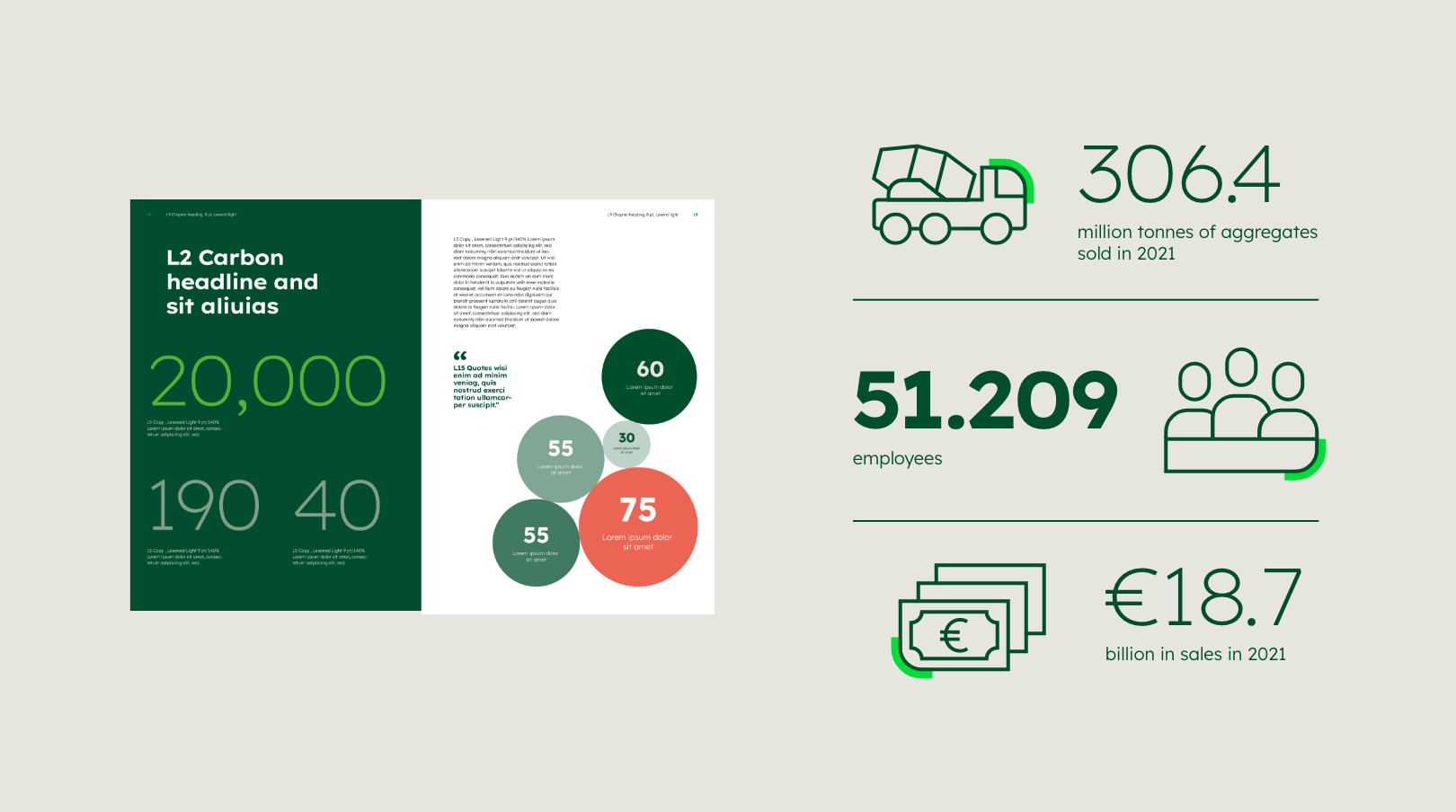

For the use of typography, please refer to the Typography guideline. For particularly important, large statements or headlines, Lexend Exa HM is to be used. Either the Light or the Bold cut (or a combination of both) may be used, with the Bold cut adding additional highlight.
Don’ts
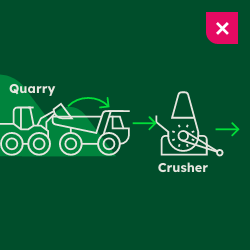

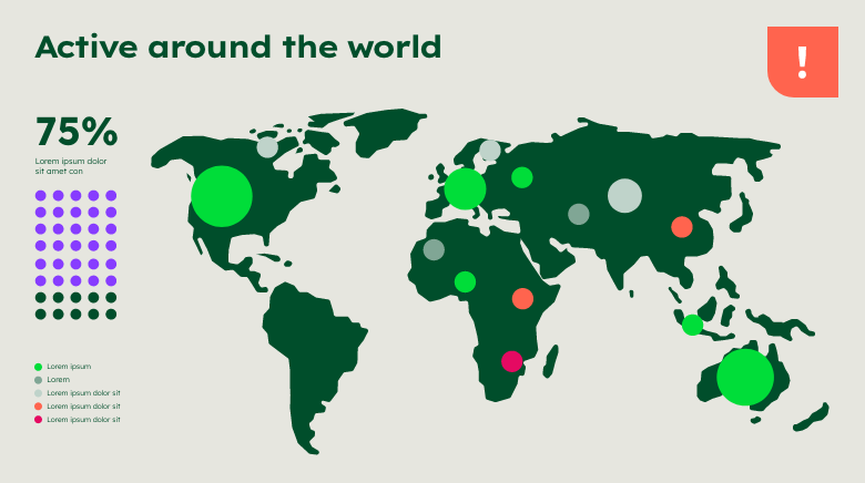
Avoid unclear visualisations without focus. The individual elements must clearly stand out against each other.
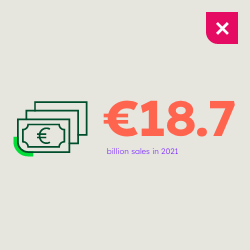

Do not use an unnecessary number of highlight colours in an infographic. Do not use colours in a way that is not specified.
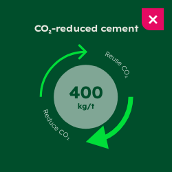

Do not use elements that do not fit into the formal language. Also, make sure that within a layout, line weights are equal for sense units.
Any questions about our guidelines? Contact us.
- N Support
- T + 49 211 690787-200
- E support@Brandhub.heidelbergmaterials.com