Employer branding
The creative concept
Heidelberg Materials has many exciting projects and products, which focus on one thing above all: innovation. After all, only those who think ahead can also get ahead! This mindset is shared by our employees – and with great conviction. Their hard work and commitment is key to everything that we do. And that us we also like them to be heard. We always establish a causal connection between people from different professions and countries. Be it truck drivers and engineers, trainees and lab assistants, or CEOs and administrators: all are part of Heidelberg Materials and their combined strength is what makes our pioneering work possible.


Guidelines for using the employer brand claim
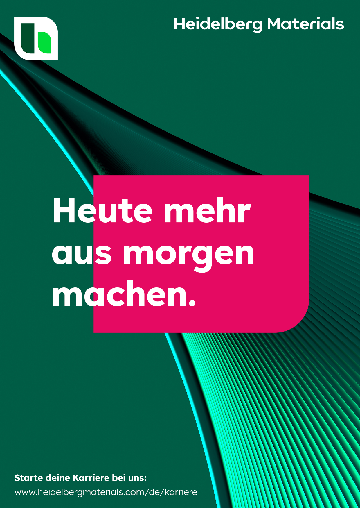
To avoid any confusion with our overall brand image, the following rules must be observed when creating advertising materials: Employer branding measures and merch must only use the campaign claim “Make more of tomorrow today.” if a clear reference is made to the career website of Heidelberg Materials, either visually or in terms of content. This reference can be established as follows:
- QR code linking to the career website with a note regarding careers information
- A sentence/paragraph with career-related content
- Headline mechanics of the employer brand showing the two employee quotes
- Key visual of the employer brand with the employees on the stage
Example:

Clothing
Clothing
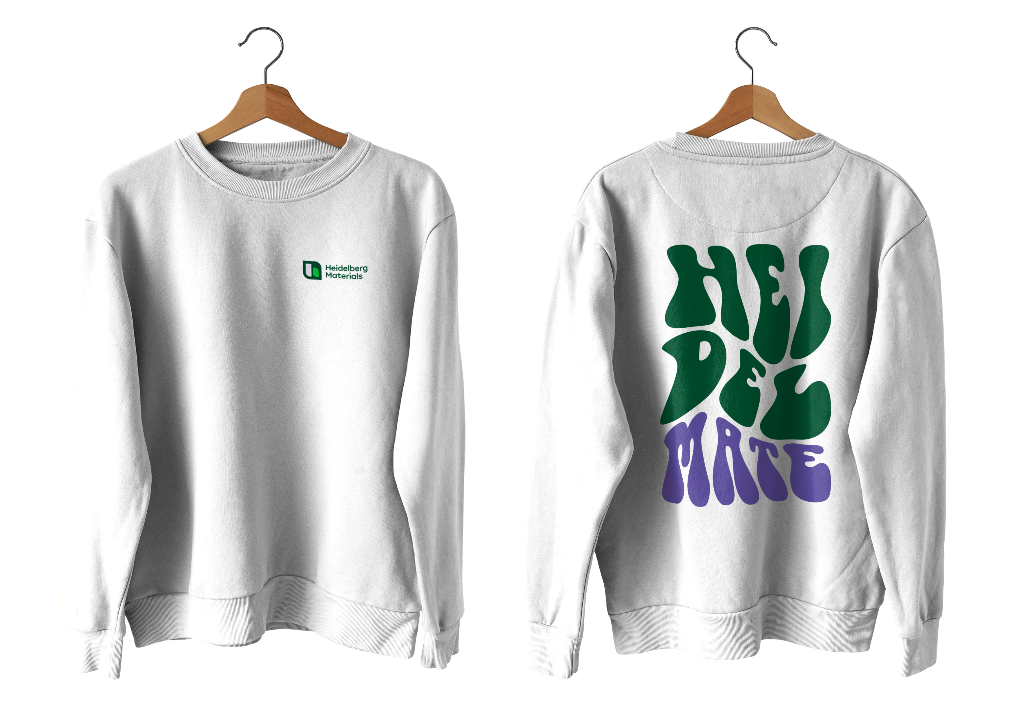
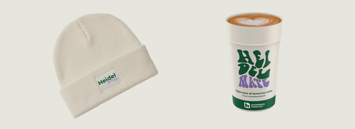
Merch items such as clothing represent a benefit for employees and should have a modern and attractive appearance to ensure that they are worn on a regular basis. The placement of the aforementioned career references is not applicable here as items of clothing do not constitute advertising material.
That is why we omit the claim from our clothing and instead use only the term “Heidelmate” or other suitable lettering for communicating the employer brand, thereby establishing a reference to our branding as an employer.
In addition, clothing items must always feature color blocking with our inspiring colors along with the primary color deep green. This separation is part of our creative concept and increases brand recognition.
Clothing items that are produced for recruitment purposes – such as events, trade fairs, etc. – are excluded from the above. In this case, the campaign claim may be used provided that at least one of the aforementioned criteria for establishing the career reference is fulfilled.
Example:

Headline mechanics
Headline mechanics
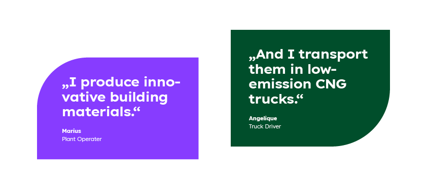
The line consists of two quotes from different employees from distinct areas or career levels. The quotes reference different aspects of working for Heidelberg Materials. These may be innovative projects but can also be topics related to our corporate culture or development opportunities within the company. A direct connection exists between the two statements. They either complement or build on each other, and they surprise with their conveyed message in order to arouse interest among the target groups.

Design rules
This section concerns the structure for the layout/design of our employer brand identity. In the following, we define clear visualisation rules in order to establish a uniform framework for the employer brand and thereby ensure reliable and effective brand recognition. These rules can be adapted to a wide range of advertising materials and must be followed to ensure that our output is of consistently high quality.

1. Background
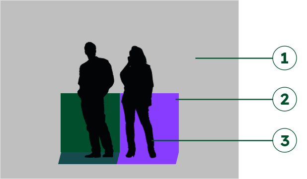
A specific project or working environment befitting the relevant topic is shown at background level.
2. Stage/backwall
A stage with backwall is placed in the respective background setting. The stage is always split down the center so that each side has its own color, specifically deep green and one of the inspiring colors. The colors of the separate halves of the stage can be adjusted in post-production.
Stage dimensions: 250 cm wide, 180 cm deep, 125 cm high (backwall)
3. Employees
Two employees from different departments/trades are photographed in a studio together with the stage but separately from the background.
All three elements are then combined in post-production.
The imagery and overall look are based on the current specifications for the brand in the general.
Key visuals
These six key visuals show six individual projects with different employees of Heidelberg Materials. They represent the starting point for the displayed content and visual representation including all core elements and serve as the basis for further motifs.
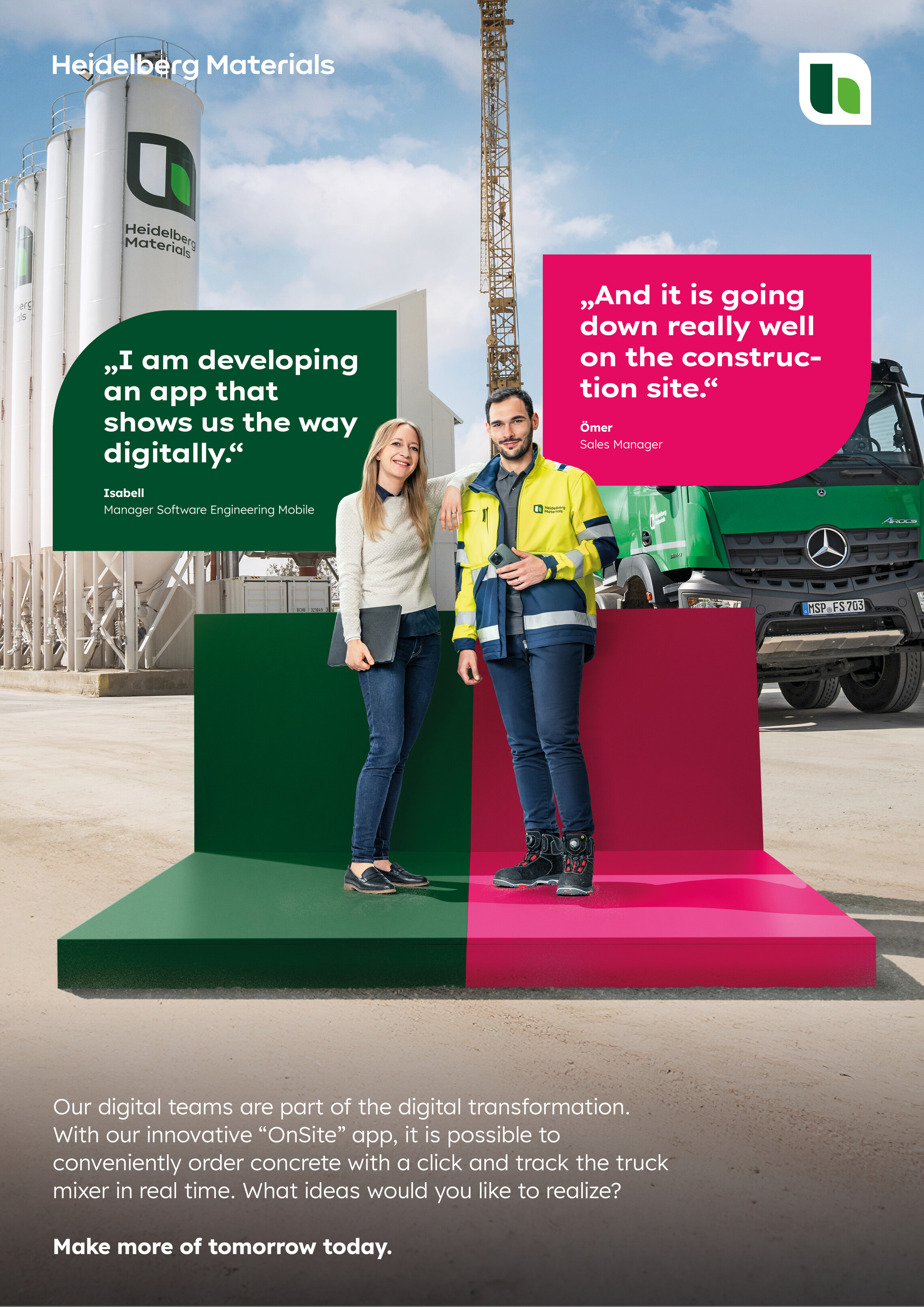

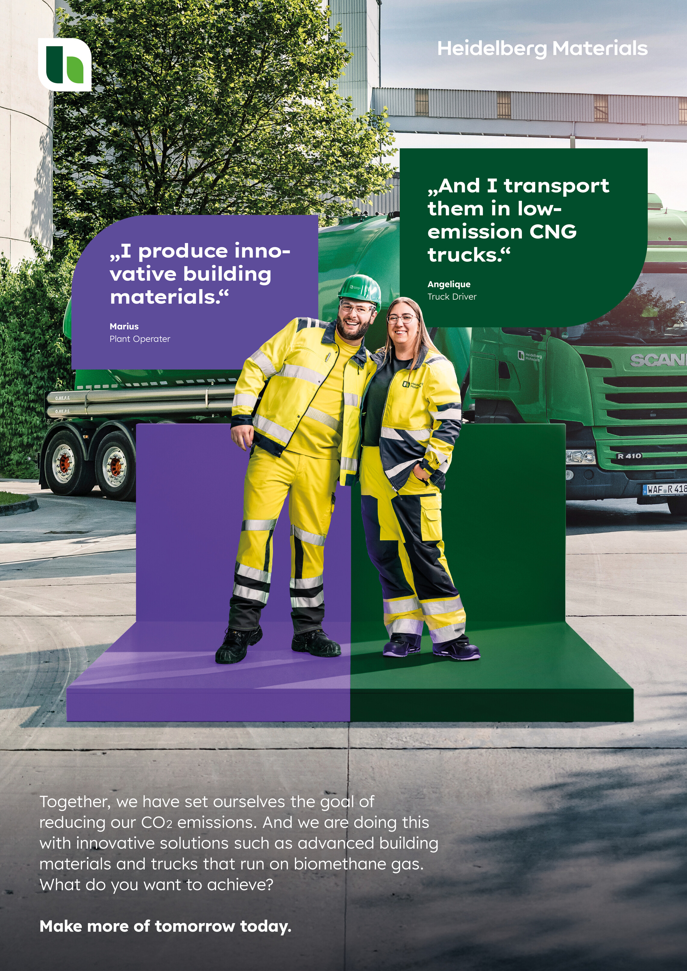

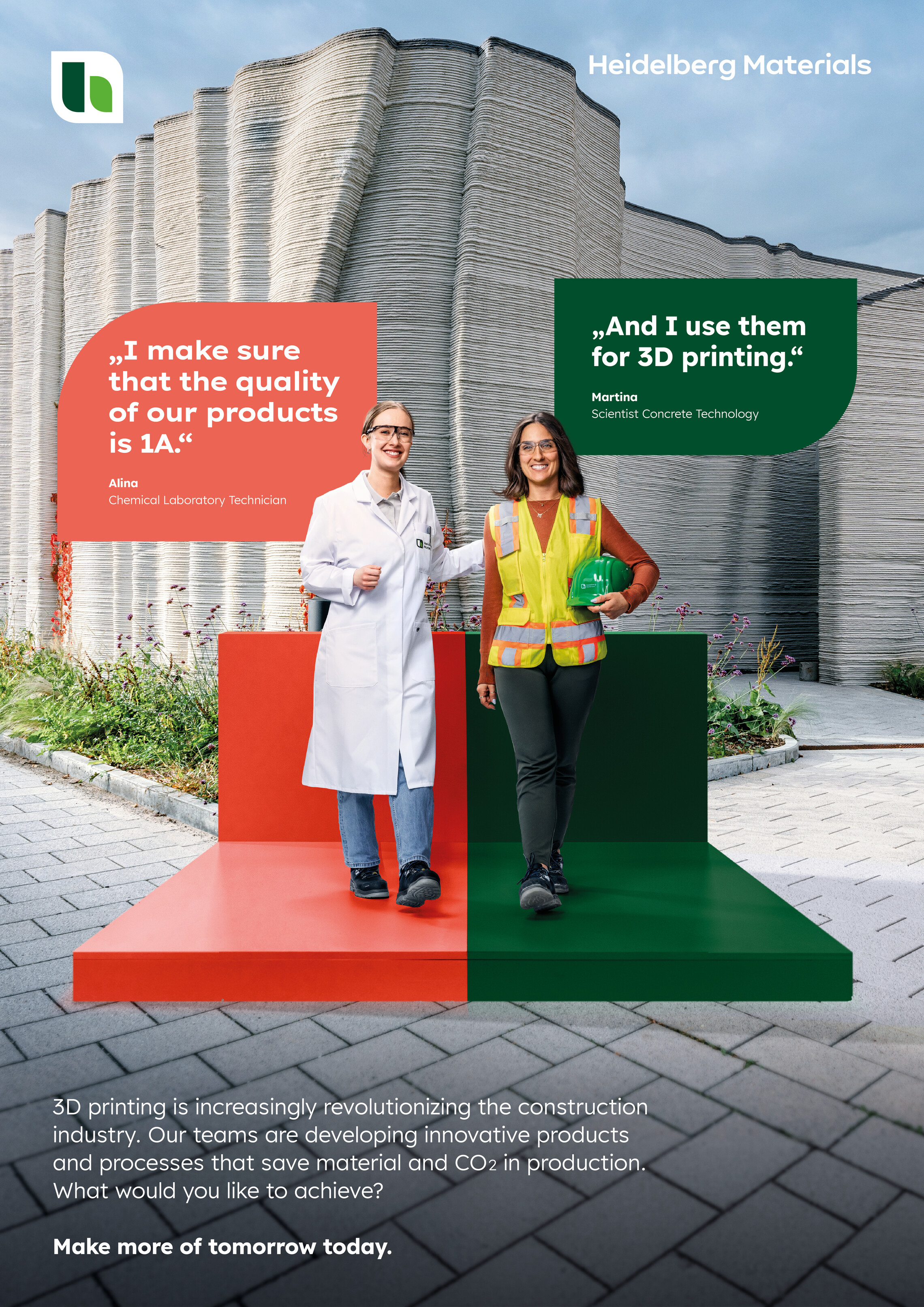

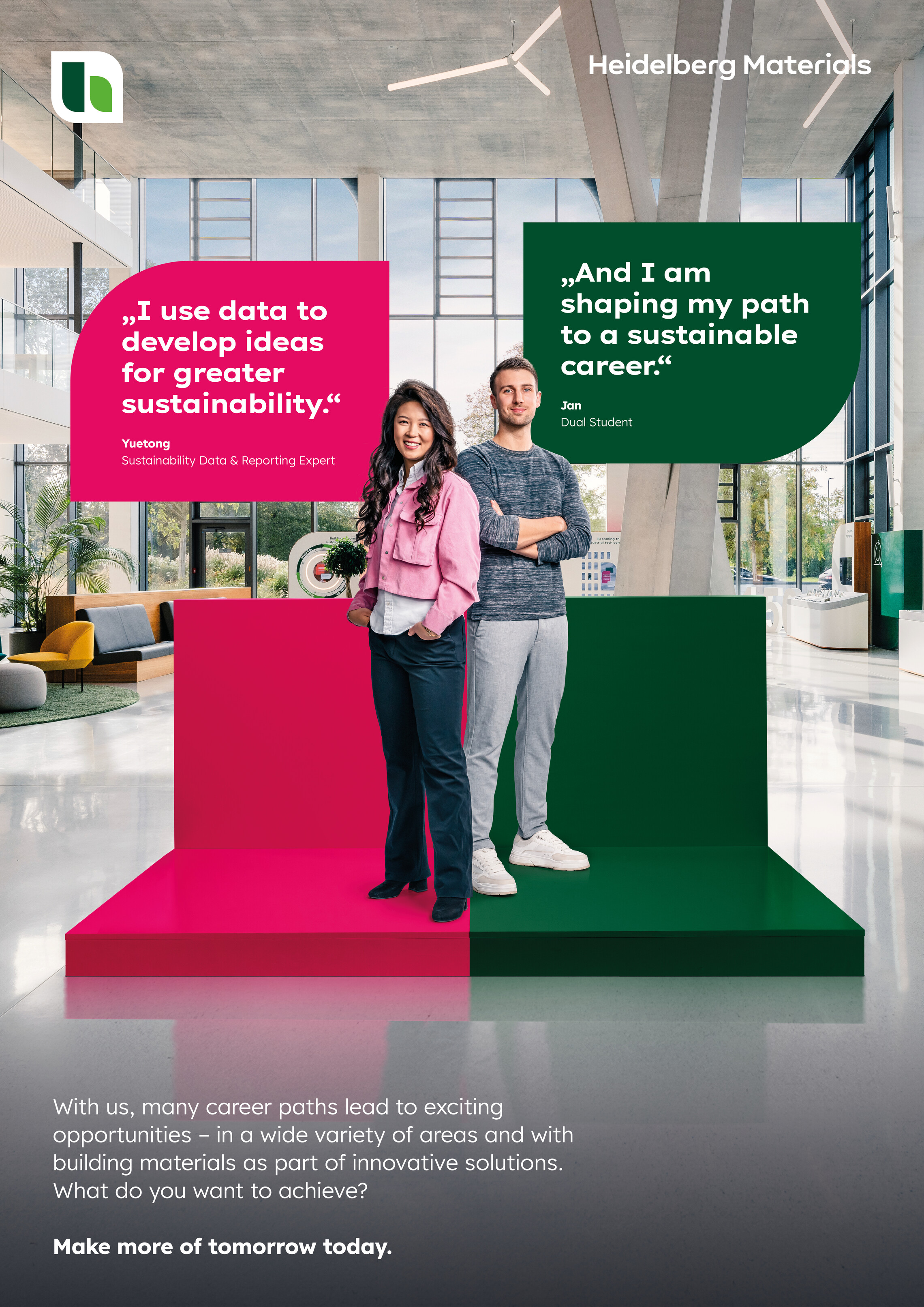

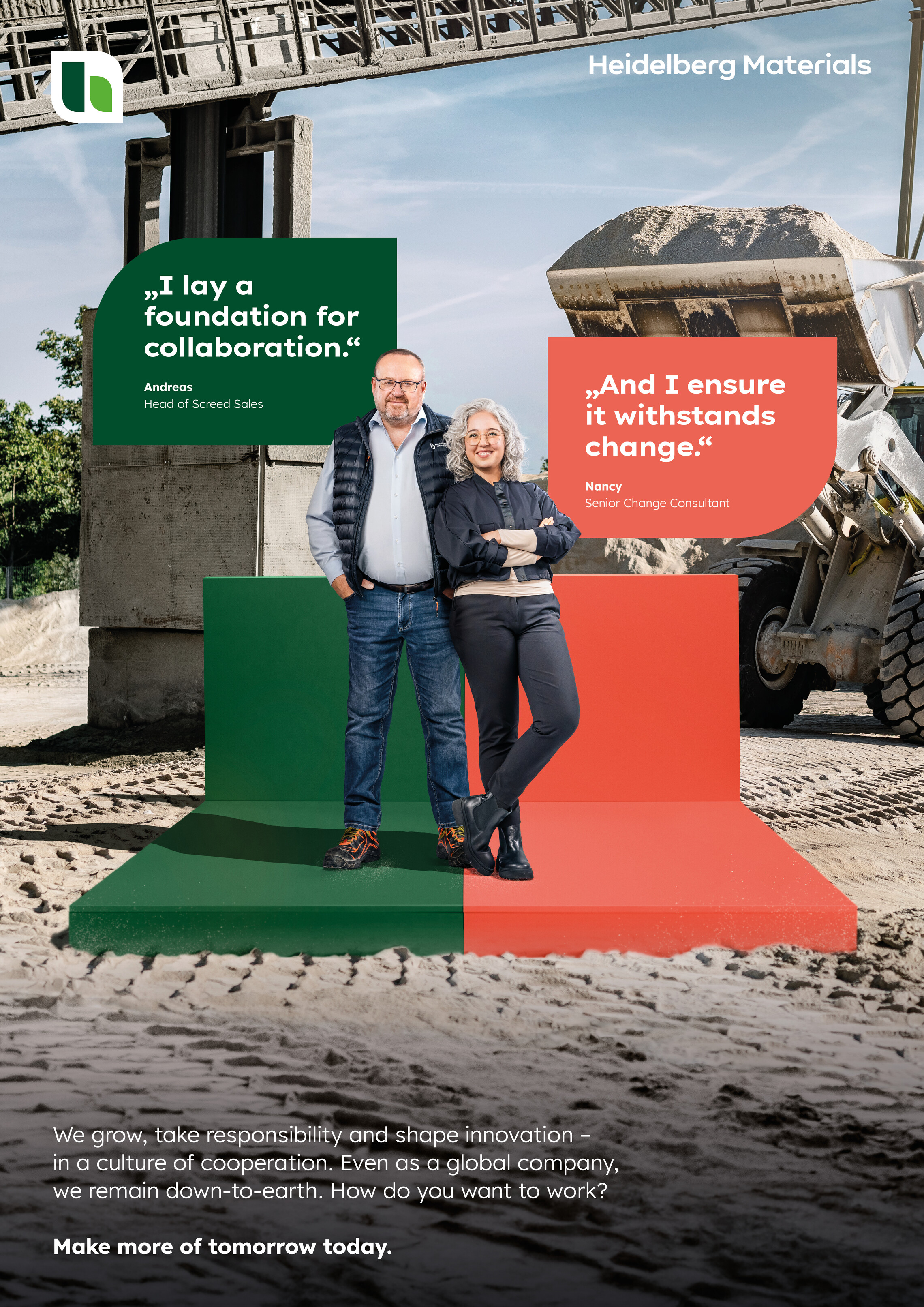

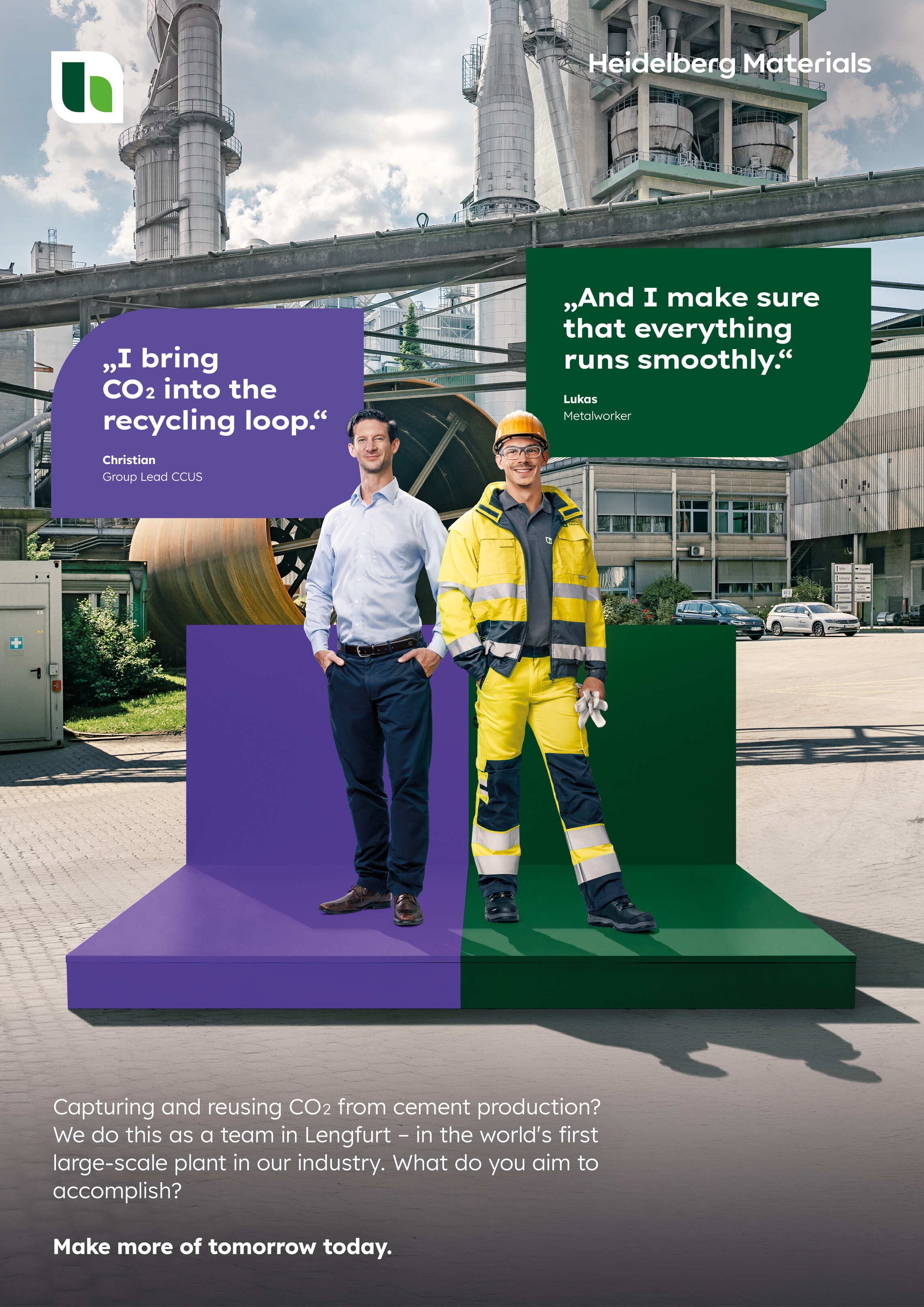

Layout structure for employer brand ads

Employees
The employees are positioned centrally in the layout. They are always clearly visible and must not appear too small. It must also be ensured that the background and relevant project remain clearly visible.
Interactions
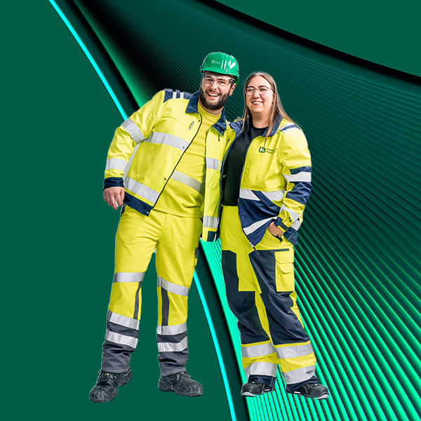
Relaxed poses and mutual interaction demonstrate the cohesion across teams and help to make the synergies that exist between individual trades more tangible. Optional interaction with the camera makes the image more dynamic and speaks directly to the target group. Suitable props may also be used.
Interactions

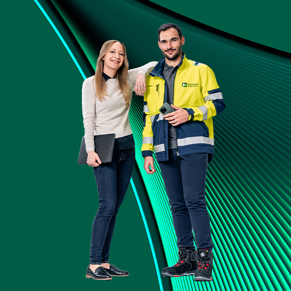

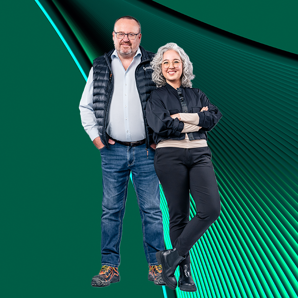

Interactions
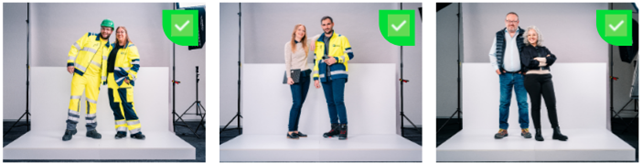

Headlines
The two quotes from the headline mechanics are always placed in two different-colored shapes (scroll down to see the color combinations). In addition, the quote always appears in combination with the respective person’s name and job title. The shapes can be overlapped slightly by the employee images and may also be offset.
Copy (body text)
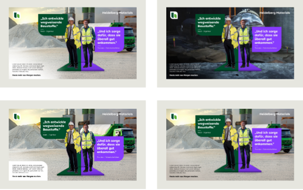
The copy is always placed in a neutral area at the corner of the layout. This can be achieved either with a white shape or a neutral section of the background image.
If no shape is used, every background motif must feature a neutral space in the copy area to ensure clear legibility.
The copy is set against white shapes in the employer brand if the background motif does not offer sufficient neutral space for the required text. The white shapes must only be used for the employer branding

Claim
- Is placed below the copy
- Is always set in the font Lexend HM Bold
- Must have at least the same font size as the copy
- Is shown in black, white or dark gray, depending on the background color
Logo
In the employer brand, the floating logo is used in accordance with the brand design.
Formats
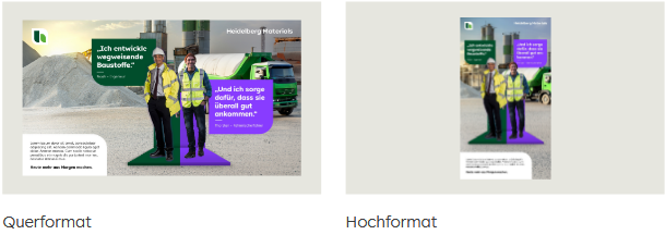
The final formats are displayed here, such as landscape, portrait, square, etc.

Layout structure for job ads
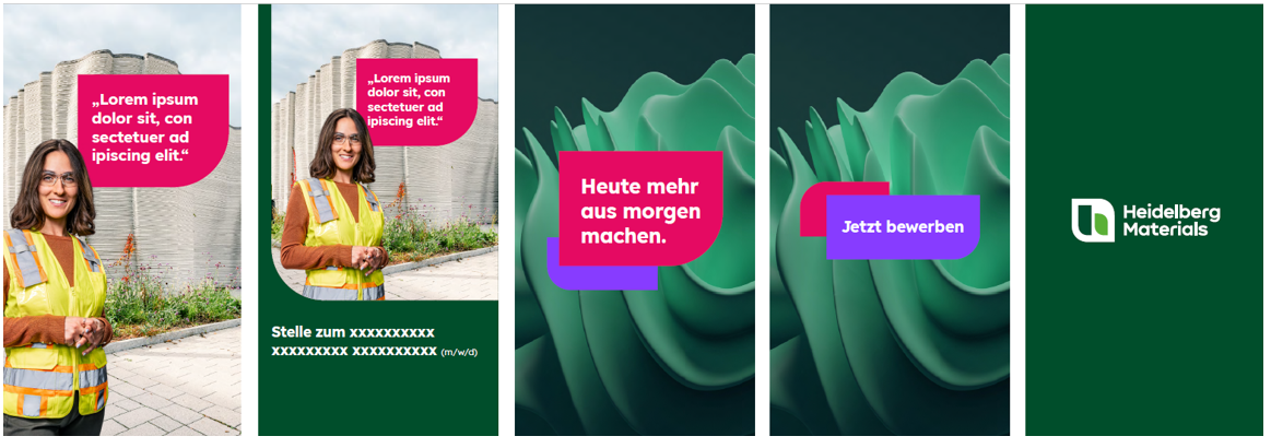
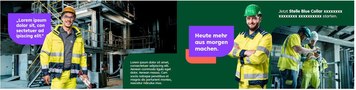
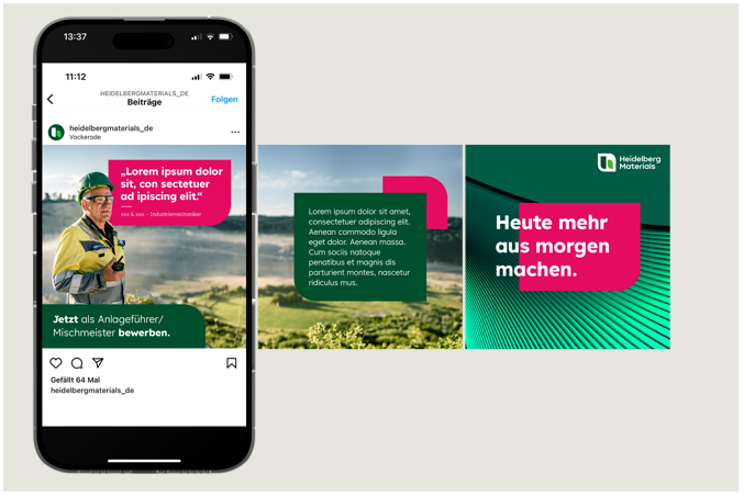
The composition of job advertisements serves as a general guideline for the layout composition. The presentation and structure can vary according to the respective medium, e.g., for social media ads.
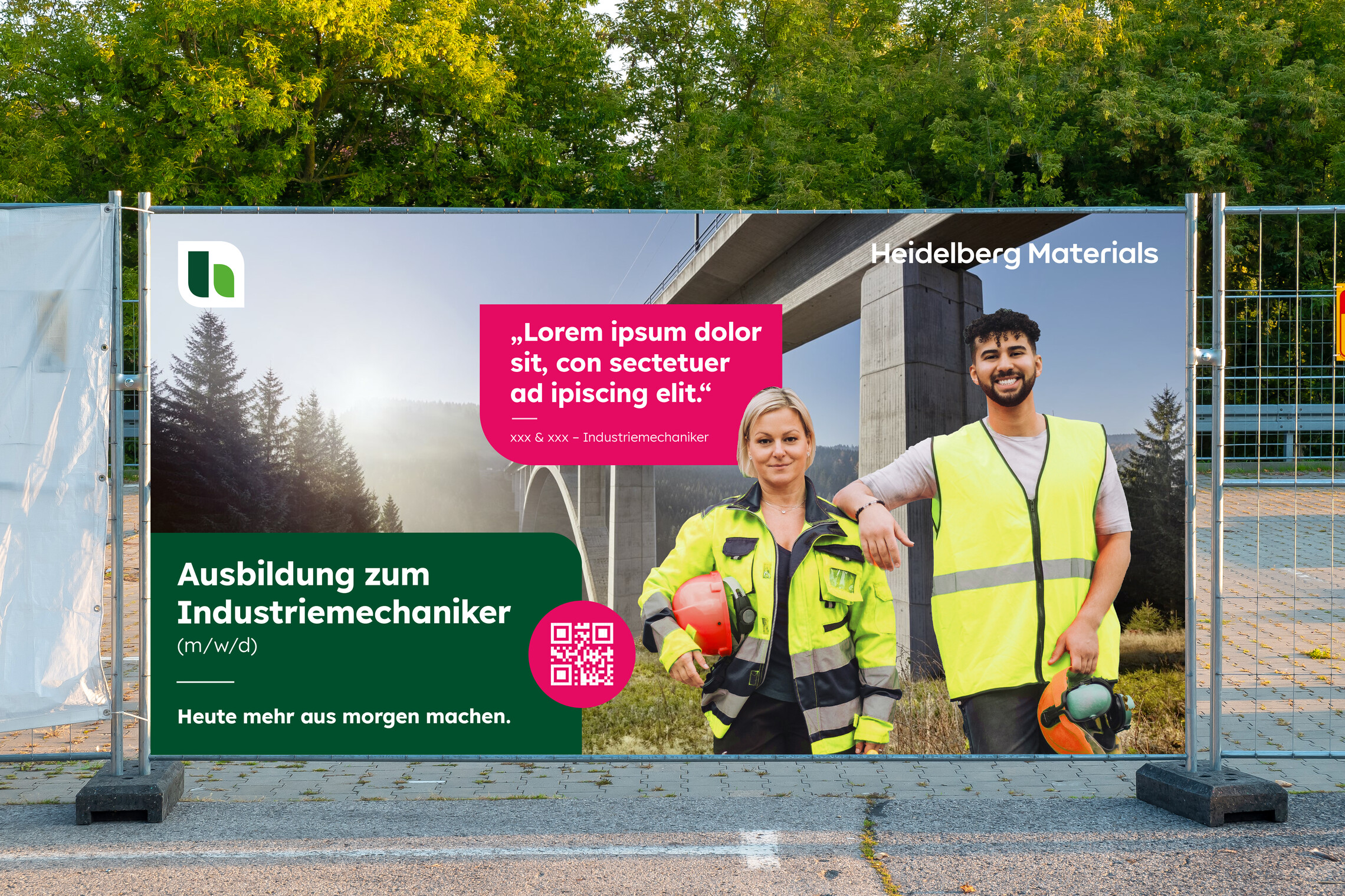

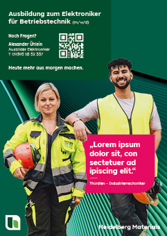

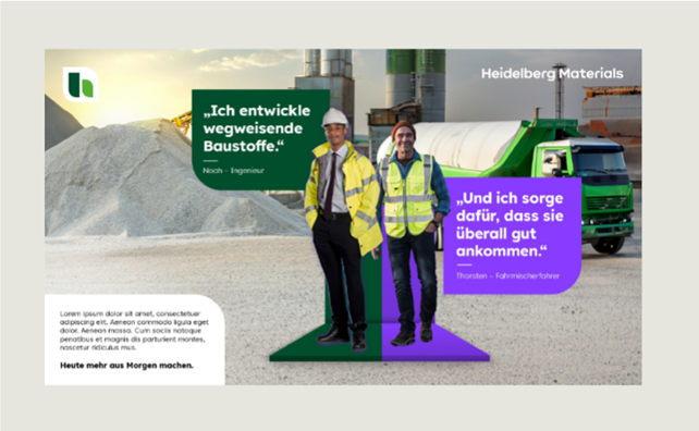
Employee motif
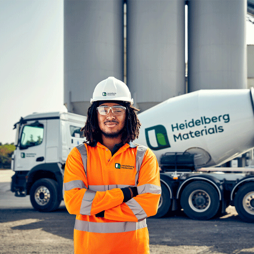
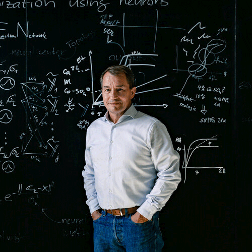
Real employees are used as freestanding images in job advertisements.
It is also possible to use existing image material along with a suitable background (see criteria).
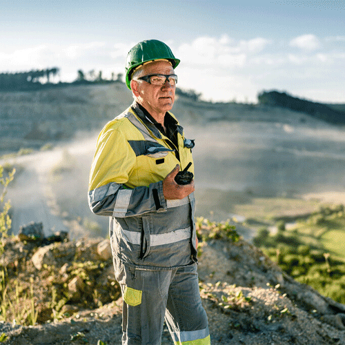
Existing image material
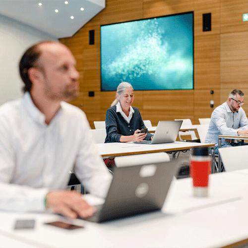
Existing image material can also be used within the job advertisements. The following criteria must be met in this case:
- The employee is in focus in the foreground of the photo.
- The employee is not overlapped or in any way covered by objects and is clearly visible (no blurring).
- The background should remain visible (slight blurring is acceptable).
- Sufficient background should be visible.
- One or more persons of the relevant target group can be shown.










Background
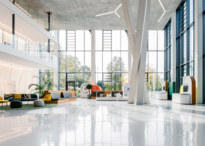
The backgrounds are used as required and are interchangeable. They can show projects, locations, or working situations. Both when adding motifs at a later stage and when using existing image material, it must be ensured that the background is not too busy and does not distract from the core message. Alternatively, the abstract CGI backgrounds may also be used depending on individual requirements.



Headline (here: quote)
The shape in deep green or one of the inspiring colors must always be placed next to the respective employee and contains a quote that is relevant to the topic. The quote must surprise with its message in order to capture attention and arouse interest. Depending on the motif, the shapes can vary in height to suit the individual layout. The rounded corner of the shape is always located at the bottom left or right and points away from the employee.
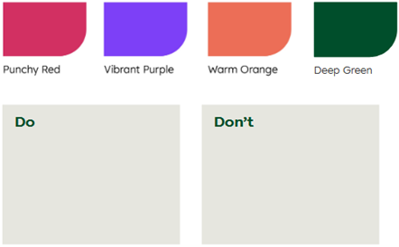

Shape as info/text box
In our employer brand, we always use shapes for text content instead of rectangular info boxes. A shape colored in deep green is always used for the information to be conveyed in the advertisement. The shape is placed in one of the corners of the image. Text content varies according to the advertising medium.
The campaign claim always appears as the boilerplate/call-to-action of the advertisement text.
Example advertisements
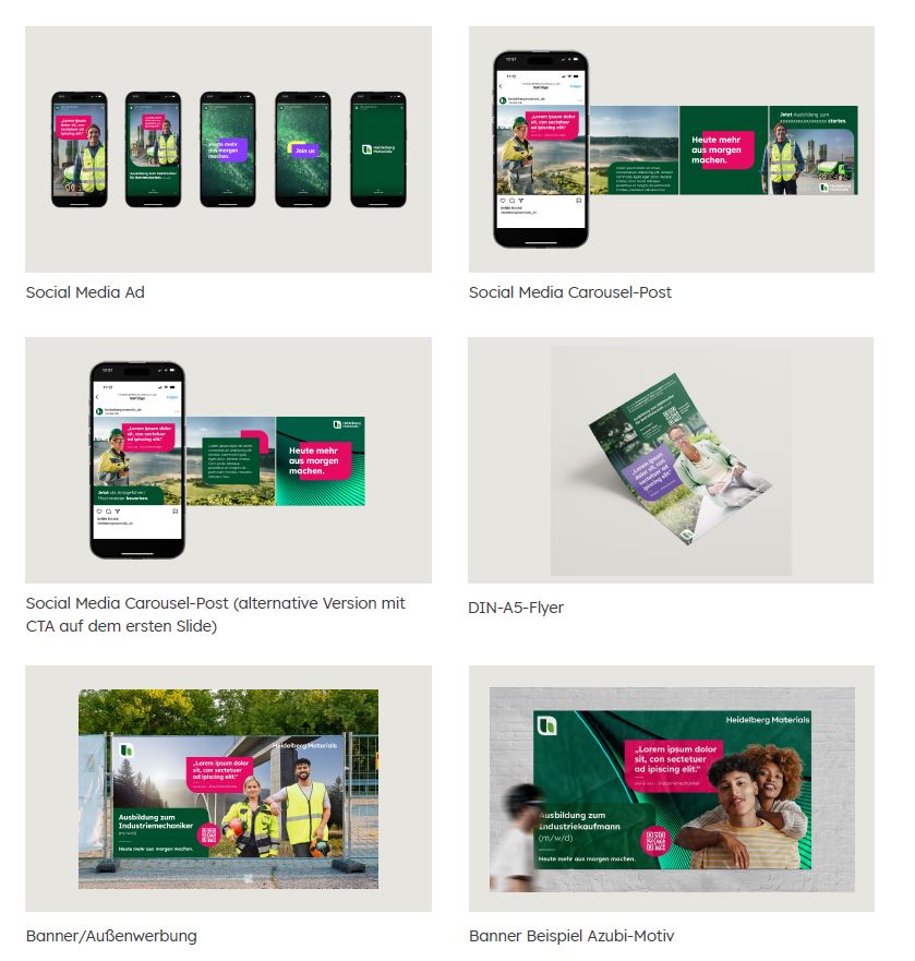

Colour codes
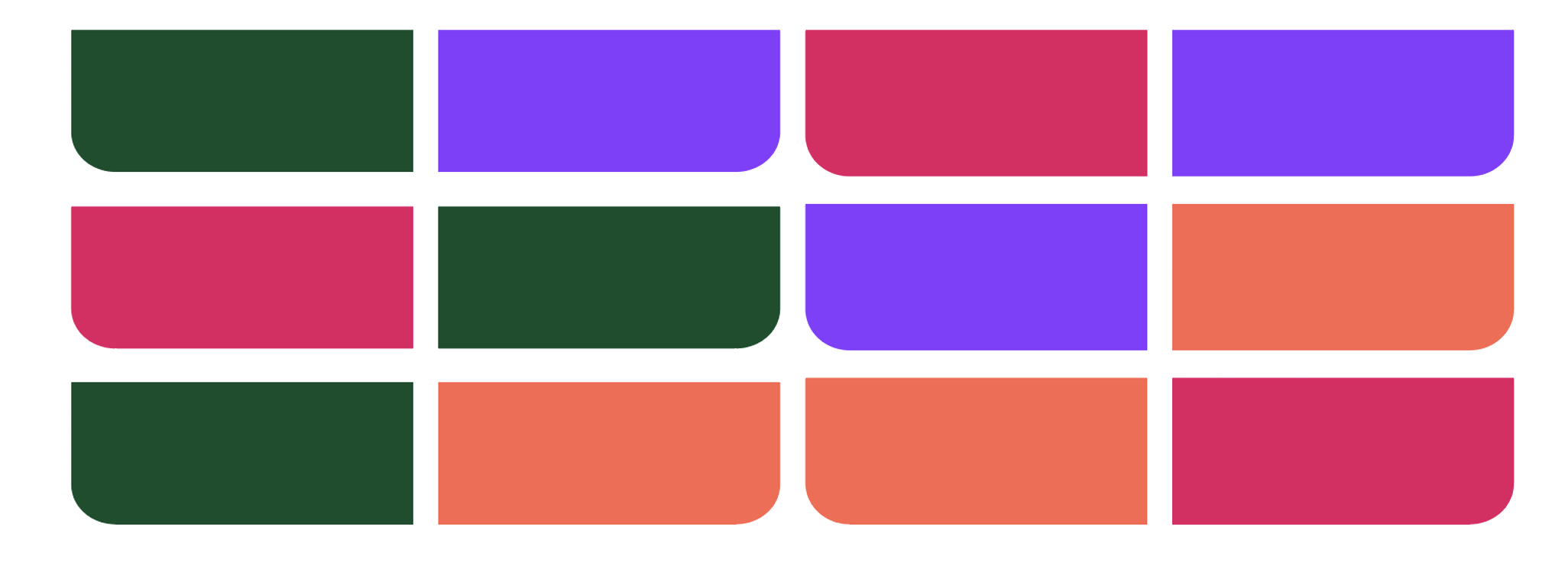
Mixture of inspiring colors + primary color deep green
To reflect the professional diversity of Heidelberg Materials and to create exciting, contrasting combinations, we freely combine deep green with the inspiring colors in our employer brand.
The color combinations are defined individually for each visual. Therefore, no direct correlation exists between the individual trades and colors, and this ensures that the image gives a consistent overall impression. In employer brand advertisements, it must be ensured that shapes are always filled with the primary color deep green.

Colour Codes
Further information on the colors and color values can be found here
HeidelMate
Guideline
HeidelMate is our internal community that promotes cohesion and collaboration. Through various activities and initiatives, we strengthen the sense of community and create a positive work atmosphere. Our employees are proud to be part of Heidelberg Materials and to work together towards a sustainable future.
HeidelMate offers numerous opportunities for networking, knowledge exchange, and participation in social and professional events. We foster a culture of inclusion and mutual respect, where every employee is valued and supported.
Both merchandise (e.g. textiles or small items) and (text) design (online/offline) must follow the visual and textual concept of the brand in order to ensure a uniform and professional appearance of the brand and achieve a clear recognition effect. There are therefore fixed rules for each logo variant.
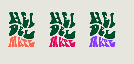
Font logo – variant 1

Areas of application
Lifestyle merchandise (e.g. textiles such as shirts, sweaters, etc.)
Colours
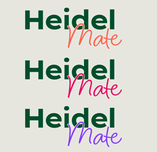
The font logo part “Heidel” is always colored in Deep Green. The “Mates” font logo part can be coloured in Punchy Red, Vibrant Purple or Warm Orange.
Important: Depending on the application, it is permitted to use the logo variant in both positive and negative representation.
Font logo – variant 2

Areas of application
Website, text elements, smaller merchandise items (e.g. pens, lanyards, notepads, etc.)
Colours
The font logo part “Heidel” is always colored in Deep Green. The “Mates” font logo part can be coloured in Punchy Red, Vibrant Purple or Warm Orange.
Important: Depending on the application, it is permitted to use the logo variant in both positive and negative representation.
HeidelMate usage
Internal communication
- HeidelMate can be used, but care should be taken to ensure that the context is appropriate and that it does not completely replace the formal address.
- In the case of informal communication, HeidelMate can be used in combination with a formal address. For example: “Dear colleagues, dear HeidelMates,...”
- Further examples: HeidelMate can be used for internal posts (intranet, Viva Engage) or informal meetings.
External communication:
- Career fairs, job advertisements / image advertisements in recruiting, social media [LinkedIn, Meta, etc.]
- The term HeidelMate generally requires a recruiting or employer branding context. One example of this is a career fair that could run under the motto “Become a HeidelMate”.
Merch | other items

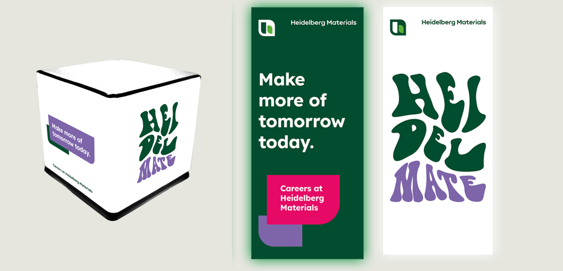
Glow cubes & light walls

Example advertisements | social media



Downloads
Important Note Regarding Login
Due to the transition to our new website, all users must
set a new password the first time they log in.
To do so, please use the “Forgot Password” feature and
follow the instructions.
Thank you for your understanding.