Basic Elements
In order to achieve a distinctive appearance, we have defined styles that make it possible to create highly recognisable user interfaces and digital experiences.
Design system

The block system
The block system is our flexible layout system and the basis for everything we design. We use it in all formats and media. This simple approach helps us determine the sizes, proportions and spacing of the design elements.
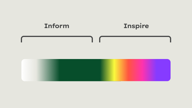

Level of expression
We derived two flexible design fields from the various use cases: Inform and Inspire. These two design fields cover all our communication, whether print or digital, emotional or functional. The overarching colour scheme is always green.
Simply choose the level of expression that best suits the context
CTA
Learn more about our layout principles in the Design system section.
Logo

For most digital media, the single-line logo variant is the best choice because it is easier to read in small sizes.
Please note: For the design of non-digital media, please observe the basic rules for handling our logo variants. The use of the single-line logo is always an exceptional case.
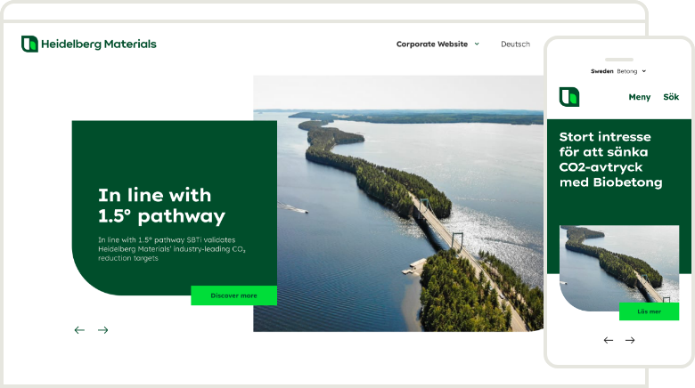

Typically, our logo should only be used as a combination of the icon and the word mark. However, to ensure the responsiveness of applications, the icon can be used without the word mark in very narrow formats, e.g. for mobile applications.
Colours
Our basic colour palette is also applied in user interfaces. Additionally, functional and structuring colours are available particularly for this application.
Proportions
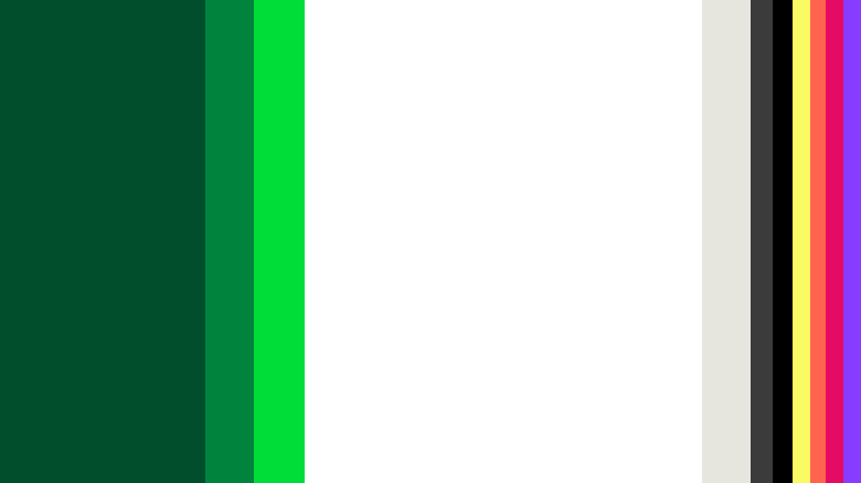

The white as a calm background colour and the green colours dominate the colourfulness of our user interfaces.
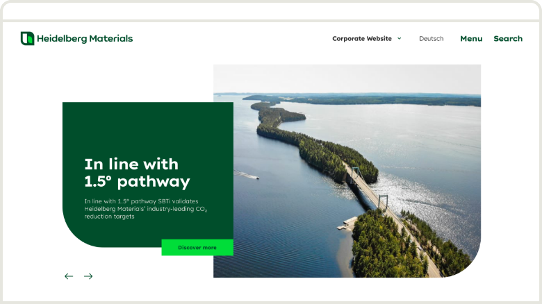

Lots of white space in combination with green areas ensure a clear and functional digital interface and a high level of brand recognition.
Functional application
Primary
Primary
Our primary colours ensure brand recognition and provide contrast and structure in our layouts. They shape the overall visual impression of our applications.
Deep Green


HEX: #004E2B
RGB: 0 | 78 | 43
Sandy Grey


HEX: #E6E6DF
RGB: 230 | 230 | 223
White


HEX: #FFFFFF
RGB: 255 | 255 | 255
Primary shades
Primary shades
Primary shades are mainly used for section backgrounds.
Deep Green 15%


HEX: #D9E4DF
RGB: 217 | 228 | 223
Sandy Grey 60%


HEX: #F0F0EC
RGB: 240 | 240 | 236
Interaction
Interaction
Interaction colours are mainly used for buttons, links or notifications.
Bright Green


HEX: #00DD39
RGB: 0 | 221 | 57
Mid Green


HEX: #00843D
RGB: 0 | 132 | 61
Grey
Grey
Grey colours are mainly used for copy.
Dark Grey


HEX: #3B3B3B
RGB: 59 | 59 | 59
Dark Grey 75%


HEX: #6C6C6C
RGB: 108 | 108 | 108
Dark Grey 55%


HEX: #939393
RGB: 147 | 147 | 147
Secondary
Secondary
Secondary colours are mainly used for shapes.
Spark Yellow


HEX: #FAFA64
RGB: 250 | 250 | 100
Vibrant Purple


HEX: #873CFF
RGB: 135 | 60 | 255
Warm Orange


HEX: #FF644E
RGB: 255 | 100 | 78
Punchy Red


HEX: #E50A62
RGB: 229 | 10 | 98
How to use colour shades
How to use colour shades
Shades of our primary colours may be used to structure content and highlight functional features.


Deep Green 15%
HEX: #D9E4DF
RGB: 217 | 228 | 223


Sandy Grey 60%
HEX: #F0F0EC
RGB: 240 | 240 | 236


Use Sandy Grey 60% to structure any general content sections.
How to use the Inspiring colours
How to use the Inspiring colours
Inspiring colours attract attention and add variety to our media. They should be used pointedly to highlight content. They should not be used excessively so as not to distract from the content.


Our recognizable Deep Green should always be displayed prominently in headers.


In the header area, inspiring colours may only be used in conjunction with a Deep Green shape or background.


In the content area, inspiring colours may be used without a green shape or background.
Learn more about colours in the Colours section
Typography
In general, we also use fonts in user interfaces in accordance with our Typography guideline. However, to meet the special requirements in digital media, there are some extended typographical options documented below.
Type families


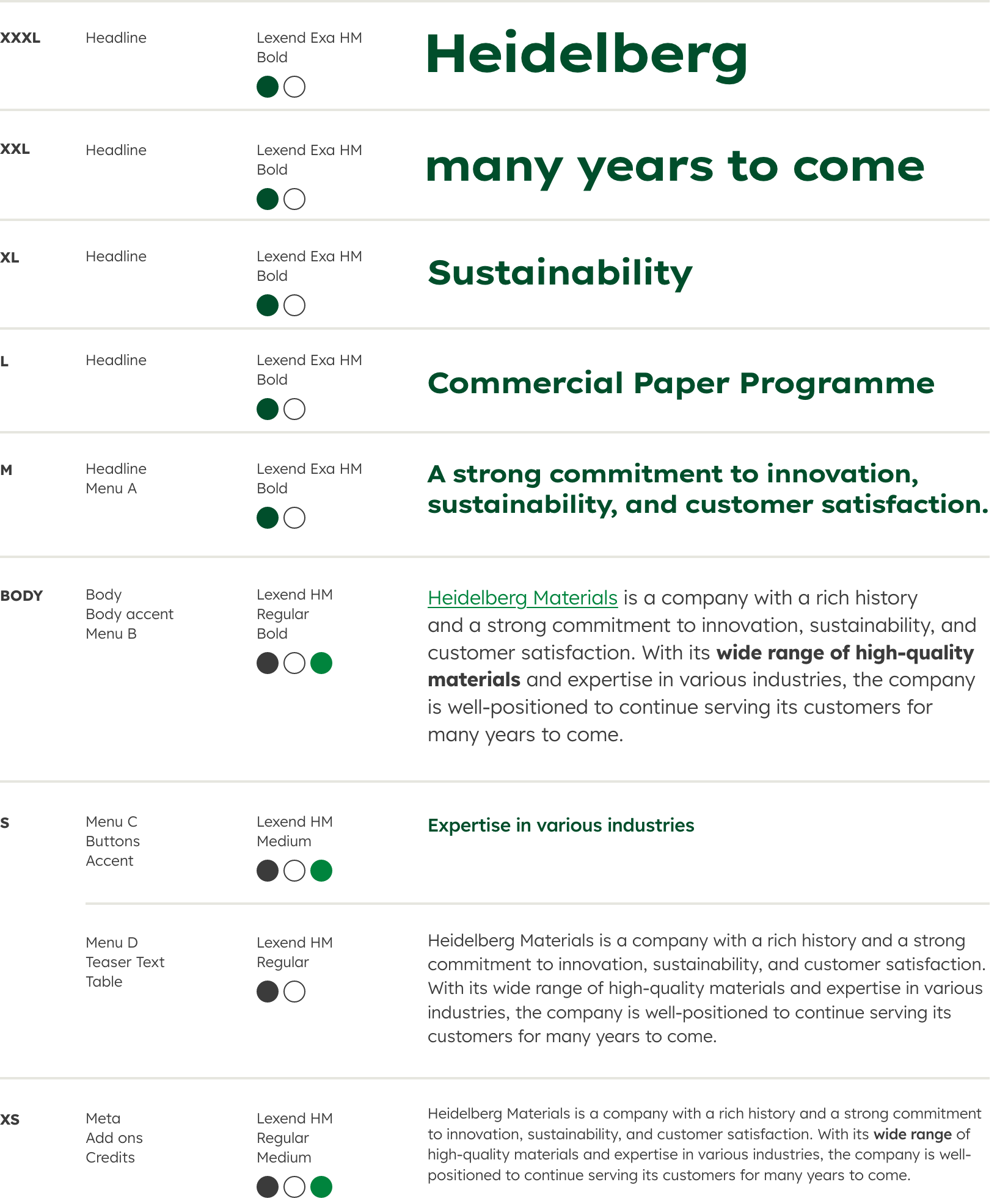
Lexend Exa HM is a strong character typeface that shapes the overall image of our brand. Therefore we use it for headlines and sublines.
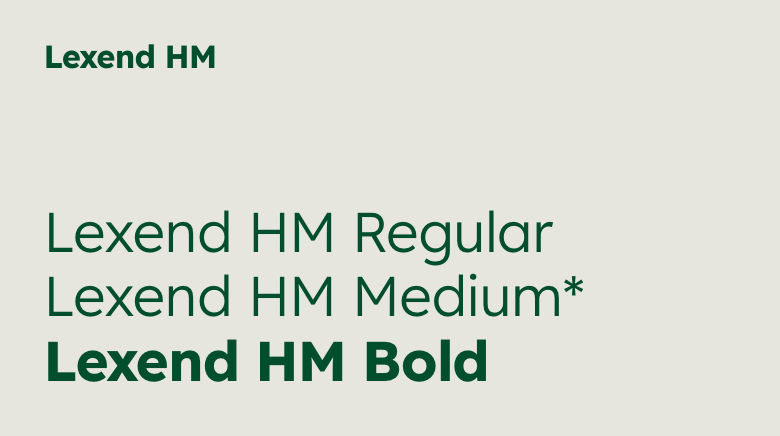

Lexend HM features excellent legibility and is used for body text, menus and buttons. We offer a medium font-weight for digital applications, which can be requested from the Brand Support.
*only for UI design
Text styles

Icons
Our icons are visual symbols used to represent ideas, objects or actions. We have divided our icon sets into two categories: Illustrative icons and UI icons.
Categories


Illustrative icons structure information and make it easy to grasp. They can be used in large sizes and thus also serve to represent our brand.


UI icons are used on a functional level and for interactions. They are optimised for small sizes and should only be used in this way.
UI Icon Set
Variants
Variants
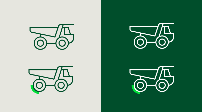

The icons can be used with or without a corner accent. The corner accent quotes the shapes and creates a visual link to the logo. It is always to be used in Bright Green. The corner accent can also be used as a hover.
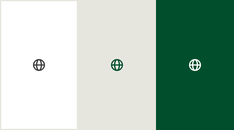

Our UI icons have been designed to work best in four sizes: 16 px, 20 px, 24 px, and 32 px. You can use the UI icons in the colours Dark Grey, Deep Green or White.
Usage
Usage
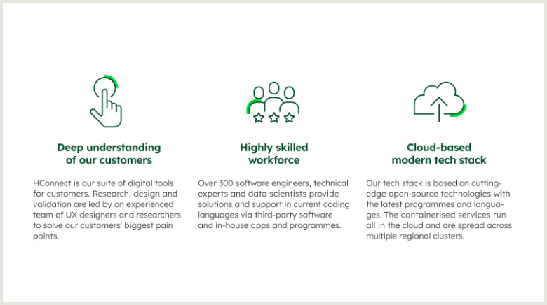

Illustrative icons can be used to visually support the message of a text, to represent categories and to structure information.

UI icons refer to particular functionalities and can be used in conjunction with text as well as on their own.
Structure and hierarchy
For a structured and user-friendly representation of our content, we clearly separate sections from each other. This can be achieved by using different background colours or size ratios of design elements.
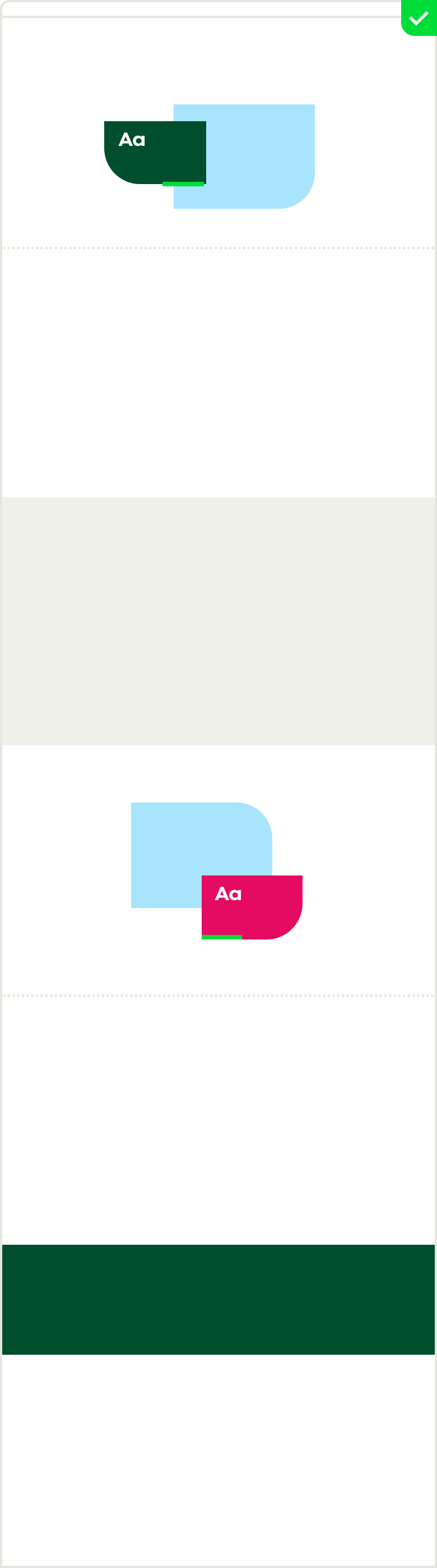

Create excitement by alternating important and less important content. Coloured backgrounds should be used with care and alternate with white areas. Use stronger contrasts for a stronger emphasis of the content.
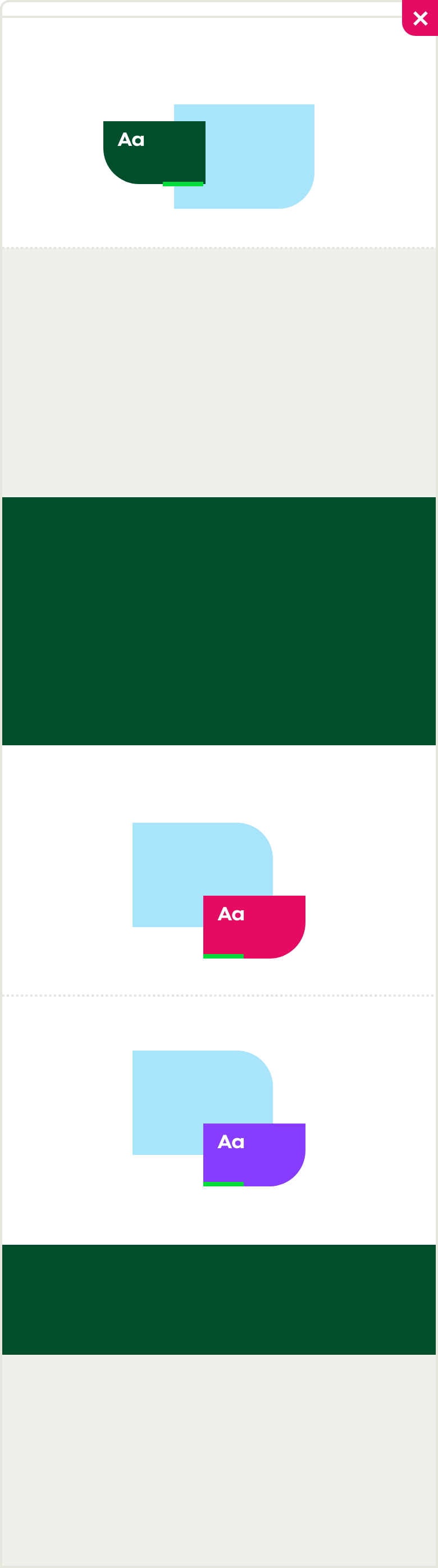

Do not use the same module twice in a row.
Spacing
Spacing is the space between elements and components in our layouts. Always keep sufficient distance to improve the user experience and to ensure the best possible content intake.
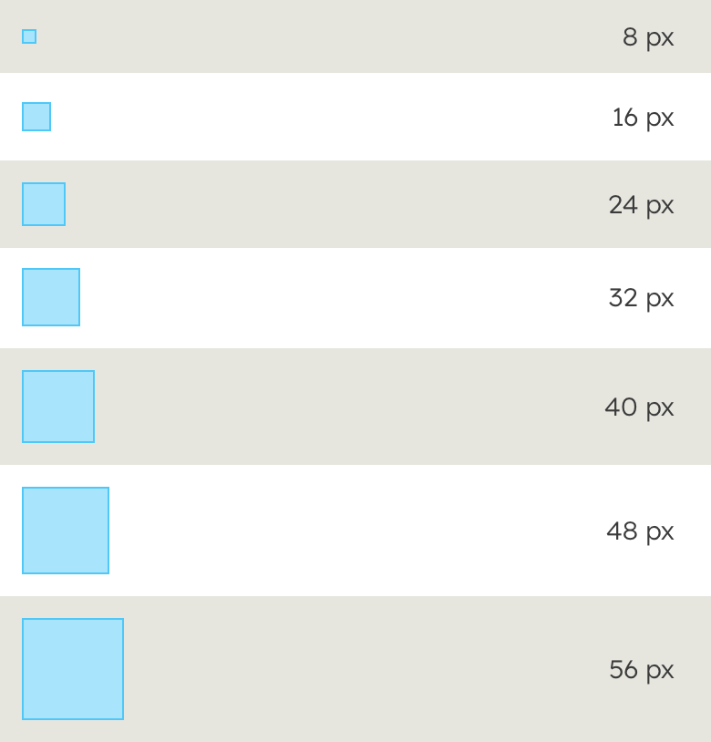

Our spacing scale is divided into 8 px intervals.
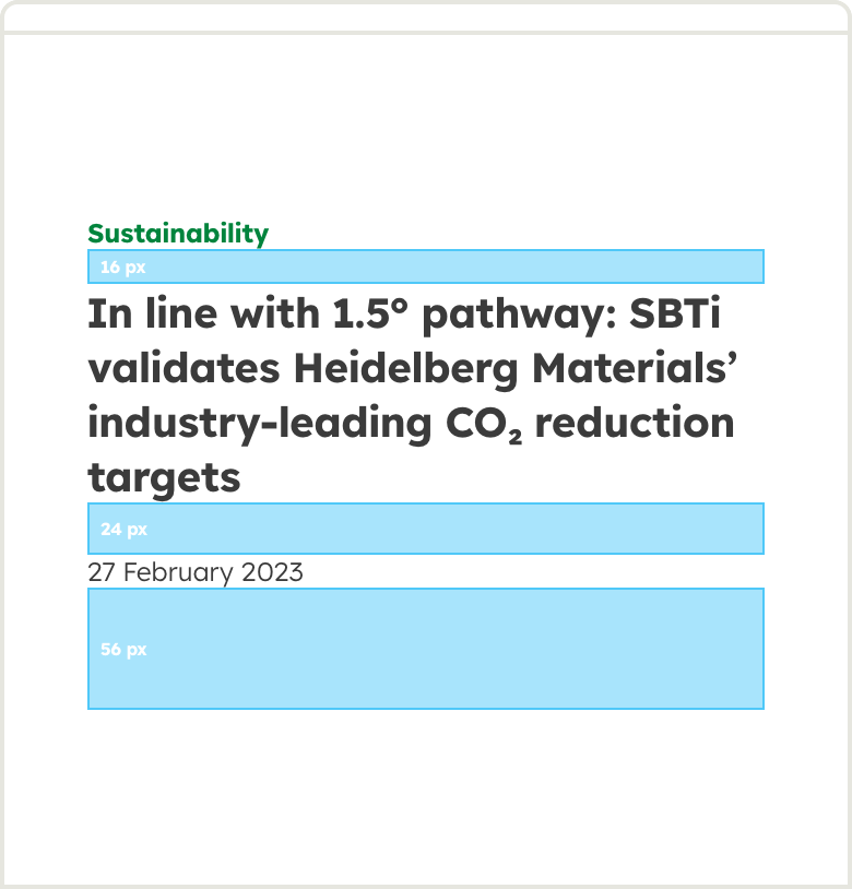

Example of how we work with spacing.
CTA
Learn more about our layout principles in the Design system section.
Contact
Any questions about our guidelines?
Contact us.
- N Support
- T + 49 211 690787-200
- E support@Brandhub.heidelbergmaterials.com