Departments
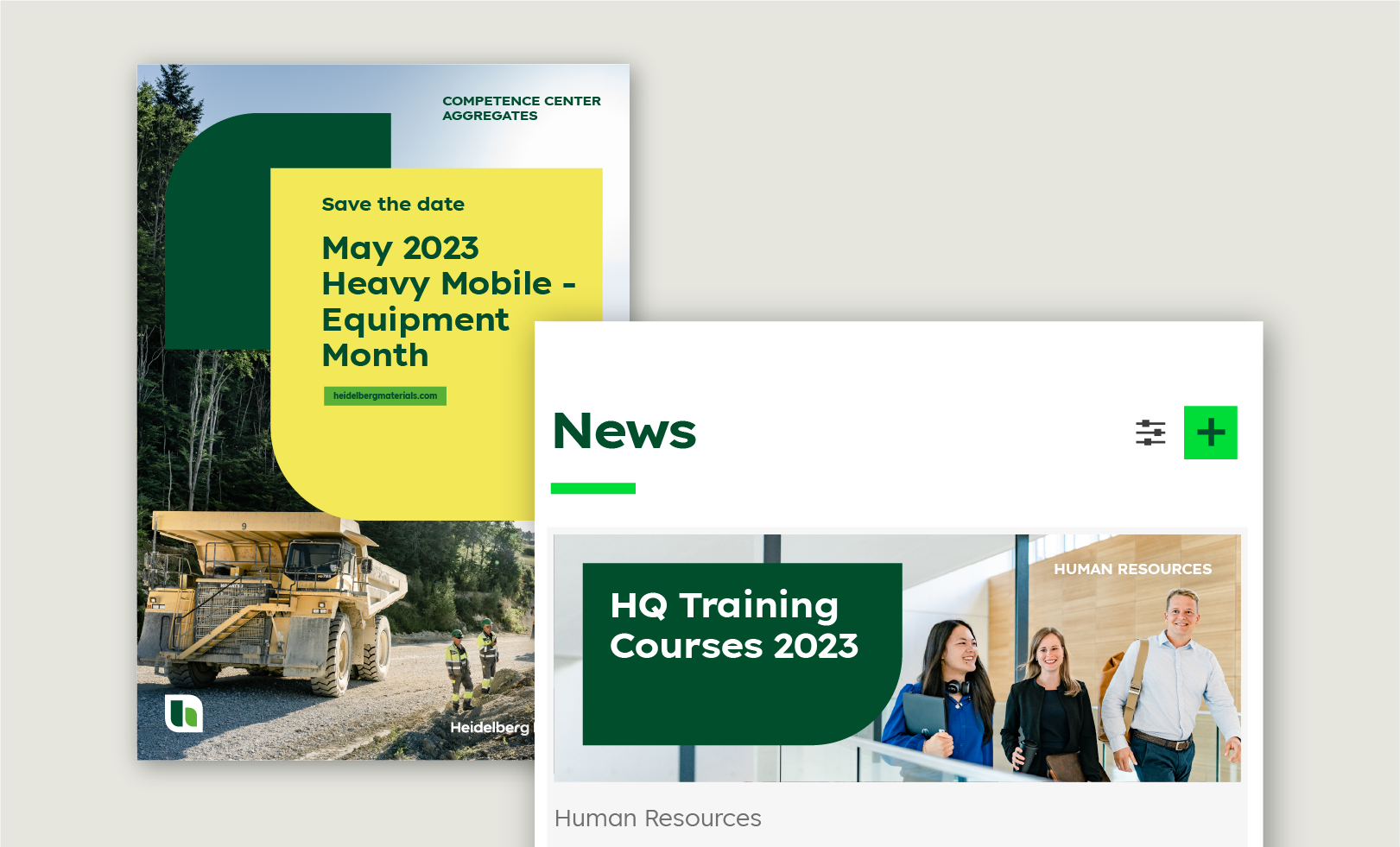

The departments of Heidelberg Materials are specialists in their respective fields and would like to share their expertise with other departments and to foster exchange with their colleagues. To give all departments a clear identity within the Heidelberg Materials corporate design, the following design parameters apply to all departments.
This section covers department design and communication. If you would like to know more about our organisational brand hierarchy, please visit the section on Brand architecture.
Criteria for department communication
When does the department act as the sender?
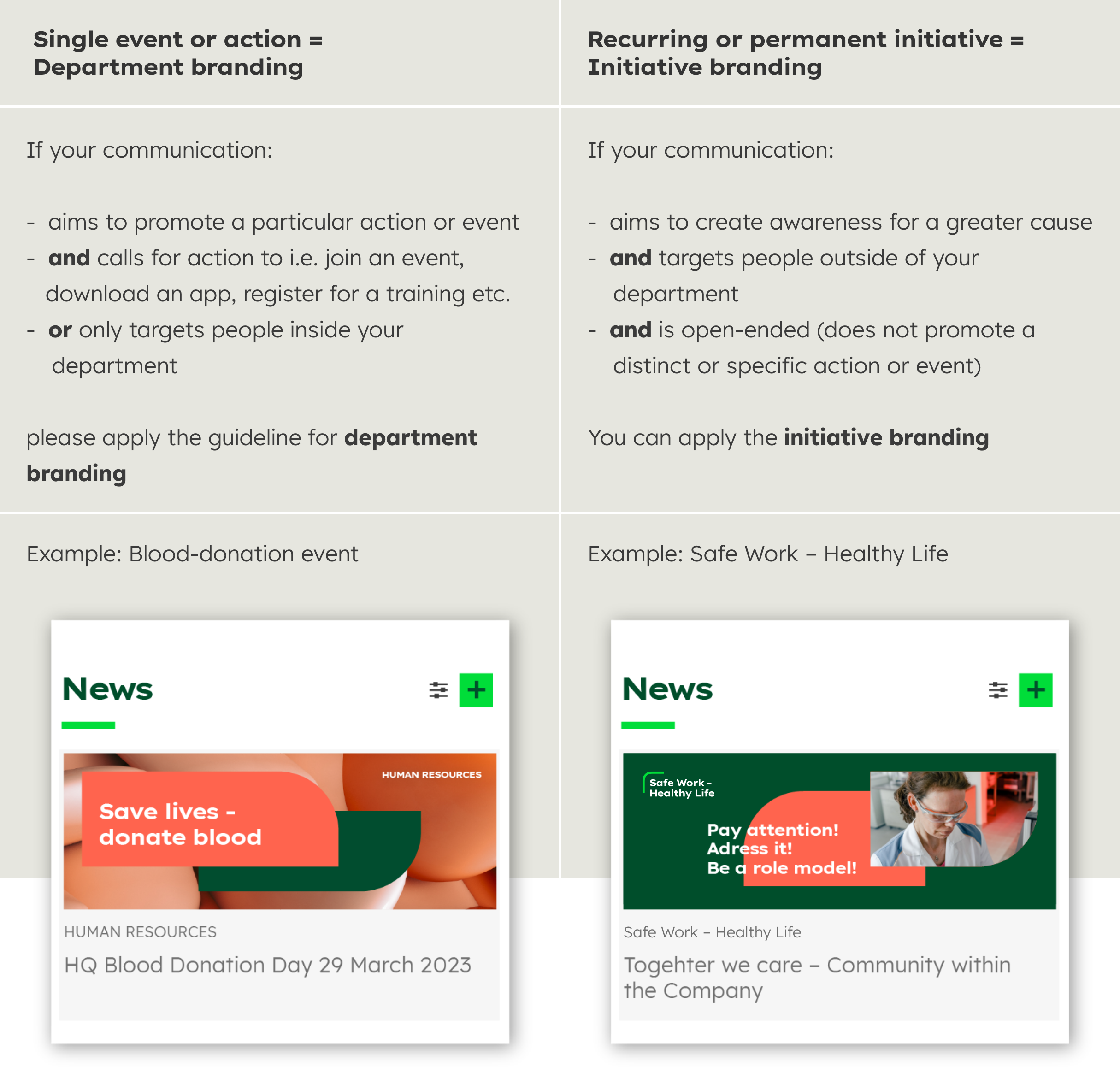

Department name
The names of the departments are written in capital letters in the font Lexend Exa HM Bold.
The colour is Deep Green or white, depending on the background.
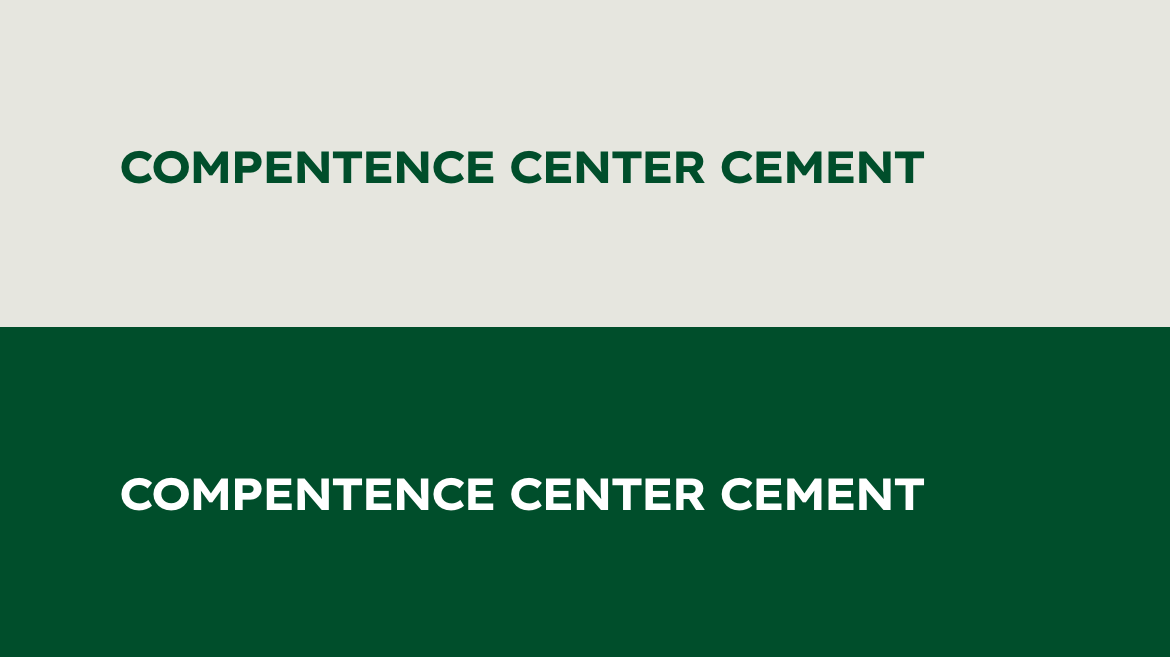

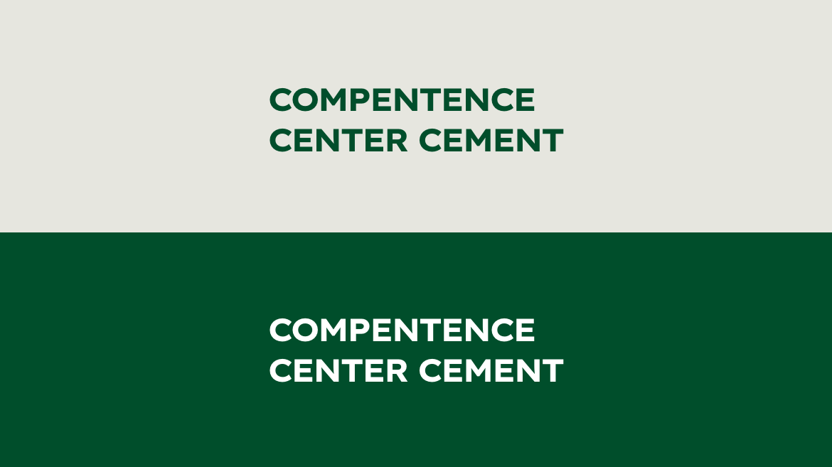

The name can be set in one or more lines, depending the space on the medium used.
Layout departments
Sizes
The font size depends on the size of the building block. The cap height is the height of the building block.
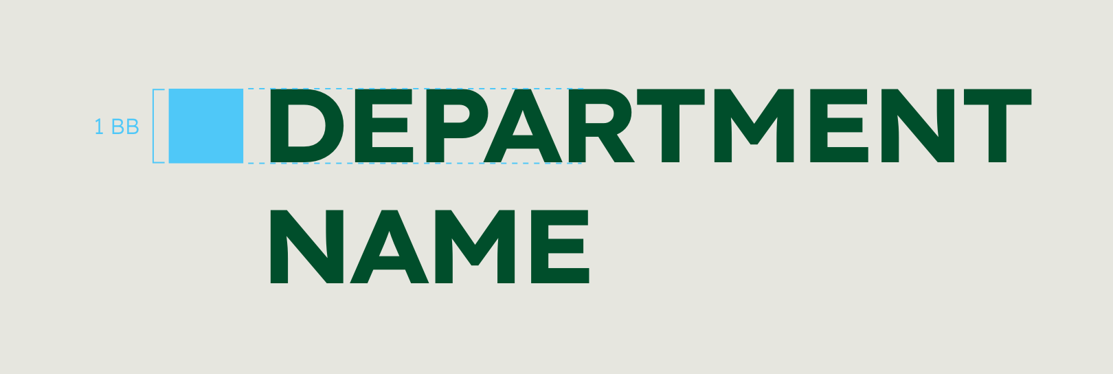

Font: Lexend Exa HM Bold, capital letters, alignment: left
Font size: 75% height of the building block, leading: 115% font size
Please note: The guidelines regarding the size only apply to the title and header. If you need to use logos in the content, please adjust the size of the logos to your layout. In general, logos should be avoided in the content area in favour of mentioning the department or initiative in the headline or topline.
Sizes of the building blocks
The sizes for the most common formats can be found below. If you cannot find your format here, this is how to calculate it:
- For landscape or portrait formats, divide the longer side of the format by 72.
- For square formats, divide by 54.
- Round to the nearest whole number.
This will give you the size of the building block.
| Format | Size | Building block Cap height | Department name font size/leading |
| DIN A4 | 210 x 297 mm | 1 BB = 4 mm | 16/18.4 pt |
| DIN A3 | 297 x 420 mm | 1 BB = 6 mm | 24/27.6 pt |
| DIN A2 | 420 x 594 mm | 1 BB = 8 mm | 32/36.8 pt |
| Powerpoint | 338.67 x 190.05 mm | 1 BB = 5 mm | 20/23 pt |
| Intranet news | 430 x 150 px | 1 BB = 6 px | 8.5/9.8 pt |
| Intranet header | 1095 x 258 px | 1 BB = 15 px | 16 pt |
| Newsletter desktop | 800 px width | 1 BB = 10 px | 14.5/12.6 pt |
| Newsletter mobile | 375 px width | 1 BB = 8 px | 11.5/13.2pt |
Positioning
The department sender is right-aligned at the top in the type-area. The type area is calculated from the format of the medium and the building blocks, see Design system.
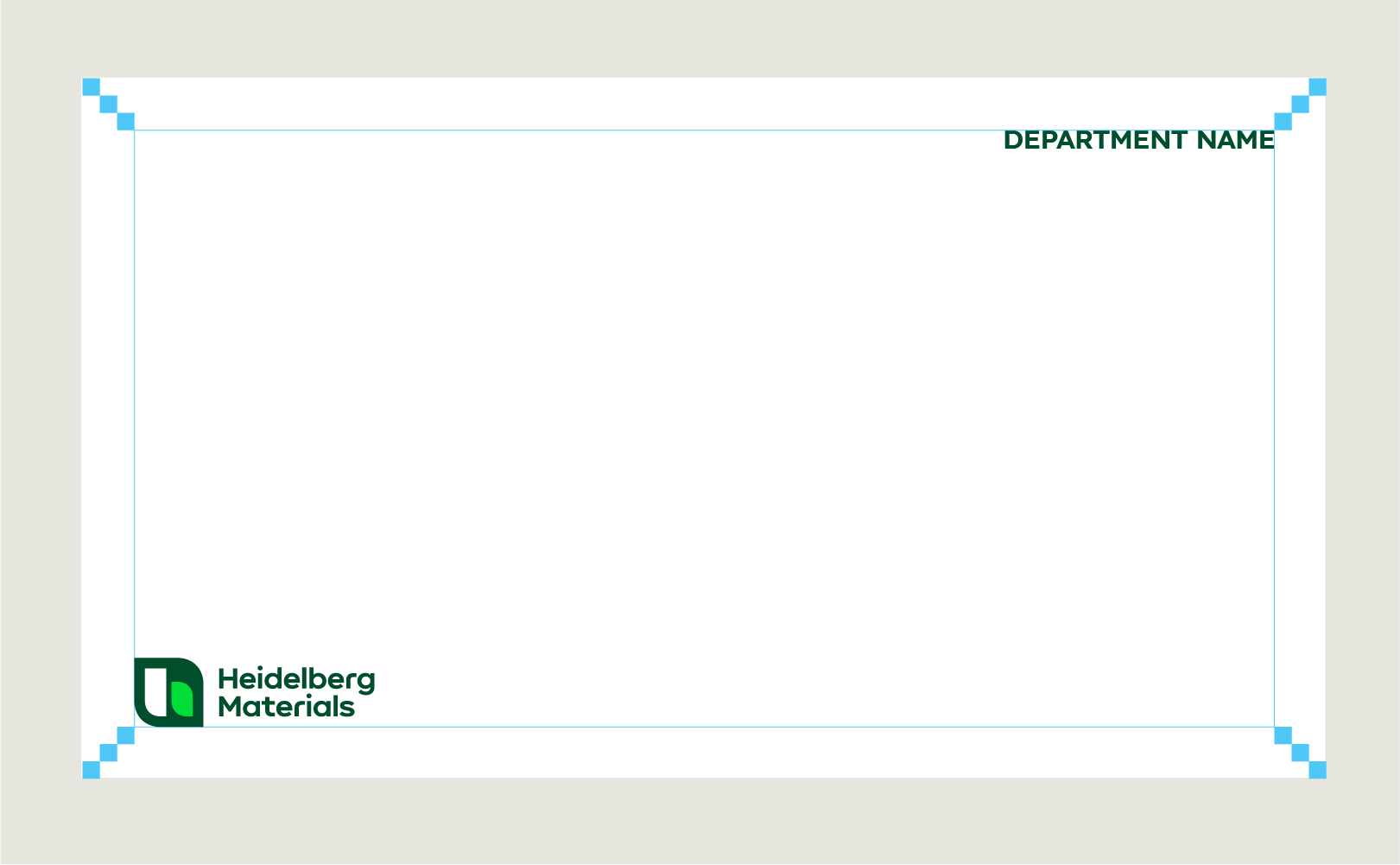

Layout departments cntd.
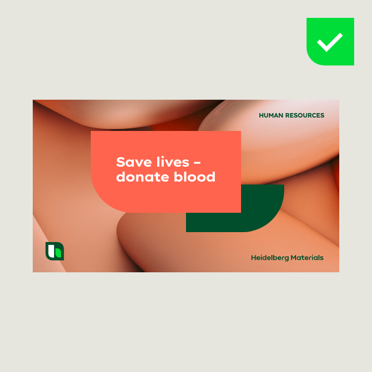

Use the department sender on single-page media such as headers or posters.
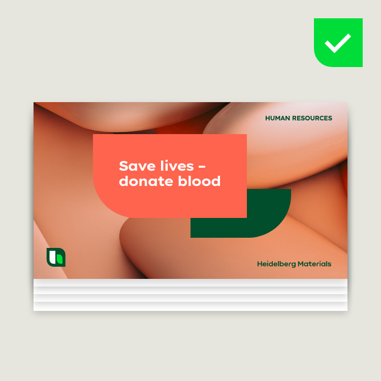

In multi-page media like presentations or brochures, use the department sender on title pages only.
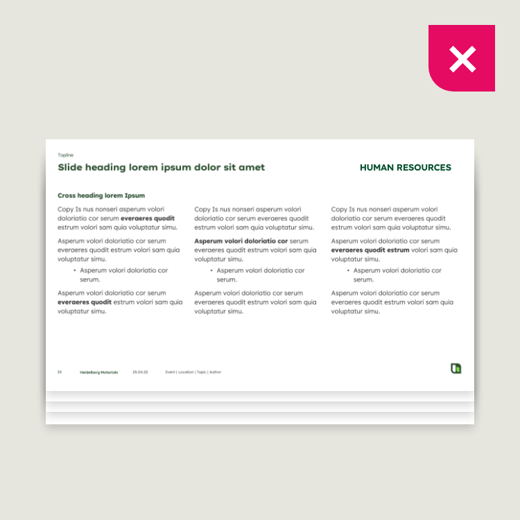

Don’t use the department sender in the content part/inner pages. If necessary, the department sender can be integrated as a (running) topline.
Department media
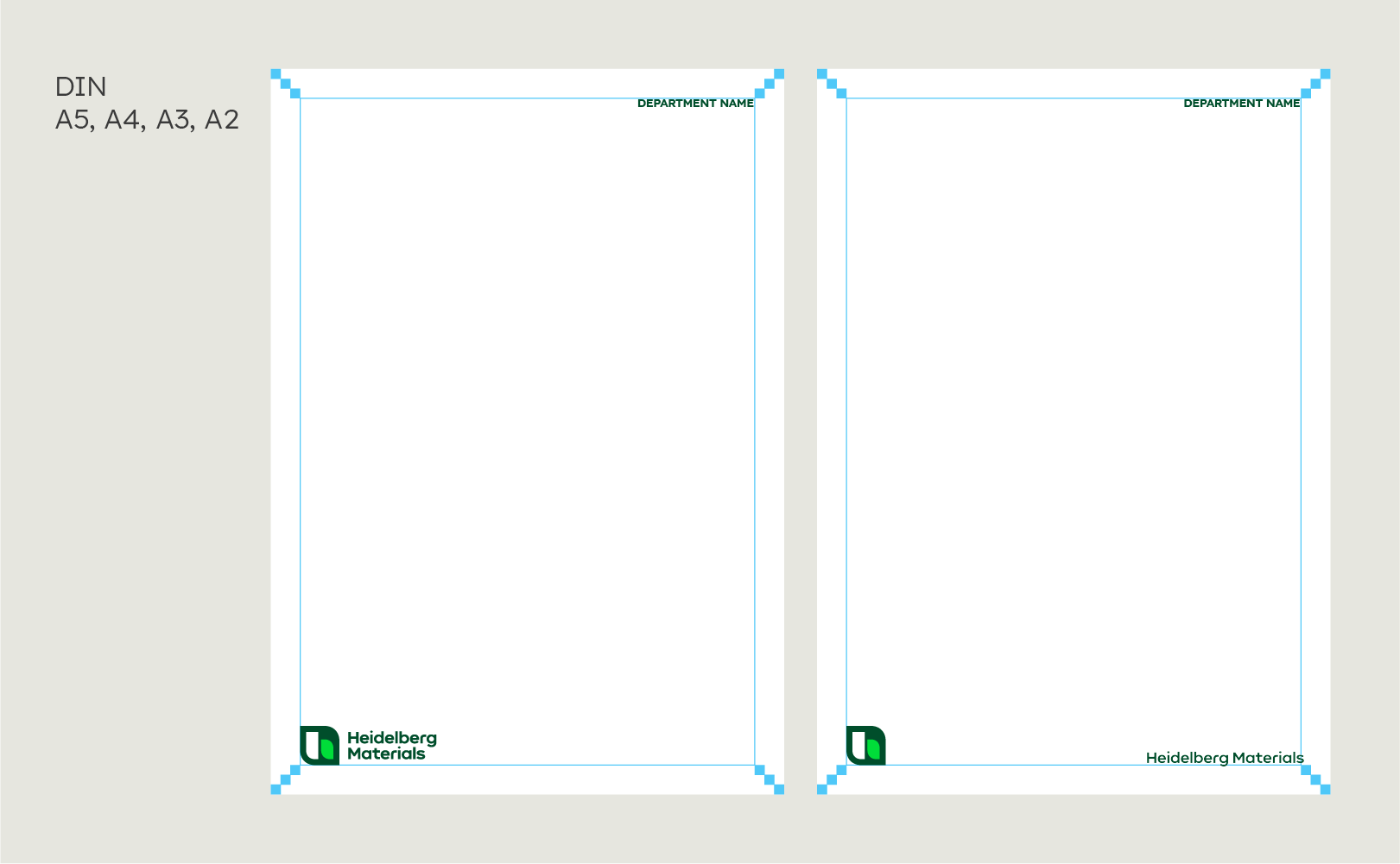

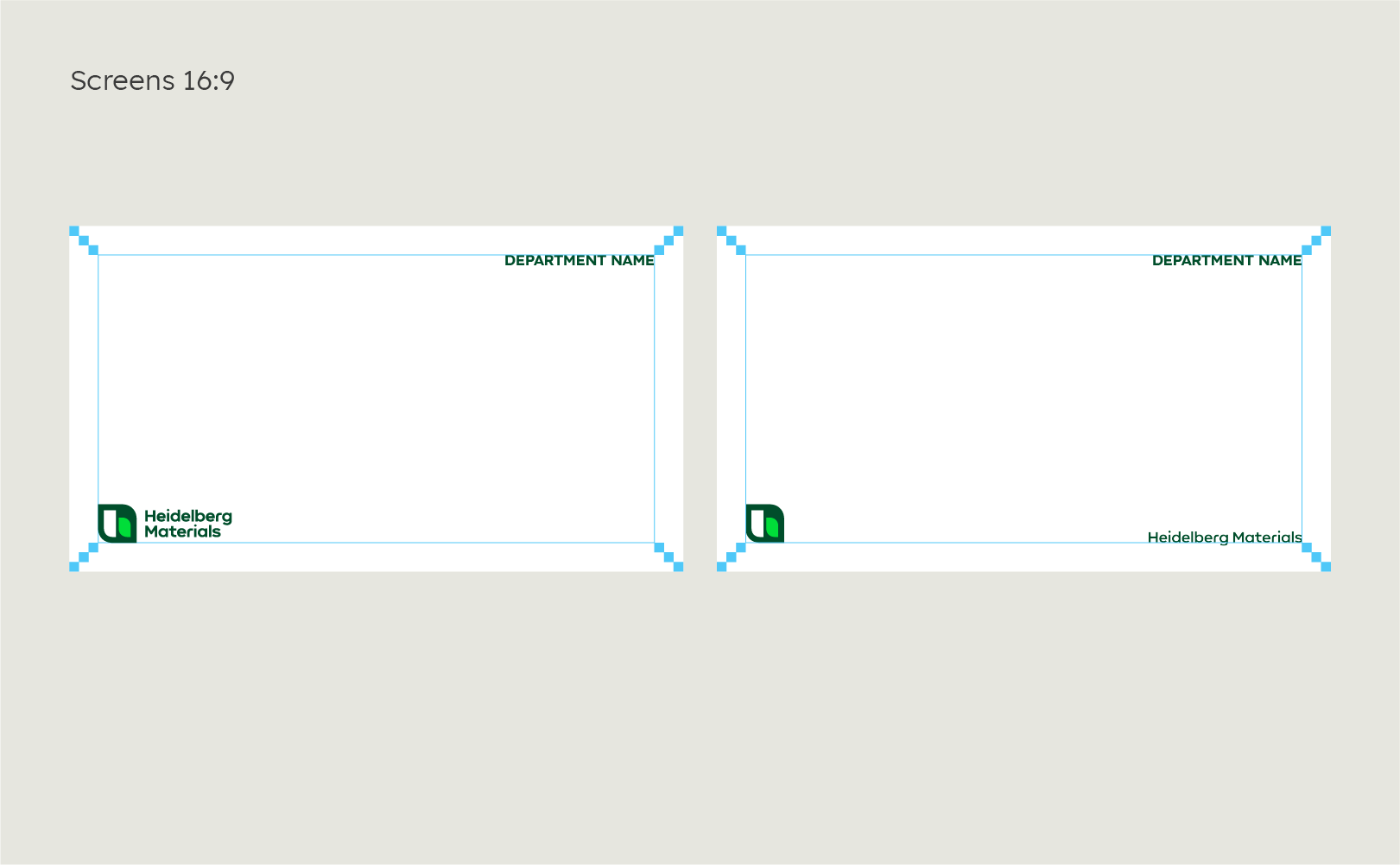

The department communication can use "Inform" and "Inspire" layouts. It can be used with the Heidelberg Materials compact logo or with the floating logo.
When selecting one design field, always consider the communicative context. Learn more in the Fundamentals section.
Don'ts
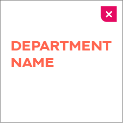

Only the specified colours may be used.
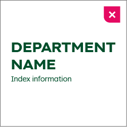

The department names speak for themselves; further elements may not be added to the logo.
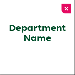

The names of the departments are set in capital letters and are always left-aligned.
Departments in use
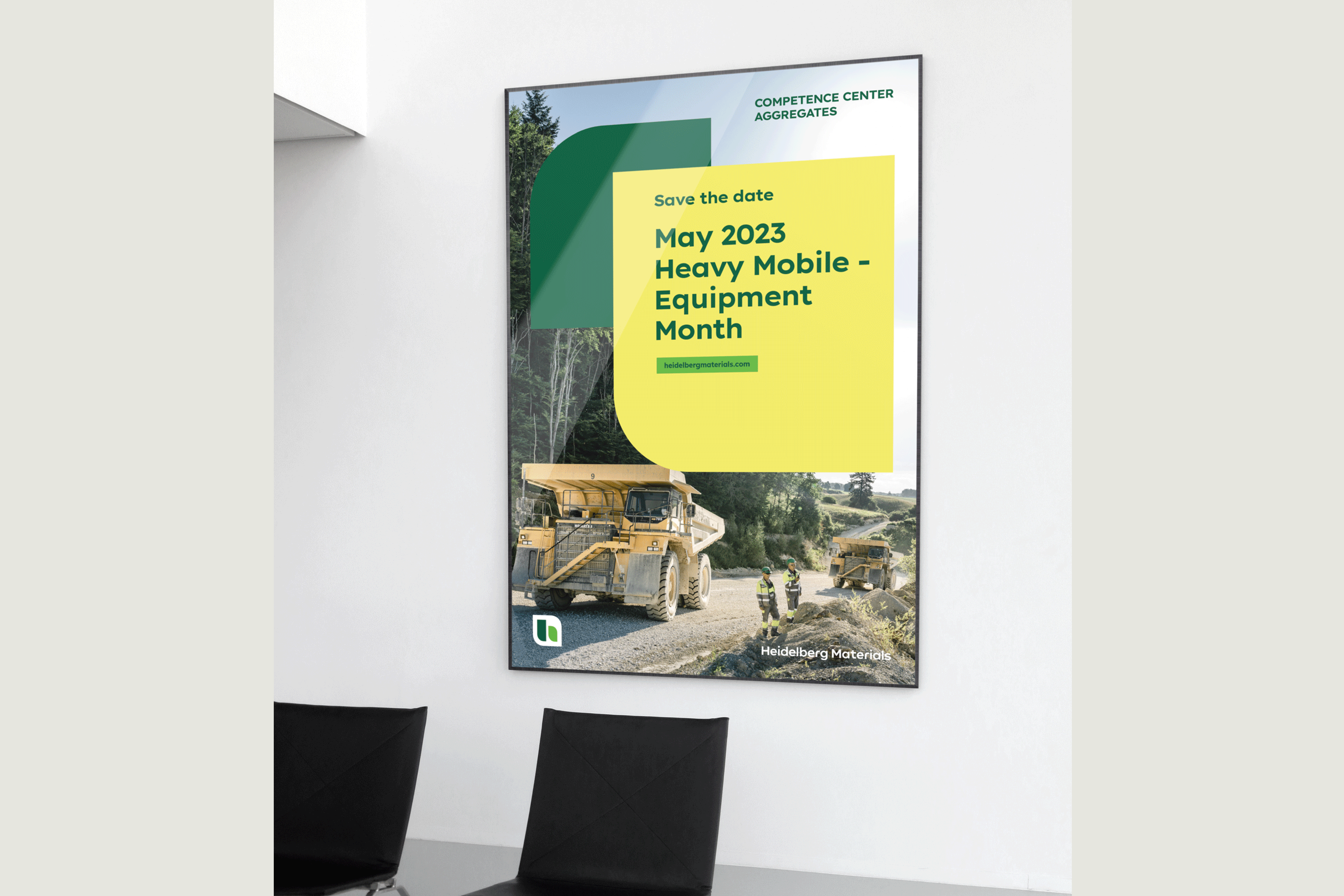

Poster
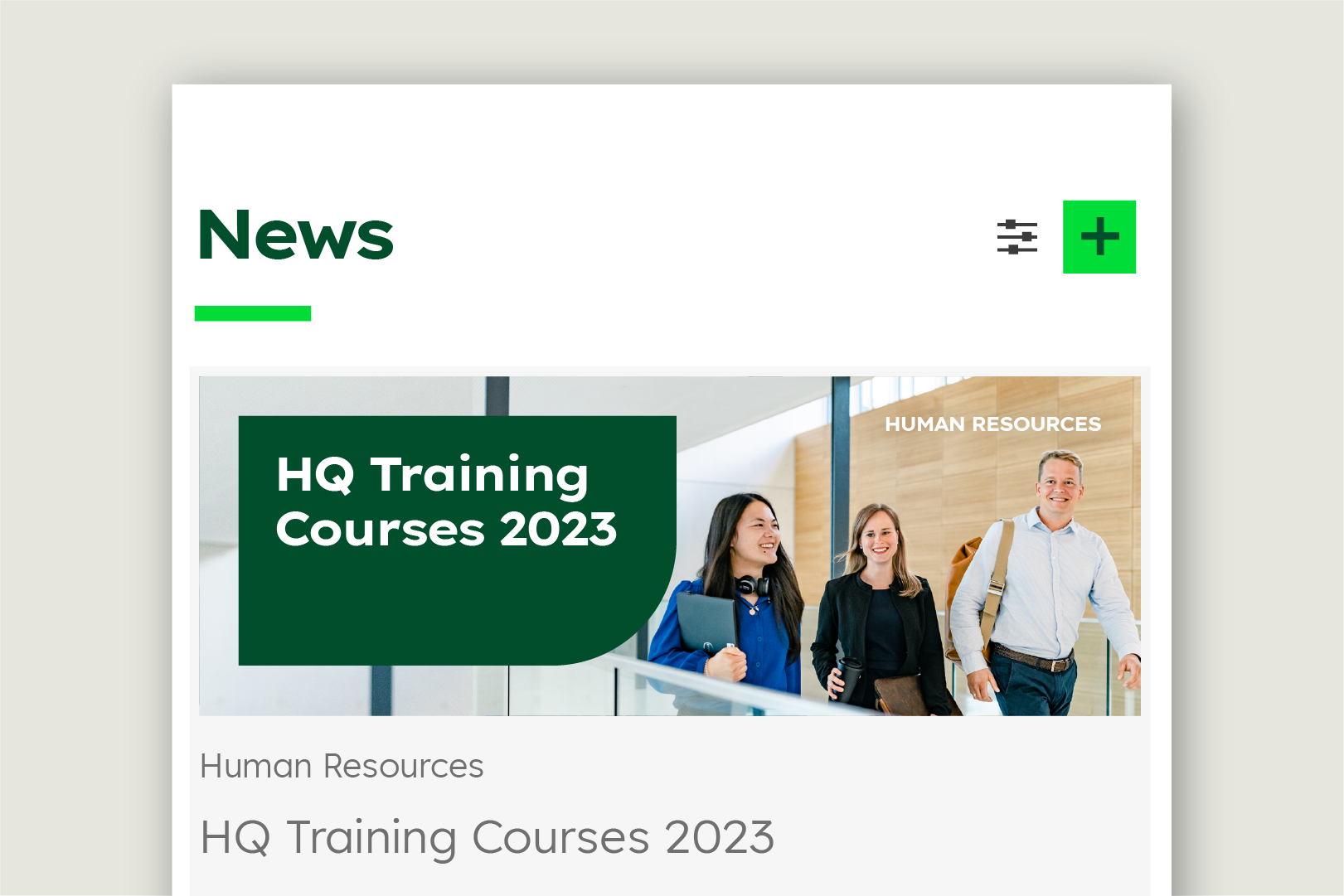

Intranet
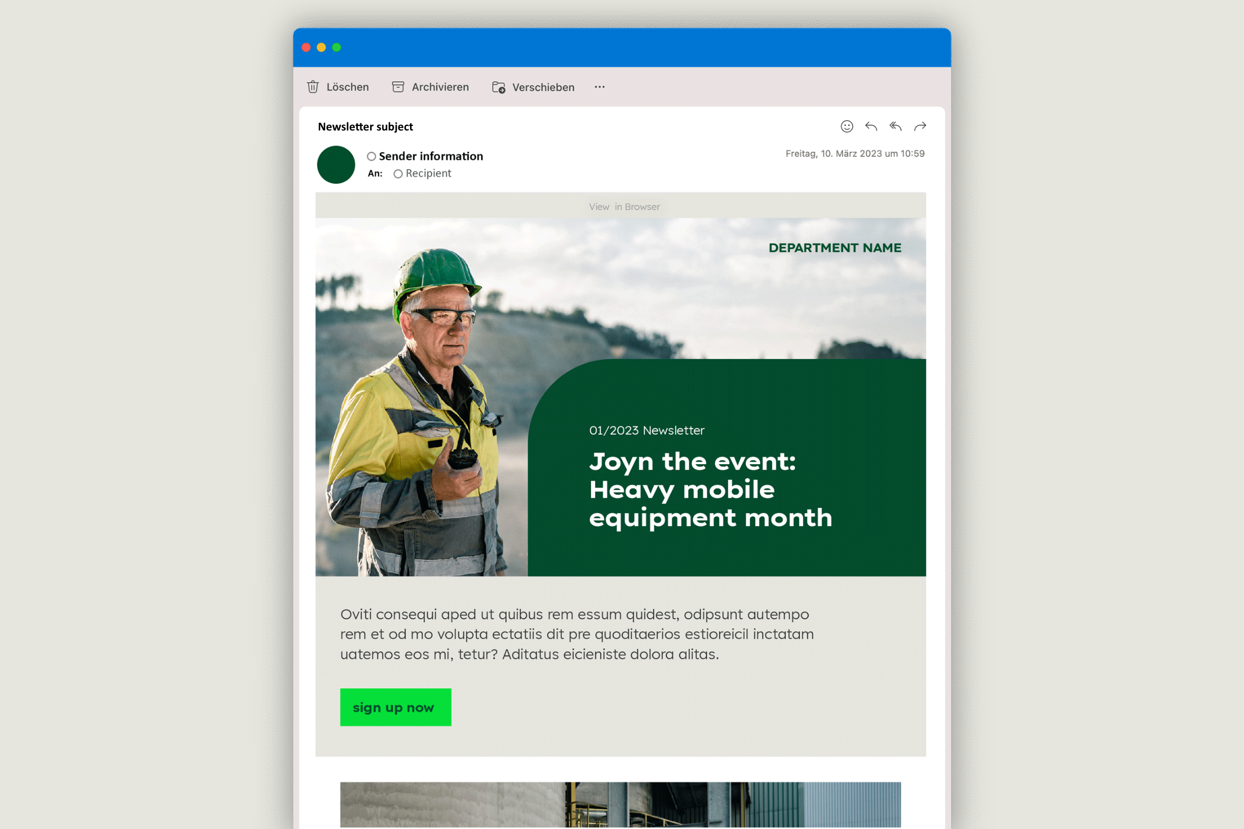

Newsletter
If you would like to send internal newsletters as part of a department or initiative communication, please make use of our ready-to-use Newsletter templates.
Downloads
Important Note Regarding Login
Due to the transition to our new website, all users must
set a new password the first time they log in.
To do so, please use the “Forgot Password” feature and
follow the instructions.
Thank you for your understanding.
Contact
Any questions about our guidelines?
Contact us.
- N Support
- T + 49 211 690787-200
- E support@Brandhub.heidelbergmaterials.com