evoBuild® packaging
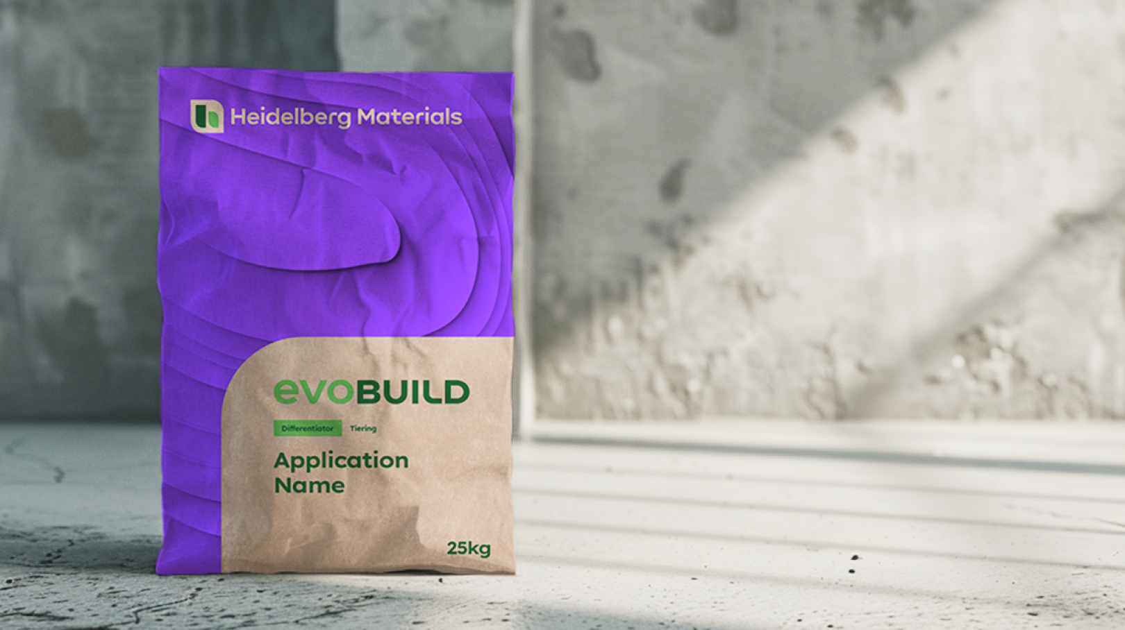

With evoBuild, we are setting new standards for building materials. It is our sustainability brand for low-carbon and circular products with various properties offering solutions for a wide range of purposes.
Look and feel
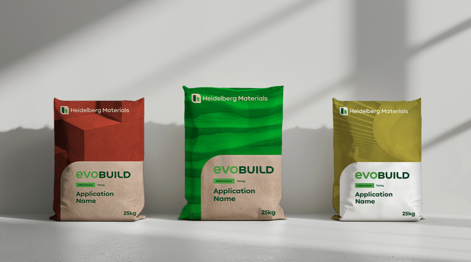
The globally consistent but flexible packaging design makes it possible to strengthen our brand identity worldwide while catering to regional preferences. This adaptability drives customer loyalty and facilitates acceptance across cultures, leading to a successful market entry through our global presence.

Layout system
Our packaging design for the evoBuild products is divided into two main areas: one that stands out due to its eye-catching emotionality and an informative area that is characterised by its design.
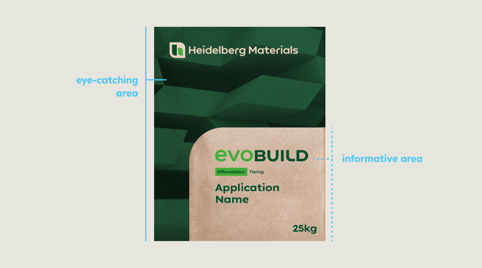


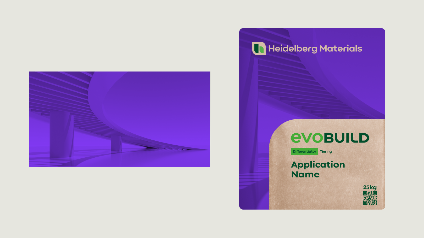
An image that represents the product or process covers the entire packaging. The corporate brand logo is placed on the front of the image, along with a shape (for any product information).


The shape area contains all the product information, including the product brand logo, application name, classification, special features, etc.
Logos
Usage
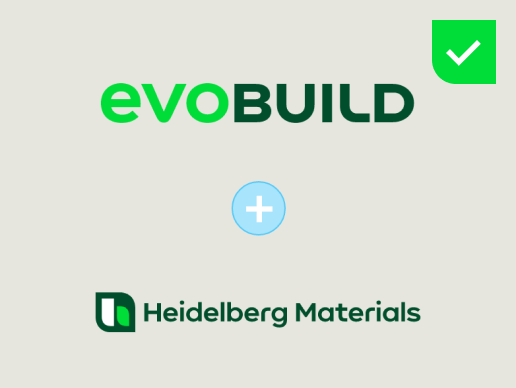

The product logo always appears in conjunction with the single-line version of the corporate brand.
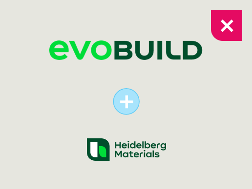

Do not use the compact logo of the corporate brand in conjunction with the product logo.
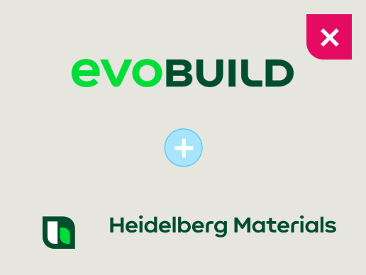

Do not use the floating logo of the corporate brand in conjunction with the product logo.
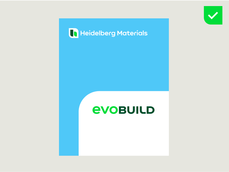

The corporate brand logo should always be at the top left of the cement bag, and the product logo should always be inside the shape.
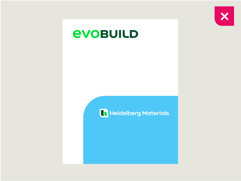

Do not place the corporate brand logo inside the shape and the product logo at the top left of the cement bag.
Sizes
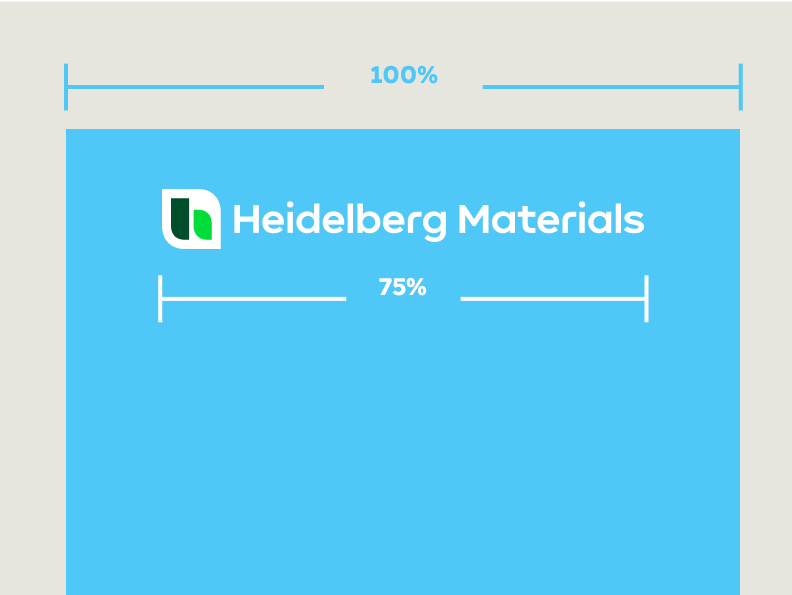

The corporate brand logo width should always equal 75% of the format width.
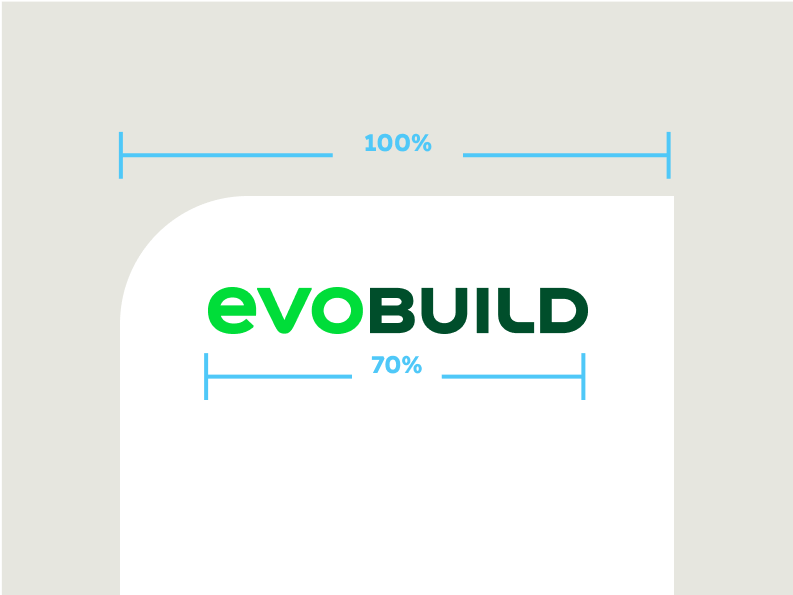

The product brand logo width should always equal 70% of the format width.
Positioning
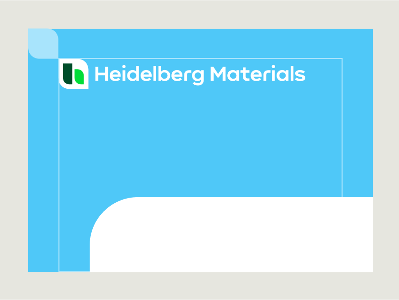

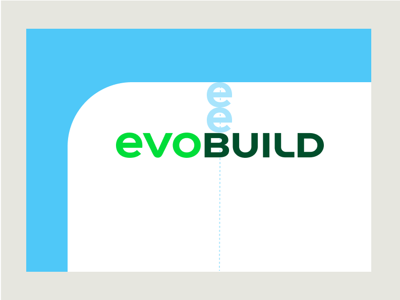
The safe zone has the height and width of the icon of the corporate brand logo (single-line logo).

Colours of the corporate brand logo
The colour of the logo can be chosen depending on the amount of colours used in the layout. As an alternative to the colour white, the paper of the packaging material can be used to save one colour (and therefore expenses) in the printing process and thus saving costs.

Corporate brand logo, positive

Corporate brand logo, negative

Corporate brand logo, positive without white

Colours of the product logo
The colour of the logo can be chosen depending on the amount of colours used in the layout.

Product logo, positive on white surface

Product logo, positive on paperbag surface


Product logo, mono white on imagery


Learn more about our evoBuild brand in the Sustainable product brands section.
Special cases
Special logo cases, like the Arabic version of our logo, can be used if needed. Make sure to follow the country-specific guidelines when using these logos. The Arabic logo version consists of two lines and therefore needs to be treated differently.
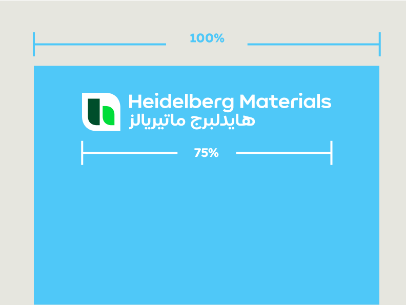

The (Arabic) corporate brand logo width should always equal 75% of the format width.
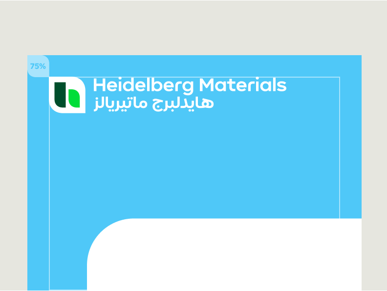

The protection area should equal 75% of the height and width of the icon of the corporate brand logo.
Shapes
The shape is an important element in our design system. Inspired by the design language of our brand mark, the shape is a strong character element that transports information and guarantees a high degree of recognisability for our communication.
Function
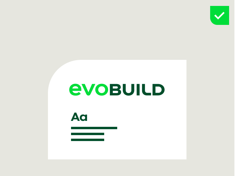

Use the shape as a surface for any product information.
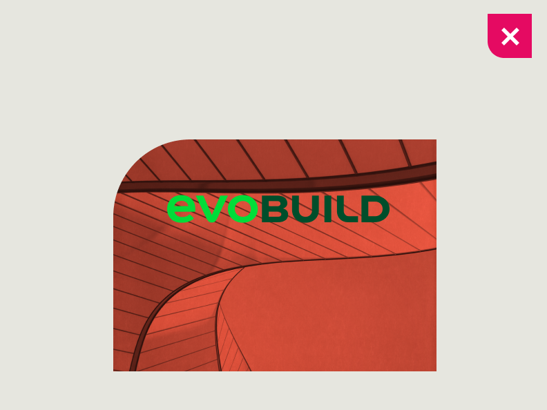

Do not use the shape as a container for images.
Colours
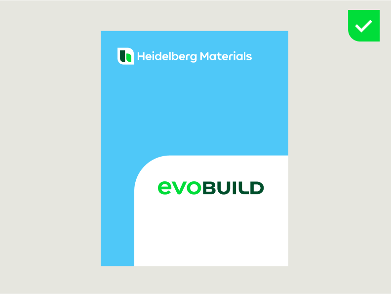

The evoBuild brand guidelines apply to the colour scheme. The shape is always in the colour white.
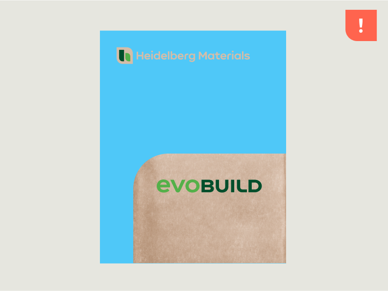

If white is to be omitted for budget or printing reasons, replace the material colour, e.g. packing paper, with white. This applies to the shape as well as to the logos, as described above.
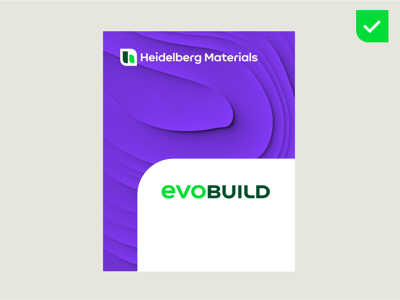

Example: “White” colour on a white plastic bag.
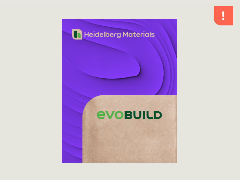

Example: Packaging material replaces the colour white; in this case, the brown paper.
Positioning
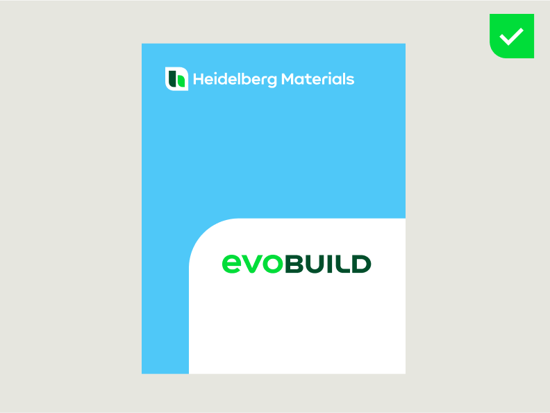
Always use a fixed shape. The shape is always docked to two edges of the format, bottom and right.
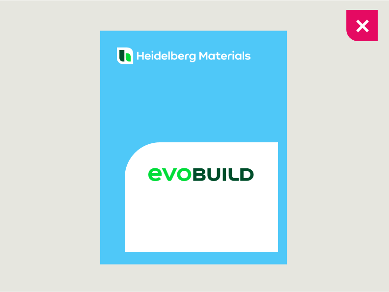

Do not use a floating shape.
Width
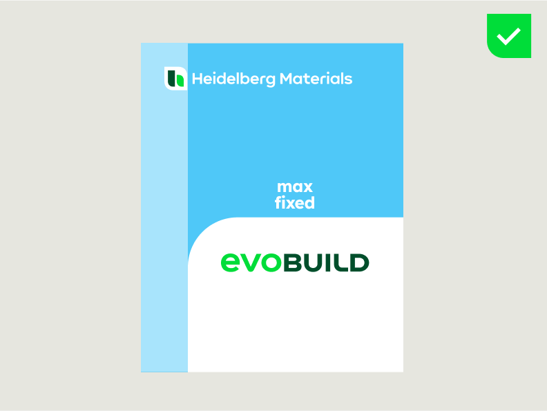

The maximum and fixed width of the shape extends from the right side of the layout to the right-hand side of the icon.
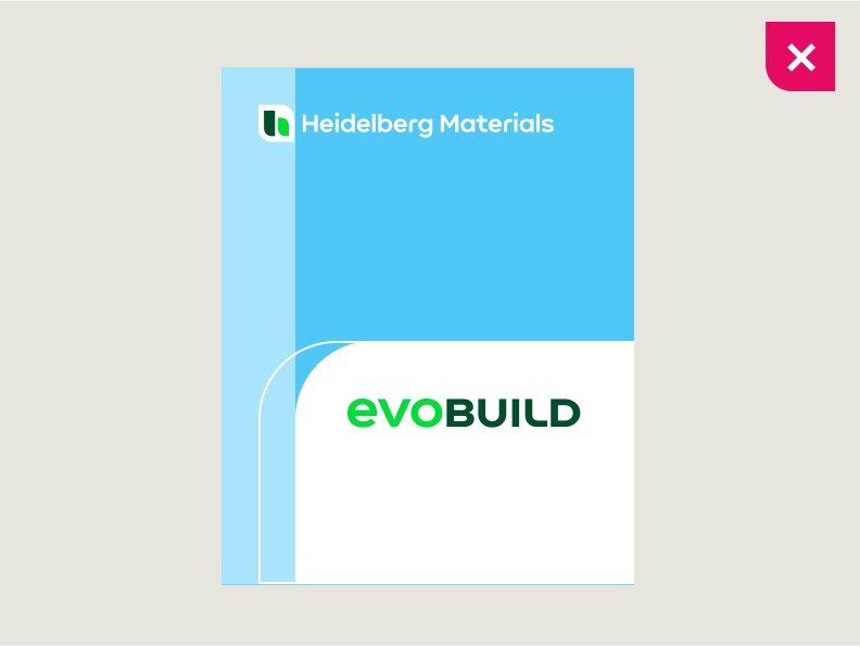

Do not change the fixed width of the shape.
Height
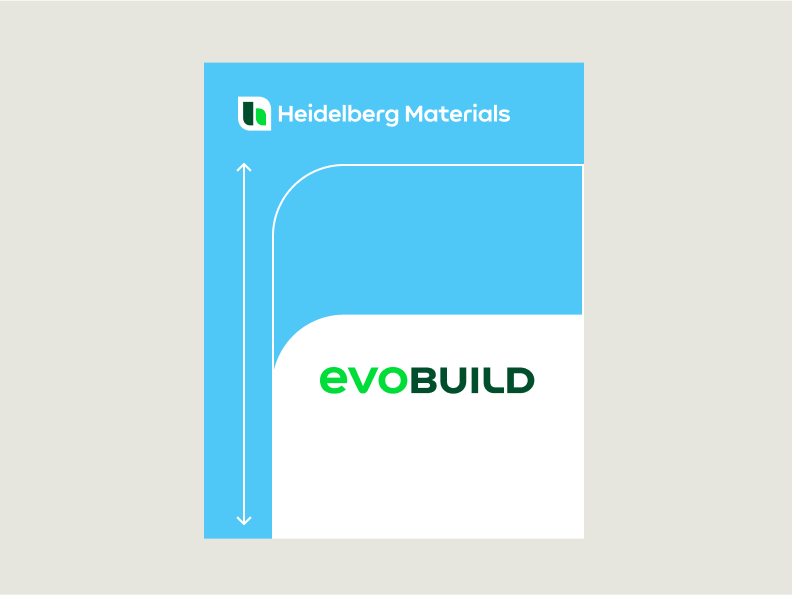

The height of the shape is flexible and can be changed depending on the evoBrand packaging format or the content. Always ensure that the layout provides enough space for the defined colour coding.
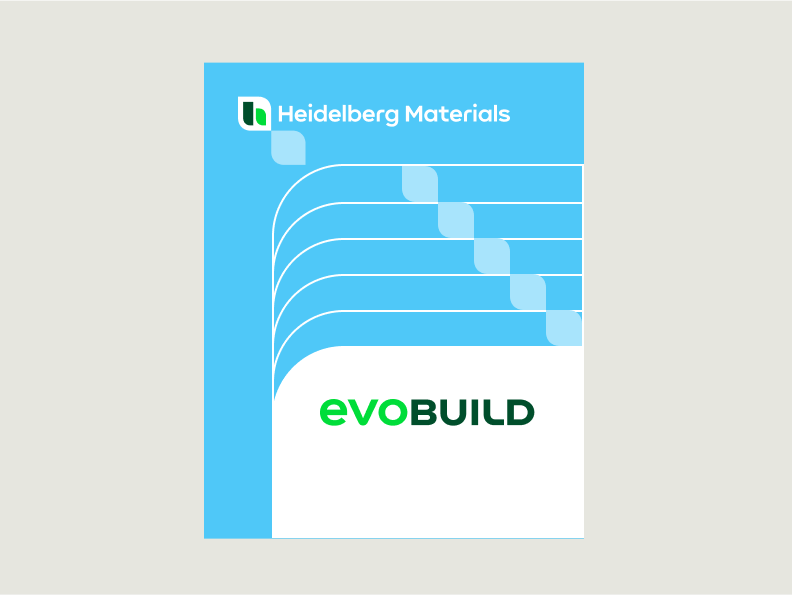

The minimum distance to the logo is always the height of the icon. The maximum distance is 6 x the height of the icon.
Expansion over multiple surfaces
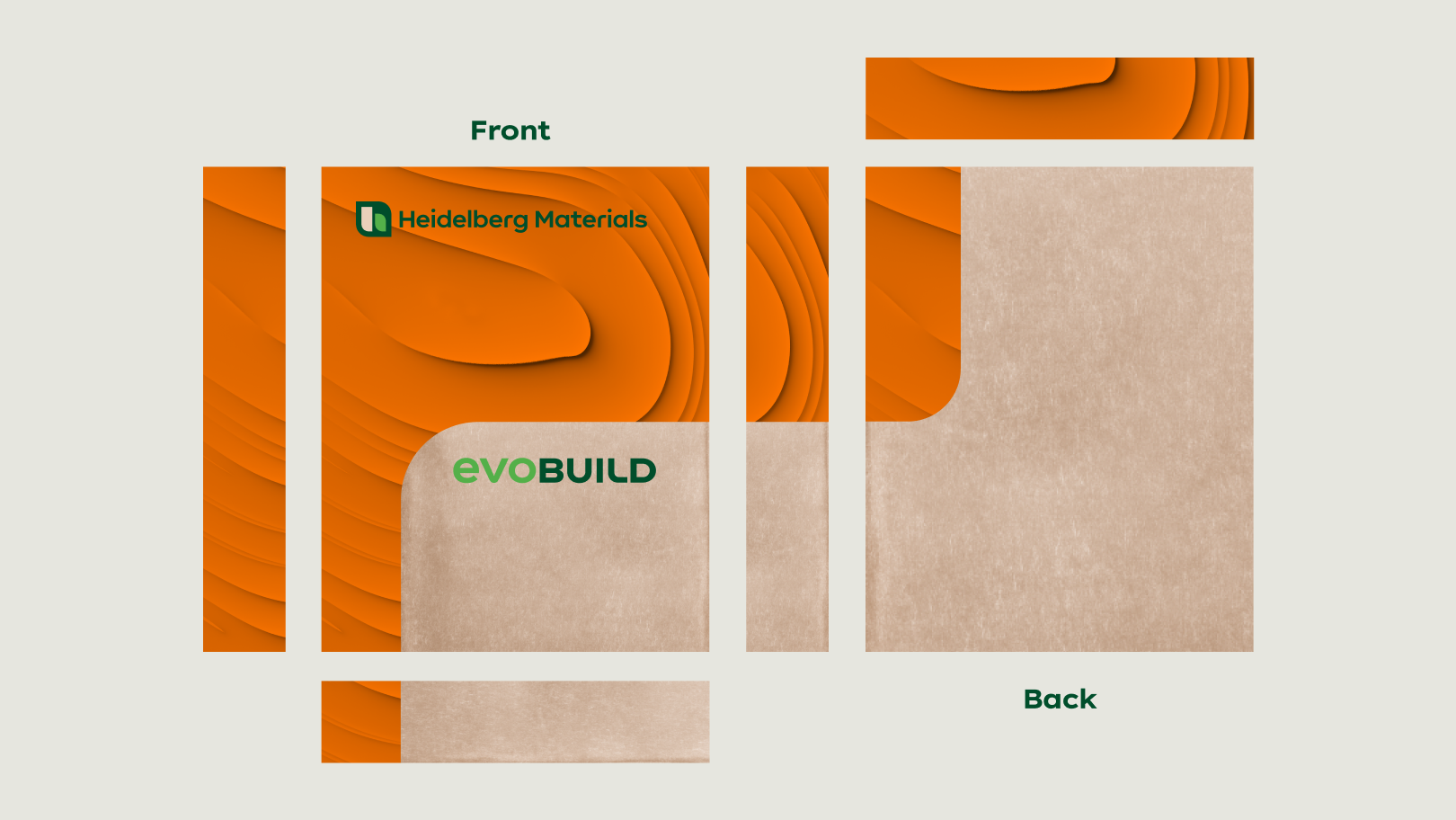

Our shape conveys our brand and therefore needs to make a strong visual impact, no matter from which side the product is recognisable. By expanding our form language over multiple surfaces, we achieve a dynamic and recognizable expression.
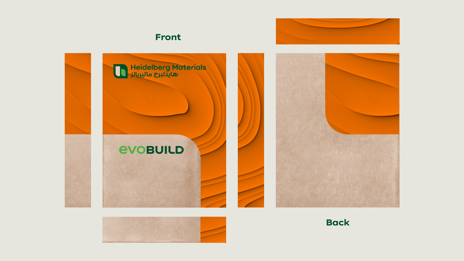

In certain countries such as Egypt, the displayed colour coding on the backside of the bag should cover at least 25% of the total backside layout.
Content
The content may vary depending on the region or market, but the developed design system guarantees a standardised appearance across countries.
Content on the front
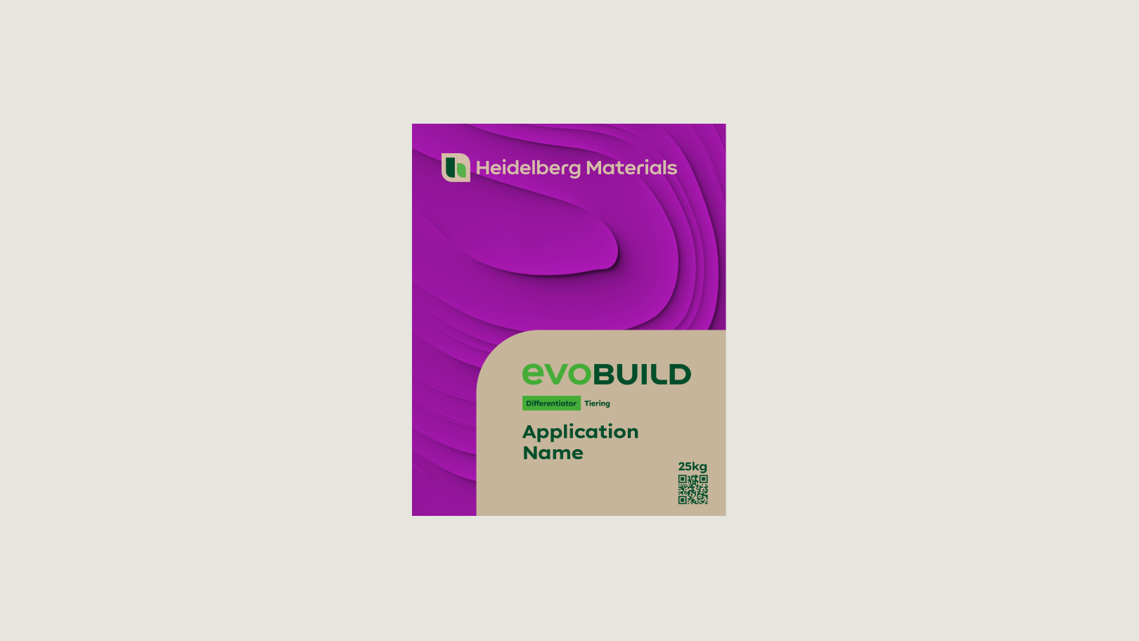

On the front of the packaging, we use the shape as a container for content that briefly and strikingly introduces the product.
Content inside the shape
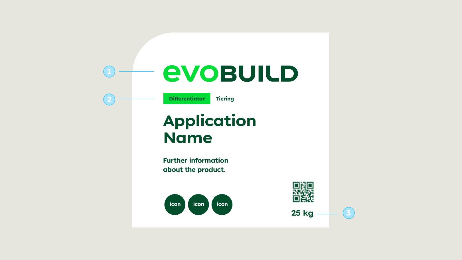

The content inside the shape may vary depending on the region or market, but the following elements should always be present:
- evoBuild product brand logo
- Differentiator and Tiering
- Weight specification
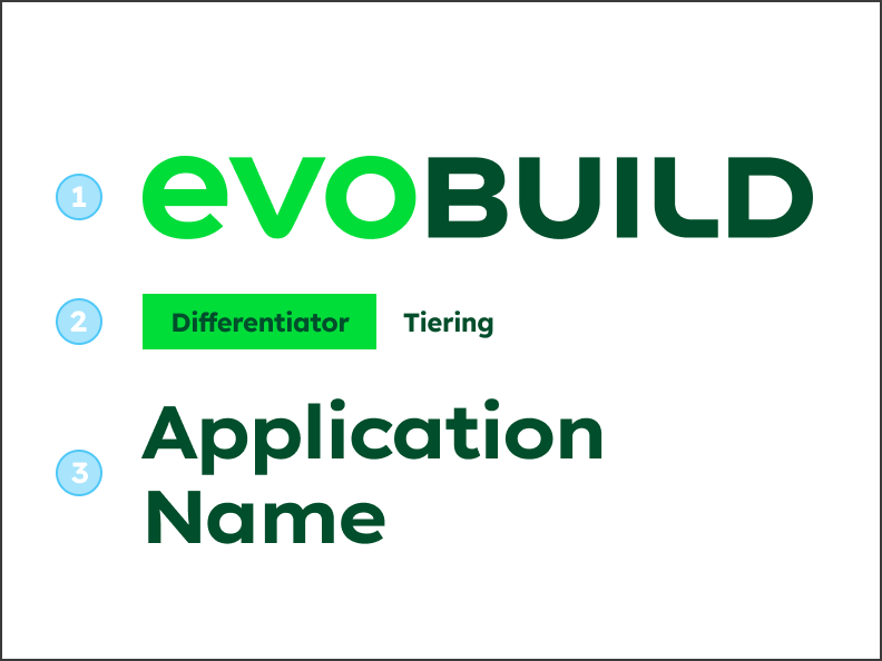

Hierarchy of the product brand logo, the descriptor and application name.
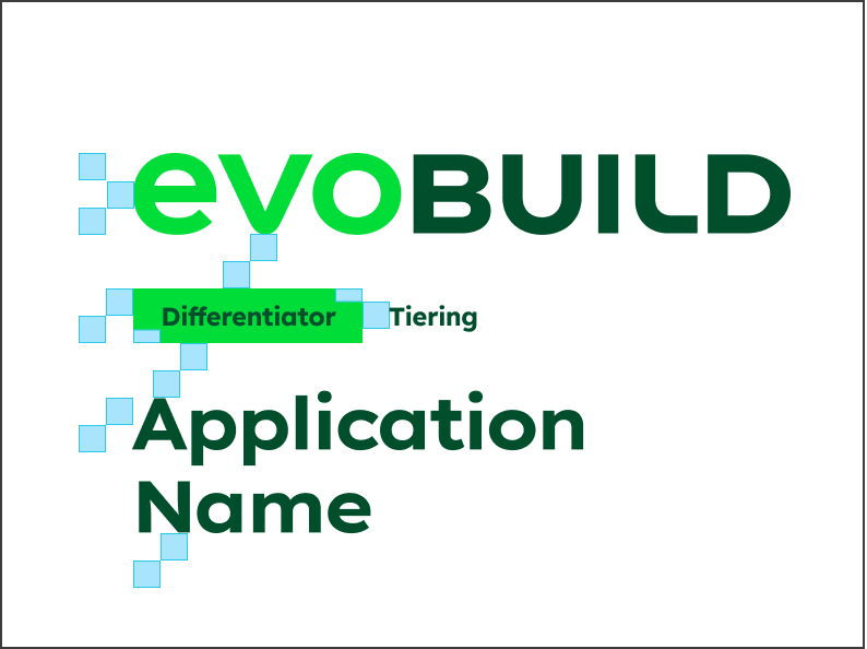

The building blocks define distances and sizes for all elements in the descriptor area.
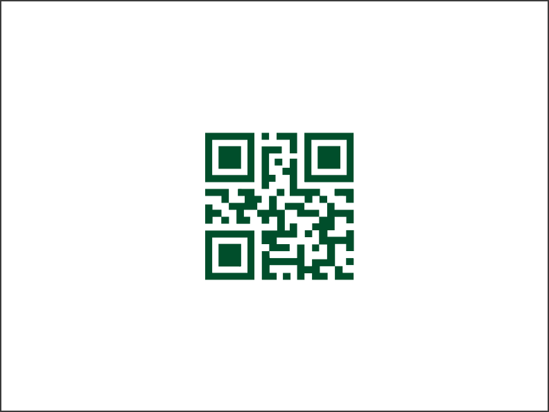

If possible, QR codes should be placed inside of the shape to ensure maximum readability.
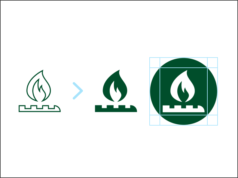

Any icons used should be filled to ensure maximum visibility from a distance. The icon artboard is to be used as a measurement for the circle.
Content on the back
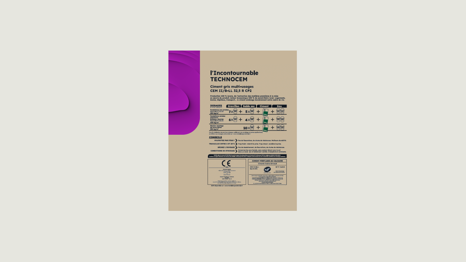

Important information, safety instructions and instructions for the proper handling of the product can be listed on the back of the packaging. Texts, tables and icons can be used to transport the information. If specifically stated by the country, content on the back can be displayed on a white background.
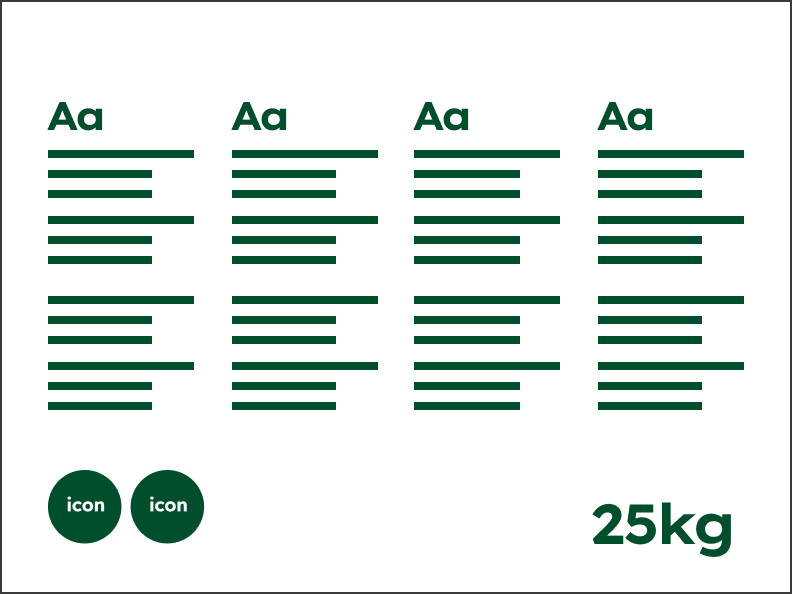

Texts, tables, icons and weight specifications can be used to transport the information.
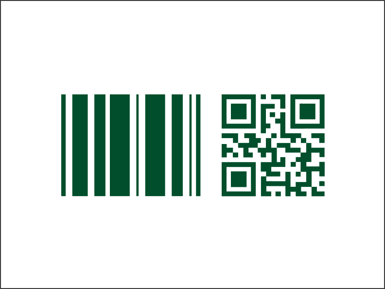

Scannable barcodes and QR codes should be sufficiently large and clearly visible.
Content on the sides
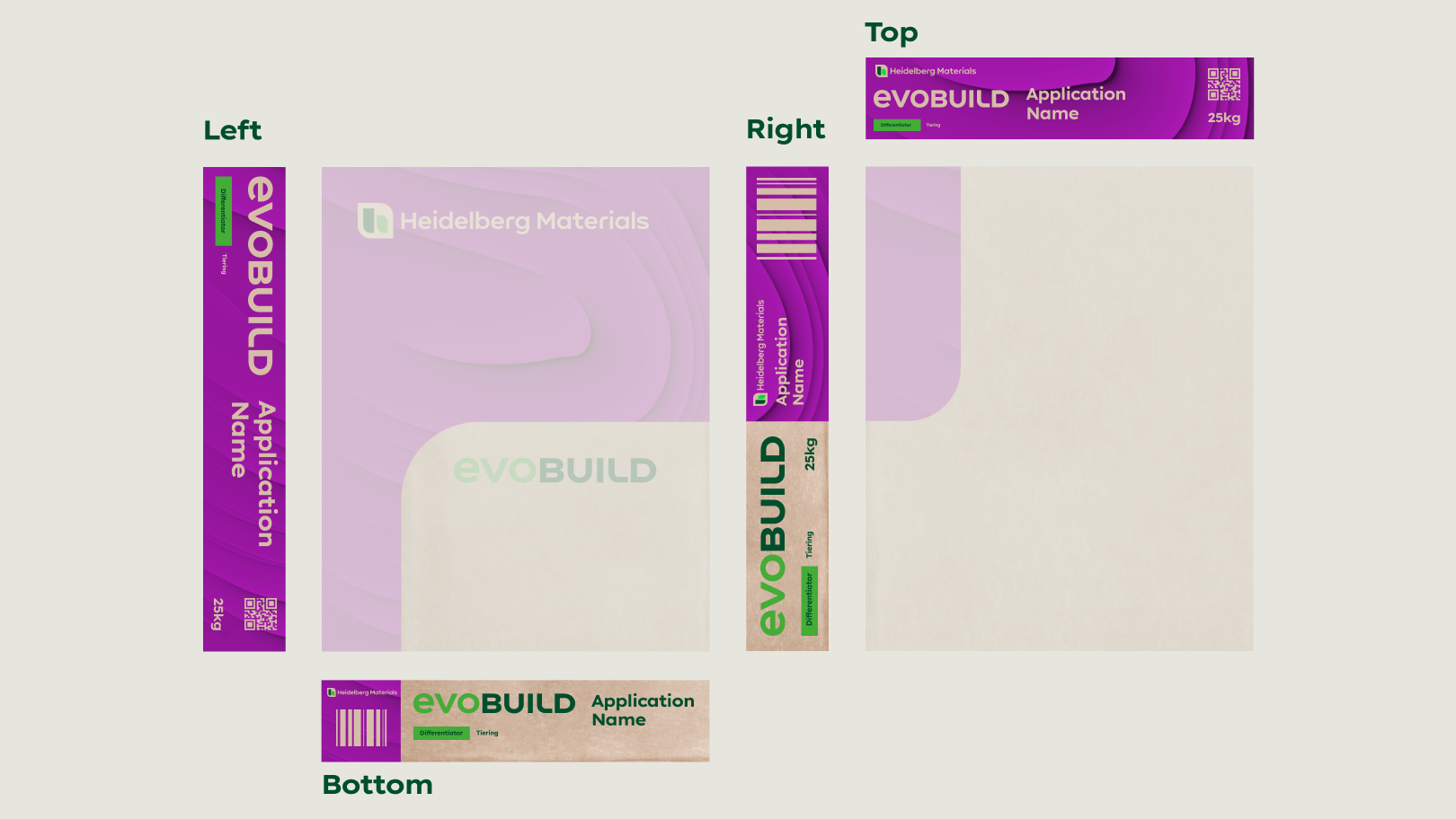

When designing the sides, it is important to consider which content is relevant for the respective market or country. In certain regions, the application name may be more important than the company brand; similarly, the product brand may be prioritised. The structure and placement of the content can vary, but the company brand, the product brand and the application name should be placed visibly.
Imagery
Strong and brand-defining CGI images are the centrepiece of our evoBrand packaging. They are eye-catching and unique and represent the core values of our brand and our products.
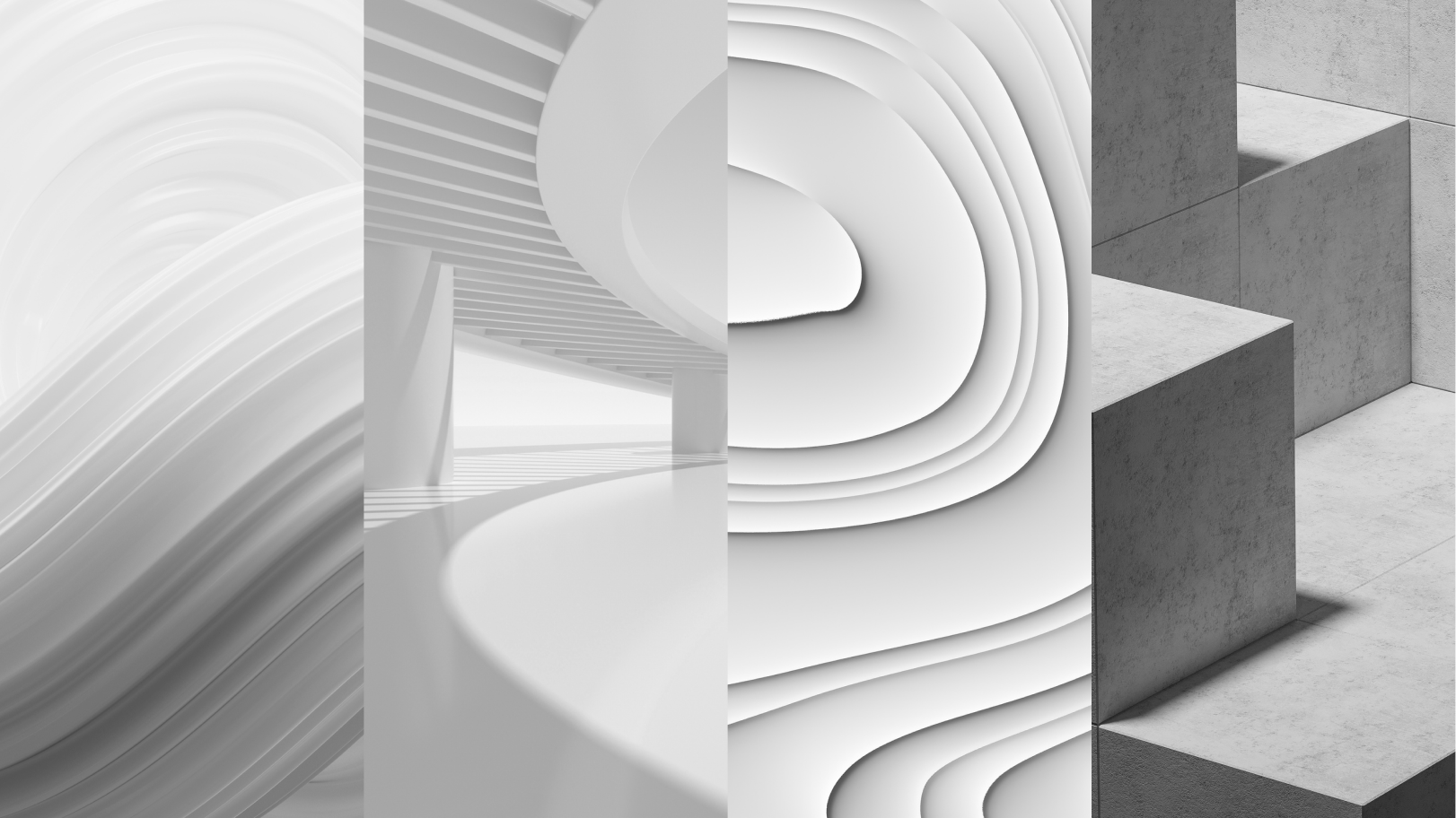

Imagery categories
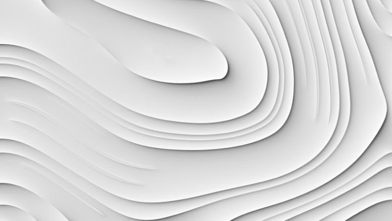

Process: e.g. mixing, 3D printing
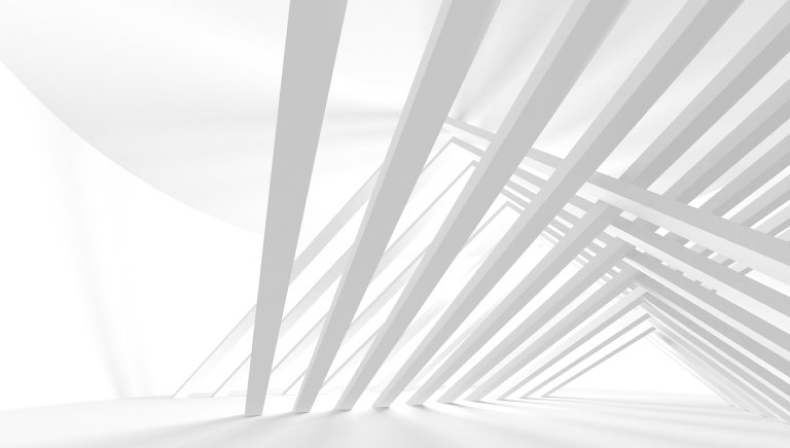

Applications: e.g. infrastructure, architecture
These categories form the basis from which all CGI images derive. They allow us to display complex processes and to visualise specific materials or properties. All future imagery should be chosen according to these categories.
Imagery abstraction
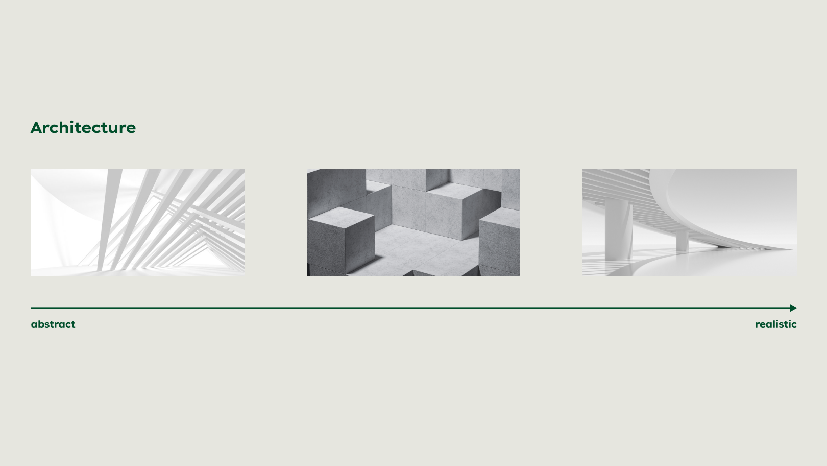

Our CGI imagery offers a flexible system to adapt to the content and communicate certain themes through its visuality. When using our packaging images, always consider what you want to depict and how you can best visualise it.
All our evoBuild packaging images are available in the Downloads section below.
Colouring images
In order to achieve a diverse look and to remain versatile, our imagery is coloured in our colour scheme.
Colours
We use defined colours from the Heidelberg Materials colour world for colouring the imagery. Exceptional colours are to be selected in compliance with certain specifications and can be coordinated with the Group Communication team after consultation.
Colours
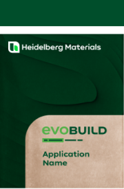

Deep Green
HEX: #004E2B
RGB: 0 | 78 | 43
CMYK: 77 | 0 | 72 | 70
PMS C: 3537 C
PMS U: 342 U
HKS K: 61 K
HKS N: 61 N
RAL: 160 30 25
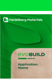

Bright Green
HEX: #00DD39
RGB: 0 | 221 | 57
CMYK: 68 | 0 | 98 | 0
PMS C: 2271 C
PMS U: 2271 U
HKS K: 65 K
HKS N: 65 N
RAL: 6038
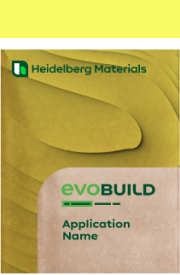

Spark Yellow
HEX: #FAFA64
RGB: 250 | 250 | 100
CMYK: 10 | 0 | 75 | 0
PMS C: 3935 C
PMS U: 3945 U
HKS K: 2 K
HKS N: 2 N
RAL: 1016
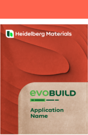

Warm Orange
HEX: #FF644E
RGB: 255 | 100 | 78
CMYK: 0 | 70 | 60 | 0
PMS C: 178 C
PMS U: 178 U
HKS K: 13 K (80%)
HKS N: 13 N (80%)
RAL: 040 60 60
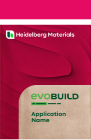

Punchy Red
HEX: #E50A62
RGB: 229 | 10 | 98
CMYK: 0 | 100 | 30 | 0
PMS C: 2040 C
PMS U: 2040 U
HKS K: 25 K
HKS N: 25 N
RAL: 010 40 53
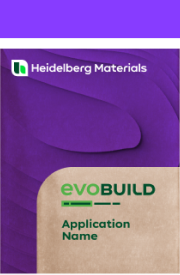

Vibrant Purple
HEX: #873CFF
RGB: 135 | 60 | 255
CMYK: 60 | 65 | 0 | 0
PMS C: 266 C
PMS U: VIOLET U
HKS K: 36 K (80%)
HKS N: 36 N (80%)
RAL: 310 40 40
Colour extension
Colour extension
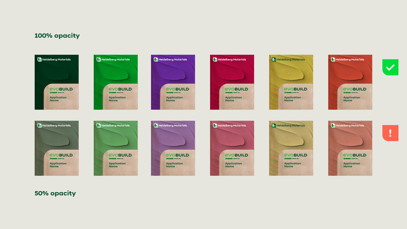

One way to create more variations is to use our inspiring colours and shades with a colour value of 50%. Opacities around 50% should be handled with care when working with paper bags instead of plastic bags (Colours like yellow and orange are similar to the paper bags’ brown colouring and might lose their visibility).
Country-specific colours
Our colour selection may be extended under certain conditions, if product-specific colour specifications already exist in individual countries.
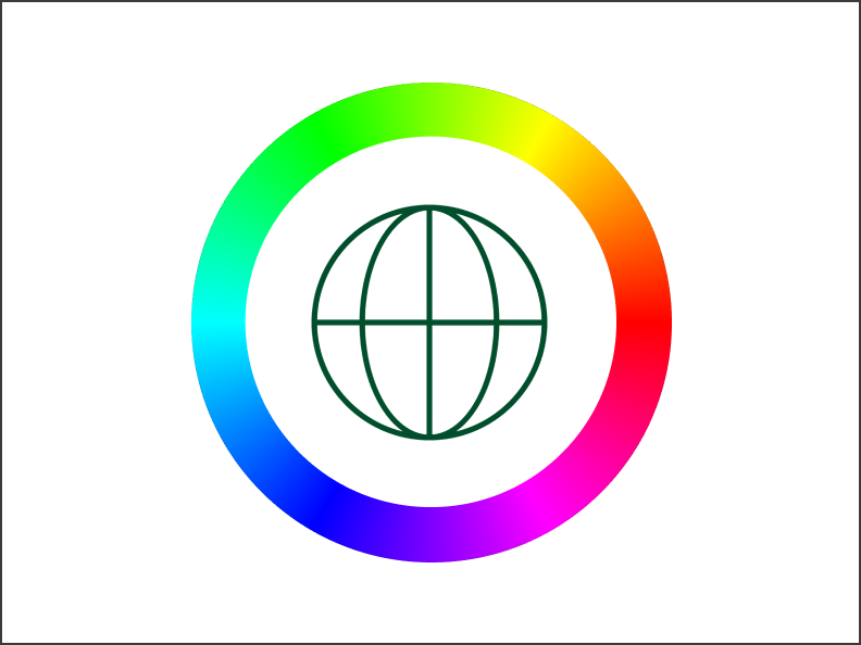

Please note: Contact the group communication team for general questions about colours specified by countries.
Colouring process
Colouring process
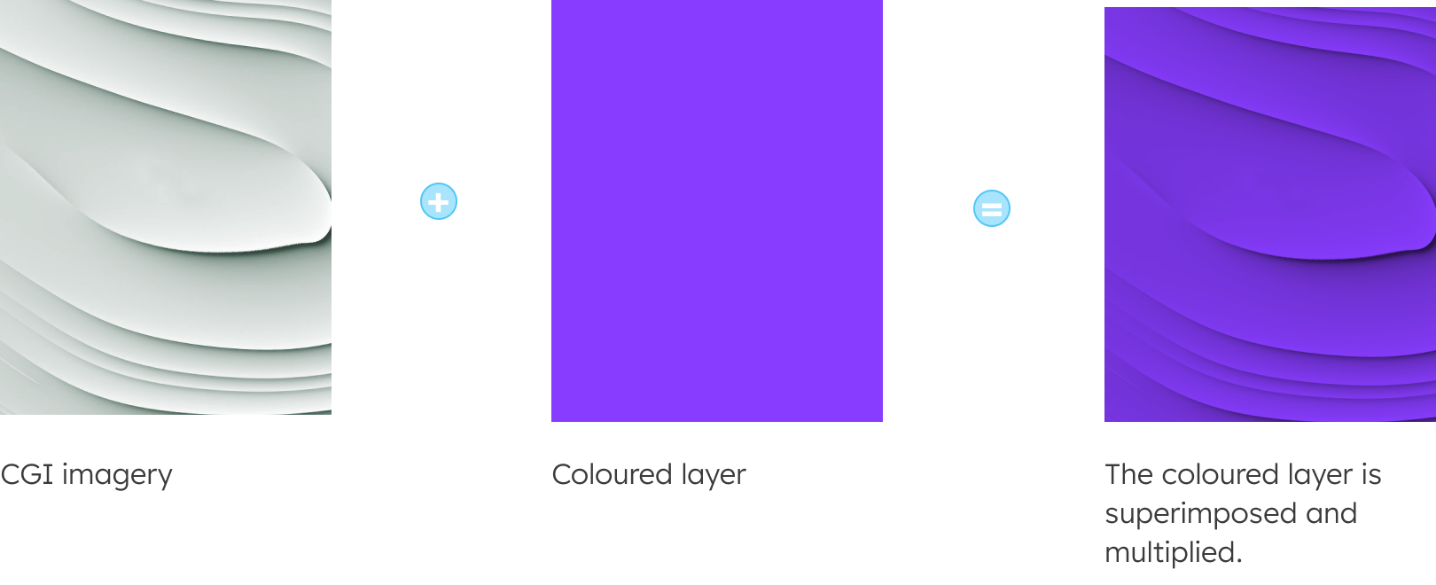
All across our international market, products need to be recognisable through their respective colour. By using these colour codes on top of our CGI imagery, we can ensure a consistent appearance and strong brand language with our packaging.
Step 1 - Converting coloured imagery to monochrome Deep Green
If the original image is in colour, it is recommended to convert it to monochrome with Deep Green replacing the colour black using image editing software to achieve the highest possible contrast.


Step 2 - Monochrome Deep Green imagery with multiplied colour layer
Our products stand out through colourful and strong visuals, reflected by our evo-brand CGI imagery. By printing in two colours, we offer a flexible and easily accessible option to display our colour codes.

Cropping images
Depending on the layout and type of image, certain adjustments are necessary. Always ensure that the CGI image used is staged in the best possible way, allowing a clear visuality and representation of the colours displayed.

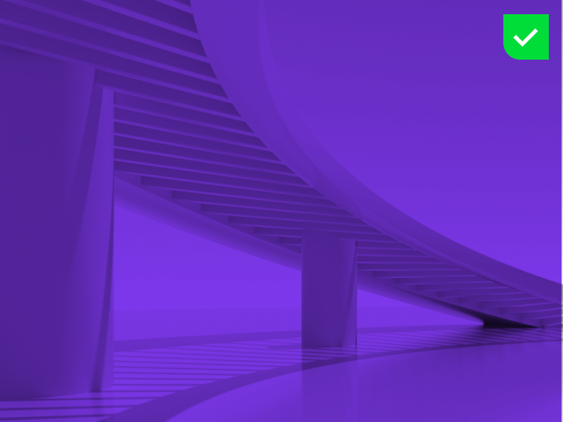

Make sure that the part of the image used contains enough visual elements to be clearly recognisable.

Do not crop the image to an extend that makes it unrecognisable and does not offer enough visual elements.
Downloads
Important Note Regarding Login
Due to the transition to our new website, all users must
set a new password the first time they log in.
To do so, please use the “Forgot Password” feature and
follow the instructions.
Thank you for your understanding.
Contact
Any questions about our guidelines?
Contact us.
- N Support
- T + 49 211 690787-200
- E support@Brandhub.heidelbergmaterials.com