Modules
Modules are small, self-contained, predefined and designed pieces of a graphical user interface that provide a specific function or set of functions.
Header
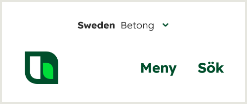
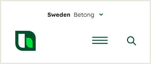
The header is the visible area at the top of a web page.
Desktop versions




Mobile versions


Hero
The hero area is the first area that the visitor sees.
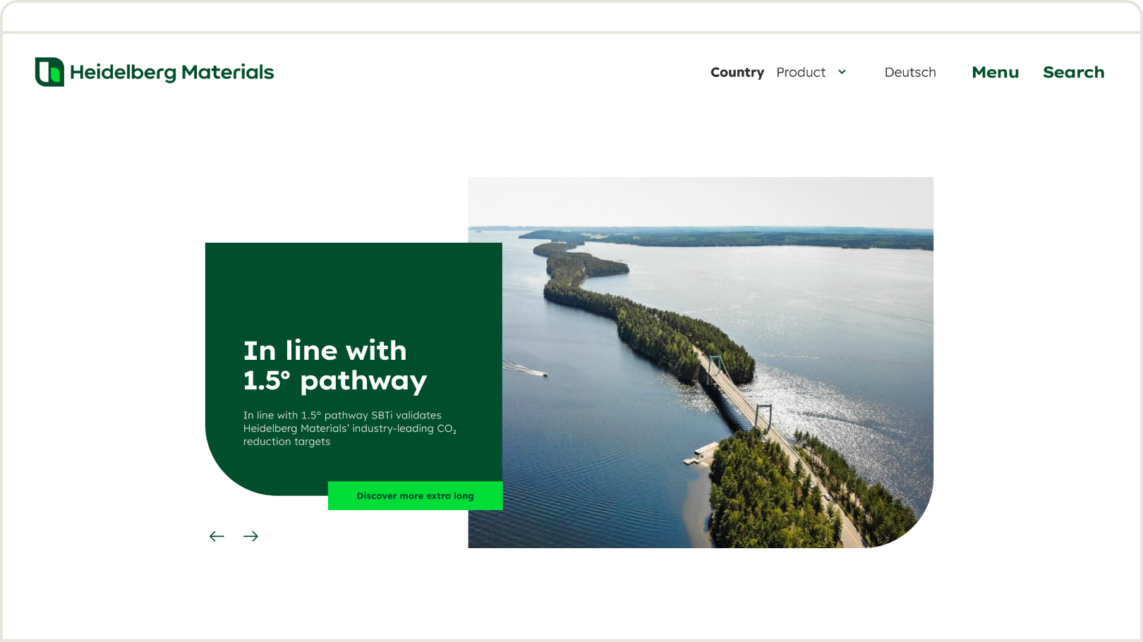

Lots of white space in combination with green areas ensure an attractive digital interface and a high level
of brand recognition.
Dos and don'ts
Dos and don'ts grid
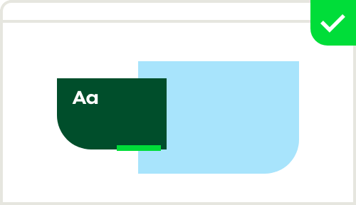

Always use Deep Green for the shape.
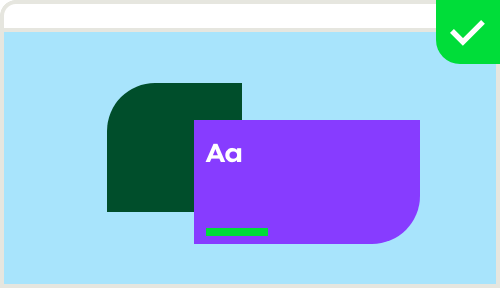

In exceptional cases, such as special theme subpages or microsites, Inspiring colours are permitted in combination with Deep Green.
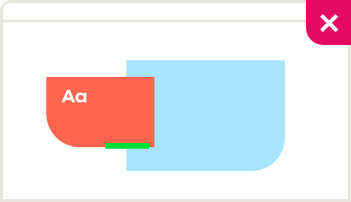

In the header area, Inspiring colours should not be used on their own. Make sure that the header contains a Deep Green element.
Jumper
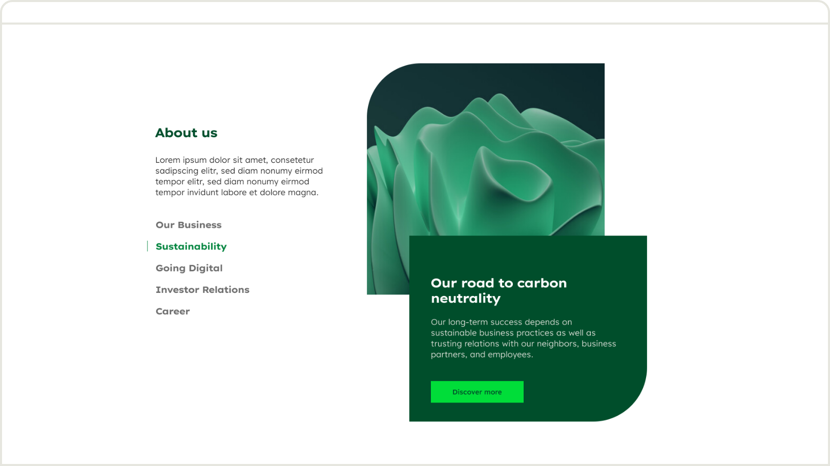
The jumper serves as a teaser for our chapters.

Dos and don'ts
Dos and don'ts grid
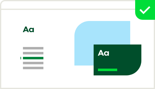

Deep Green may be used for the shape.
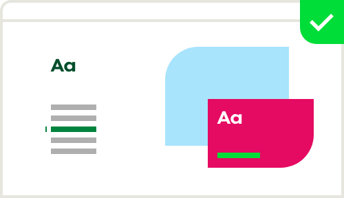

Inspiring colours may be used for the shape.
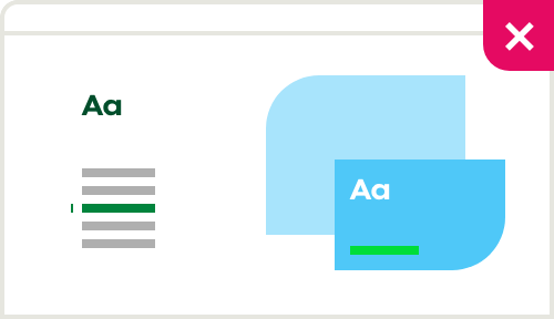

Do not use two images or two colours in the shapes.
Section hero
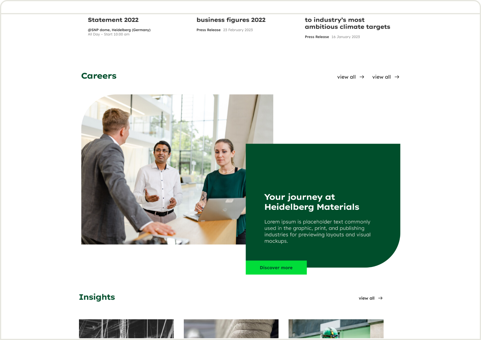
The section hero serves as a teaser for individual sections.

Dos and don'ts
Dos and don'ts grid
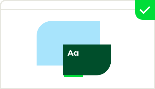

Deep Green may be used for the shape.
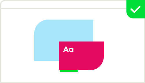

Inspiring colours may be used for the shape.
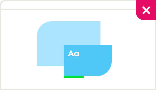

Do not use two images or two colours in the shapes.
Cookies
The message should always be visible but not too prominent.
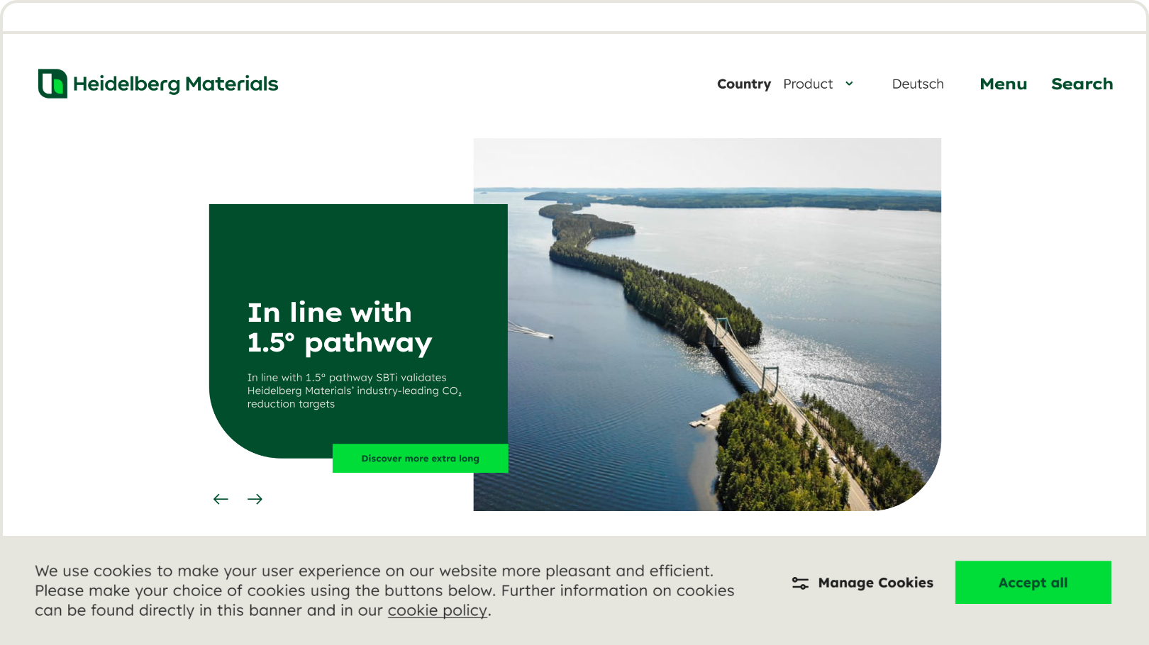

Types and positions
Types and positions


Full-width cookie banner always placed on the bottom.


Floating cookie banner always placed on the bottom.
Colours
Colours grid
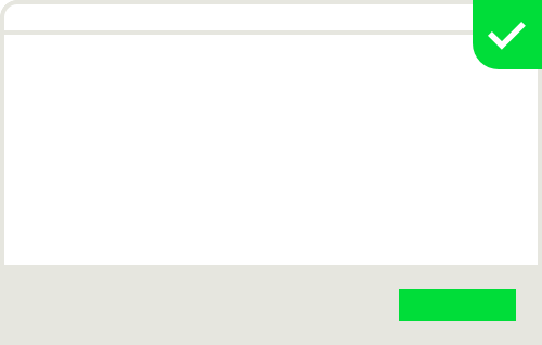

Sandy Grey may be used for cookie banners.
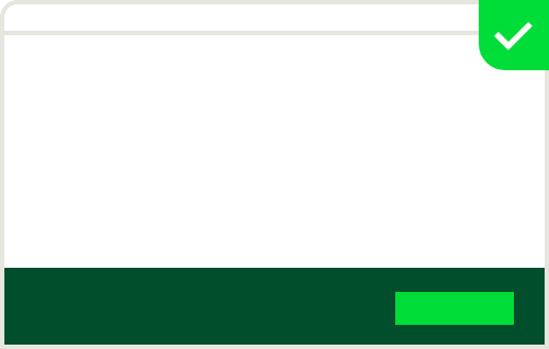

Deep Green may be used for cookie banners.
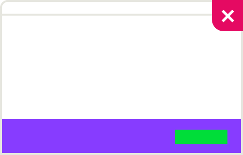

No other colour besides Sandy Grey and Deep Green may be used.
Notifications
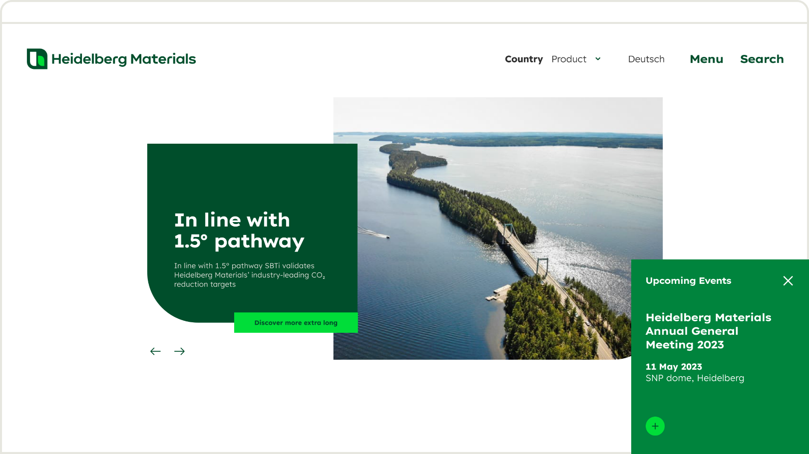
Notifications highlight particularly important information. They are placed prominently in the viewport. Their colour makes them stand out from other design elements.

Types and positions
Types and positions grid


Inline notifications


Pop-up notifications
Colours
Colours grid


Always use Mid Green for notifications.


Do not use Deep Green or Bright Green for notifications.


Do not use Inspiring colours for notifications.
Footer
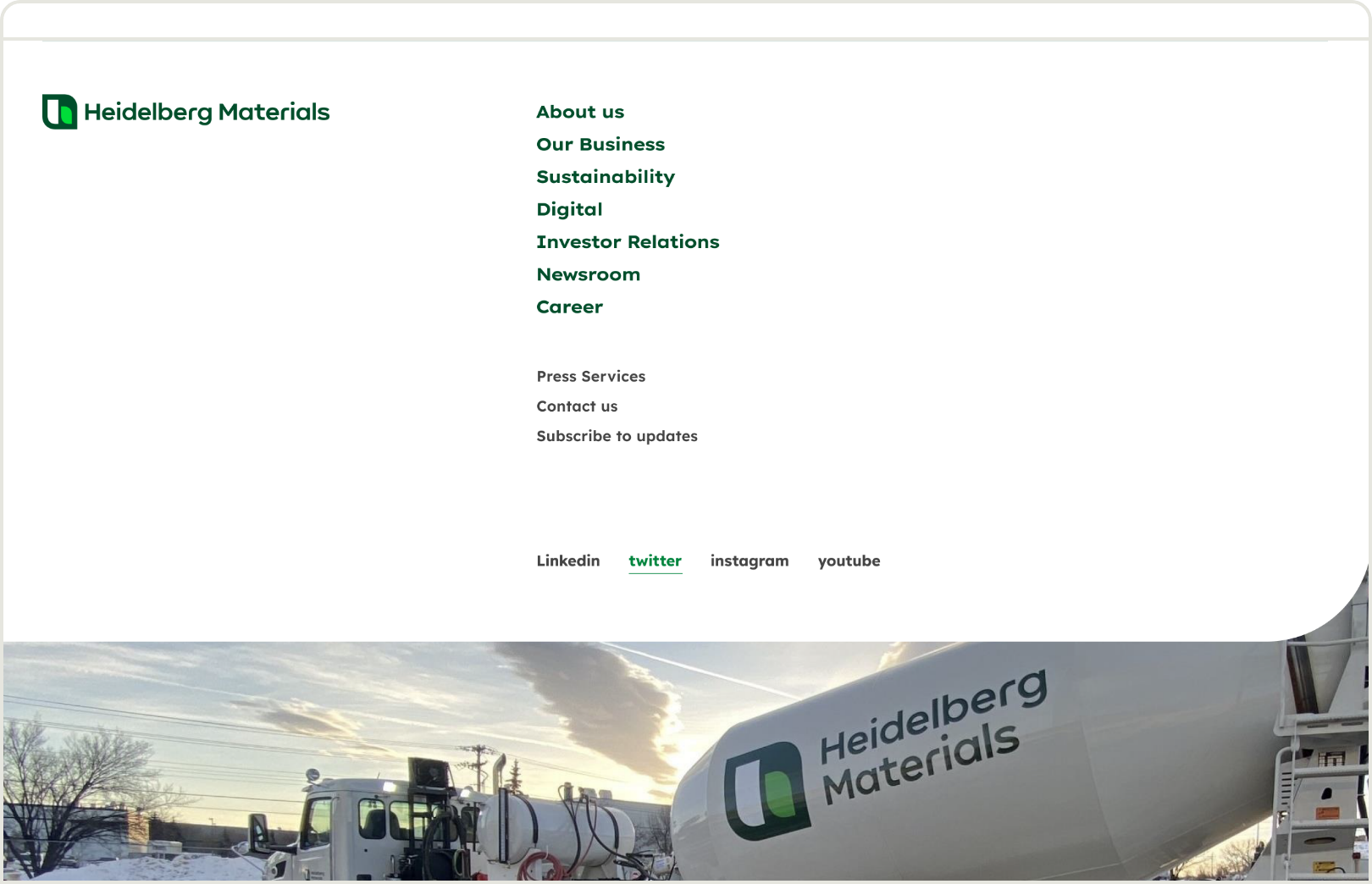
The footer contains our sitemap, the most important information, and links to our social-media channels.

Dos and don'ts
Dos and don'ts grid
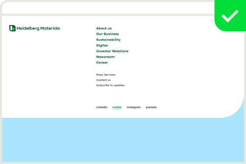

Imagery may be used in the background.
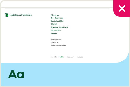

Text or copy may not be used in the imagery.
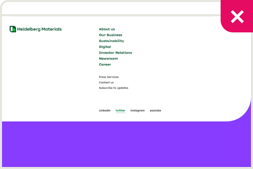

Colours may not be used in the background.
Contact
Any questions about our guidelines?
Contact us.
- N Support
- T + 49 211 690787-200
- E support@Brandhub.heidelbergmaterials.com