Conventional products packaging
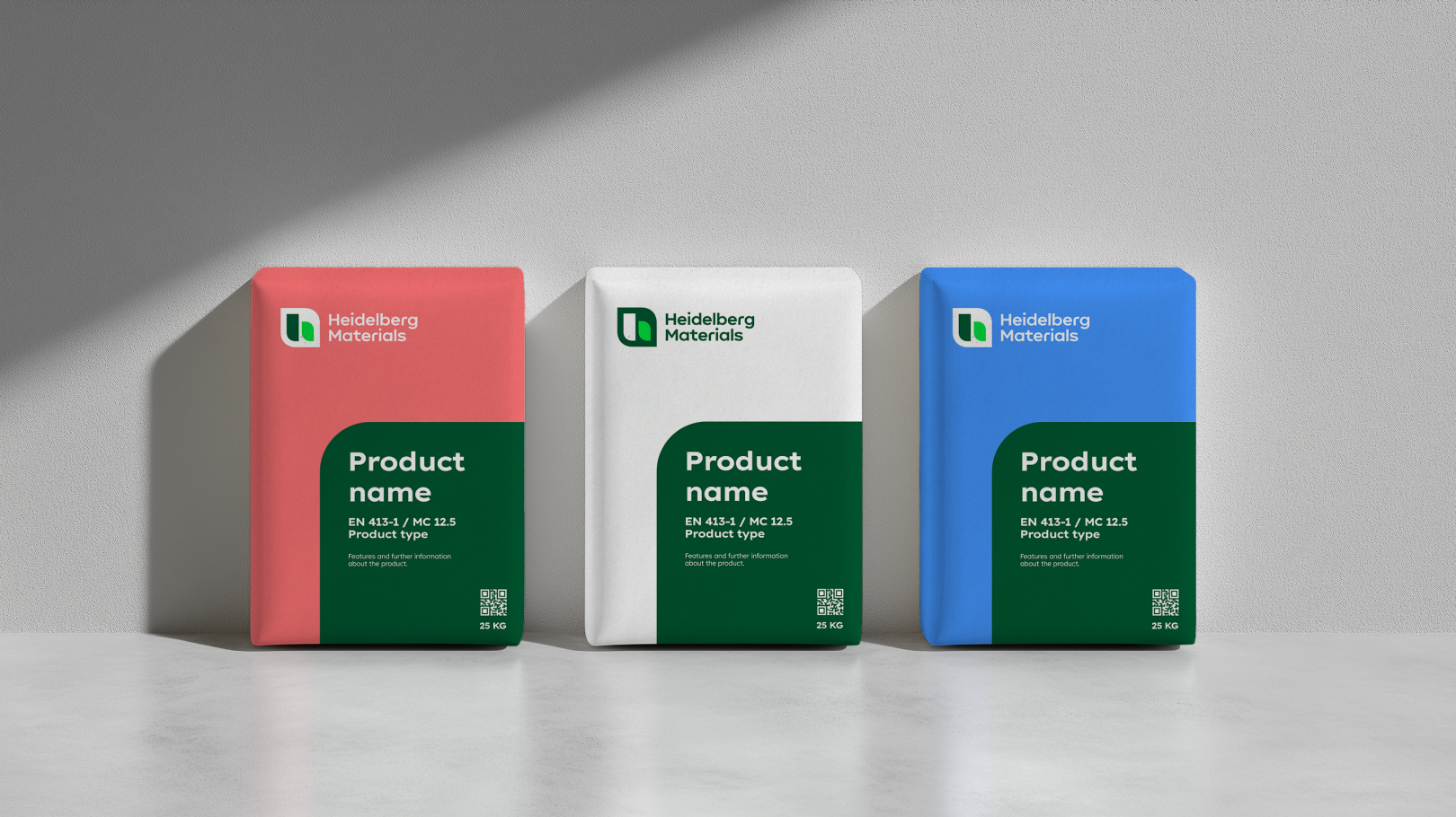

At Heidelberg Materials, we are committed to delivering our products globally while catering to the unique demands of each local market. As these demands vary, so too does the visual design of our product packaging to ensure relevance and appeal.
However, with the launch of our sustainability brands, it is important to visually distinguish these from our conventional product lines. Therefore, we have established some key guidelines to follow when designing packaging for our conventional products.
For more details on our sustainable product packaging, please check out the evoBuild packaging guidelines.
Differentiation
The packaging designs for sustainable and general products differ in their use of brand elements. The overview below highlights all key parameters.
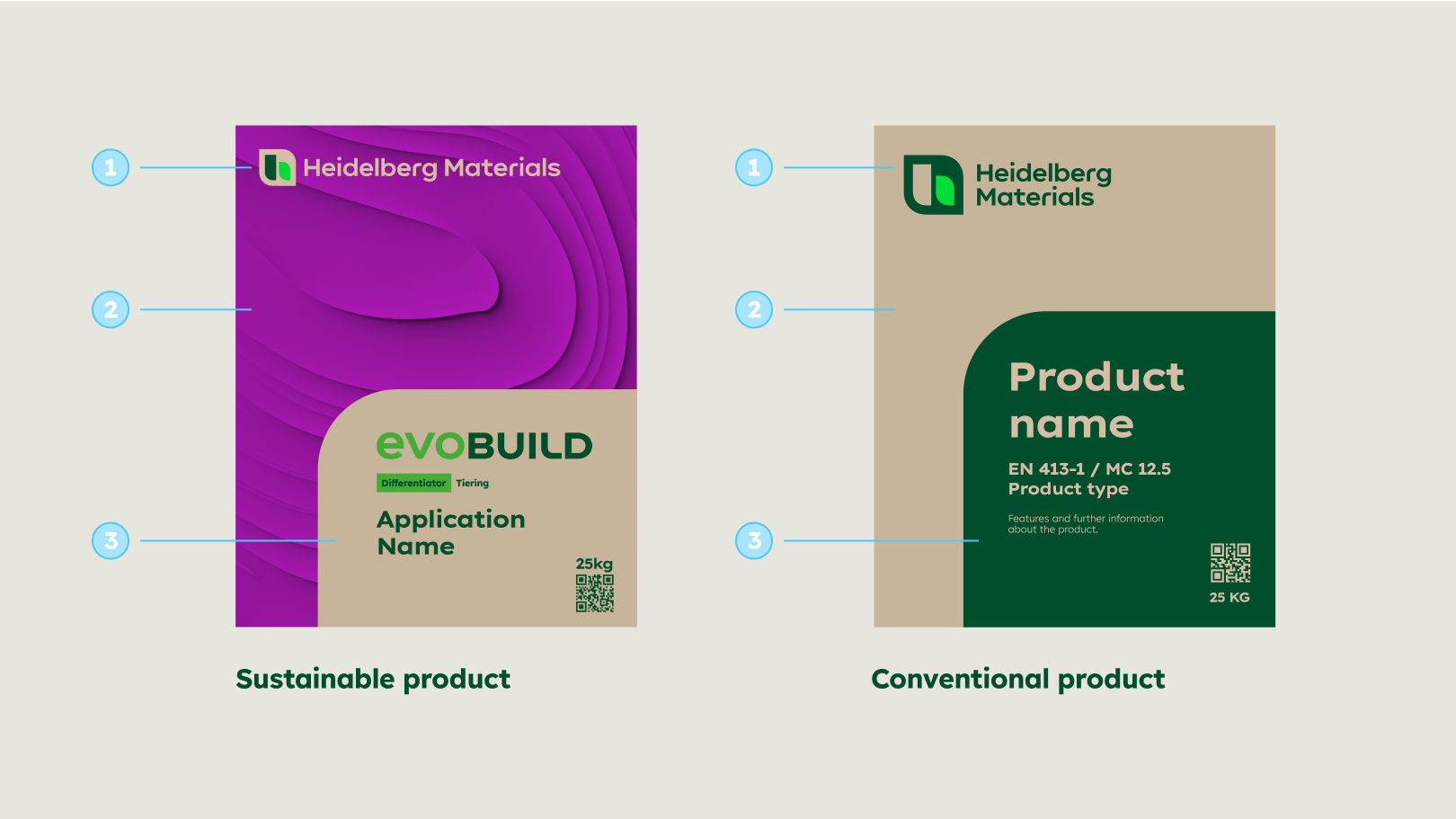

- Company logo
- Background image and colour
- Shape
Please consider the in-depth descriptions of each design element and their correct usage below.
Logo
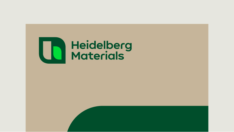

Conventional products
Only the compact logo may be used.
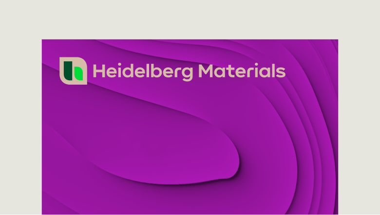

Sustainable products
Only the single line logo may be used.
Shape
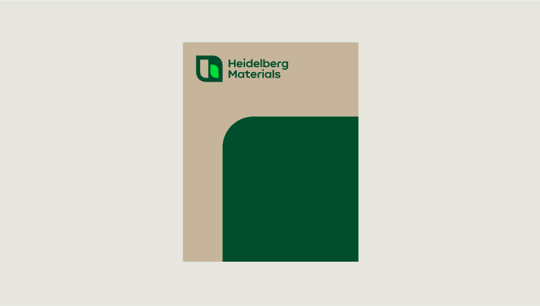

Conventional products
The designated colour for the shape is Deep Green. Do not use any other colours for the shape.
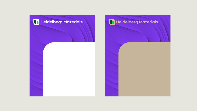

Sustainable products
The designated colour for the shape is white. If printing white is cost-prohibitive, the shape may be omitted, allowing it to appear in the colour of the packaging material.
Background colour
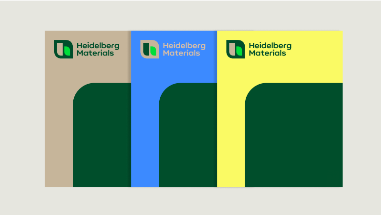

Conventional products
Backgrounds can be set up in various colours to distinguish product lines. The background colour should complement the deep green shape while providing sufficient contrast.
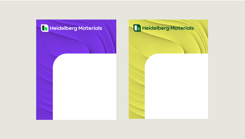

Sustainable products
Backgrounds are set up exclusively using predefined colours and images. For more details, please refer to the evoBuild packaging section.
Basic layout principles
These principles apply to conventional product packaging only. For layout principles for sustainable products, please refer to evoBuild packaging.
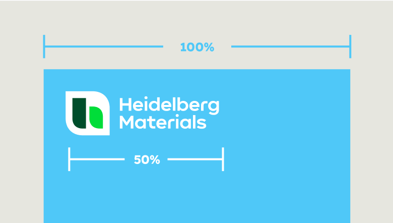

Logo
The logo width equals 50% of the format width.
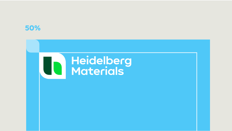

Margins
The margins equal 50% of the icon width.
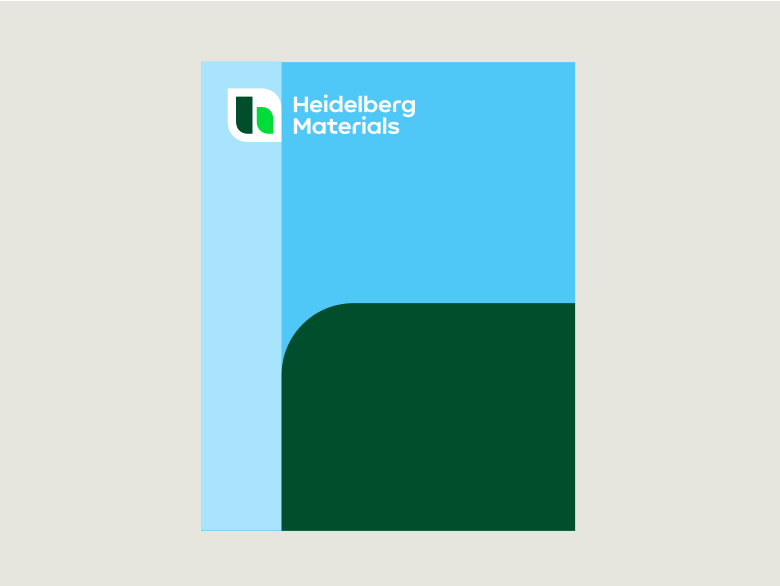

Shape width
The shape is aligned with the right edge of the icon.
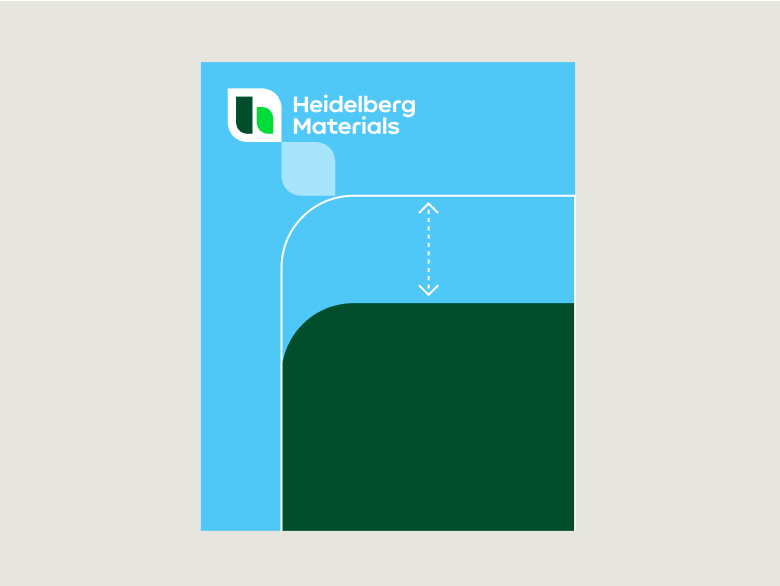

Shape height
Depending on the amount of content, the height of the shape can be varied. The space between the logo and the shape must be no less than the height of one icon.
Content elements
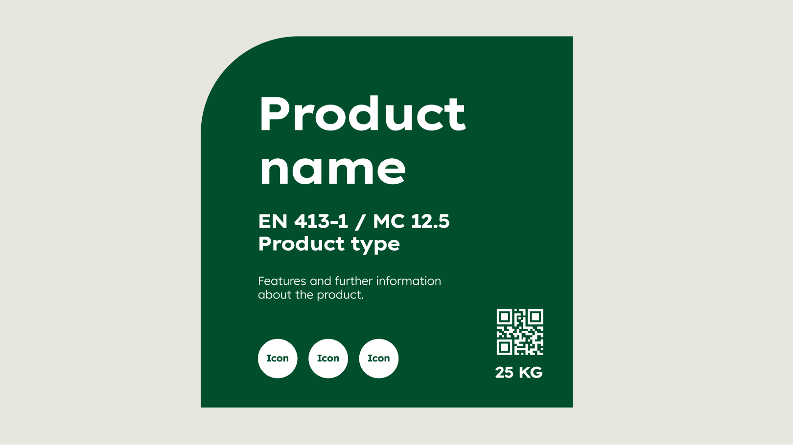

The design shown is only intended as an example. The specific content within the shape and the emphasis of the information may vary according to the region or market.
However, when designing, it is essential to adhere to the general guidelines regarding typography and the use of shapes.
Logo printing
Packaging is produced using a varying number of printing colours based on budget and design requirements. Depending on the number of colours used in the printing process, different versions of our logo may be employed.
Three colour logo
Deep Green, Bright Green, White
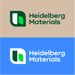

Two colour logo
Deep Green, Bright Green
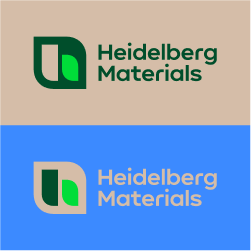

Monochrome logo
Deep Green*
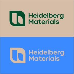

The number of colours needed for printing is influenced by the base colour of the substrate. The examples shown here are specifically for brown paper packaging.
Regardless of the type of production, it must be ensured that the logo has sufficient contrast to the background and is easily recognizable. The positive or negative logo variant can be selected according to what is most appropriate for the case at hand.
*The colour of the monochrome logo should align with the overall colour selected for the packaging. If only one colour is being printed, the logo can be produced in that same color (e.g., if the printing colour is green, use a green logo; if it is blue, use a blue logo).
Don'ts
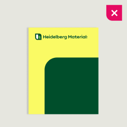

Do not use the single-line logo for conventional products.
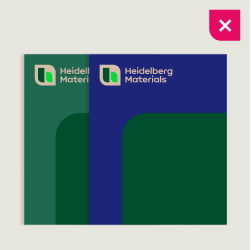

Do not use background colours that have little contrast to the Deep Green shape.
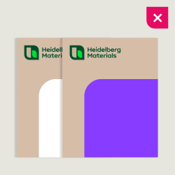

For conventional products, do not use shape colours other than Deep Green.
Contact
Any questions about our guidelines?
Contact us.
- N Support
- T + 49 211 690787-200
- E support@Brandhub.heidelbergmaterials.com