Events and exhibitions


Spatial branding
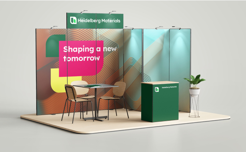
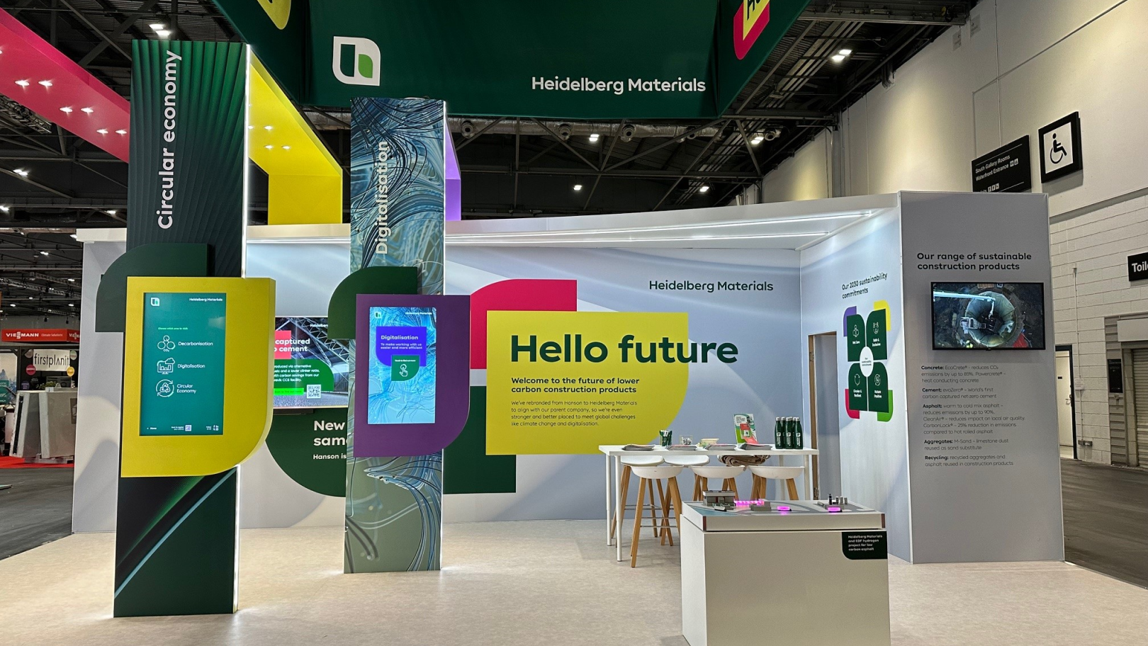
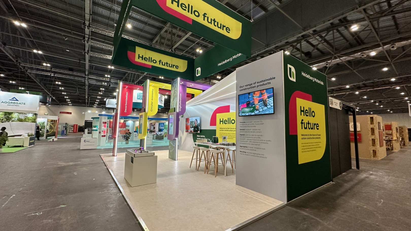
Events and trade shows are an excellent opportunity to let our brand shine in the physical world. Therefore, a consistent use of our brand elements is necessary in spatial designs as well in order to ensure recognizability and a positive customer experience.
Make spaces feel unmistakably Heidelberg Materials.
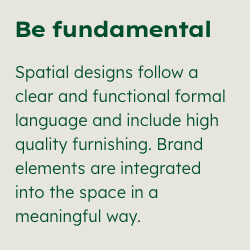

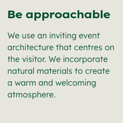

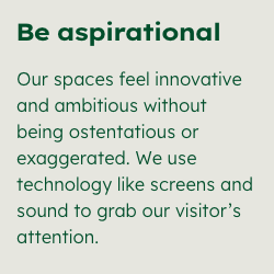

Level of expression
Our design fields are also utilized in spatial designs, which often involve a complex interplay of different designed elements. Therefore, the overall impression of the stand or space is crucial. This means:
The long-distance visibility and overall impression of a stand or room should align with either the “Inform” or “Inspire” design fields, depending on the context and communication objective. For more information on choosing a design field, please refer to the Design Fields chapter.
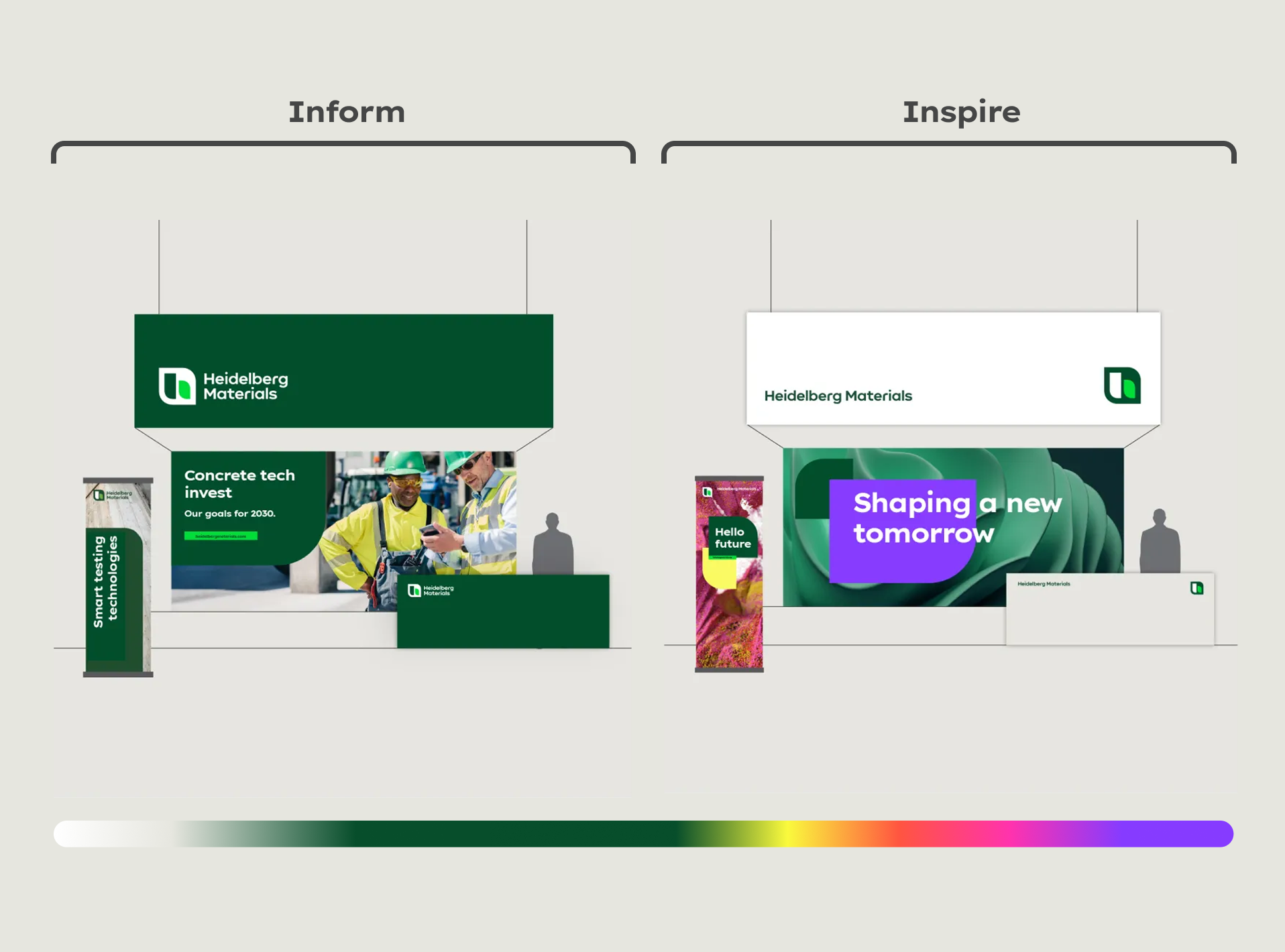

However, not every single element within the space is required to adhere strictly to the same design field, as this is often not feasible in practice.
Elements that do not significantly impact the overall image, such as product information or giveaways, can be executed in their corresponding design field or product branding.
Example: Even if a trade fair stand represents the corporate brand using the “Inspire” design field, a photo background in the stand can use the “evoBuild” design and logos to highlight the evoBuild product brand.
The correct logo
The principles outlined above are equally applicable to the use of our logo. Generally, the logo’s application should align with the chosen design field.

Use the compact logo for the design field “Inform”.

Use the floating logo for the design field “Inspire”.
In exceptional cases, the single-line logo may be utilized, particularly when it is suitable for long, low lettering or signage. However, the compact or floating logo is always the preferred option. For further details, please refer to the Logo chapter.


Size of the logo
The size of the logo refers primarily to the dimensions and format relationships defined in the design system. There are other aspects to consider for events and trade-fair stands. These include the architectural nature of the room, the given lighting situation and the distance from which the exhibition stand can be viewed.
Please contact support if you have any questions on this topic.
Learn more about the use of our logo in spatial environments in the Signage section.
Representing product brands
If the focus is on representing a product brand rather than the corporate brand, the design of the stand should adhere to the guidelines specific to that product brand. See our sustainable brands guidelines as an example for product branding.


Optimal positioning
Ensure that key elements, like the logo and text, are always clearly visible from a distance. This also applies to readability up close. Position text messages at eye level for maximum impact.
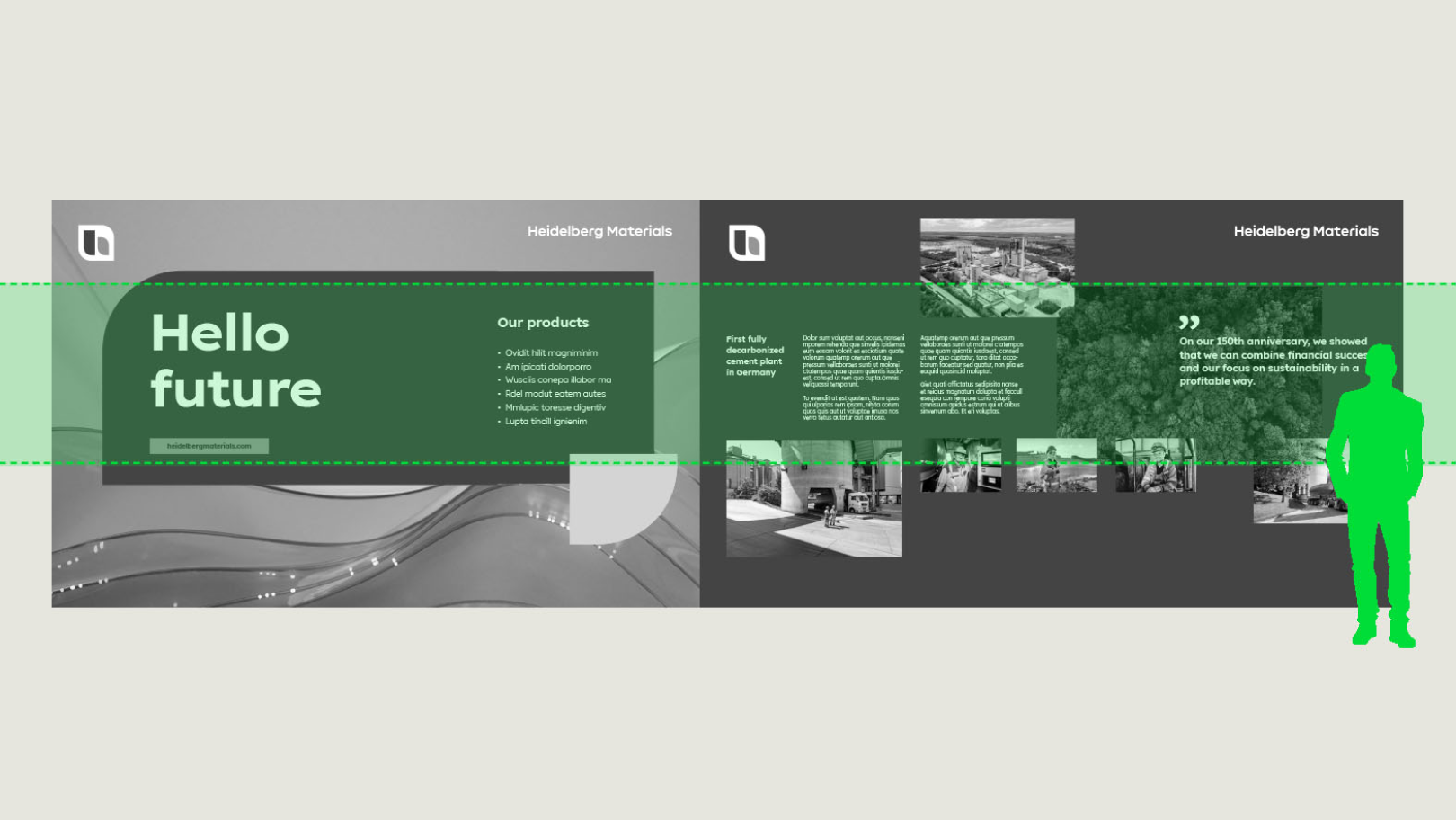

Position text at eye level for clear readability
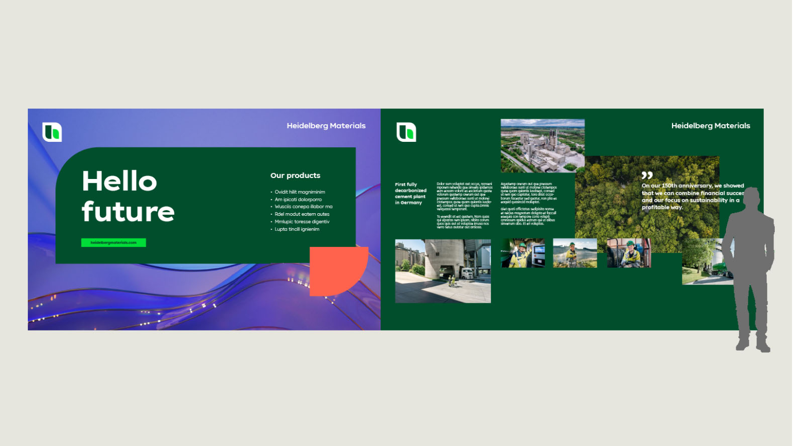

Position text at eye level for clear readability
Surfaces
In event applications, we differentiate between single surfaces and multiple surfaces.
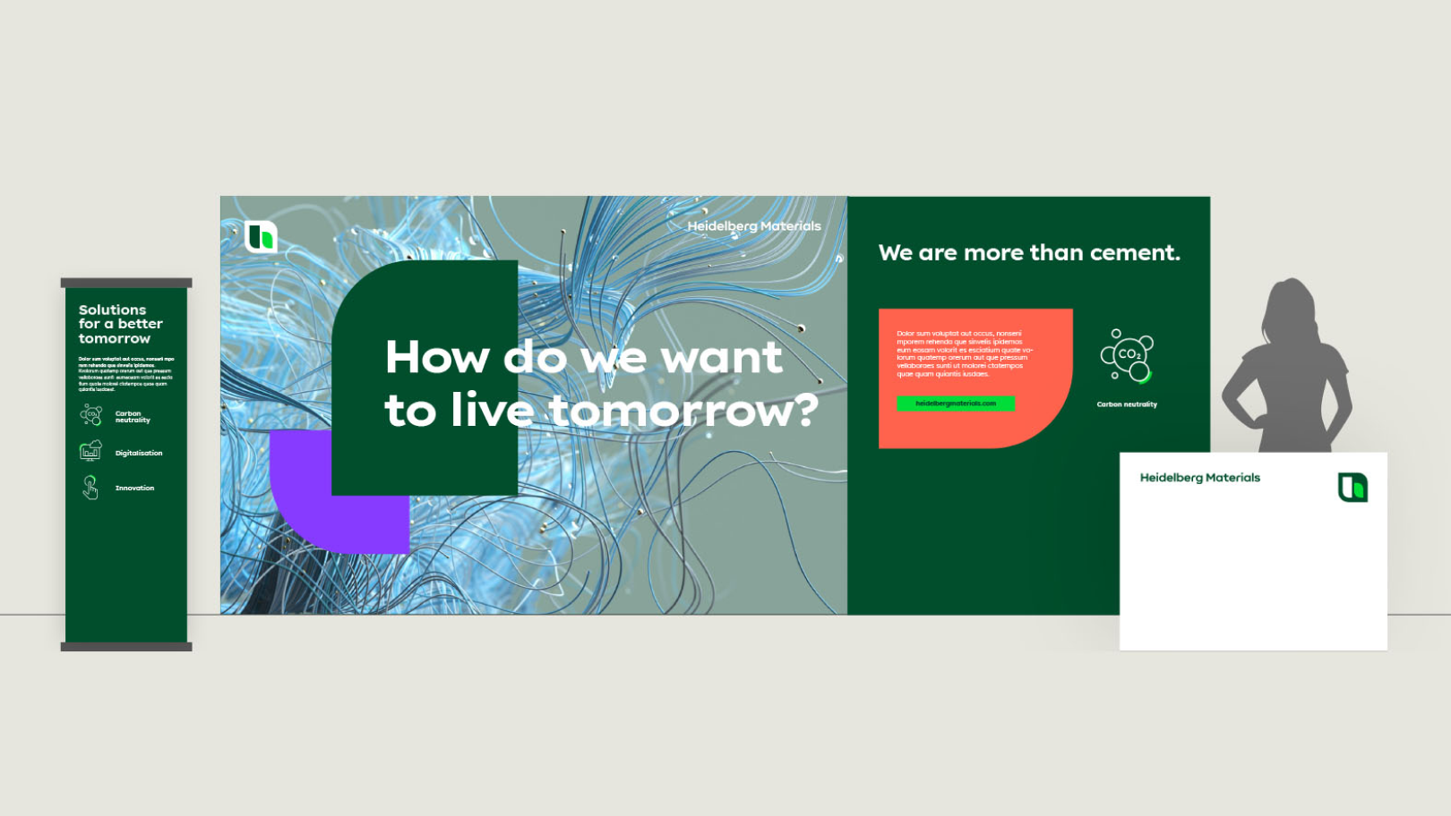
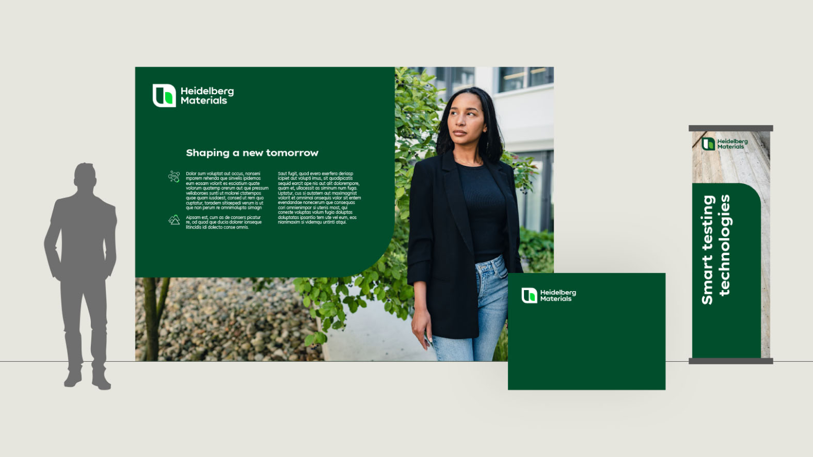
Single surfaces work with the brand elements on one area, whereas multiple surfaces such as complex, multi-area exhibition stands can display our brand elements across the entire stand.
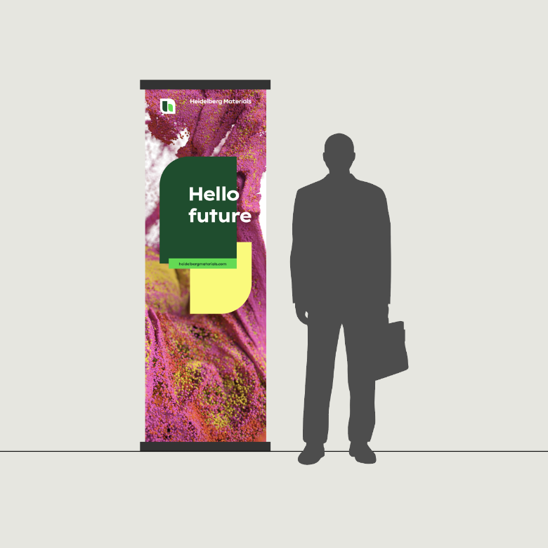

Single surface
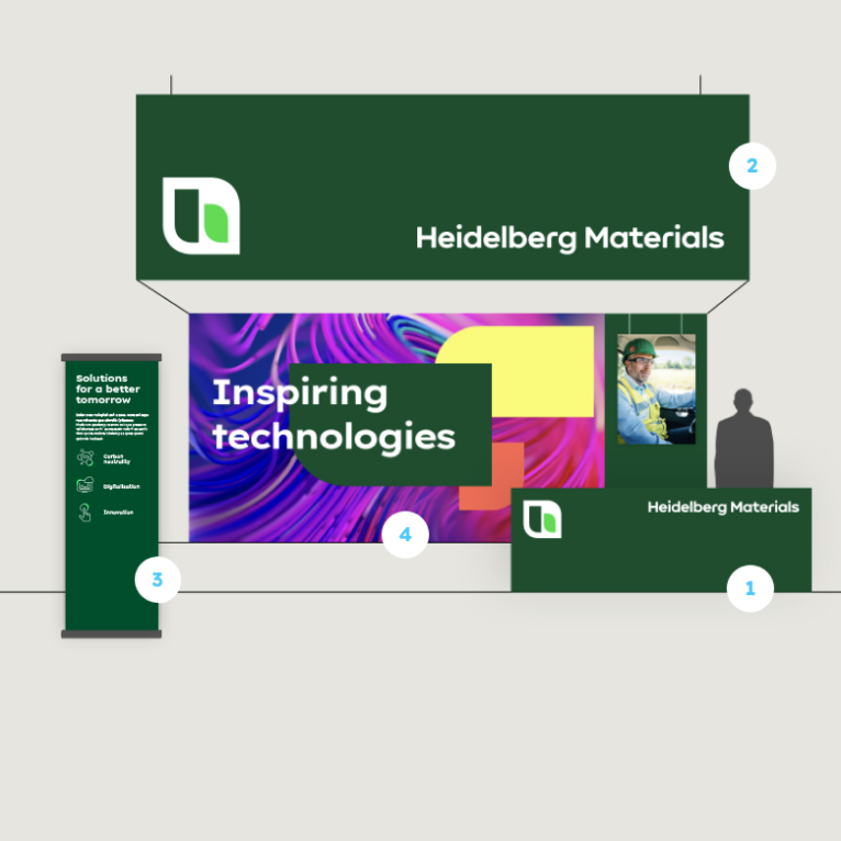

Multiple surfaces
Multiple trade-fair booths can be orchestrated through many different modules:
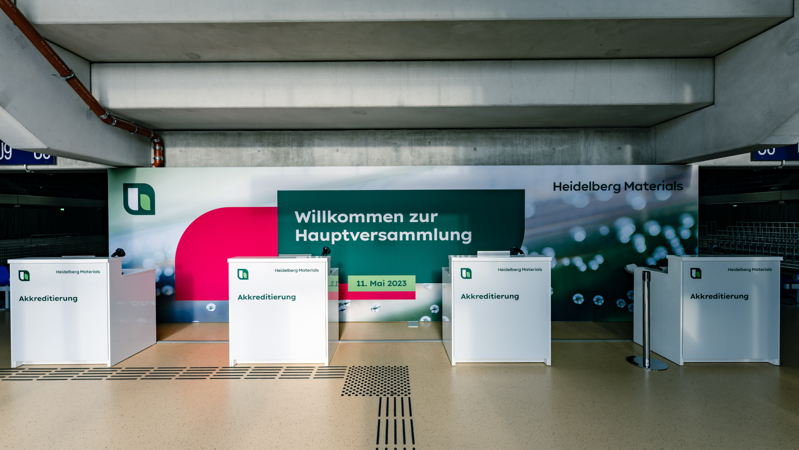
1 Counter
2 Banner
3 Roll-up
4 Backdrop
The combination of different surfaces should depict the overall brand image.
Single surfaces
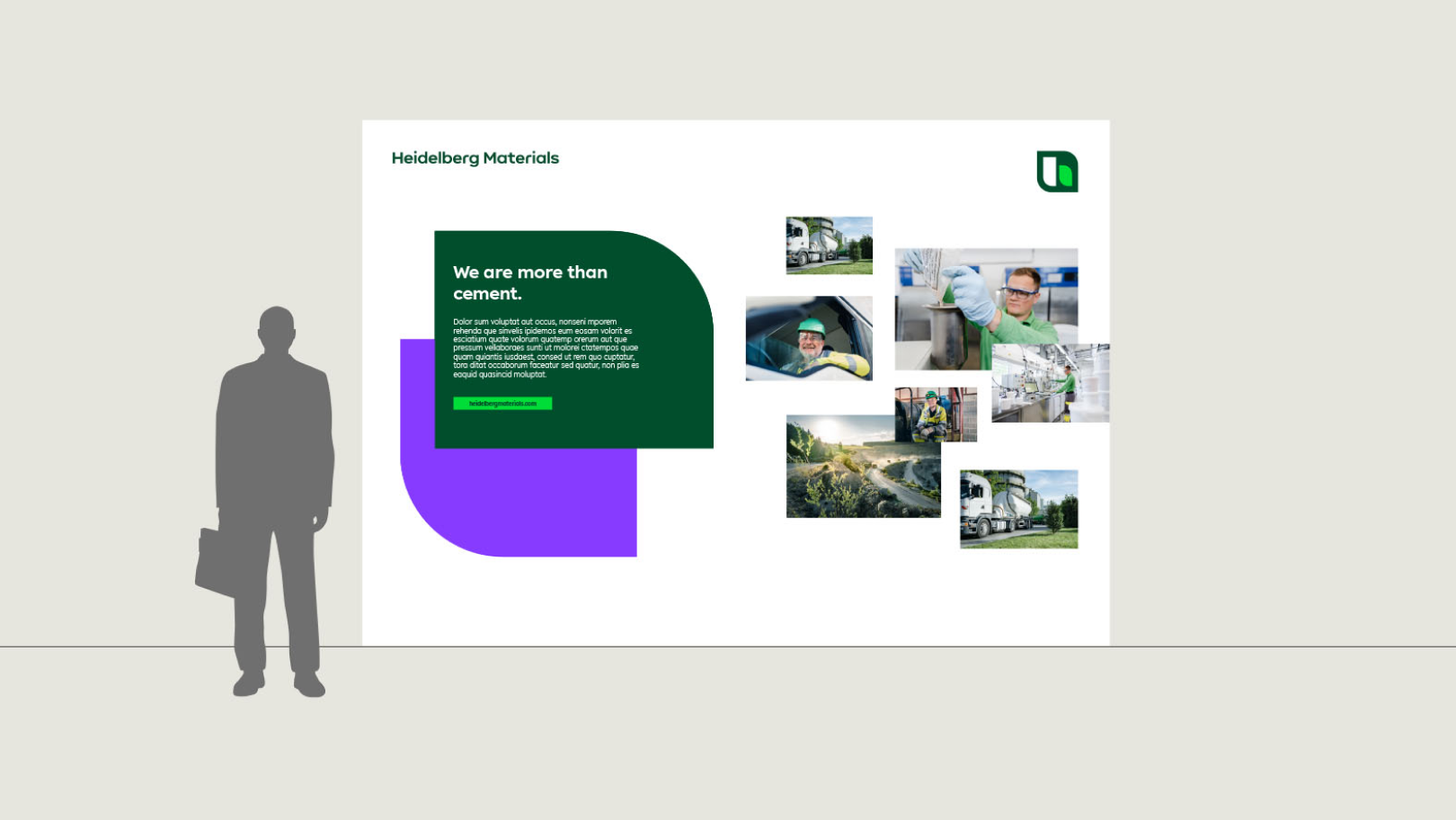

Backdrop
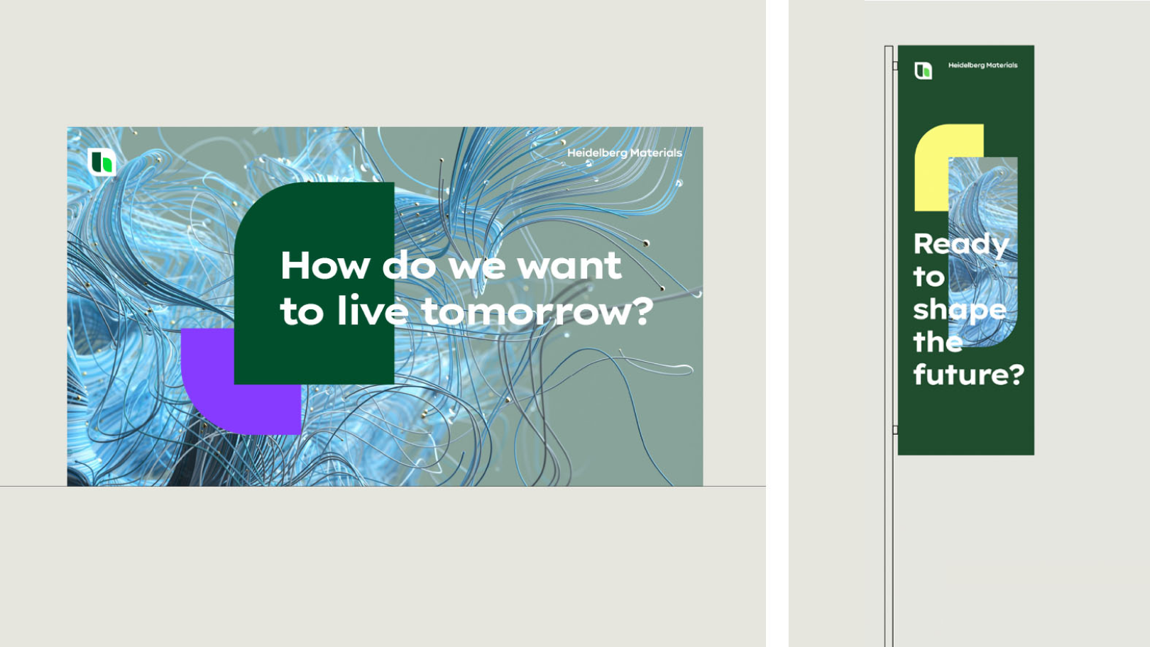

Backdrop, flag
Multiple surfaces
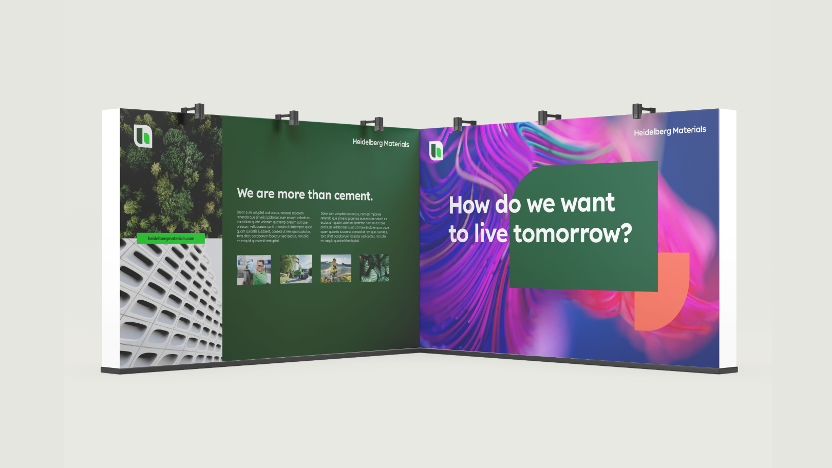
If more than two surfaces are placed side by side, repeating the logo can be omitted. This is applicable only when the surfaces are clearly visible from a distance and from all perspectives.

When two or more walls form a room, the logo may not be visible from every angle. In such cases, ensure that Heidelberg Materials is clearly identifiable as the source.

Certainly, individual surfaces may incorporate an additional logo when necessary for the context of a stand. In such cases, the basic guidelines for using our logos within the design fields apply.

Dos and Don'ts
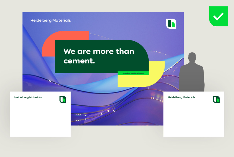

A balanced selection of motifs and colours is essential for the overall appearance.
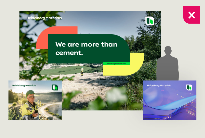

An excess of subjects can dilute the focus.
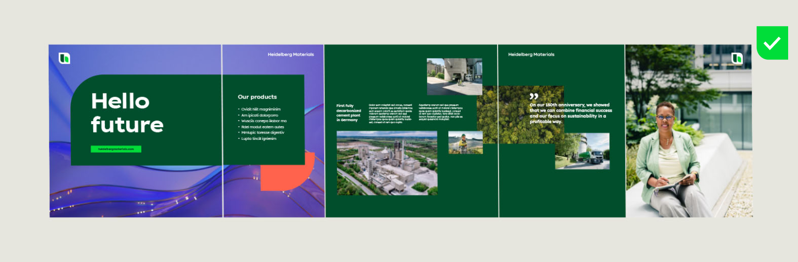

The combination of all surfaces creates the overall picture. Text content can also be placed on solid backgrounds in primary colours.
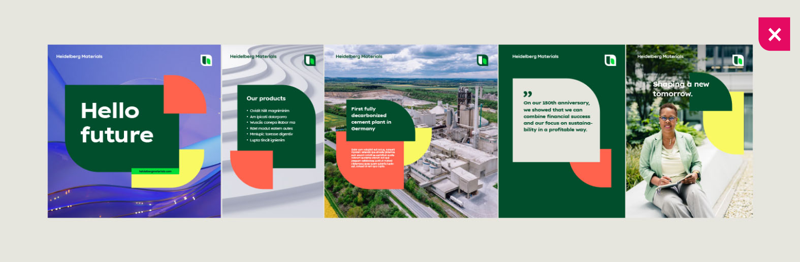

Avoid unnecessary logo repetitions and excessive use of shapes.
Stage design
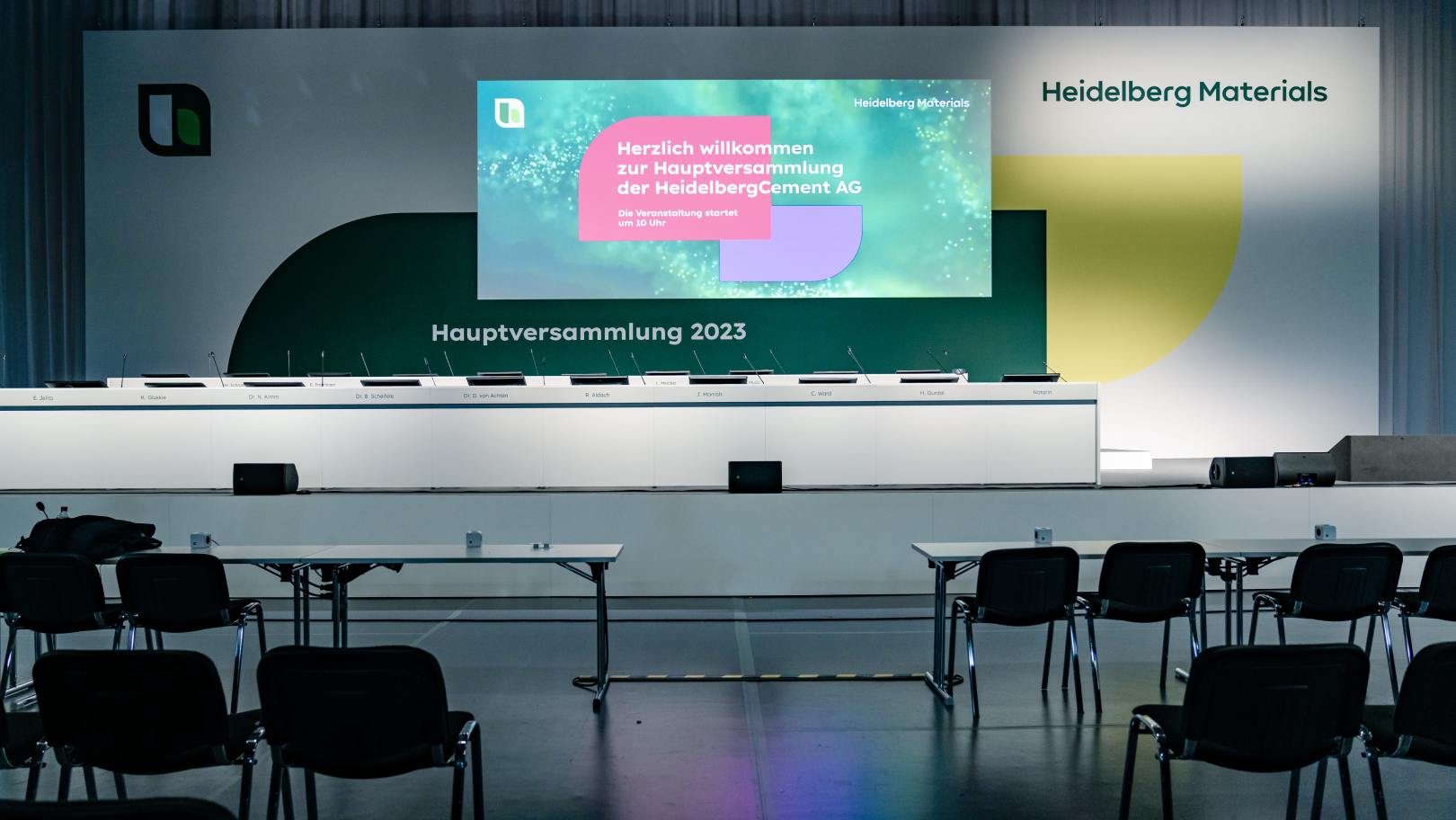
For large events with an audience, photographers and film documentation, make sure that the stage is not overly complex. The focus should be on the speakers.
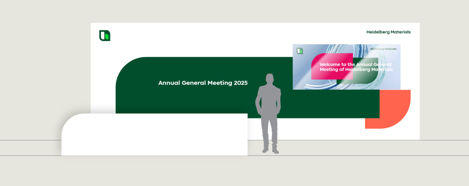

The logo and text messages must be clearly recognisable from a distance.
The projector start screen can be incorporated into the overall design. It's important to involve technical experts as early as possible.
Ensure good illumination with neutral lighting to maintain true color appearance.
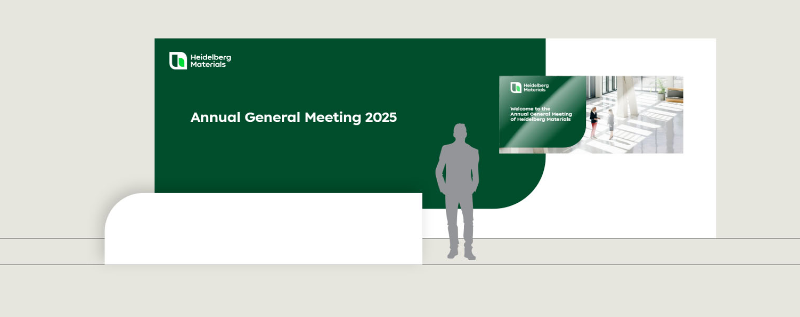

For the “Inform” design field, use the compact logo.
Examples
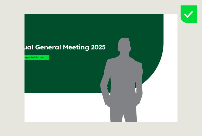

In close-up shots, the speakers should have a calm background.
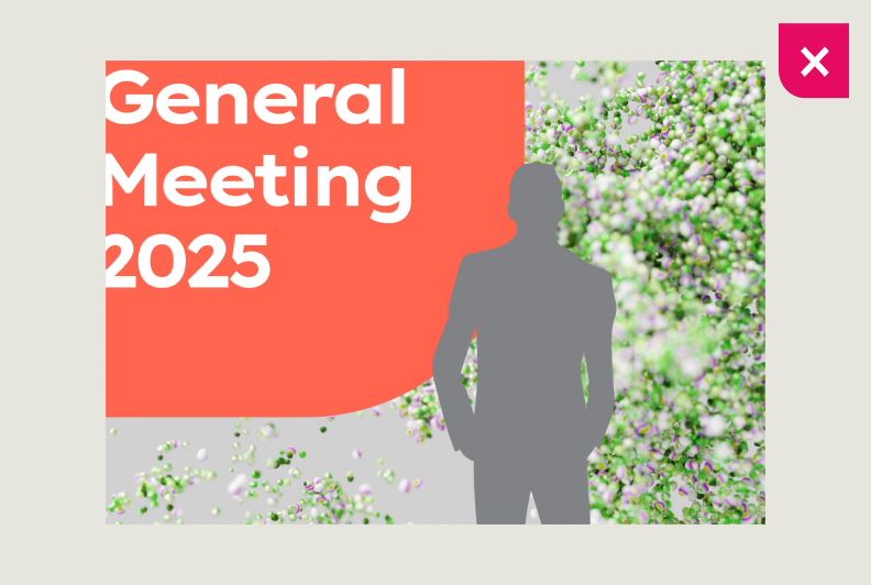

Busy backgrounds can distract from the speaker.
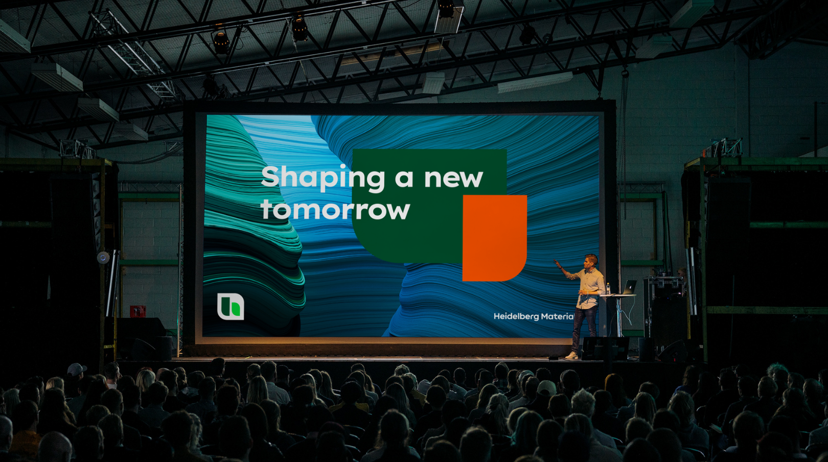

Digital presentation screen
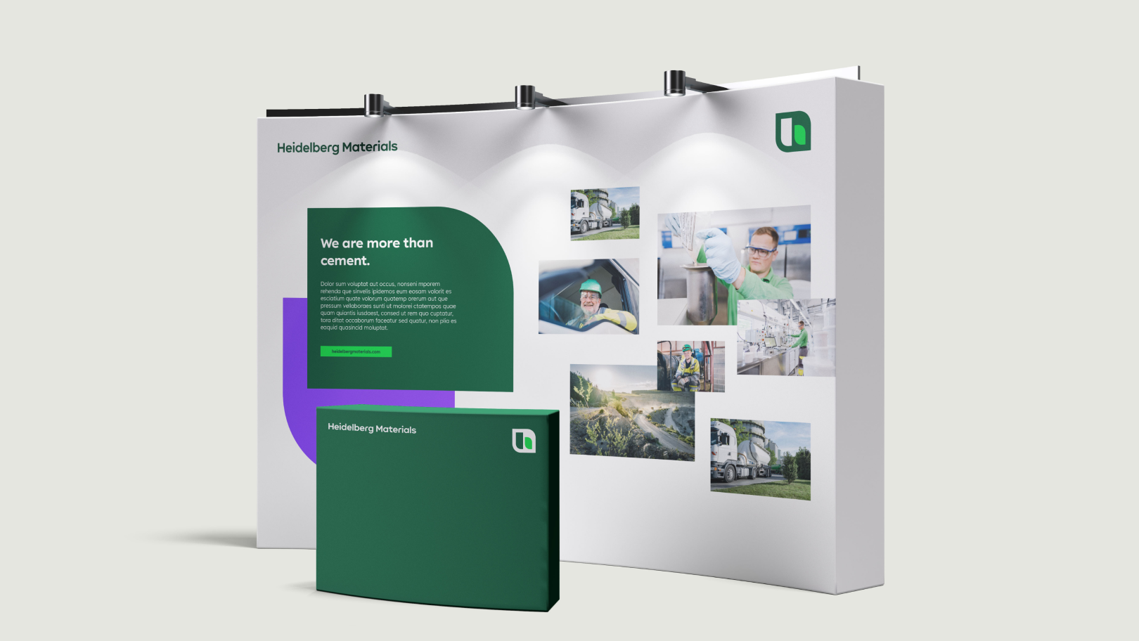

Backdrop
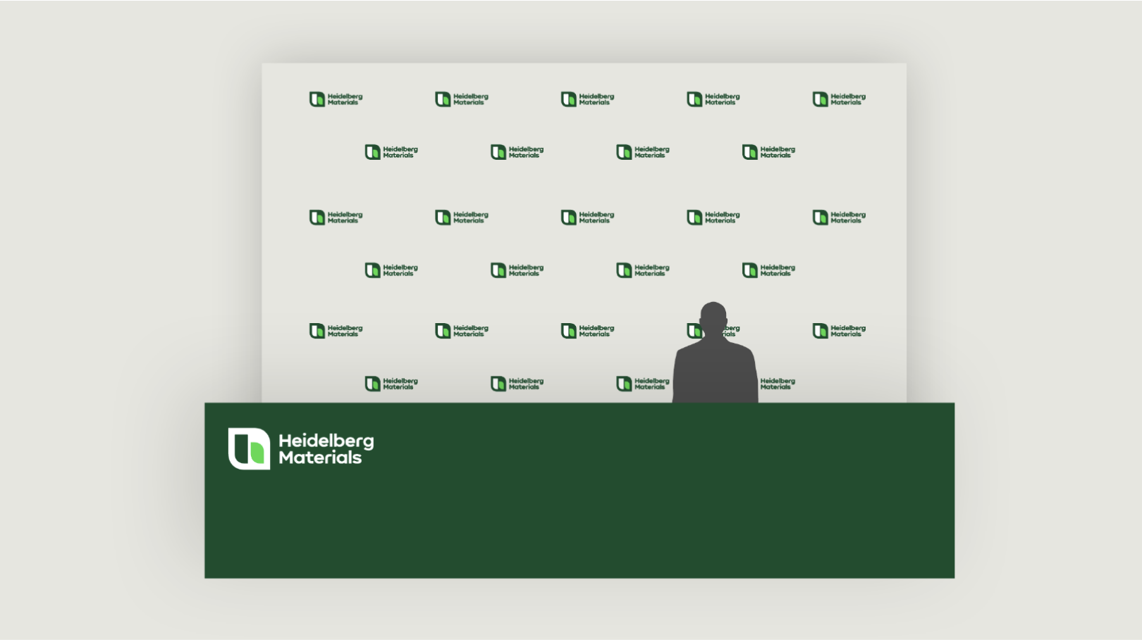

Logo wall
Dos and Don'ts
Multipicture
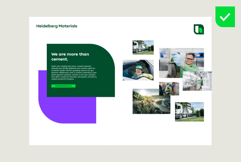

Image motifs are allowed in backgrounds, within shapes, or as multi-picture compositions.
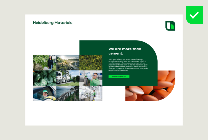

When using multi-picture compositions, it is important to maintain a balanced and calm layout.
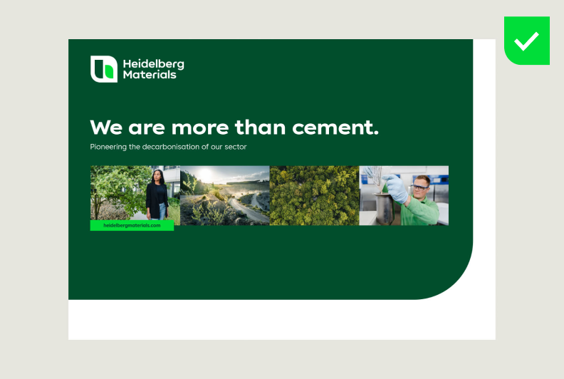

When using multi-picture compositions, it is important to maintain a balanced and calm layout.
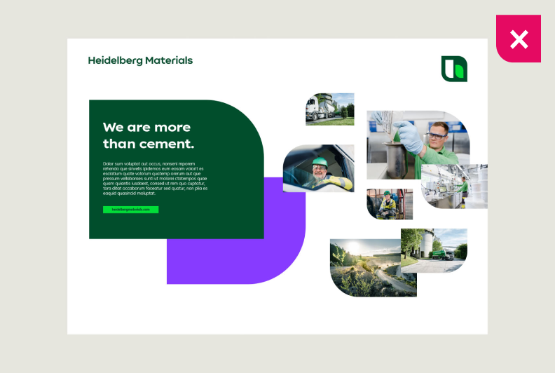

Repeating shapes is not allowed.
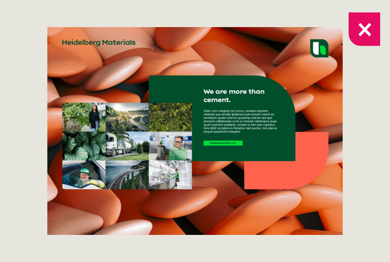

Placing multi-picture compositions on images creates a cluttered appearance and is not allowed.
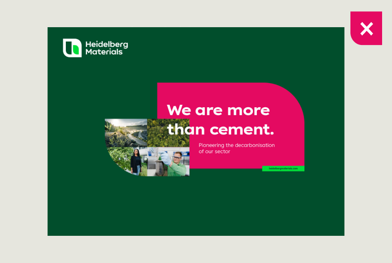

Avoid mixing the design fields “Infom” and “Inspire.” Multipictures should not be placed within shapes. For visibility reasons, headlines should not be placed on multipictures.
Best practice




Contact
Any questions about our guidelines?
Contact us.
- N Support
- T + 49 211 690787-200
- E support@Brandhub.heidelbergmaterials.com