Imagery
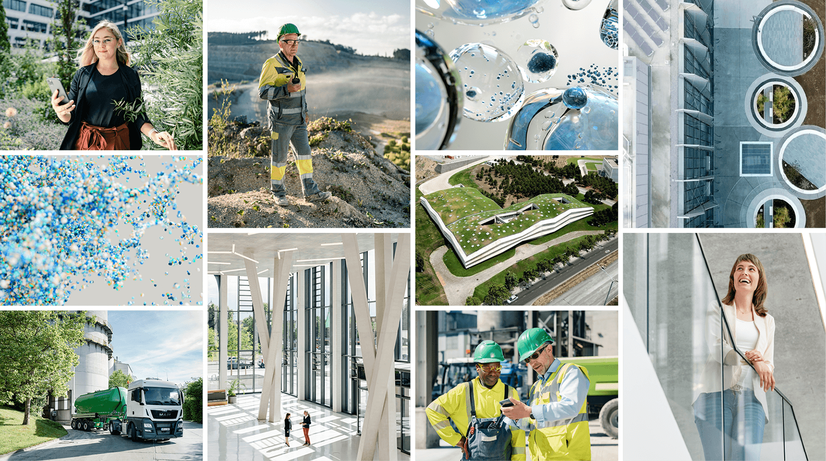

Imagery makes our brand an emotional and tangible experience. We show our company in all its facets: The products and solutions for our customers, our vision for a sustainable future, and especially the people who make it all possible. In addition, we use bold, abstract visuals to illustrate our innovative spirit and progressive attitude.
Imagery
Our brand attributes are the foundation for our storytelling and style:
Fundamental
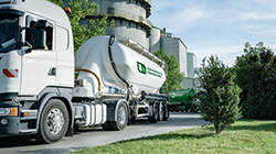

We are clear and straightforward about what we present. We do not beat around the bush.
We depict realistic situations that never feel staged.
Our photography is carefully executed and of high quality.
Approachable


People are at the centre of our content and storytelling.
We present ourselves at eye level with customers and employees.
Our photography creates a warm, friendly and optimistic mood.
Aspirational
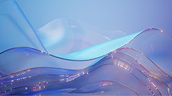

Eye-catching abstract images convey modernity and our future orientation.
Our photography has a dynamic and lively feel. We are not static or melancholic.
Two fields of design
Fields of design
When choosing imagery, we enable you to choose the media which represents your communication context best:
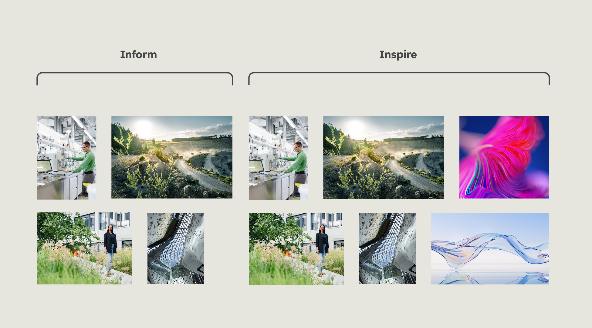
Starting in the design field "inform", we communicate in an informative and fact-based way using realistic imagery that is close to our people, products and business. Moving toward the desing field "inspire", abstract visuals may be used when we communicate our vision as a company and attract our audience in a bold and inspiring way.

Content
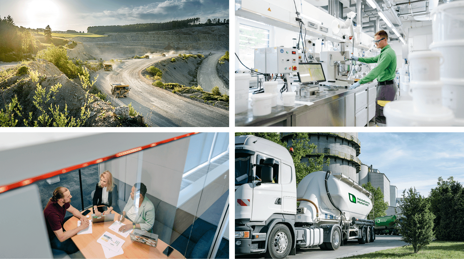
Our products and business fields
We show what we are capable of and how our customers and partners benefit from our expertise. In doing so, we are self-confident, honest and realistic. We do not present ourselves in an exaggerated or obviously staged manner.
Pictures of our products and business fields can be used across the entire fluid design spectrum.

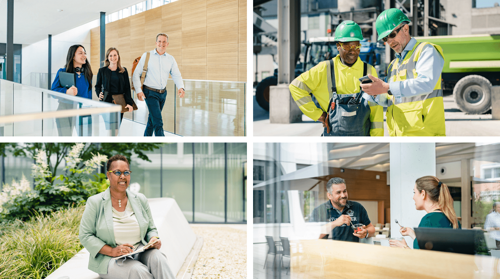
Our people
Our employees and customers are at the heart of everything we do. In our imagery, they appear authentic, approachable and open. Just like in real life, we encounter people of all ages, genders and ethnicities.
People pictures can be used across the entire fluid design spectrum.

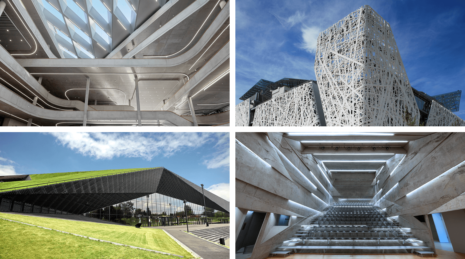
What we make possible
Our products and services turn ideas into reality. Our reference projects demonstrate our capabilities in an impressive way. The images have a modern, innovative and high-quality look and feel.
Pictures of reference projects can be used across the entire fluid design spectrum.

Abstract visuals
We use abstract, expressive and highly dynamic visuals to draw the attention of our target groups. In this way, we visualise our innovative spirit and our visions for the future. Despite the high degree of abstraction, the motifs have a connection to our company, e.g. materials, architecture, digitalisation and sustainability.
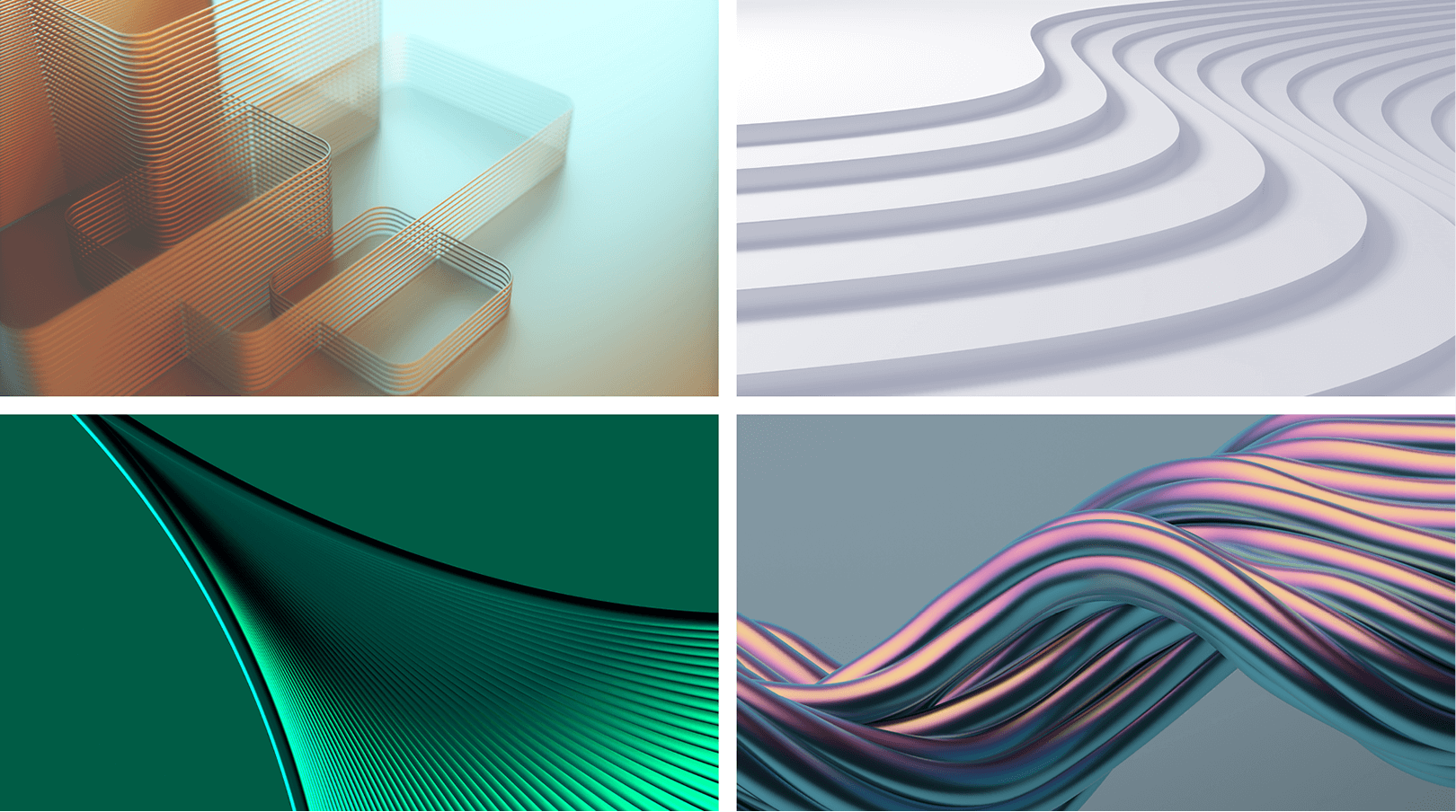

Use abstract visuals only with "inspiring" messaging/media.
Style
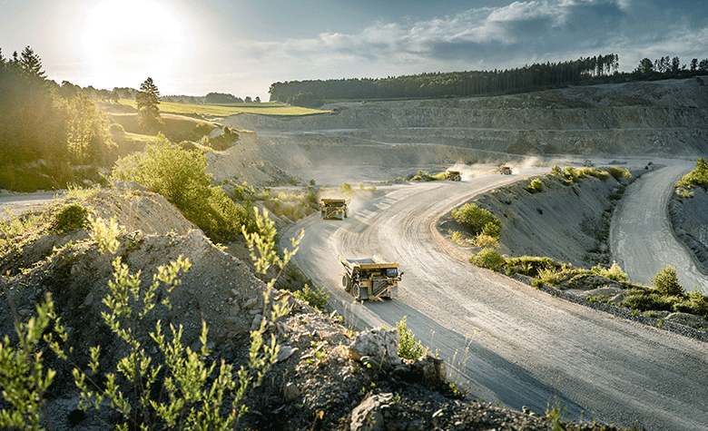

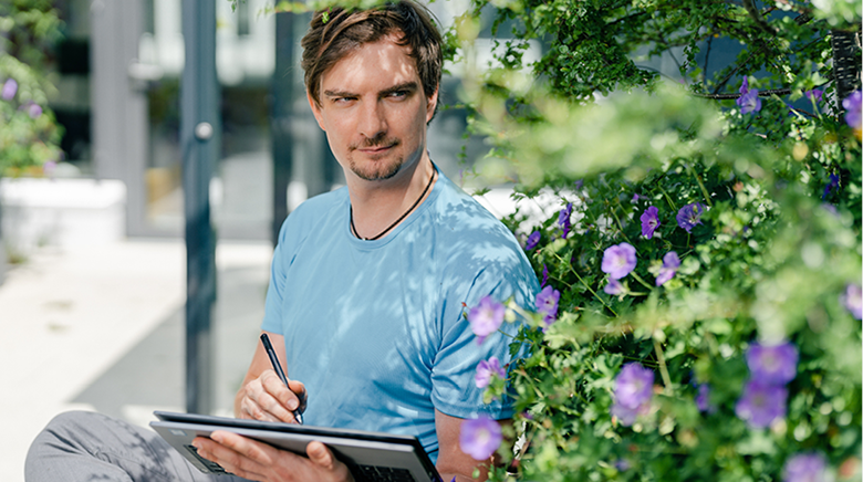

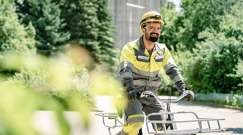

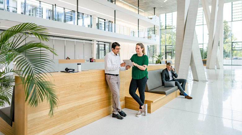

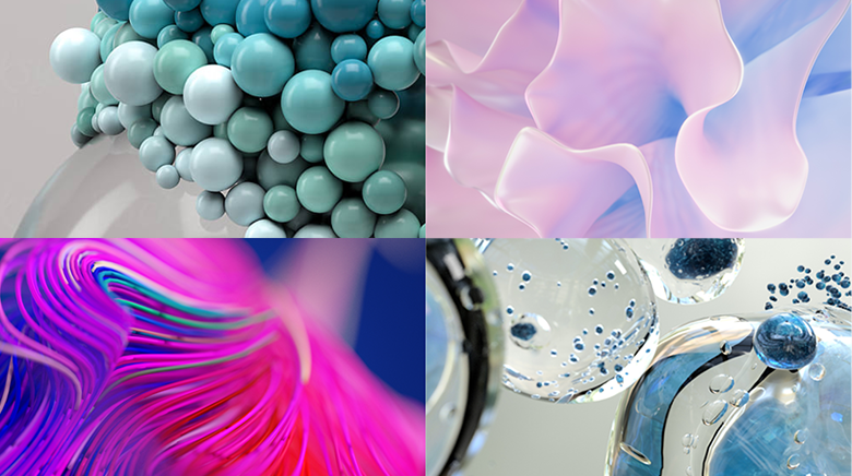

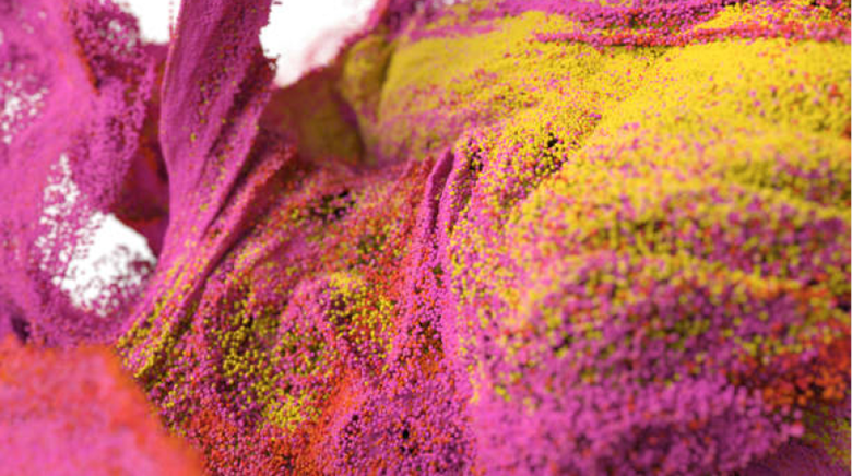

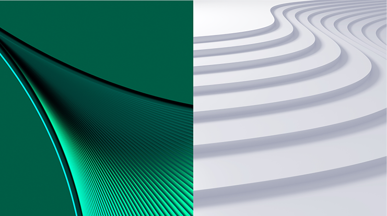

In the Image Library you will find numerous images for both styles.
Adjustment of existing images
We are going to extend our current imagery with new pictures that provide new perspectives, are close to people’s lives, and reflect our overall pioneering spirit. We will, of course, continue to use existing imagery that fits our new image style.
Any colour adjustment requires the indication of the conceptual and formal quality of the basic material.




Adjustment of contrast, hue and saturation in combination with image retouching
Adjustment of existing images
The comparison shown here between the source material and the edited motif typical of Heidelberg Materials providing a general understanding of our image-adjustment principles. Depending on its type, the unedited image has to be adjusted individually with regard to contrast, hue and saturation.



Adjustment of contrast and light
The contrasts are to be adjusted to depict objects and materials in an authentically lighted atmosphere.
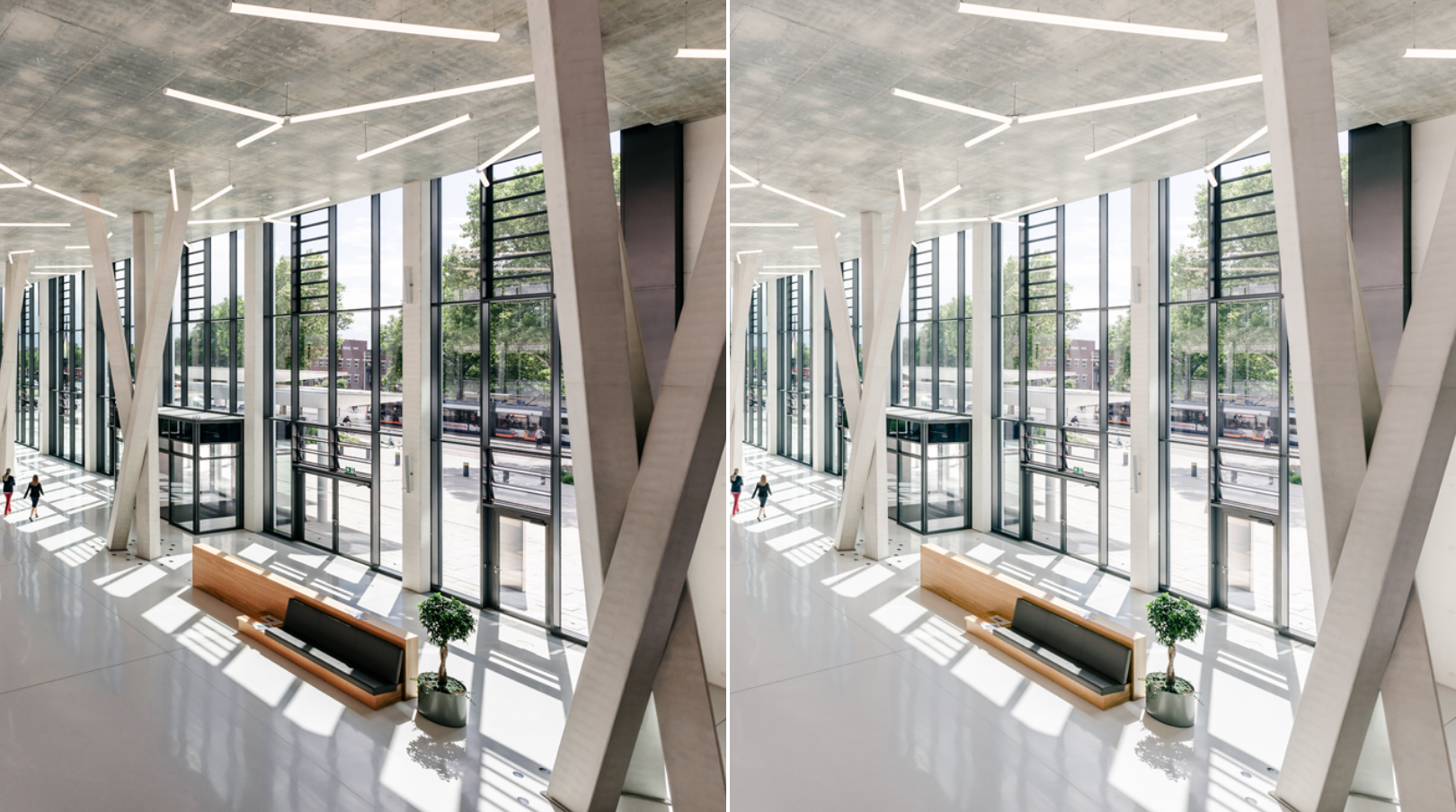

Left image: Contrast in basic image is too high.
Right image: Adjustment to create a natural and authentic contrast.
Adjustment of hue
Especially with skin tones, an adjustment of the hue is sometimes required in order to create a natural and lively look.
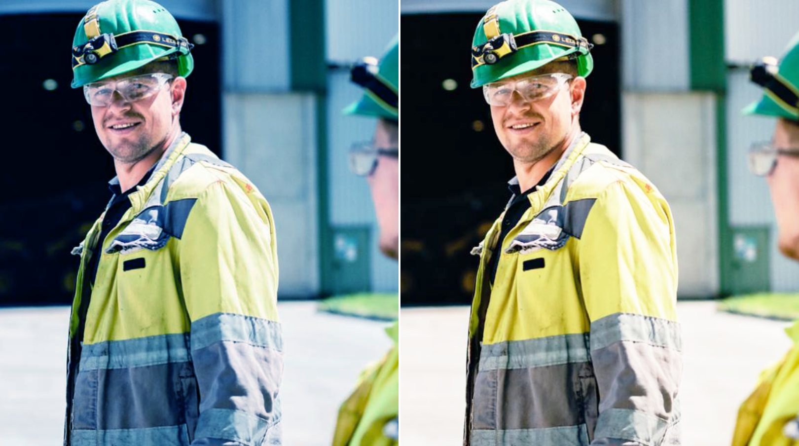

Left image: Basic image is too cold.
Right image: Adjustment to create a warm and natural color appearance.
Adjustment of saturation
In order to make our images appear warm, authentic and natural, the saturation needs to be adjusted.
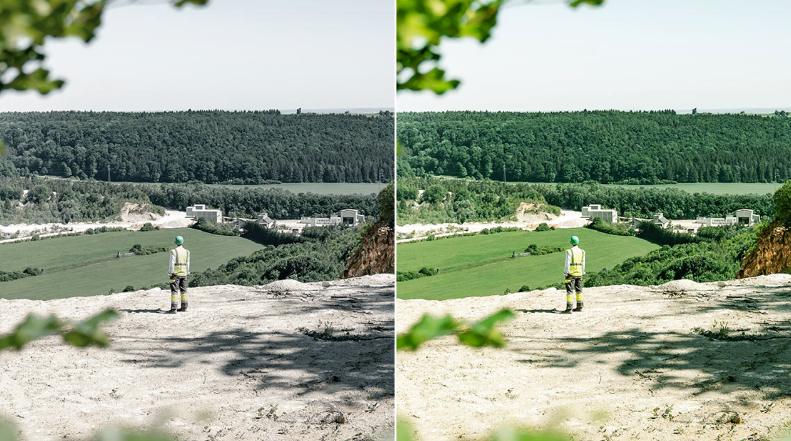

Left image: Basic image is desaturated.
Right image: Adjustment to create a warm and natural colour appearance.
To support you in adapting existing material, you can download a selection of reference motifs, which you can use as a guide for retouching.
Adjustment of the composition
Alignment of horizontal and vertical lines
In the case of pictures of buildings, it is sometimes necessary to straighten horizontal and vertical lines.
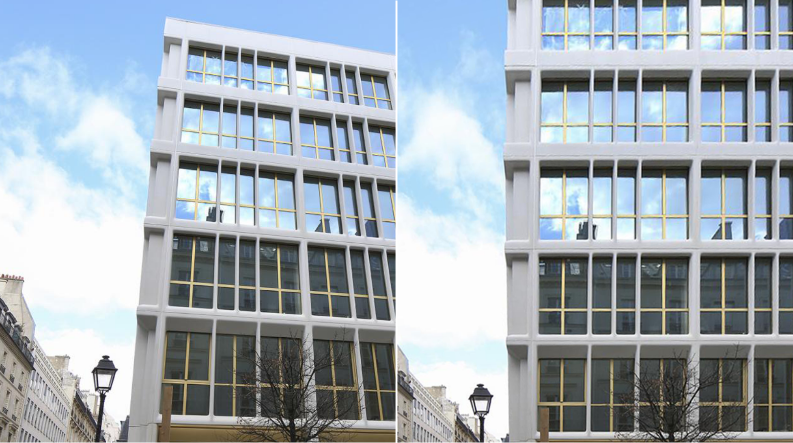

Image calming
Cluttered or distracting image compositions are to be made calmer by means of image retouching to accentuate their respective core messages.
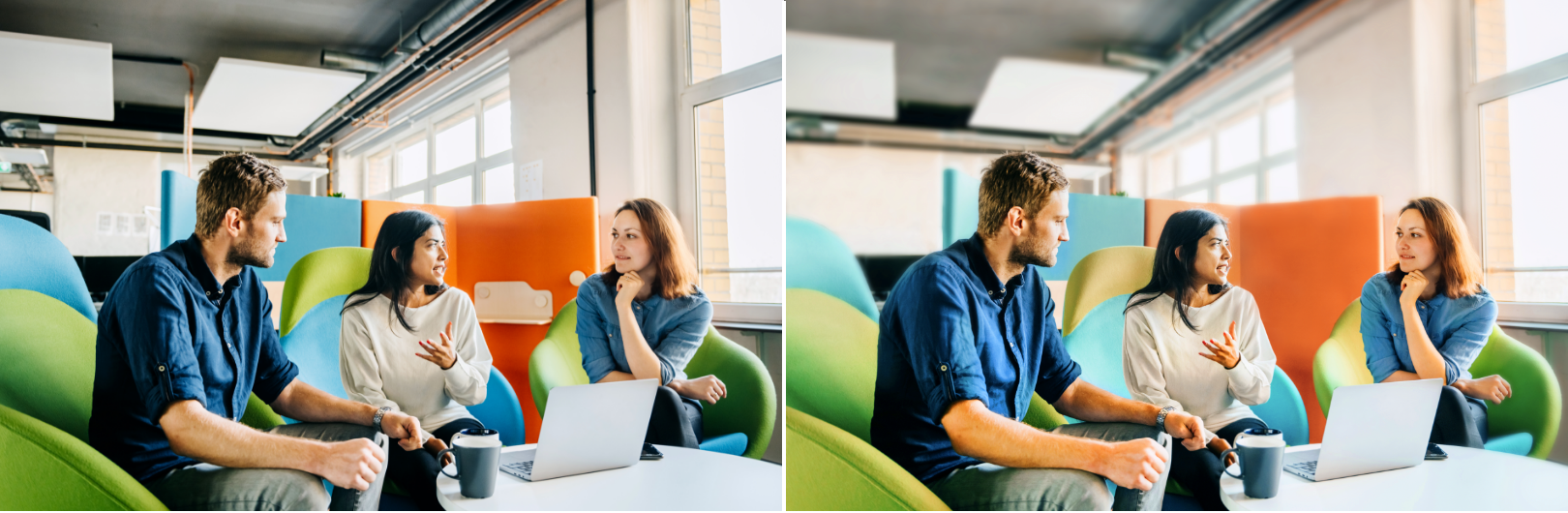

Retouching of distracting objects in the background
Don’ts
Finding the right picture is often difficult. The following examples are intended to provide assistance in sorting out images that are not on-brand. which images are not on-brand.
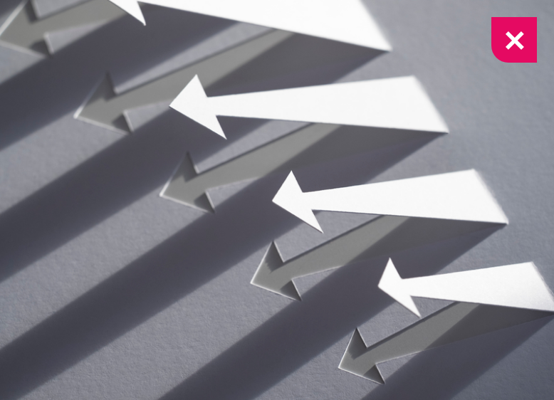

Do not use artificial images.
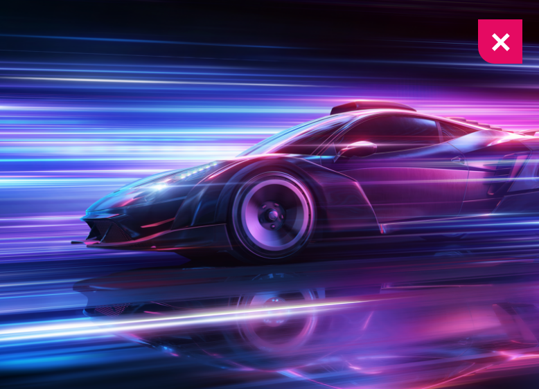

Do not use reflections or other image effects.
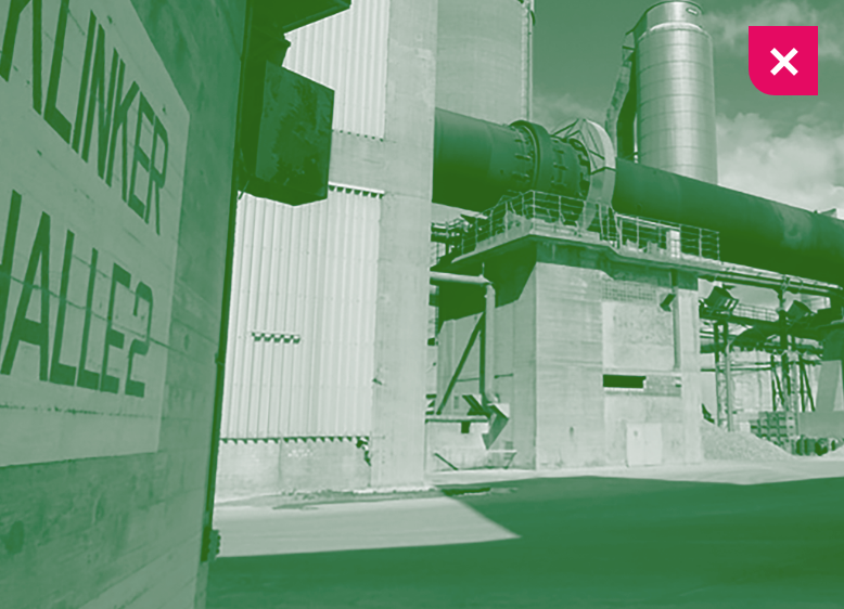

Do not use monochromatic images.
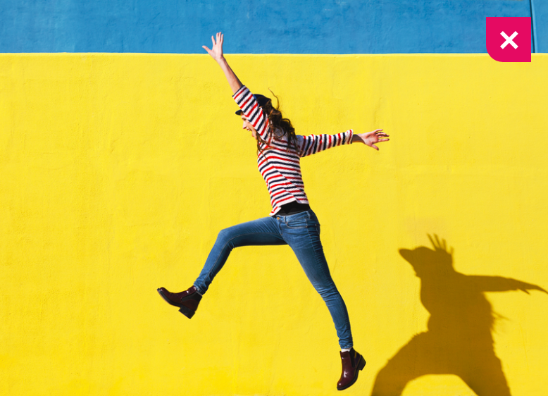

Do not use non-authentic moments.
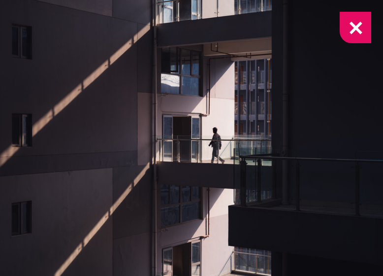

Do not create dark/dramatic atmospheres.
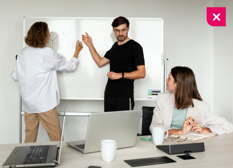

Do not use cliché images.
Downloads
Important Note Regarding Login
Due to the transition to our new website, all users must
set a new password the first time they log in.
To do so, please use the “Forgot Password” feature and
follow the instructions.
Thank you for your understanding.
Contact
Any questions about our guidelines?
Contact us.
- N Support
- T + 49 211 690787-200
- E support@Brandhub.heidelbergmaterials.com