Logo

Logo versions
For content-related design and customised communication, we are active in two different design fields that have merged from the different usage scenarios: “Inform” and “Inspire”. Depending on the scenario, we use a different forms of our dynamic logo.

The compact logo for the design field “Inform”

The floating logo for the design field “Inspire”
CTA
Learn more about our flexible design in the Design system section.
Compact logo
We use the compact logo in our design field “Inform”. It has a strong sender character while being factual in nature.
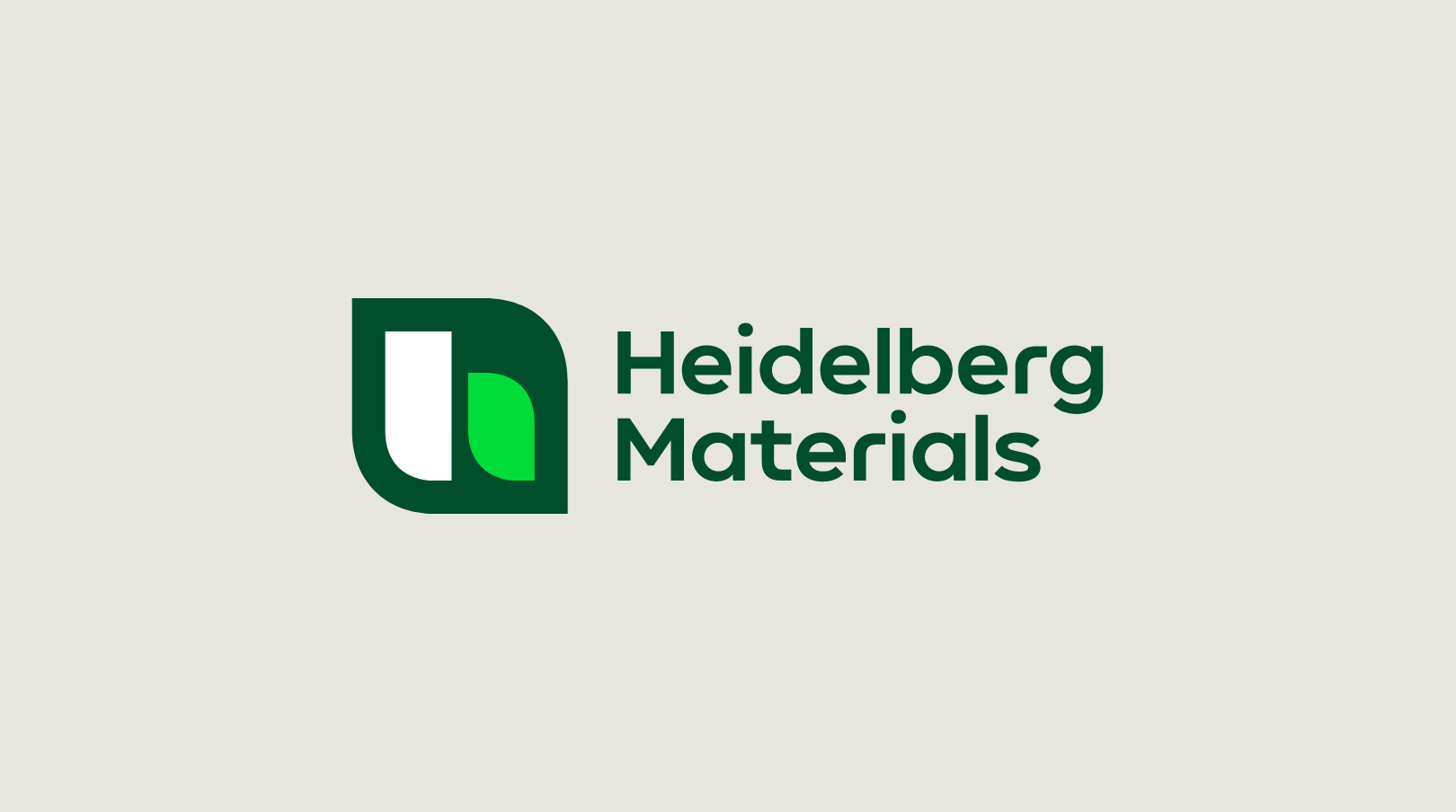

Usage
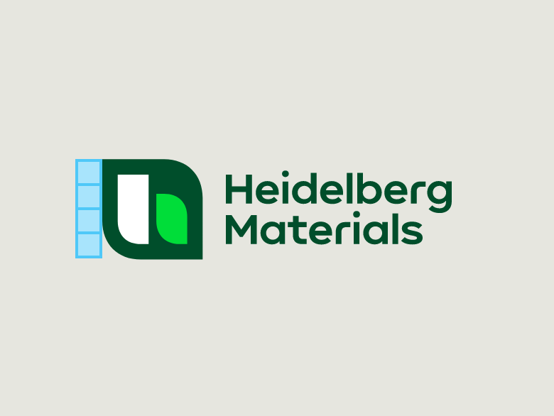

The logo height is always 4 building blocks.
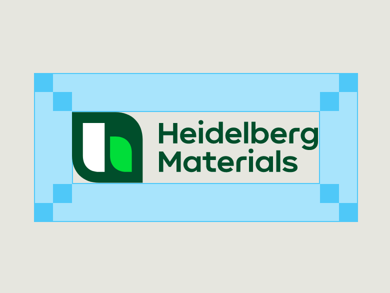

The protection area is at least 2 Building Blocks or half the icon height.
Logo position
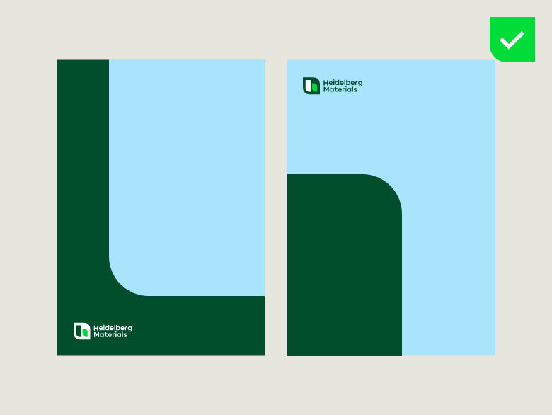

Place the compact logo only on the left side of the type area and at the top or bottom.
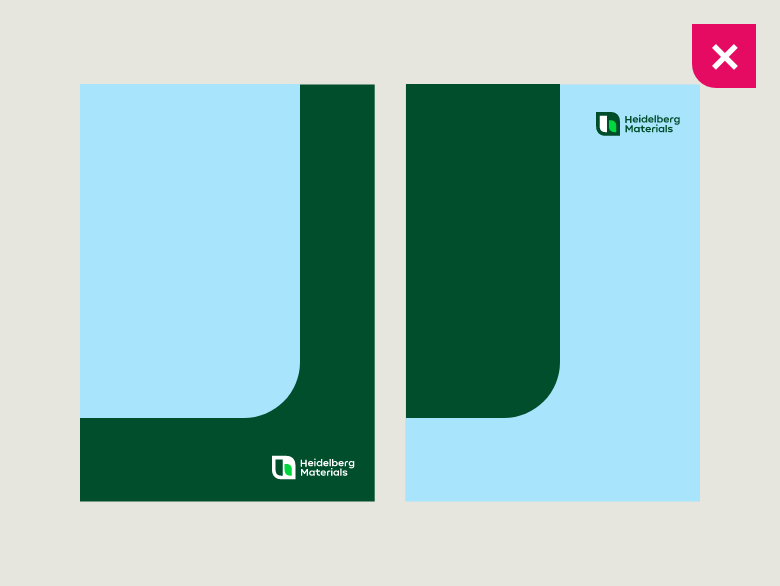

Do not place the compact logo on the right side of the type area.
Colour versions
Colour versions

Compact logo, positive

Compact logo, negative

Compact logo, mono Black

Compact logo, mono White
On background colours
Background colours

Compact logo, positive on White

Compact logo, positive on Sandy Grey


Compact logo, negative on Deep Green

Compact logo, negative on Mid Green
Please note. The compact logo may not be placed on any other background colour than those shown above
On imagery
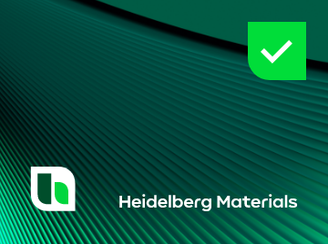
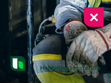
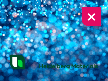
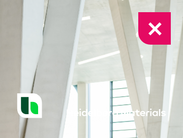
Please note: Please ensure that the logo is placed on imagery with high contrast to the logo. Use the positive logo on bright imagery and the negative logo on dark imagery.
Background imagery




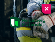




Compact logo -CTA
Learn more about our colour world in the Colours section.
Floating logo
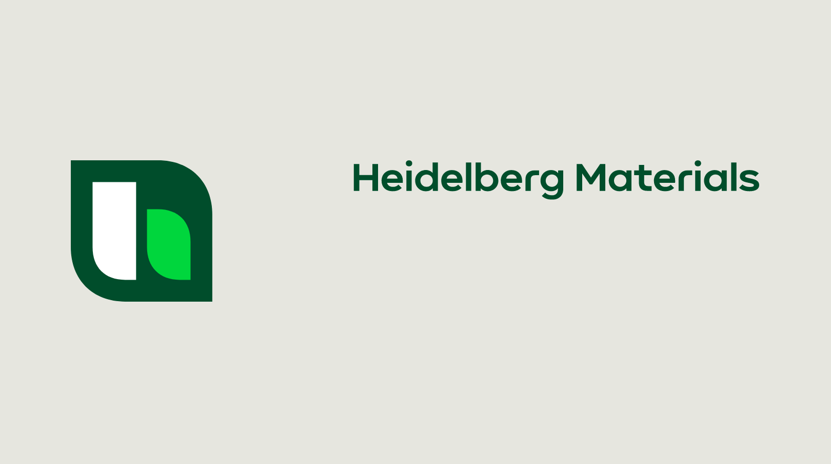
We use the floating logo in our design field “Inspire”. It is dynamic and adapts to any format.

Usage
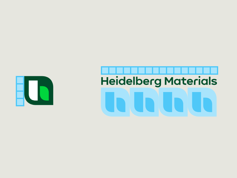

The height of the brand mark is always 4 Building Blocks and the width of the word mark is always 4x the width of the icon or 16 Building blocks.
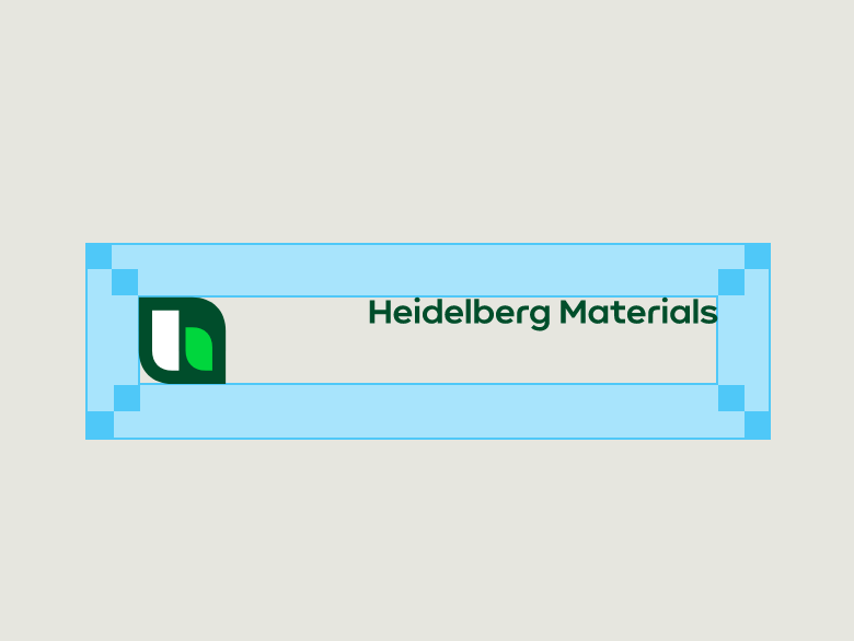

The protection area is at least 2 Building Blocks or half the icon height.
Logo position
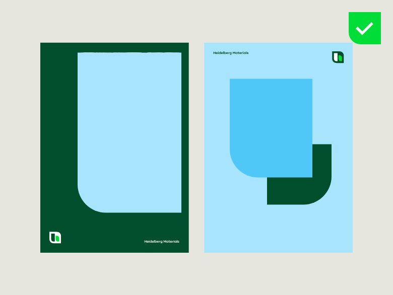

The floating logo can be placed at the top or bottom and on the left or right side of the type area.
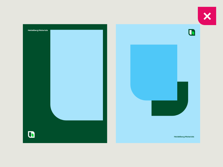

Do not place the brand mark and the word mark on top of each other.
Logo alignment
Logo alignment
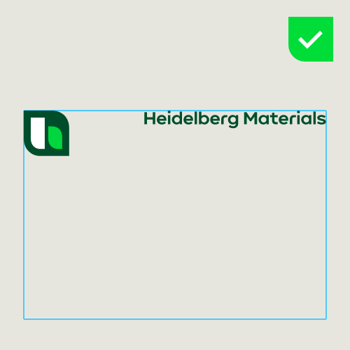

If the logo is positioned at the top, the word mark is aligned at the top of the brand mark.
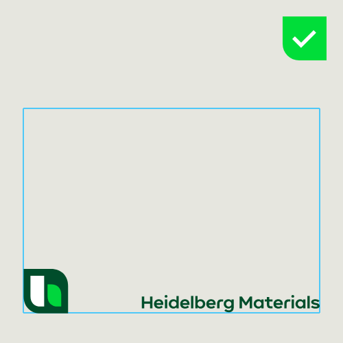

If the logo is positioned at the bottom, the word mark is aligned at the bottom of the brand mark.
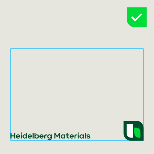

The two elements can swap positions but should always be aligned.
Colour versions
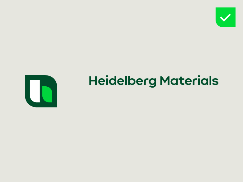

Floating logo, positive

Floating logo, negative
On background colours
Background colour

Floating logo, positive on White

Floating logo, positive on Sandy Grey

Floating logo, negative on Deep Green

Floating logo, negative on Mid Green

Floating logo, negative on Warm Orange

Floating logo, positive on Spark Yellow

Floating logo, negative on Punchy Red
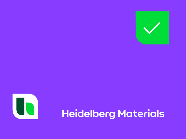

Floating logo, negative on Vibrant Purple
On imagery
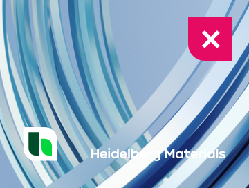
Please note: Please ensure that the logo is placed on imagery with high contrast to the logo. Use the positive logo on bright imagery and the negative logo on dark imagery.
Background imagery
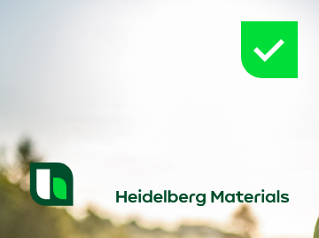

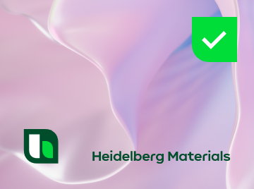

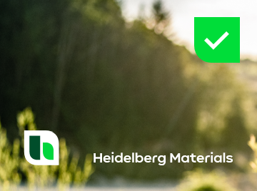






Single-line logo
Exceptional use of the single-line logo

The single-line logo should only be used in exceptional cases, when the compact or floating logo does not have the required visual impact.
This applies, for example, when:
- the logo has to be placed in a very wide format and at the same time a high visibility is required, e.g. for signage or certain digital applications
- no other logo variant will fit into the layout, e.g. due to a large amount of content in a small format.
Usage
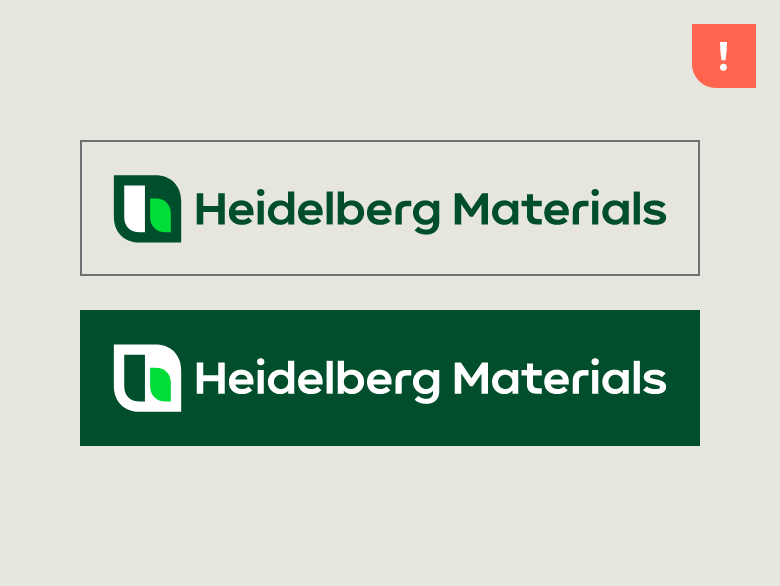

The logo should always be used only with wide formats.
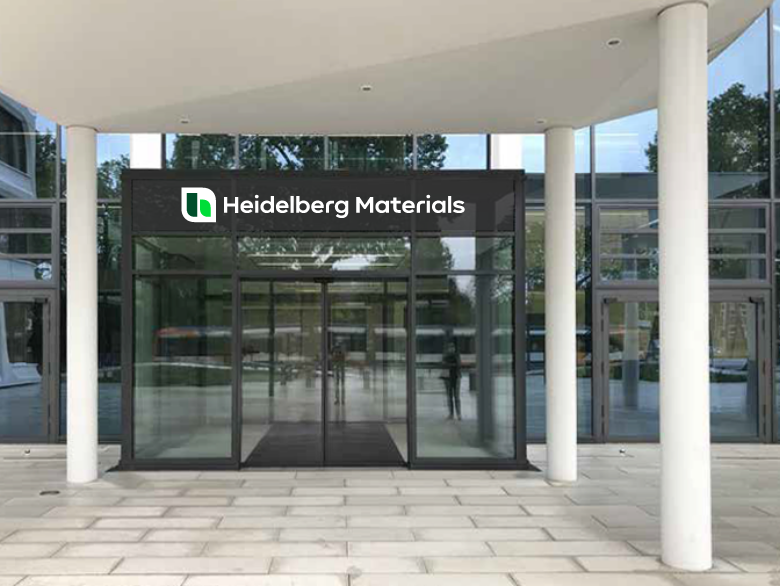

Use the logo for wide formats such as signage.
Icon
Use of the icon without the wordmark
As a rule, the icon should always be used in combination with the wordmark to clearly identify Heidelberg Materials as the sender of a communication. In certain media and applications, however, the icon may also be used on its own.
Examples
- Situations where the aesthetics of the branded object are the primary focus and a more subtle branding is desired, e.g. on apparel or premium merchandise
- Cases where the use of the wordmark is not technically feasible for production reasons
- Very small applications or applications with limited space
- Applications where a highly iconic visual impact of the symbol is desired, e.g. physical exhibits
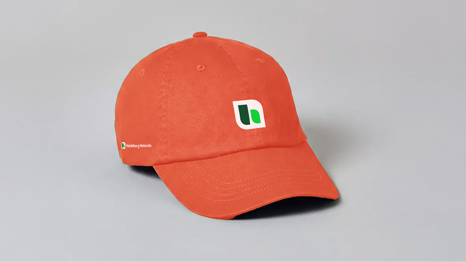

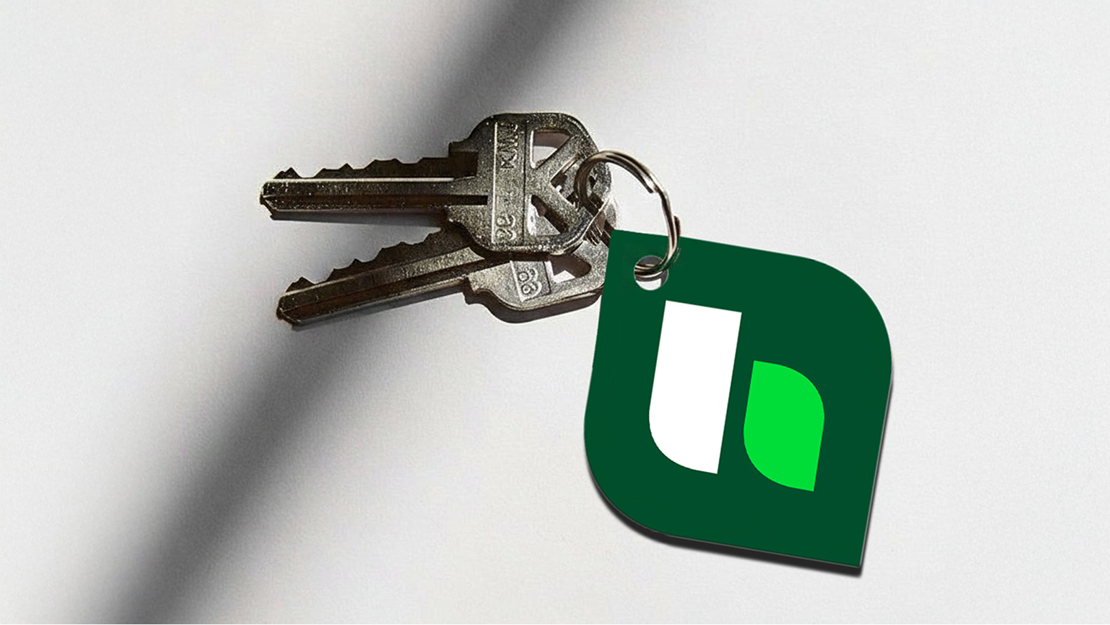

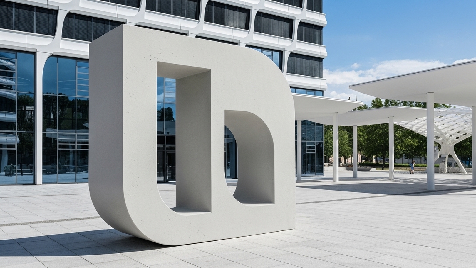
Sculptural brand statement
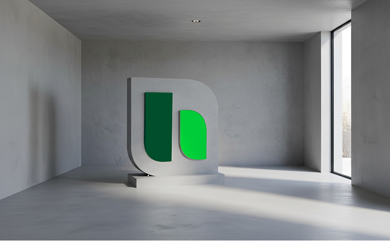
Here, the logo becomes a bold, iconic statement in the space. The freestanding, perforated sculpture uses cut-outs for exciting perspectives and plays of light. With sufficient size and weight, the object stands solidly on its own – the base is completely omitted. Perfect for outdoor areas or large atriums.

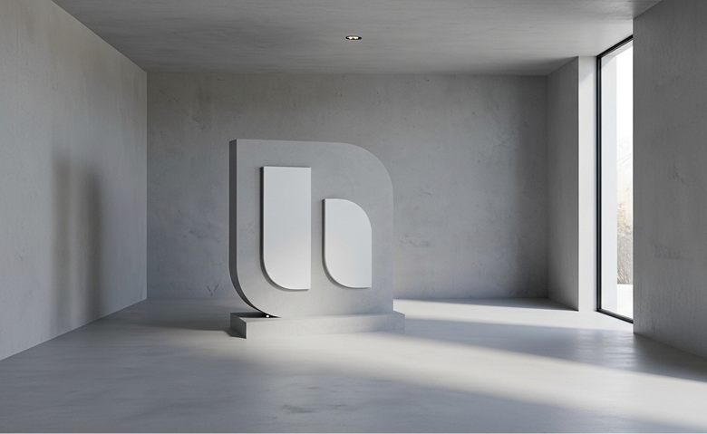
This variant presents our logo as a compact, raised relief. Since the rounded bottom edge is unstable on its own, a subtle base provides secure support. A purist solution, ideal for reception desks, foyers, or awards.


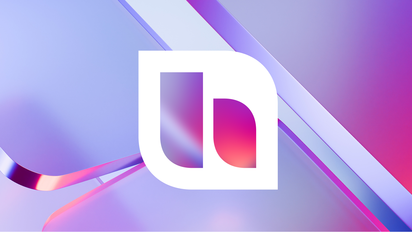
Maximum impact through blur
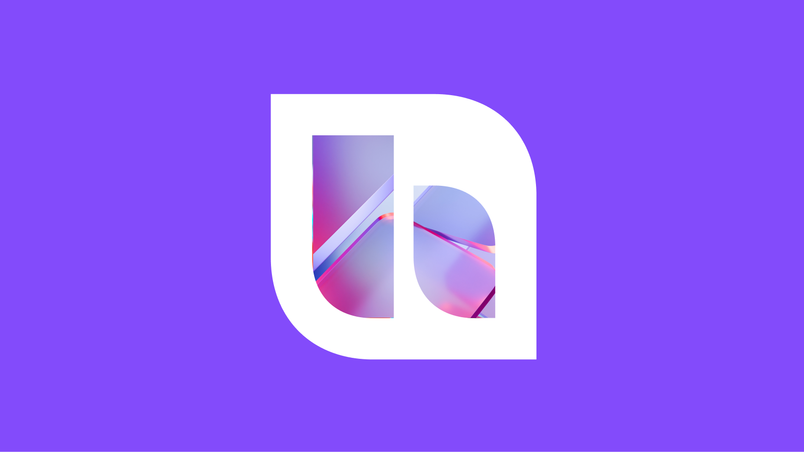
When the image covers the full background, the brand mark is our center.
Important:
- Use a slight blur inside the logo die-cut to ensure contrast.
- Images that are too bright without sufficient contrast make the white logo invisible.

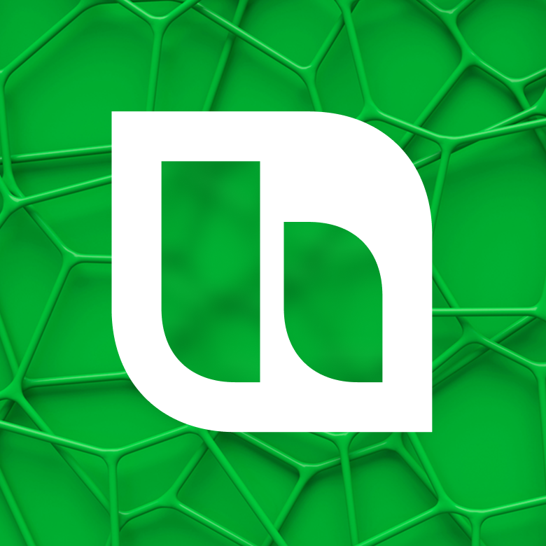

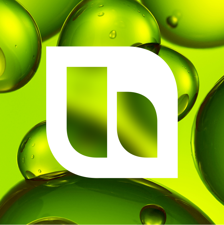

Clean separation on colour areas
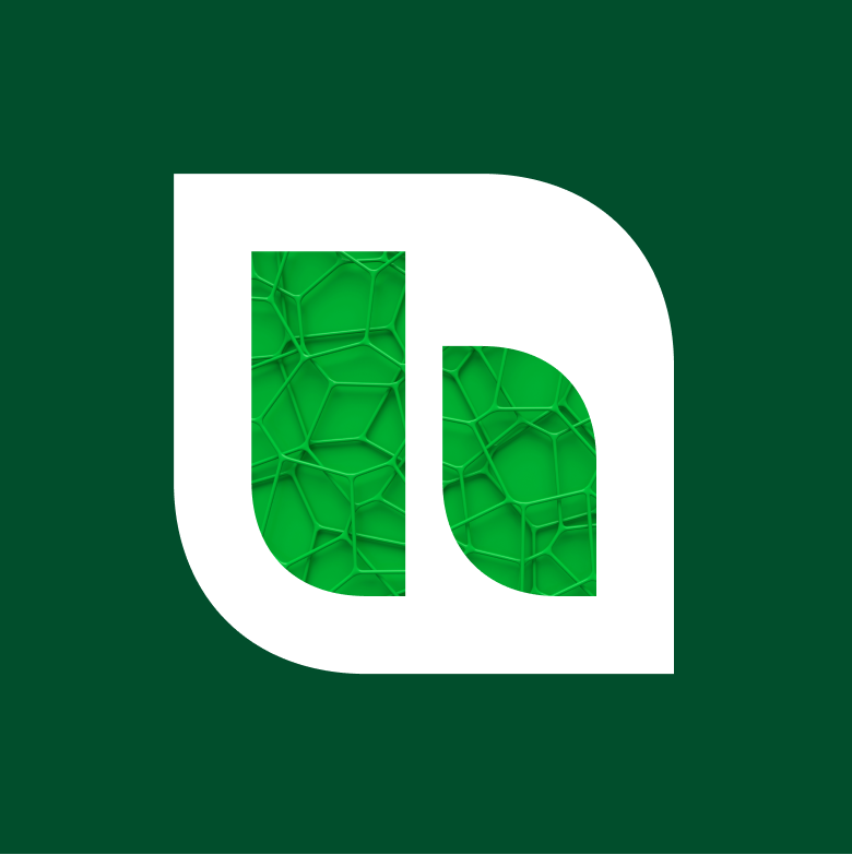
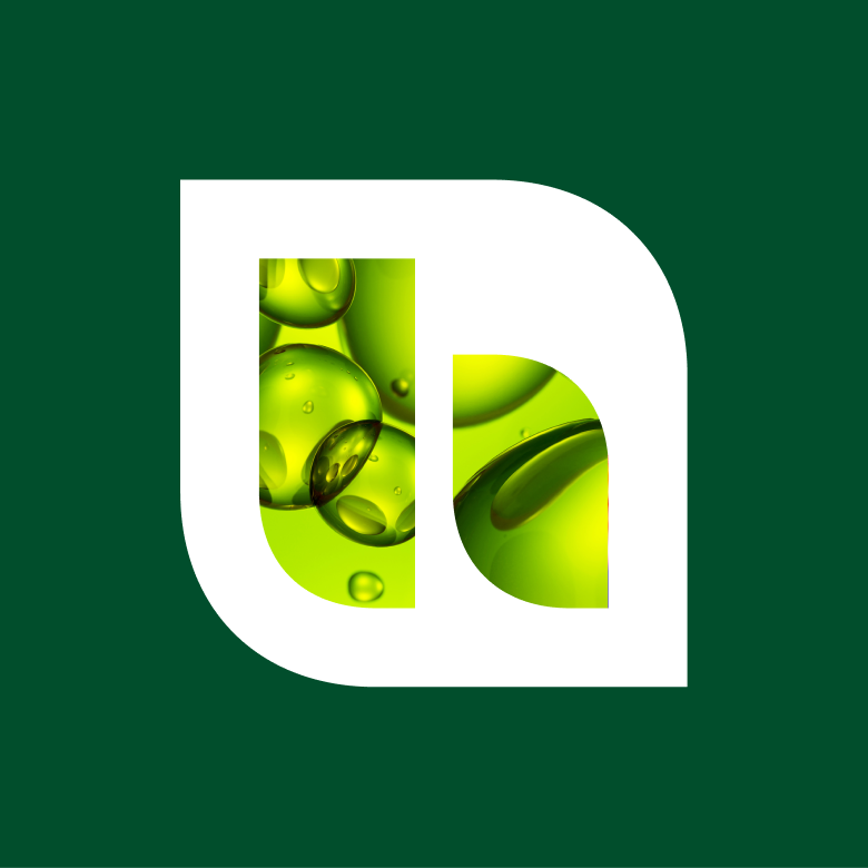
If you want to use our brand colors, the image moves to the inside of the brand mark. The white logo shape acts as a protective frame here and guarantees contrast against the colored area.



Don’ts

Do not change the colours of the logo.
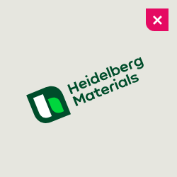

Do not turn the logo.
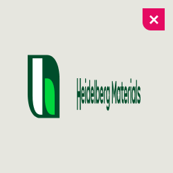

Do not distort, skew or warp the logo. Do not change the form of the logo.
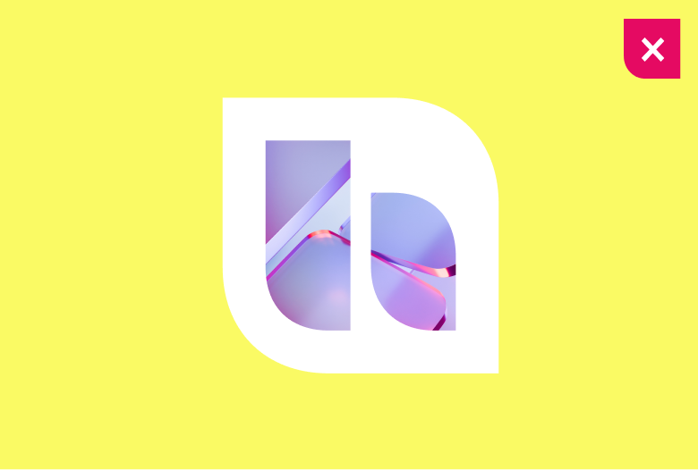

A background color that is too light destroys the contrast with the white logo. Always ensure sufficient contrast.
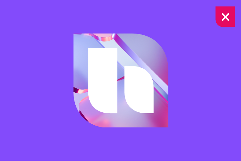

Never let images and solid colors touch directly. It looks cluttered and weakens the brand.
Logo in use
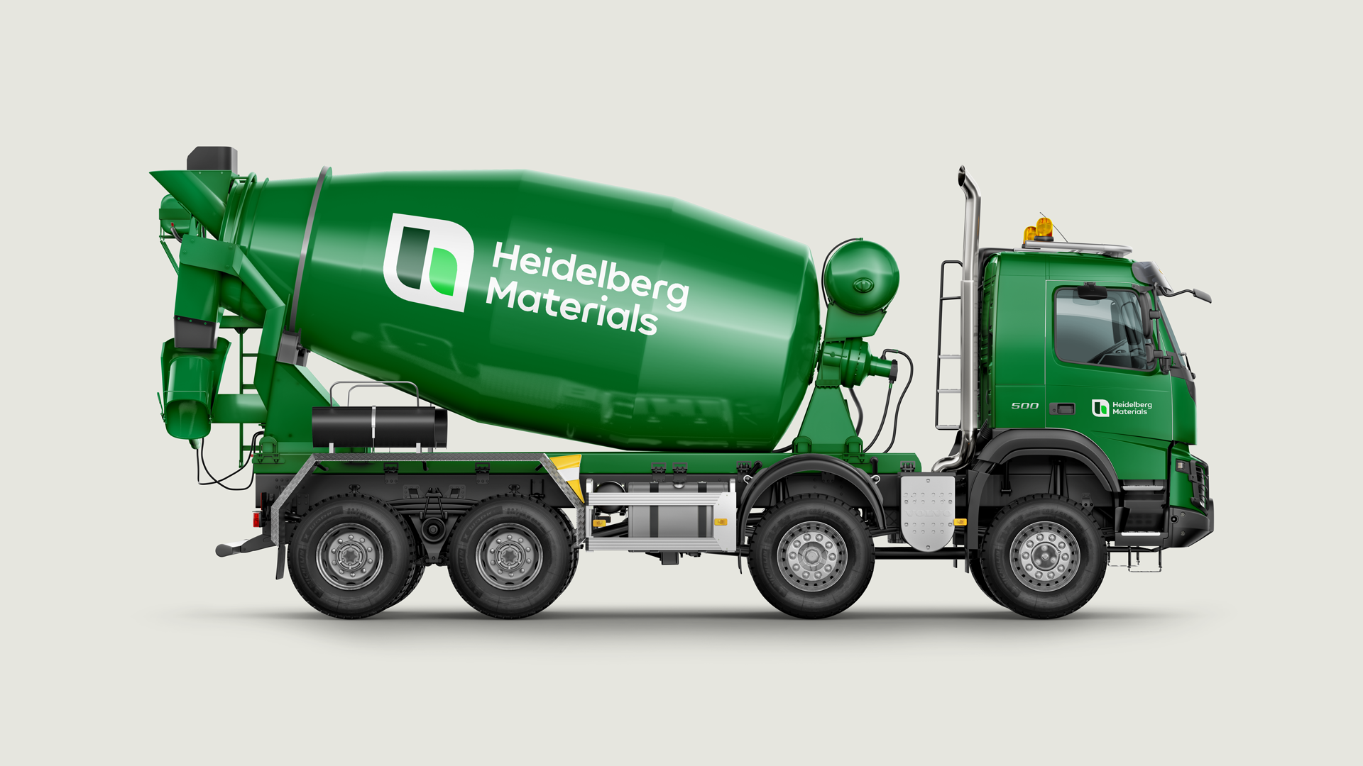

Discover the possibilities of our dynamic logo.
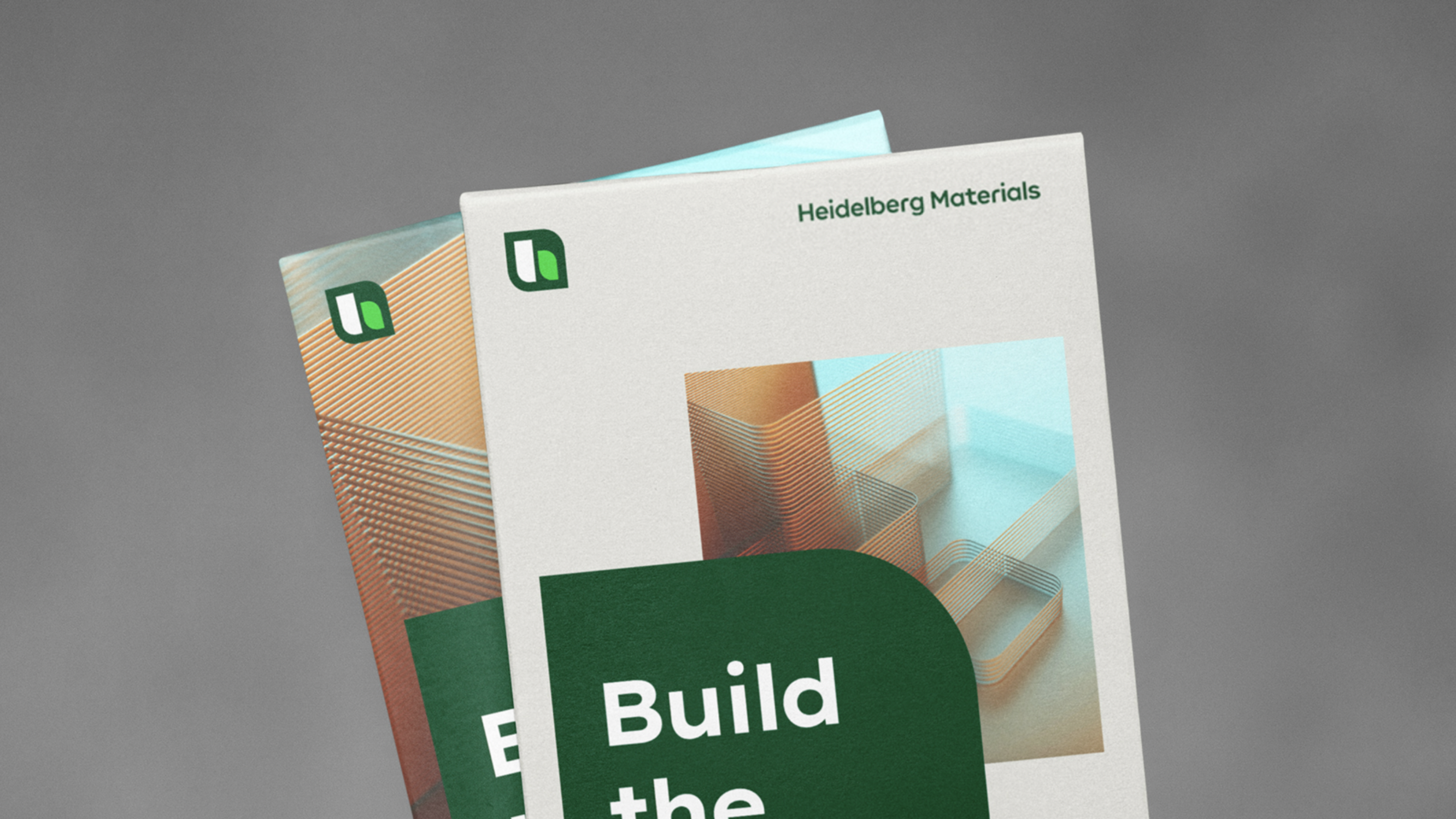

Discover the possibilities of our dynamic logo.
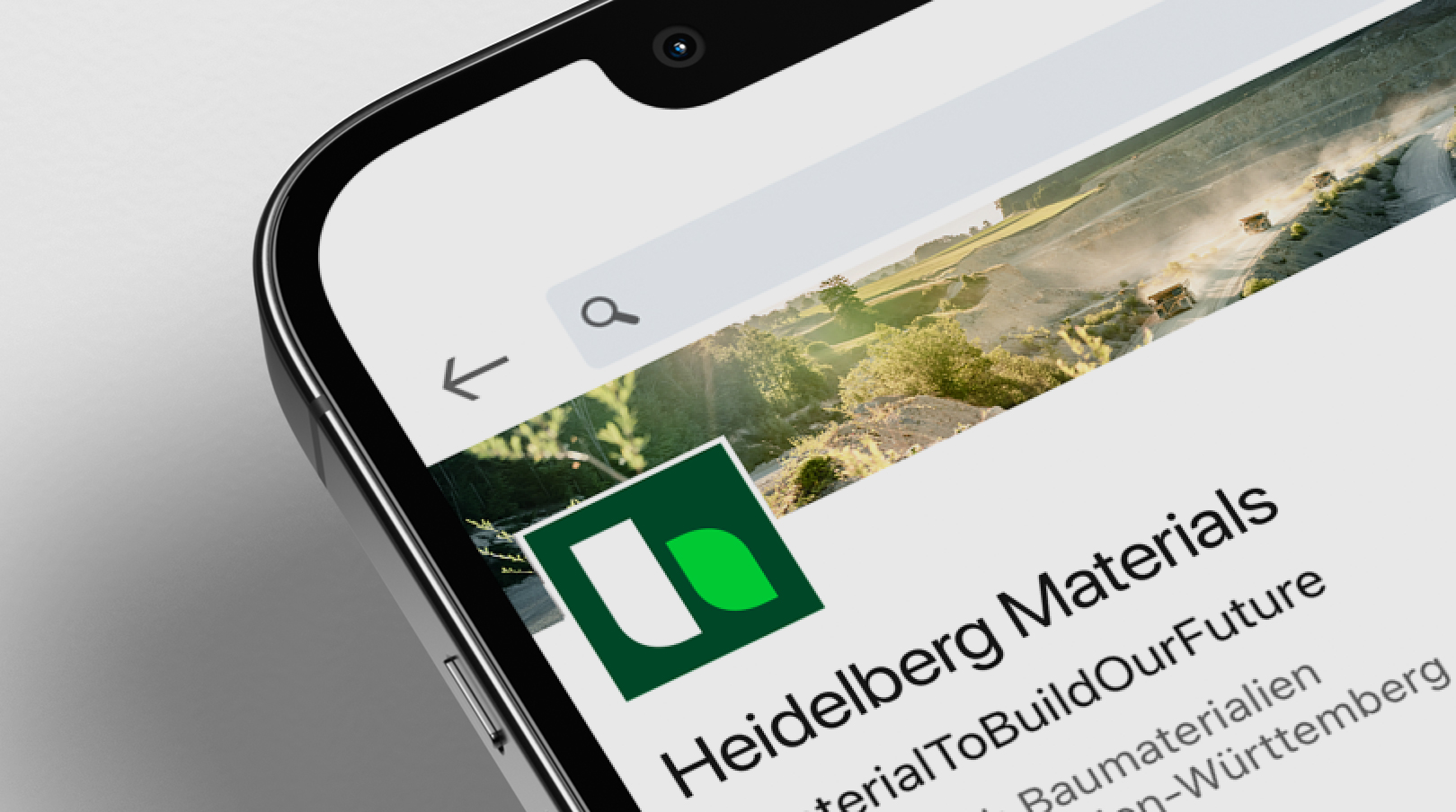

Discover the possibilities of our dynamic logo.
Downloads
Important Note Regarding Login
Due to the transition to our new website, all users must
set a new password the first time they log in.
To do so, please use the “Forgot Password” feature and
follow the instructions.
Thank you for your understanding.
Contact
Any questions about our guidelines?
Contact us.
- N Support
- T + 49 211 690787-200
- E support@Brandhub.heidelbergmaterials.com