Sustainable product brands


evo-products
With our evo-products we define new standards for integrating sustainability into cement production and set a pioneering benchmark for carbon capture.

evoZero, the world’s first carbon captured near-zero cement/concrete, is our premium brand.


evoBuild products set new standards for building
materials.
Design System
evoZero® and evoBuild® are derived from our “Inform” design field. Therefore floating shapes and the “Inspire” colour schemes are not permitted.
Usage of Shapes
The shape is an important element in our design system. Inspired by the design language of the Heidelberg Materials brand mark, the shape is a strong character element that transports information and guarantees our communications a high recognition effect.
The examples below demonstrate the versatility of the shape across a variety of formats. Always select the most appropriate version based on format function and purpose.
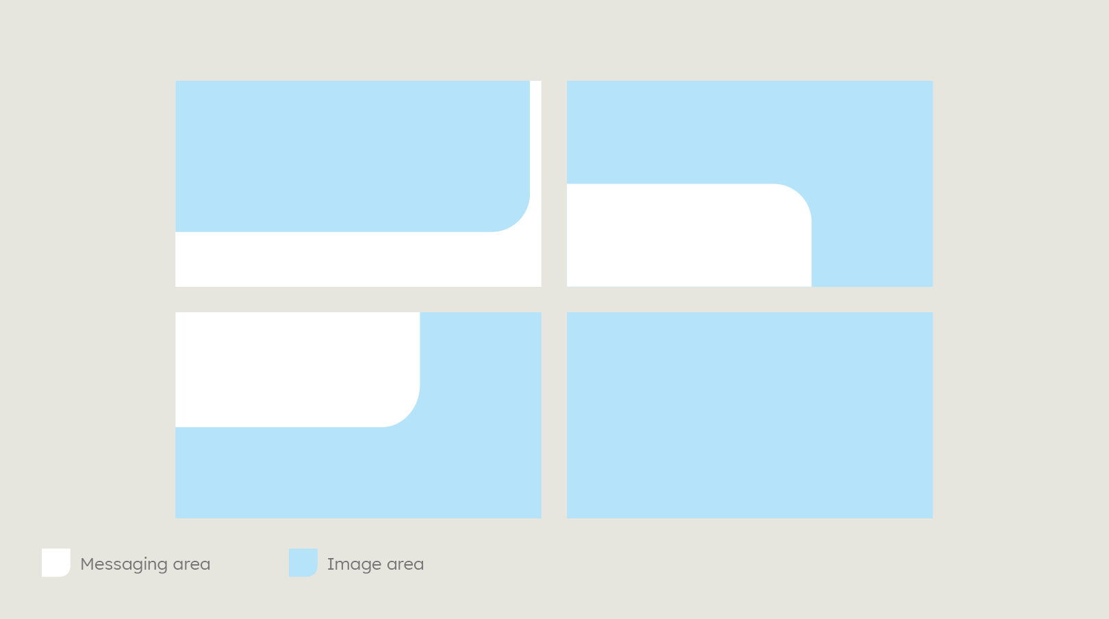

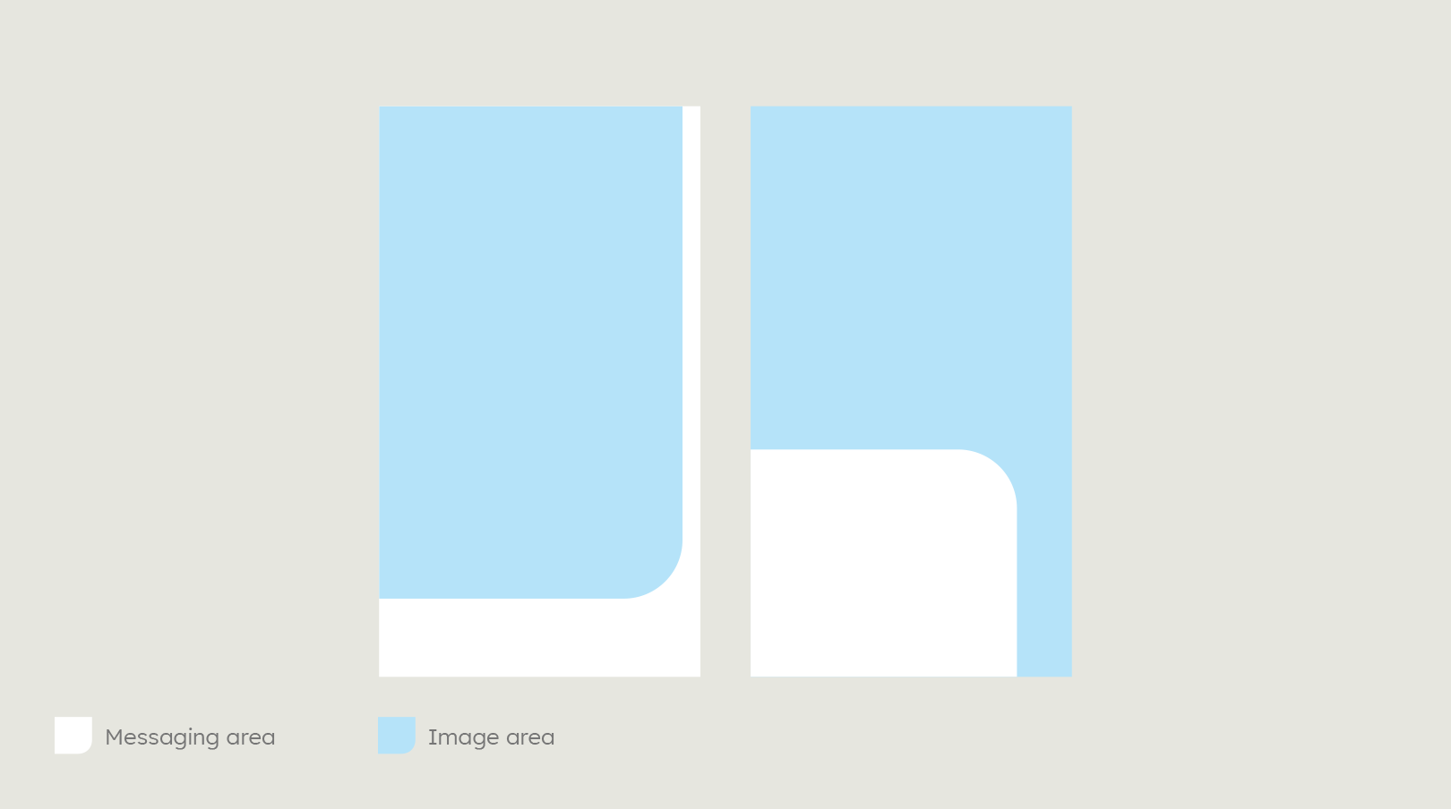

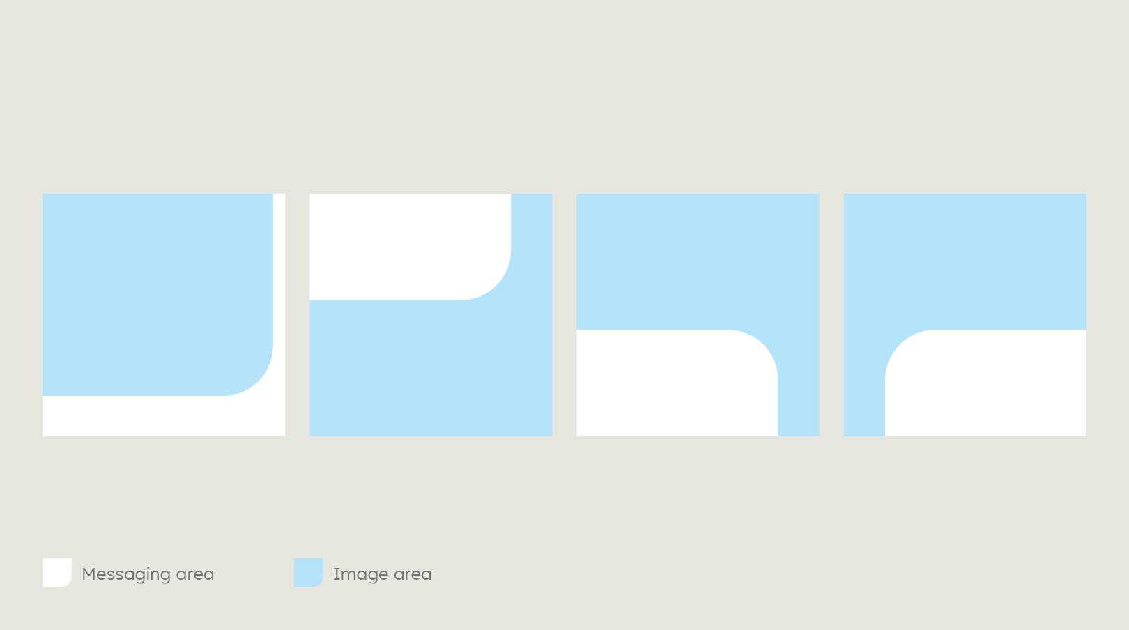

Shapes in the evoZero and evoBuild design fields are always white.
evoZero
Heidelberg Materials is first to implement the carbon-capture technology to offer a carbon captured near-zero product. The visual identity of evoZero therefore brings across the innovation, uniqueness and idea of “reduction” with a bright, minimalist and clean appearance.
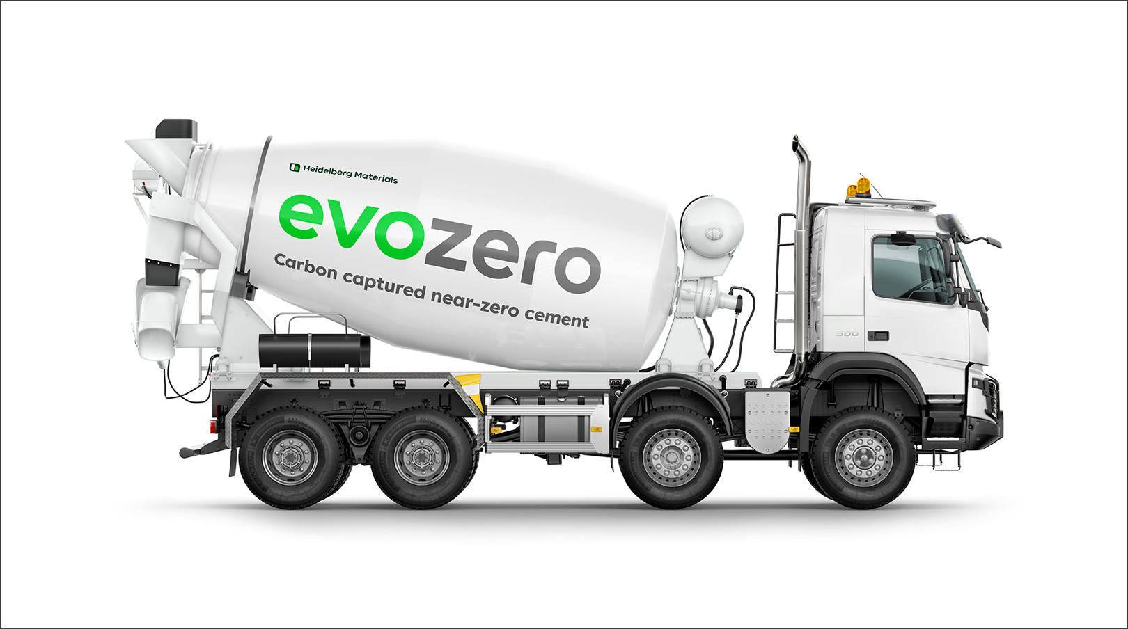

Important note: Please make sure that the corporate brand "Heidelberg Materials" is always clearly reconisable next to the product brand.
Logo
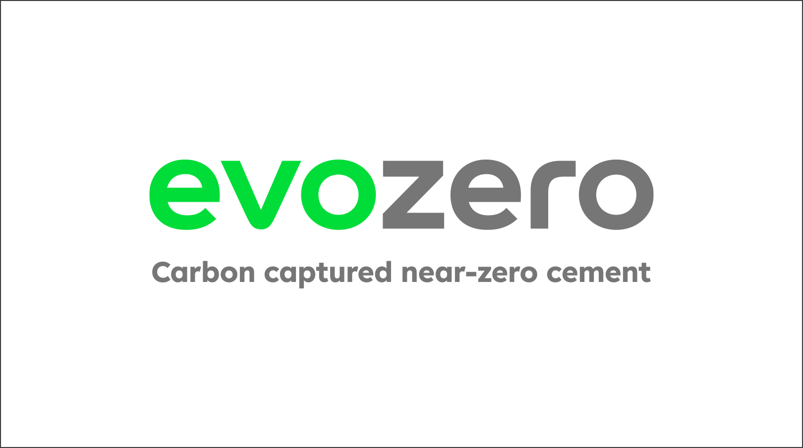

The product logo is independent, but at the same time fits into the visual language of Heidelberg Materials, as the proportions and typeface are derived from the corporate brand. The special nature of the premium brand is communicated by the reduced silver-grey in the word mark.
Usage
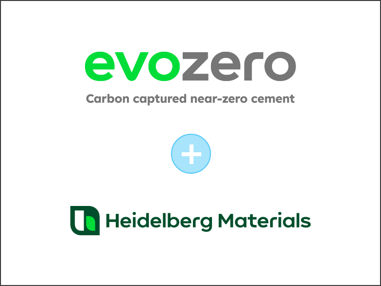

The product logo always appears in conjunction with the single-line version of the corporate brand logo. The only exception to this is in social media posts, where you should only use the product logo.
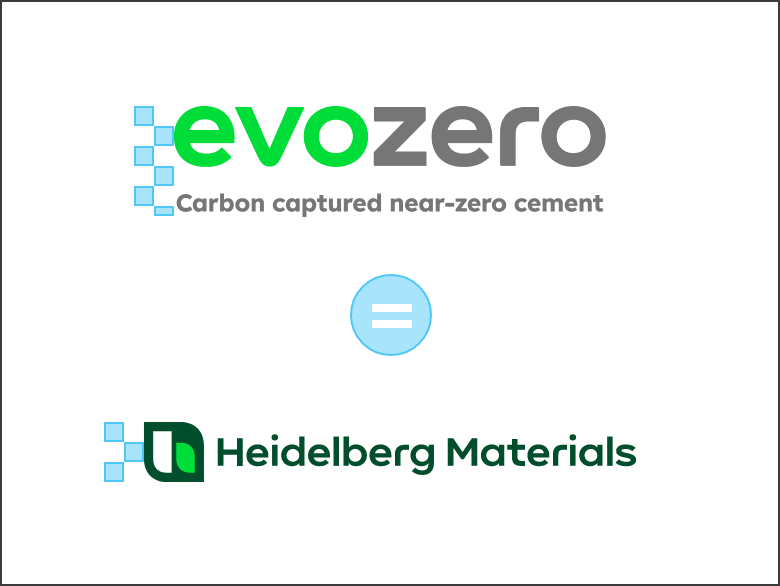

The product logo height and the corporate brand logo height are always the same. The number of the building blocks may vary depending on format and medium.
The single-line logo is used within the evoZero framework for design reasons. As part of the corporate brand (Heidelberg Materials), the use of the single-line logo remains an exception.
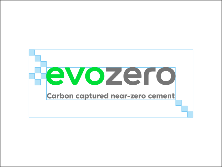
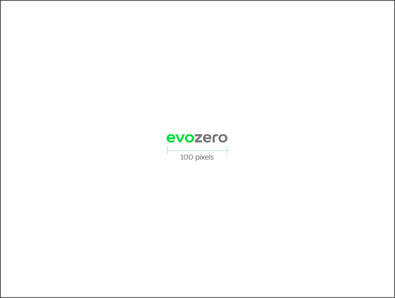
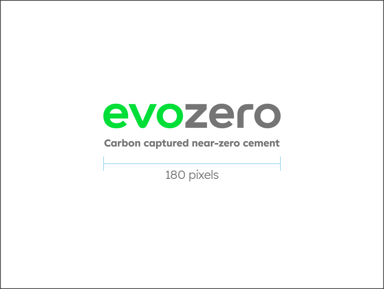
The exclusion zone and minimum size are critical to maintaining the visibility and integrity of our logo. The exclusion zone ensures that no text, graphics, or other visual elements interfere with the logo’s clarity and impact by defining a clear area of space around it. This protects the logo from appearing crowded or diminished.



Exception
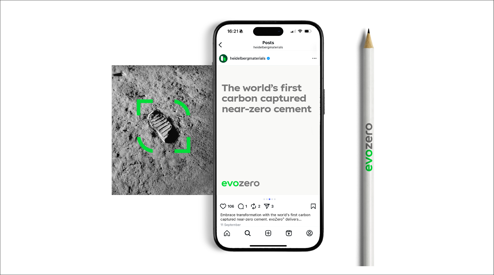
If the claim “the world’s first carbon captured near-zero cement” is used as a headline or as wording and is positioned in close proximity to the logo, it can be removed as part of the logo. Another exception are promotional items/giveaways whose purpose is not exclusively to influence purchase decisions. These items can be produced without using the “near-zero” claim next to the logo.

Position
The product logo is always placed on the background or shape. The corporate brand logo is always placed on the imagery and must always be placed on the left side of any layout or document.
On a shape, the product logo should be prominently placed first in front of all content. On a background the product logo can be placed in each of the four corners.
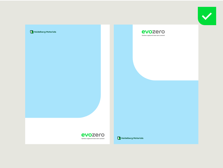

The product logo is always placed on a white background or a white shape. The corporate brand logo is always placed on the imagery.
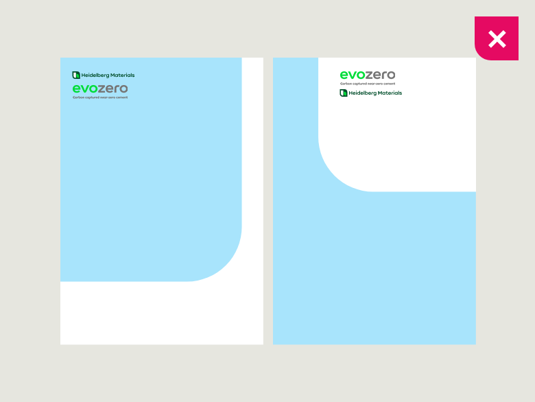

Don’t place the two logos next to each other or below each other in the same area.
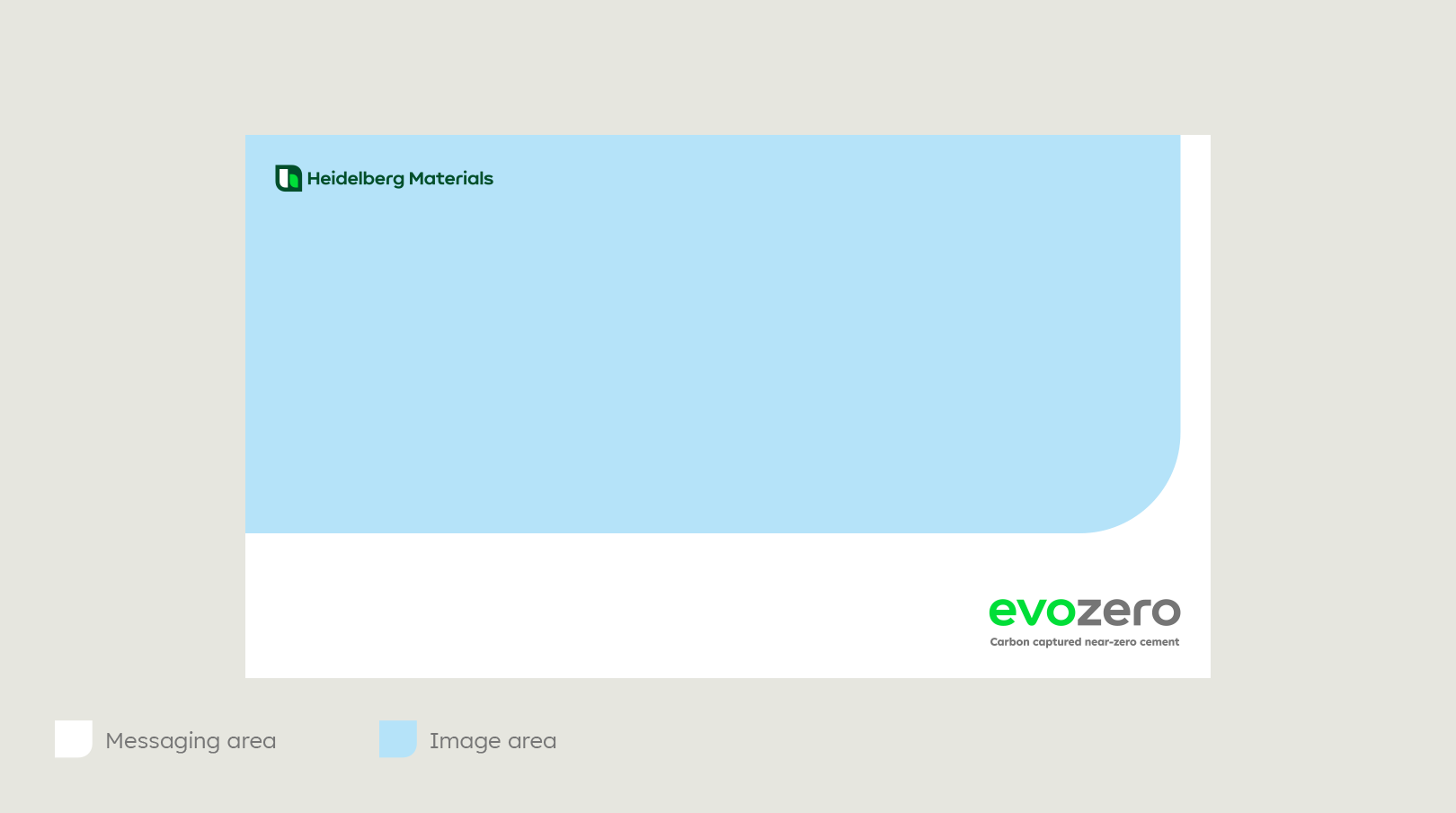

The corporate brand logo must always be placed on the left side of any layout or document.
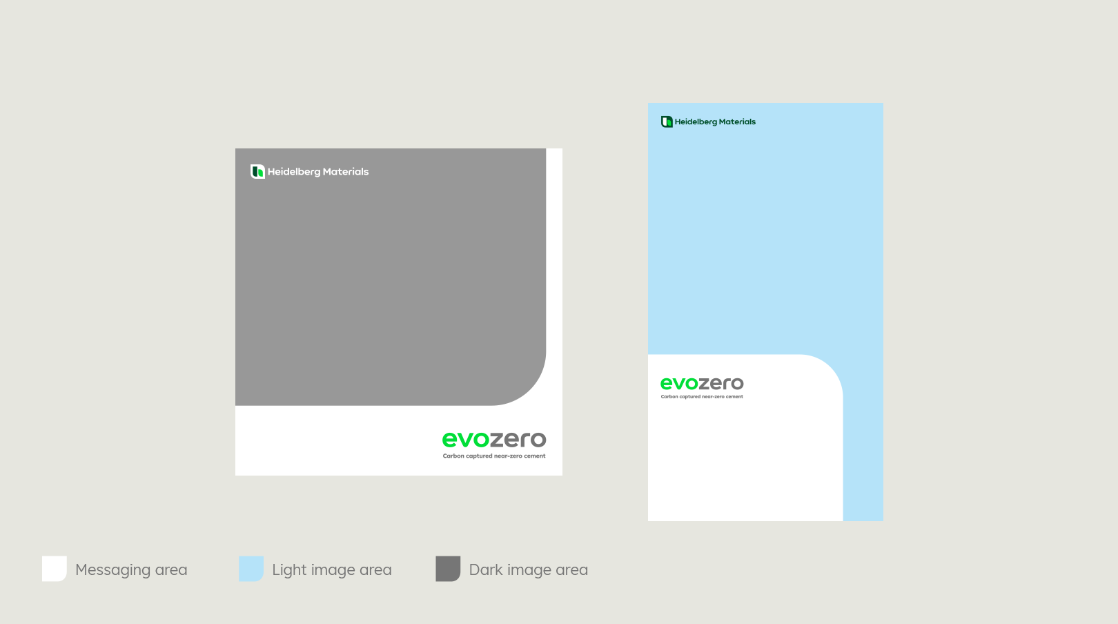

The product logo must always be placed on a white surface. Use the colour negative corporate brand logo on dark image surfaces.
Colour versions
Colour versions

evoZero logo, positive

evoZero logo, mono Black

evoZero logo, mono White
Dont's
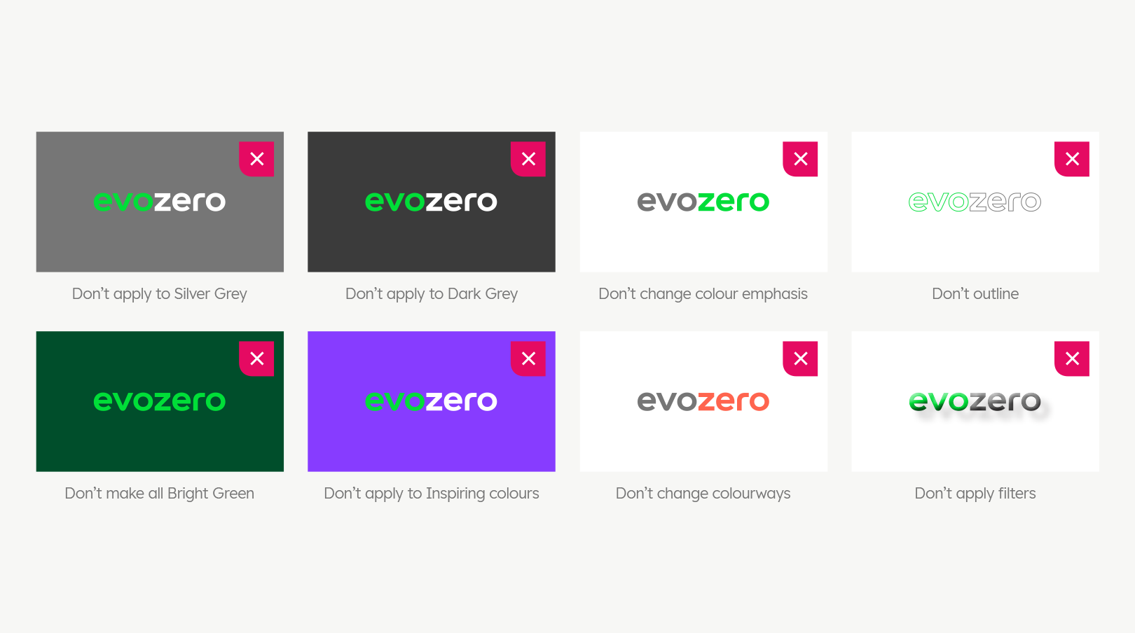

You must not apply any design styles different from the ones which have been provided.
CO₂ Words
The CO₂ word device has been developed to place emphasis on carbon capture within our key messaging. It is designed to highlight the ‘CO’ letterform by incorporating the CO₂ mark directly into selected words. To maintain clarity and impact, only single words containing the letters ‘CO’ may be used with this treatment.
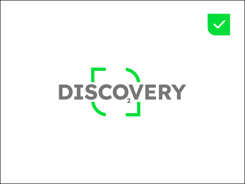

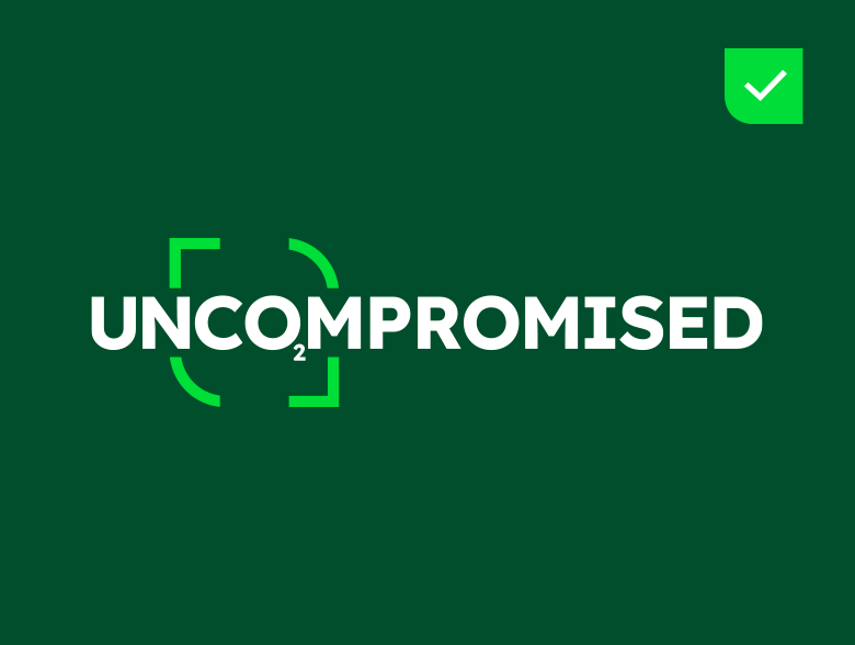



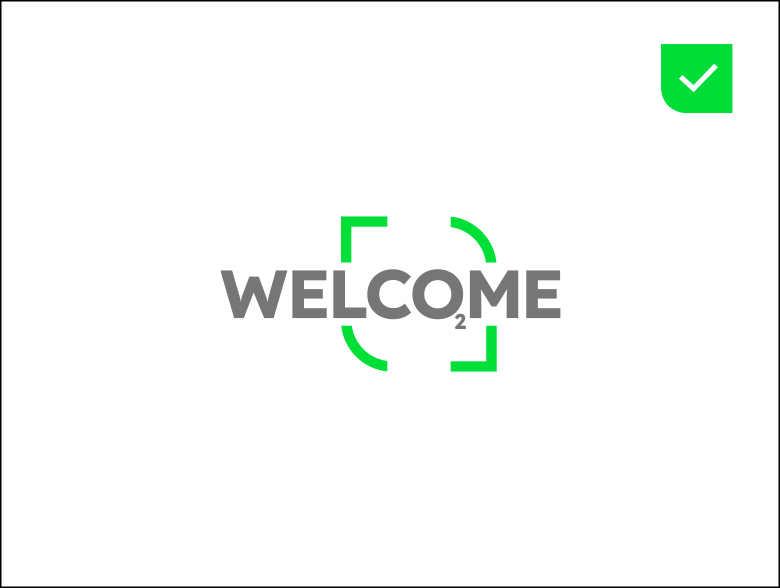

When applying this device, chosen words must always be relevant, meaningful, and appropriate to the context of the communication. Careful selection ensures that the emphasis on CO₂ remains purposeful and reinforces our brand narrative, rather than distracting from it. Incorrect or arbitrary use of this device dilutes its effectiveness and should be avoided.
Always use Lexend HM Bold in uppercase with the ‘Capture Graphic’ highlighting the CO₂ part of the word.
Keyword messages should always appear in English unless a direct translation can be made which includes ‘CO’.
Dont's
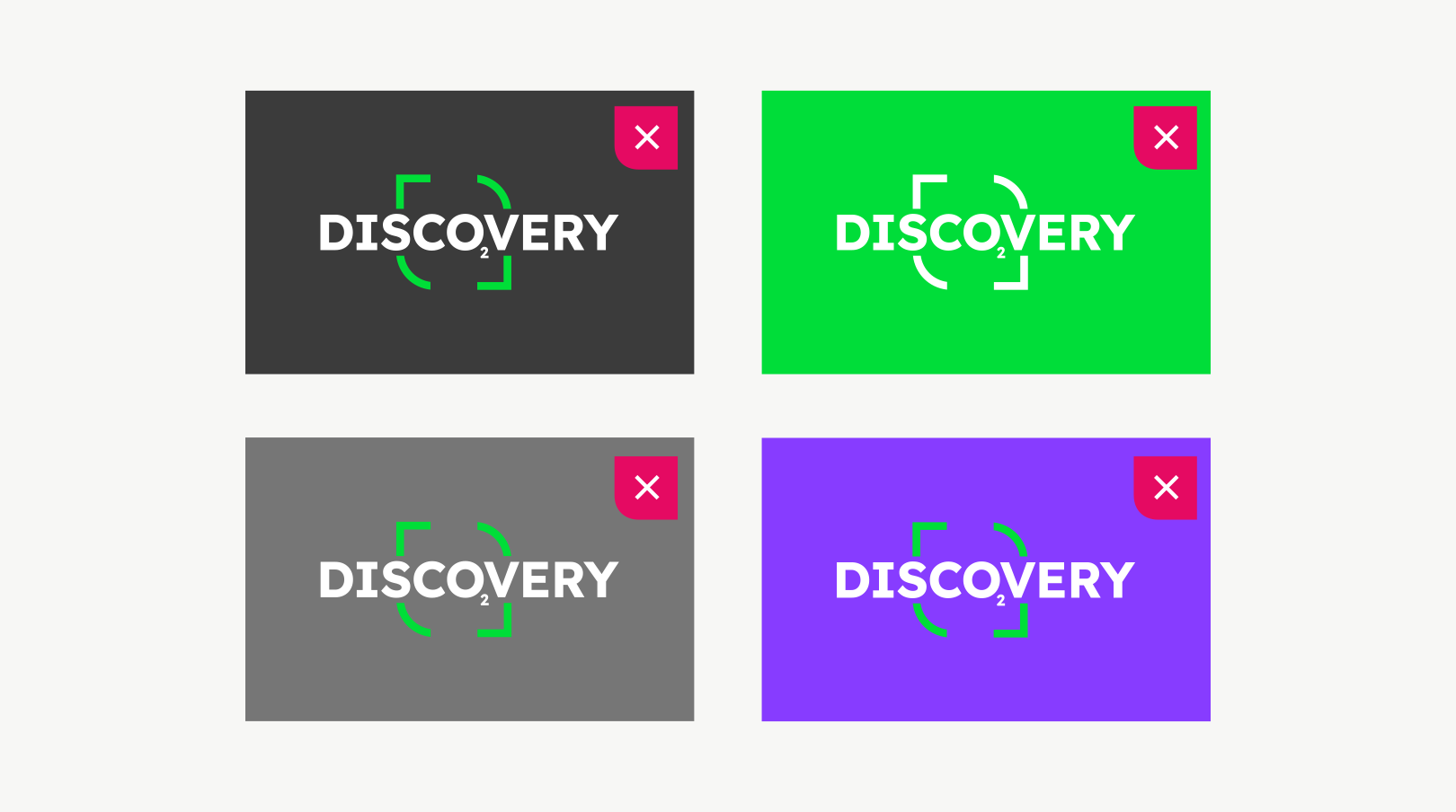

Only use a white, transparent, or deep green background in combination with CO2 words.
You must not use different background colours, inspiring colours, and different colours for the Capture Graphic.
Capture Graphic
evoZero Capture Graphic
Inspired by a viewfinder, the ‘Capture Graphic’ is a dynamic device derived from the Heidelberg Materials brand mark, used to highlight messages, facts, and aspirational ideas.
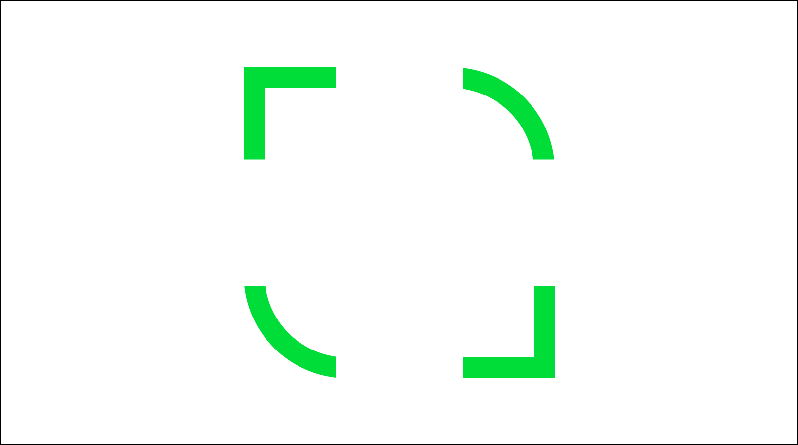

Layout
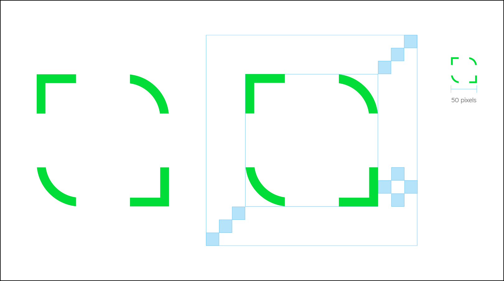

We have created an outer exclusion zone to ensure appropriate scale within a frame and provide a protective area from separate graphic elements.
The minimum size requirements guarantee legibility and recognition across all applications, whether in print or digital formats.
Please do not recreate, always use the master artwork that have been provided.
Usage
The examples below show how we may use the ‘Capture Graphic’ in a variety of applications, highlighting its versatility and the dynamic role it plays within our visual identity system.
Usage
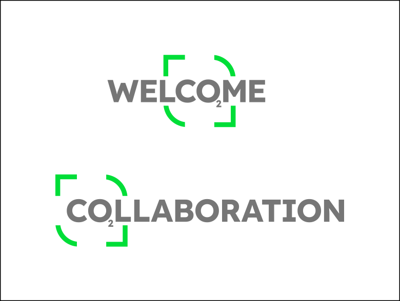

You may use the Capture Graphic with CO2 words.
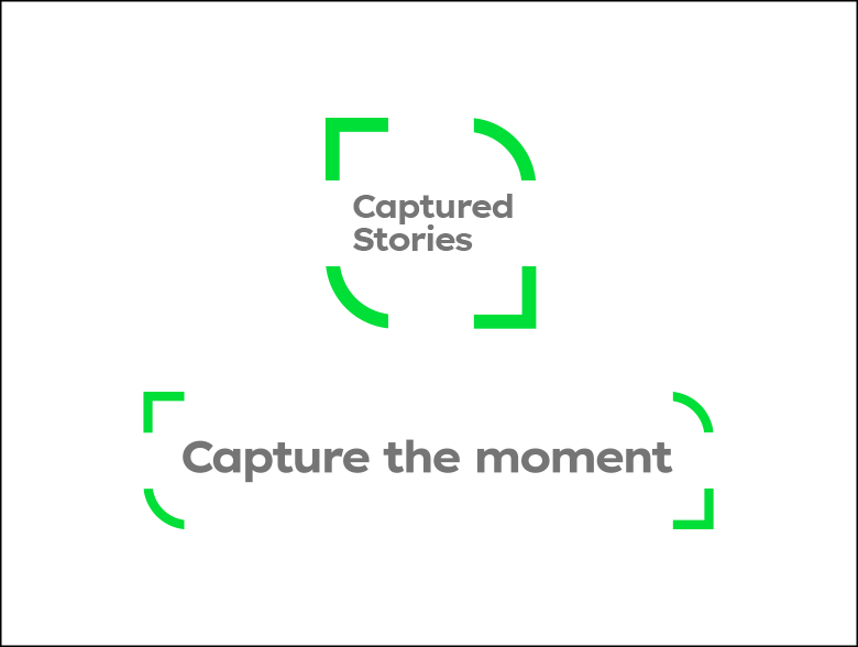

The Capture Graphic can also be used in campaign & event titles.
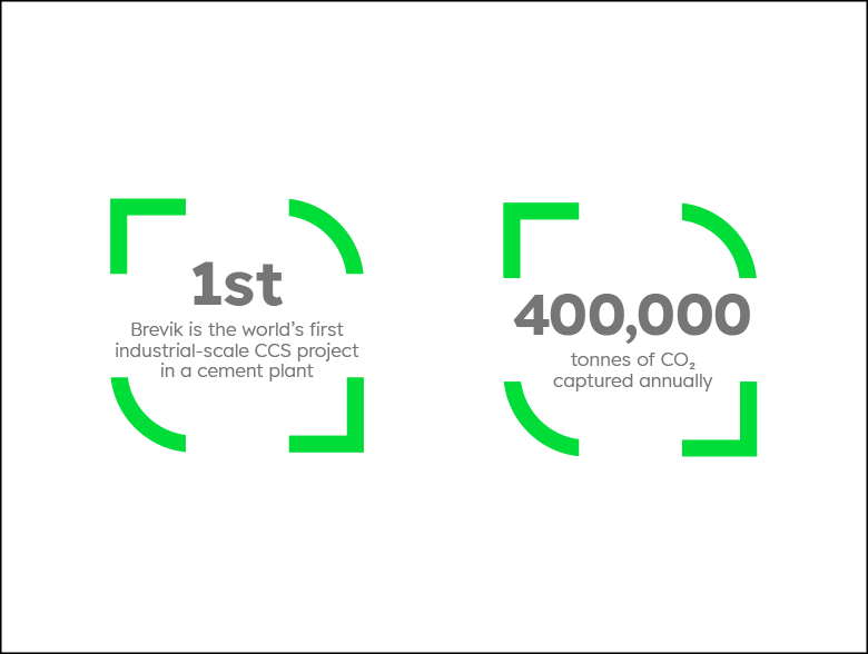

The Capture Graphic can be used to capture important facts & figures.
Usage
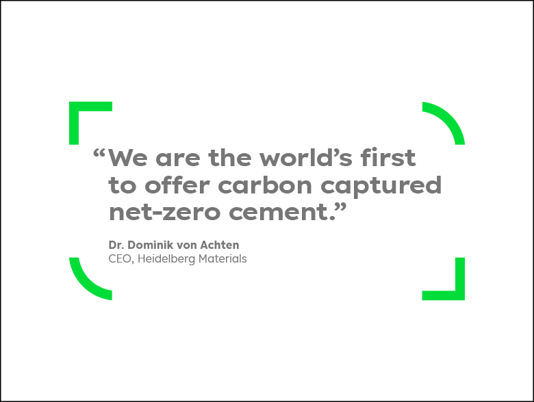

You may highlight important qoutes with the Capture Graphic.
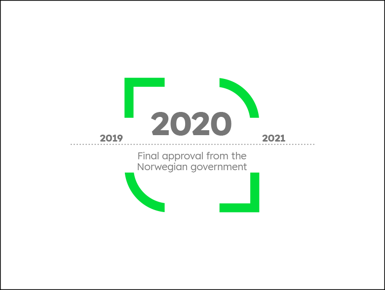

The Capture Graphic can also be used to capture important dates on a timeline.
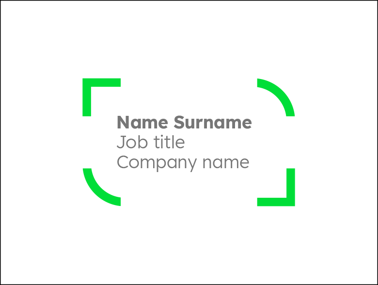

In motion design, the Capture Graphic may be used in lower thirds.
This only applies to captured stories campaigns.
Example
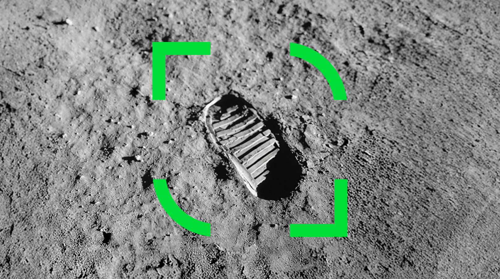

Capture Graphic used in the campaign picture on mass marketing level.
Dont's
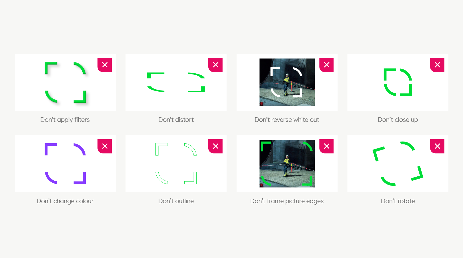

You must not apply any design styles different from the ones which have been provided.
Typography
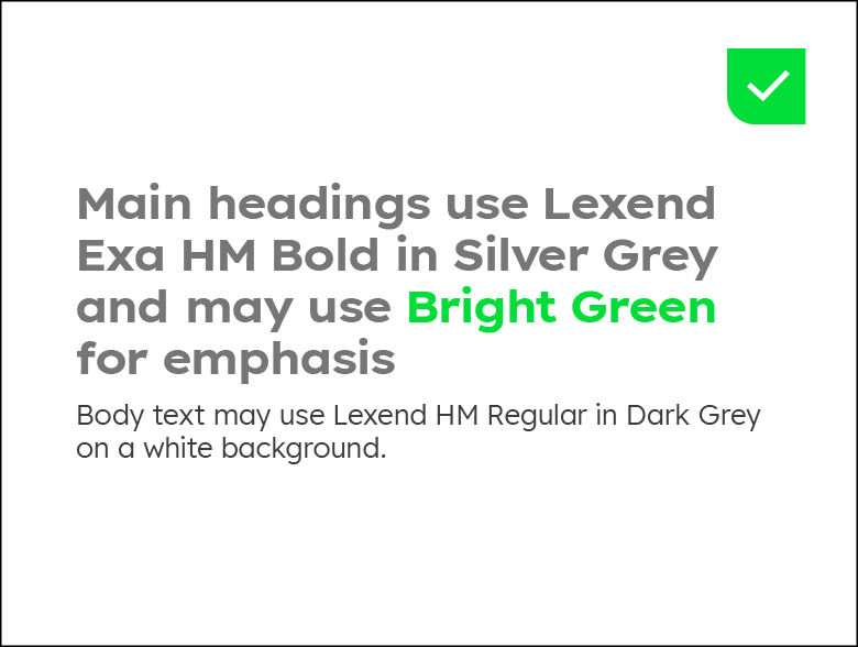
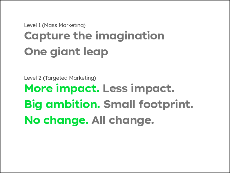
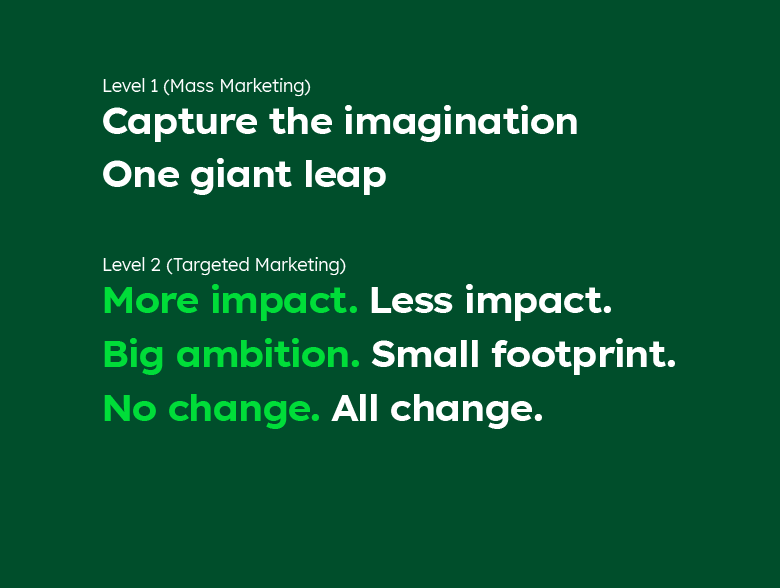
Typography plays a vital role in shaping the clarity, tone, and professionalism of our communications. Consistent use of these typefaces across all applications creates a unified visual identity and reinforces recognition of the brand. Establishing a clear hierarchy, through defined heading, subheading and body styles ensures information is delivered with structure and impact.
Main Headings

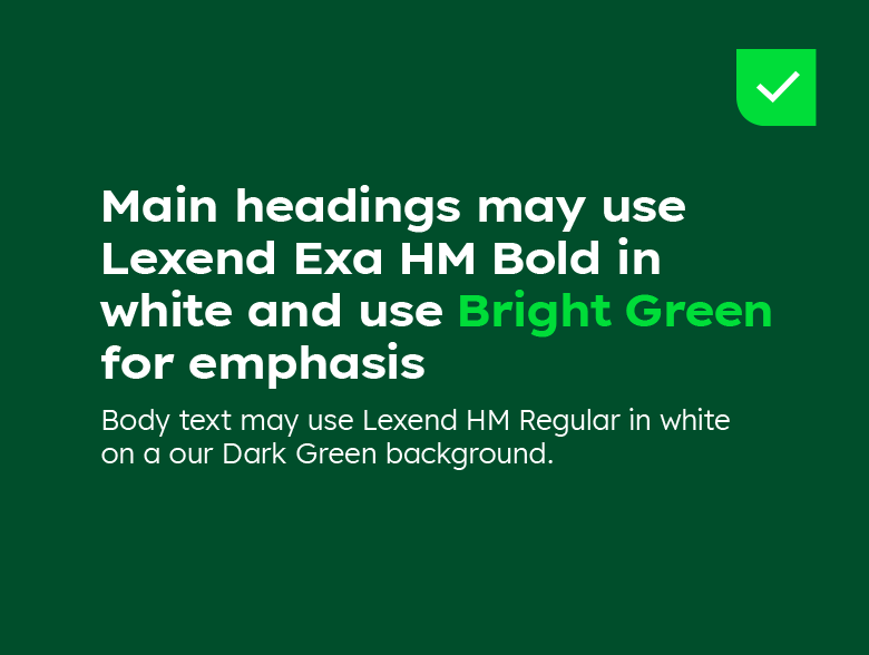

Campaign Headlines


Body Text
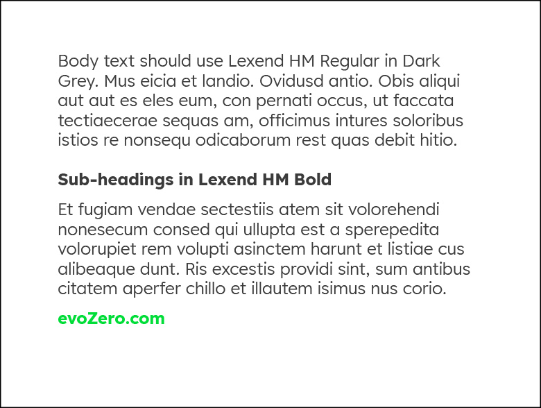

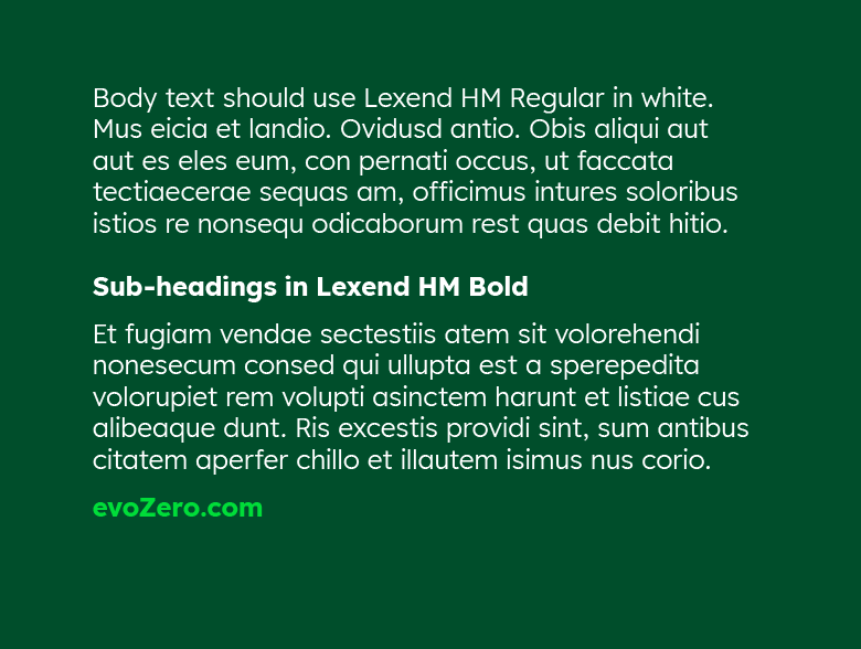

Typography must always be applied according the guiding principles of the Heidelberg Materials brand.
This includes adhering to approved fonts, specified weights, and recommended sizes across print, digital, and presentation materials. Substituting typefaces, altering proportions, or misusing weights and styles weakens brand cohesion and should be avoided.
Learn more about our text styles in the Typography section.
Colours
Colour is a fundamental component of our visual identity, providing immediate recognition and reinforcing the personality of evoZero®. When applied consistently, colour strengthens brand recall and ensures a cohesive look and feel across all communications. Examples below demonstrate our permitted identity colours.
Colours
Dark Green


HEX: #004E2B
RGB: 0 | 78 | 43
CMYK: 77 | 0 | 72 | 70
Bright Green


HEX: #00DD39
RGB: 0 | 221 | 57
CMYK: 68 | 0 | 98 | 0
Dark Grey


HEX: #3B3B3B
RGB: 59 | 59 | 59
CMYK: 0 | 0 | 0 | 80
Colours
Silver Grey


HEX: #767676
RGB: 118 | 188 | 118
CMYK: 0 | 0 | 0 | 54
Sandy Grey


HEX: #E6E6DF
RGB: 230 | 230 | 230
CMYK: 0 | 0 | 5 | 10
White


HEX: #FFFFFF
RGB: 255 | 255 | 255
CMYK: 0 | 0 | 0 | 0
To maintain visual integrity, colour must be used with precision and consistency. Always apply the specified CMYK, RGB, and HEX values to guarantee accuracy across print and digital media. Overuse of accent colours or alterations to the established palette undermine the strength of the brand and must be avoided.
Labelling text
The labelling text is set separately from the descriptor within the layout. It appears as an asterisk text for the tiering note on defined media.
All touchpoints that are aimed directly at (potential) customers (invoices, orders, cement bags, e-brochure) have a QR code that leads directly to a website with the labeling text. In the high-level marketing and campaign materials (print ad, digital assets) there will be no QR code but instead a hyperlink or URL.
The world’s first carbon captured near-zero cement/concrete. Learn more here: evozero.com
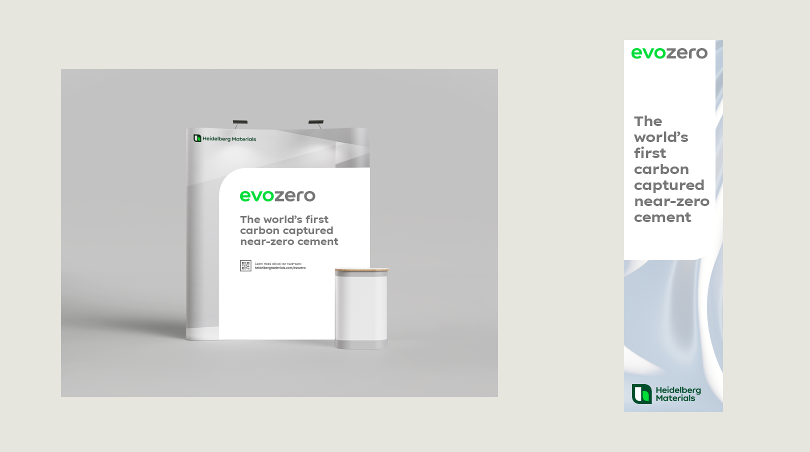

Examples with the labelling text.
Find the labelling text on evozero.com
Imagery
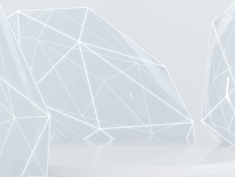
The visual language of the evoZero product brand is minimalist, reduced and defined by images with a high proportion of white. The white colour scheme is consistently integrated into the visual language, both in CGI and in real images. Exceptions can be made for editorial and informational content.
For special content purposes, such as campaigns, it is possible to expand the image guidelines. For specific requests that go beyond the guidelines, please contact the Brand Communication Team.
Abstract Imagery
Abstract Imagery









Dont's
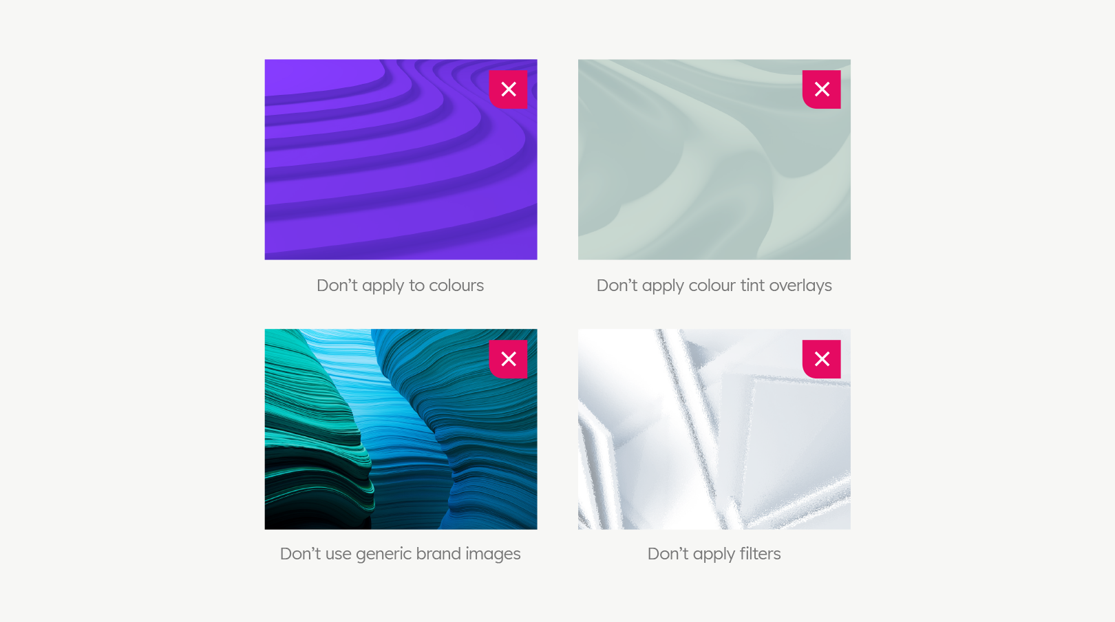

You must not use coloured images or generic brand images. Also, don't apply tint overlays or filters.
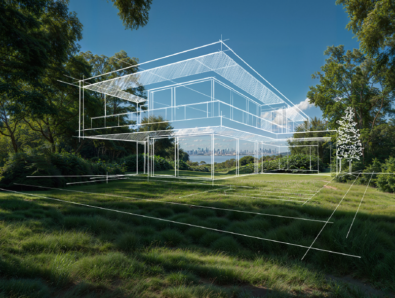
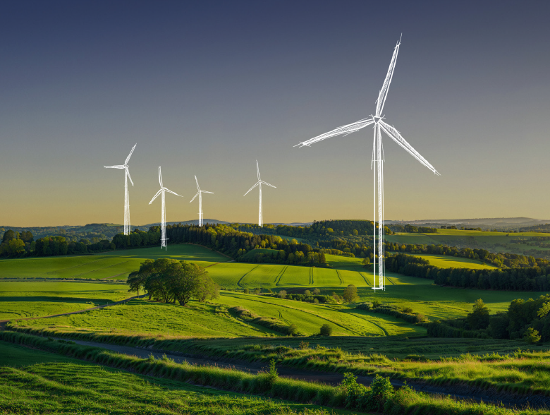
Campaign Imagery
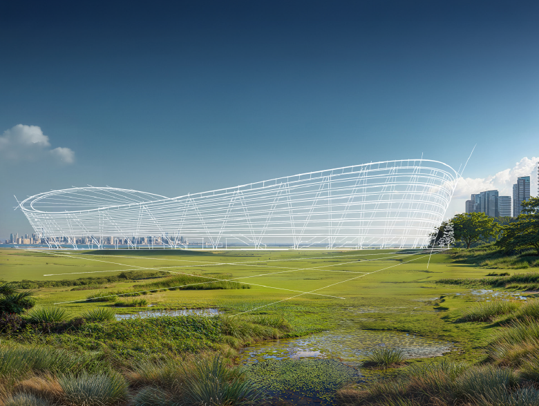

Level 2 (Targeted Marketing)
For targeted, direct forms of communication that aim to engage specific groups of consumers.
Level 1 (Mass Marketing)
For broad, mass-media communication strategies aimed at building brand awareness and reaching a wide audience.
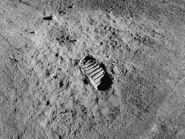

We have a range of images available for Level 2 communications which are built into the campaign templates. These allow users to select the visual best suited to their audience, ensuring the creative remains relevant, engaging, and aligned with the intended message and customer focus. Images should be selected to best fit the format and may be cropped appropriately.

Campaign Imagery


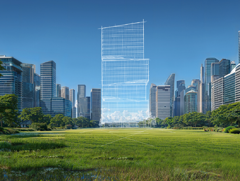

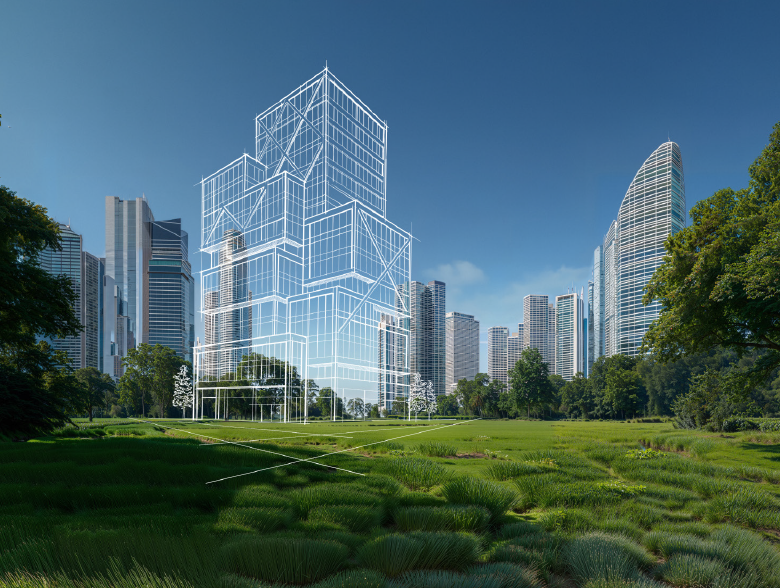

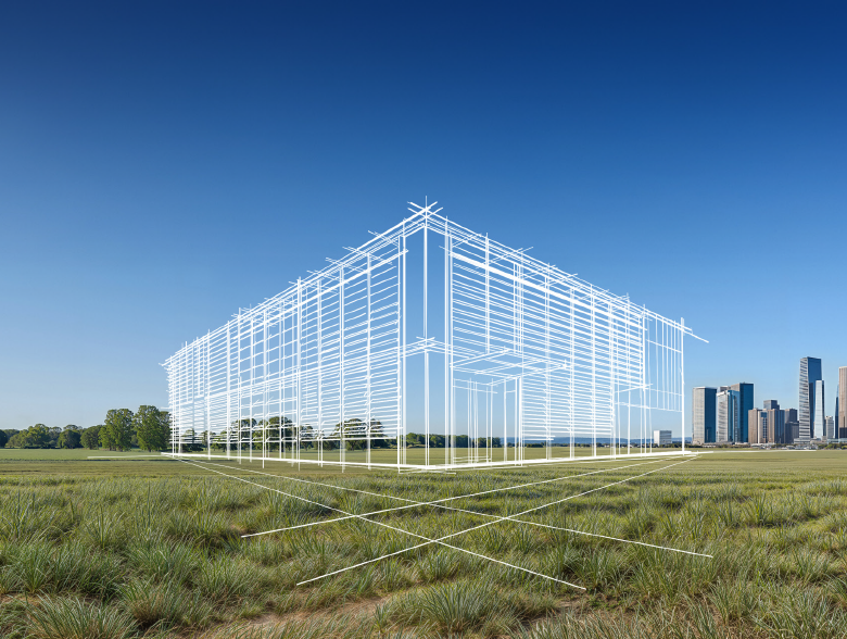



Dont's
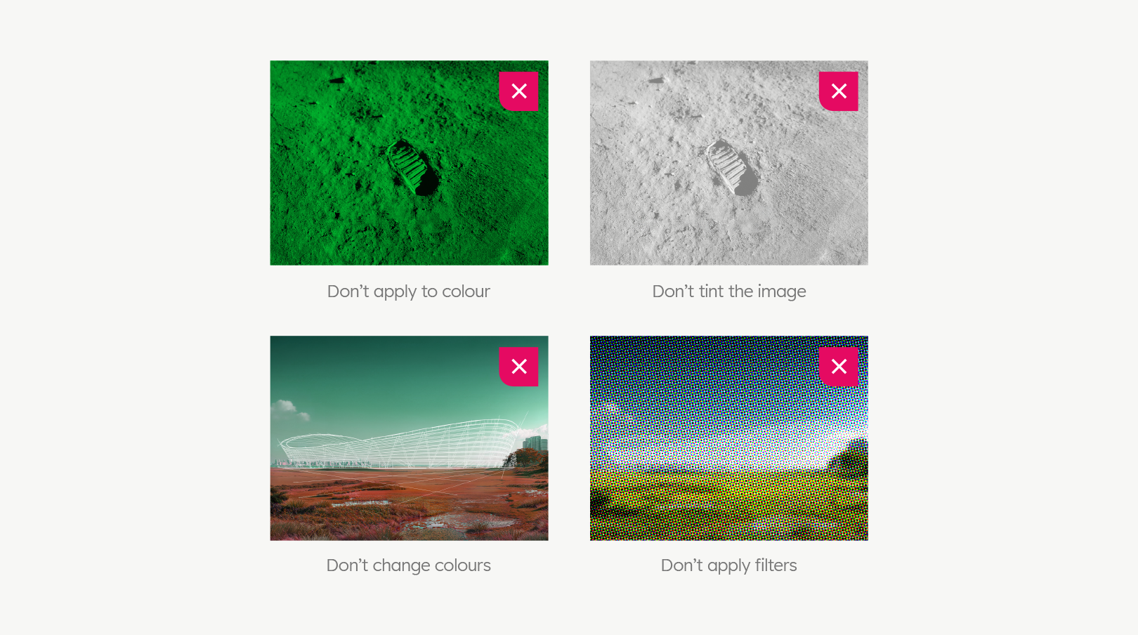

Do not apply monochromatic colour-masks, tints, filters. Also, do not change the colours of the images.
Campaign Messaging
Campaign Hierarchy
The evoZero® campaign hierarchy is carefully structured to communicate effectively across multiple audience levels, guiding messaging from broad brand awareness to highly targeted, personalised engagement. It provides a clear framework for how evoZero® connects with the market – building recognition, driving interest, and fostering meaningful relationships with specific customer groups through tailored communication strategies.
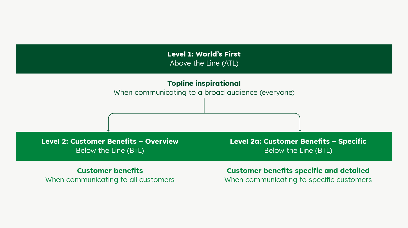

| Level 1: World's First | Level 2: Customer Benefits – Overview | Level 2a: Customer Benefits – Specific |
|---|---|---|
| Focuses on broad, mass-media communication to build awareness and establish evoZero® as an industry pioneer. Messaging highlights innovation and leadership, using high-visibility platforms to create a strong, memorable brand presence. | Engages customers by showcasing the tangible advantages of evoZero®. Messaging is benefit-driven, emphasising innovation, trust and performance to encourage engagement and conversion across a wider customer base. | Delivers targeted, personalised communication to defined segments such as architects or developers. Messaging is tailored to each audience’s needs, aiming to drive conversion and build stronger relationships through direct, high-impact engagement. |
Messaging – Level 1
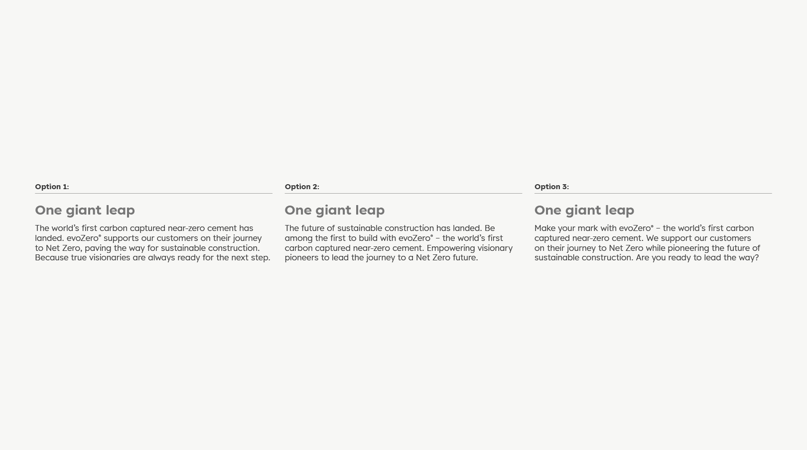
The level 1 campaign is anchored by the single headline ‘One giant leap.’ This serves as the unifying statement for all broad, awareness-focused communications. Supporting this, we have three alternative copy options to complement the headline. This allows flexibility in tone and emphasis while maintaining consistency in the overarching message.

Messaging – Level 2
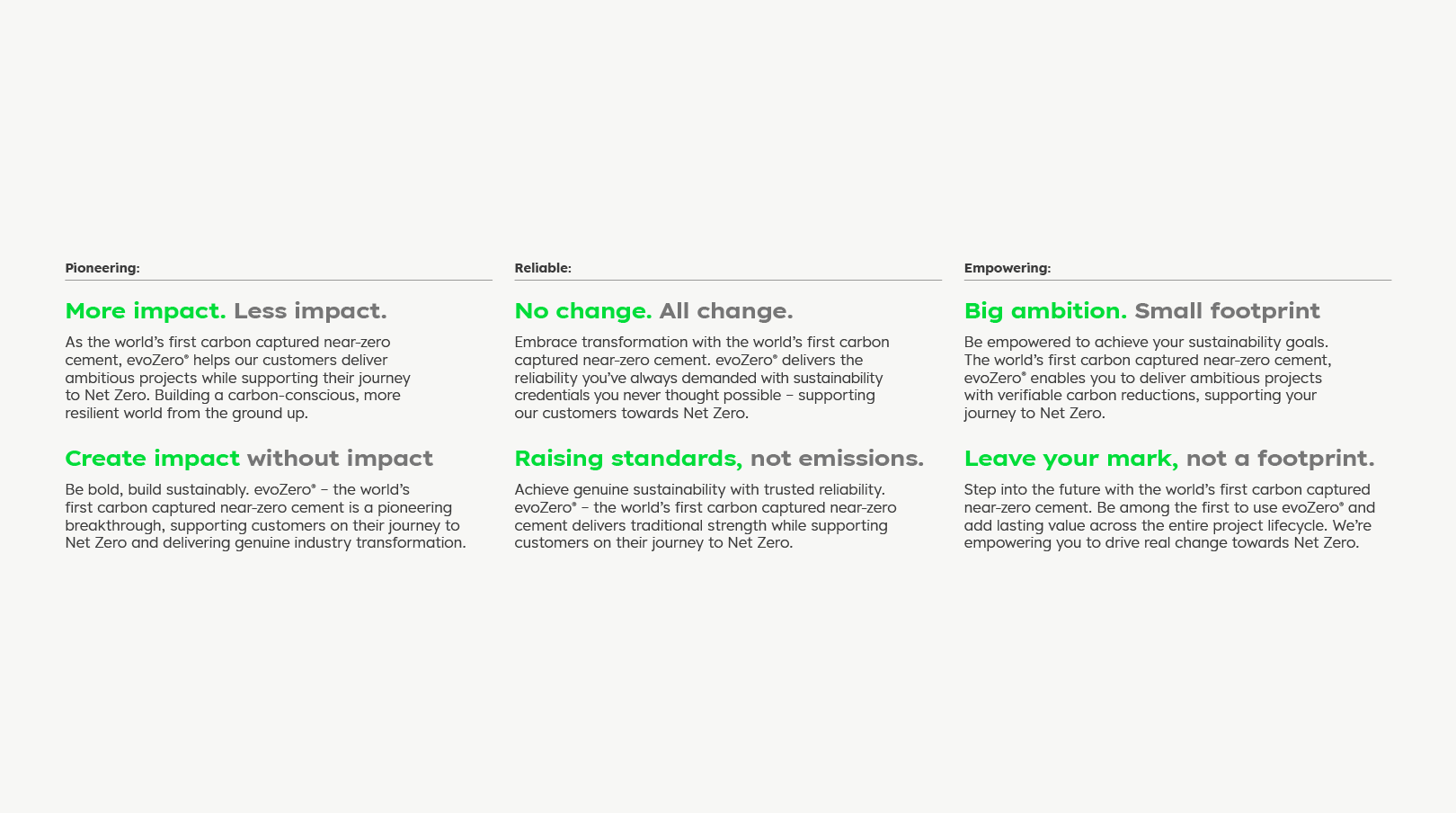
For Level 2 messaging, the campaign employs paradox headlines that sit within the benefit-driven themes of ‘Pioneering, Reliable and Empowering.’ Each headline is designed to capture attention while highlighting key customer benefits. Supporting these headlines, we have copy developed to complement them, ensuring clarity and impact in communicating value to customers.

Messaging – Level 2a
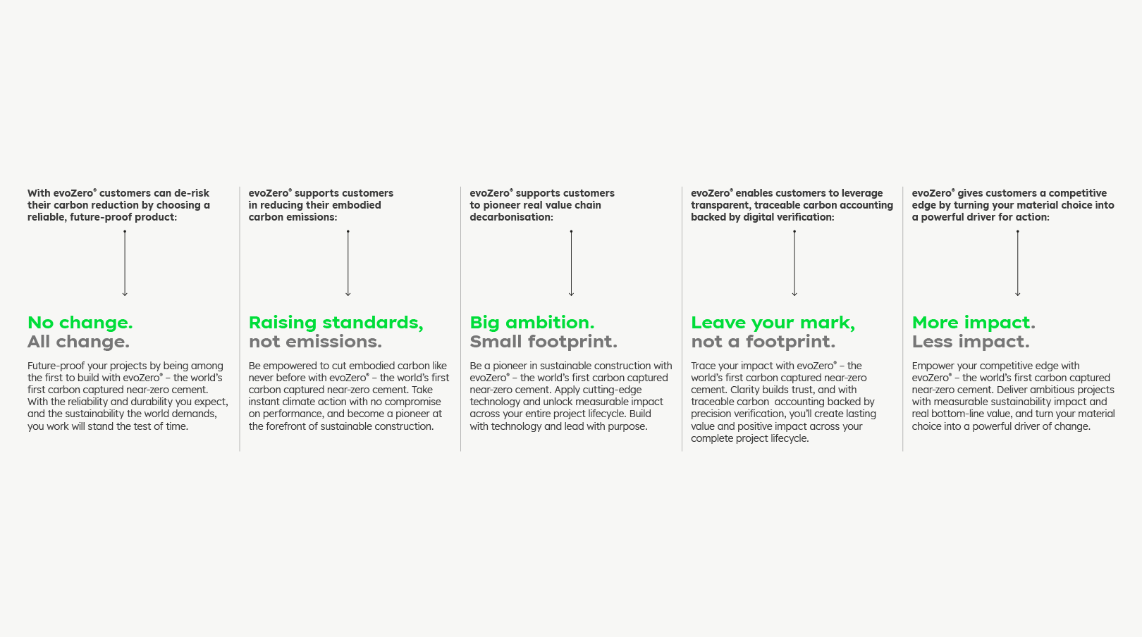
For Level 2a messaging, the campaign also uses paradox headlines, but these are aligned with specific customer benefits. We have complementary copy developed to reinforce each message, ensuring clarity and impact in communicating the benefits to each audience.

Email banners
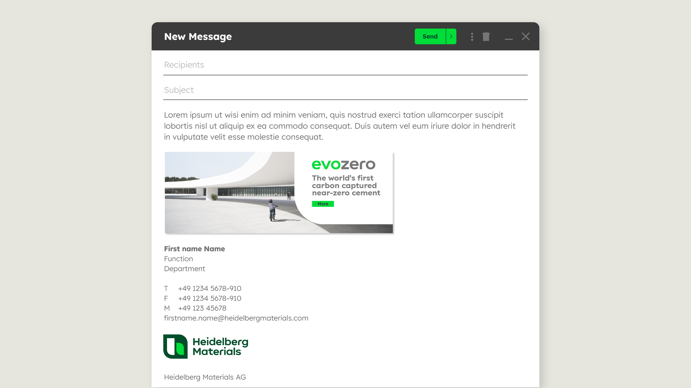

Professional email banners serve as powerful B2B marketing resources. Strategically placed in your signature, you effectively promote upcoming events, offers, new products or features while driving traffic to websites or landing pages. Examples and templates can be found within the Brand Touchpoints section.
Third-party usage evoZero Label
Our sustainable cement will also be an ingredient in other suppliers’ concrete products. Therefore, we provide a label that communicates the product advantage that comes with the benefits of our evoZero cement.
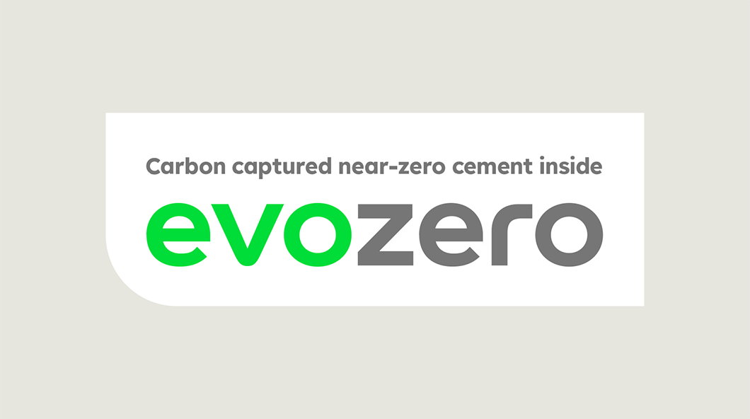

The label is available in RGB and CMYK for digital and print applications.
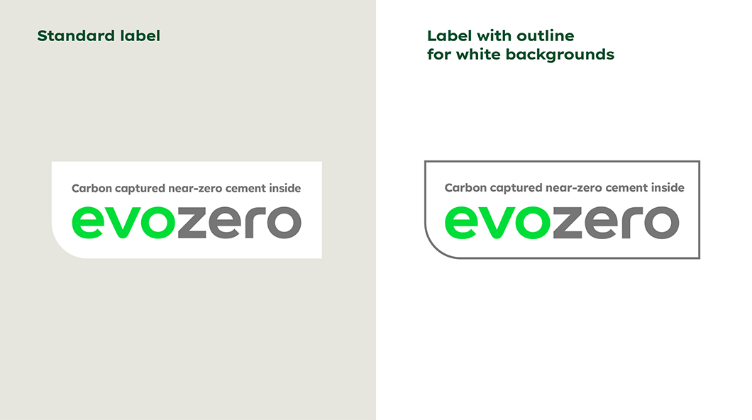

There are different label colour options for different touchpoints and backgrounds.
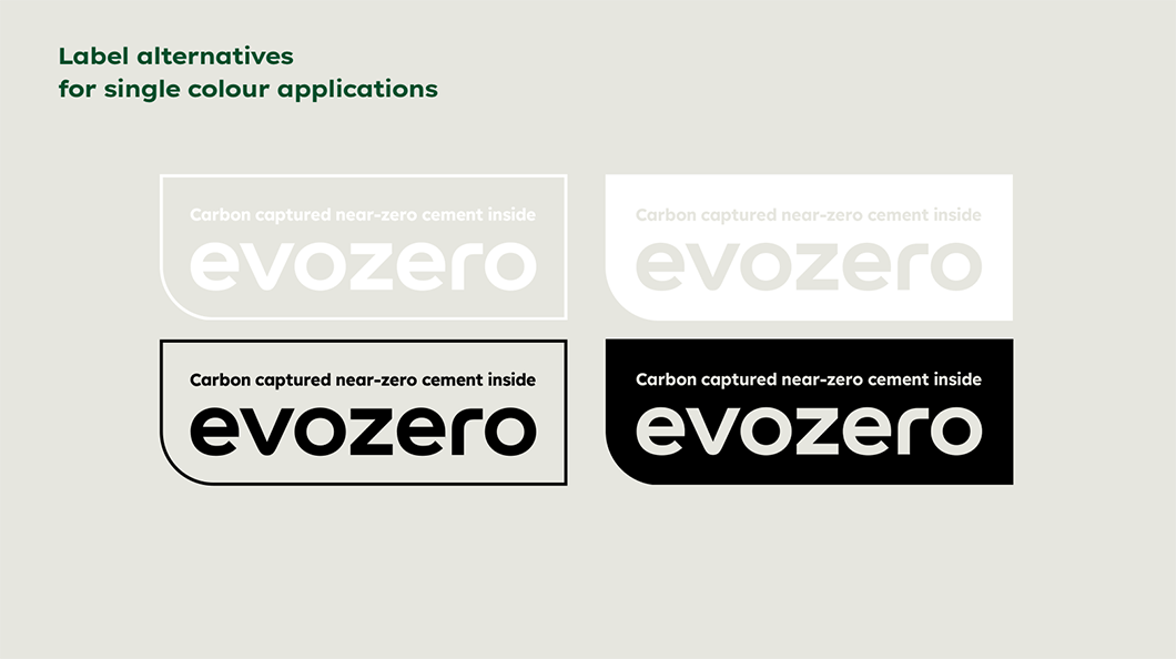

There are different label colour options for different touchpoints and backgrounds.
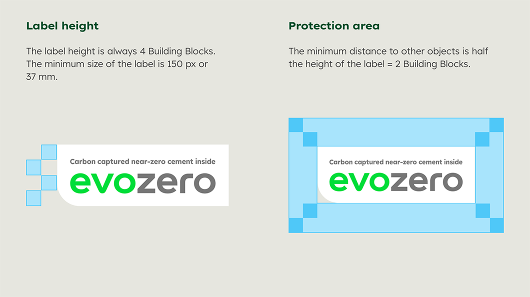

The label needs adequate space and a minimum size to be effective and legible
evoBuild
With evoBuild, we are setting new standards for building materials. It is our sustainability brand for low-carbon and circular products. The product brand is distinct from the corporate brand, with its own visual identity and independent look and feel. The evoBuild products are currently available in three variants, each specifically designed for low-carbon, circular and 3D printing applications.

Logo
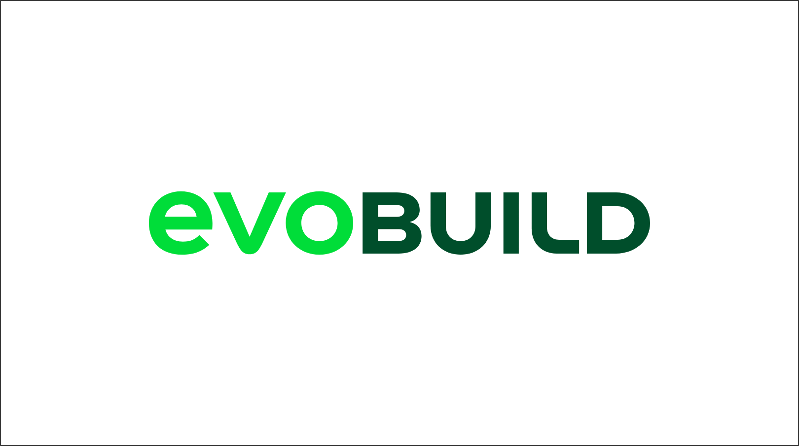

The product logo is independent, but at the same time fits into the visual language of Heidelberg Materials, as the proportions and typeface are derived from the corporate brand.
Usage
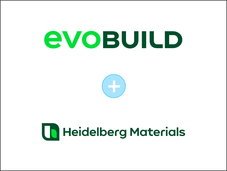

The product logo always appears in conjunction with the single-line version of the corporate brand logo. The only exception to this is in social media posts, where you should only use the product logo.
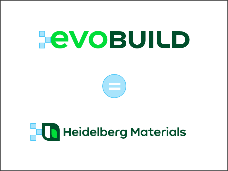

The product logo height and the corporate brand logo height are always the same. The number of the building blocks may vary depending on format and medium.
The single-line logo is used within the evoBuild framework for design reasons. As part of the corporate brand (Heidelberg Materials), the use of the single-line logo remains an exception.
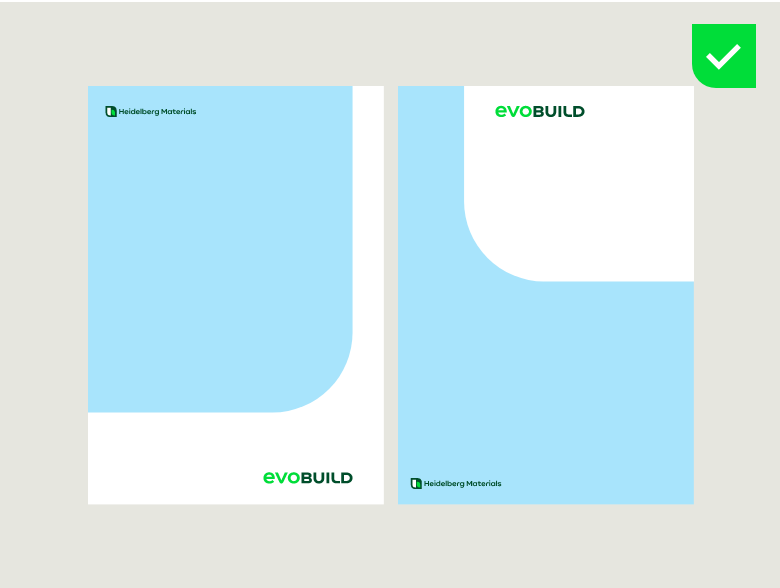

The product logo is always placed on a white background or a white shape. The corporate brand logo is always placed on the imagery.
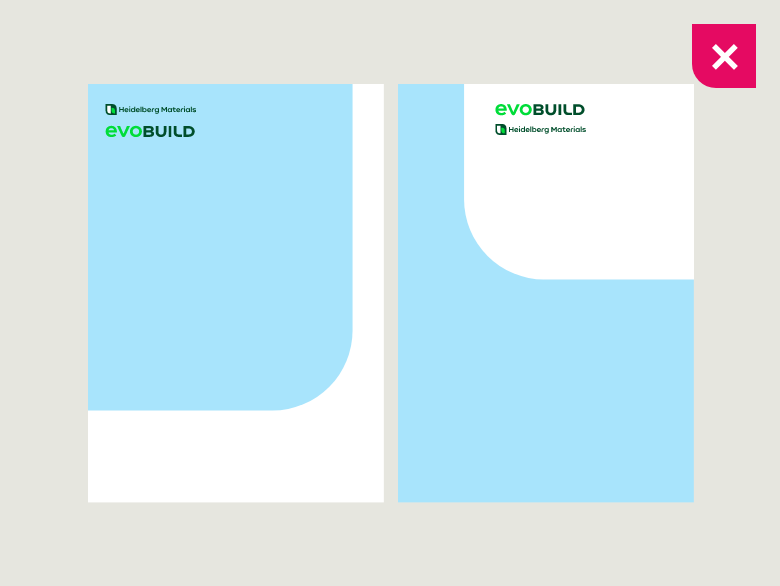

Don’t place the two logos next to each other or below each other in the same area.
Position
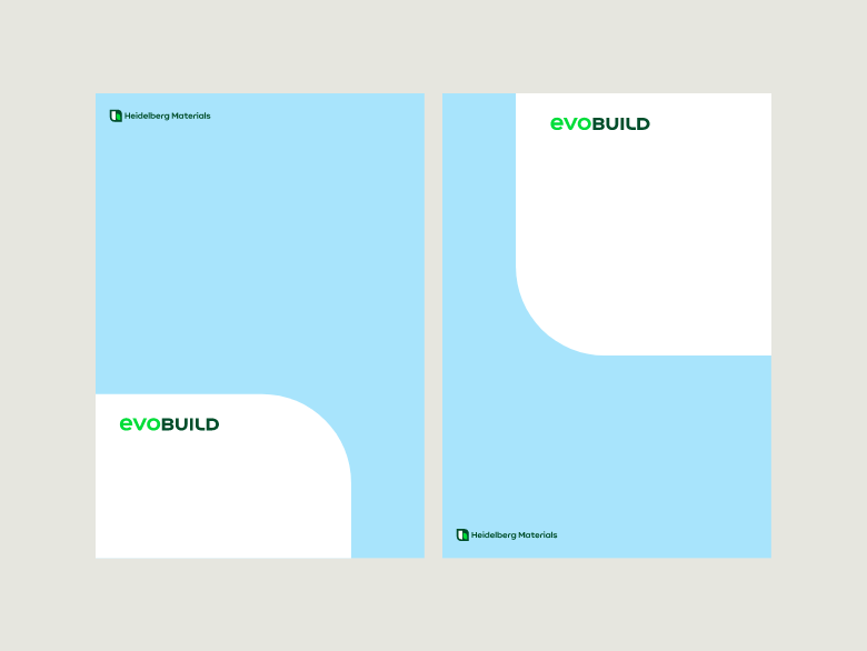

On a shape, the logo should always be prominently placed first in front of all content.
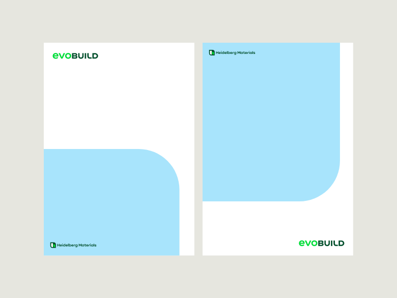

On a white background the product logo can be placed in each of the four corners.
Colour versions
Colour versions

evoBuild logo, positive


evoBuild logo, mono Black

evoBuild logo, mono White
Descriptor
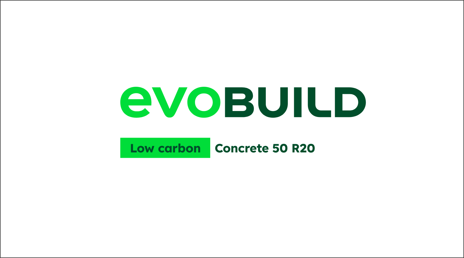

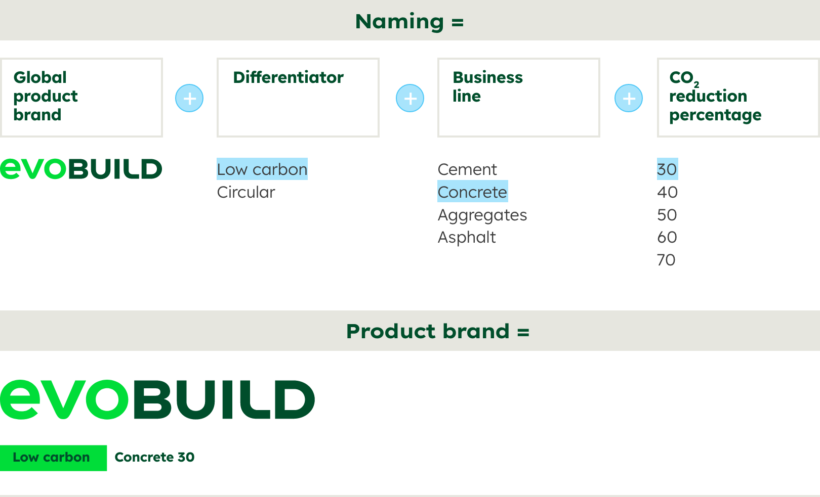
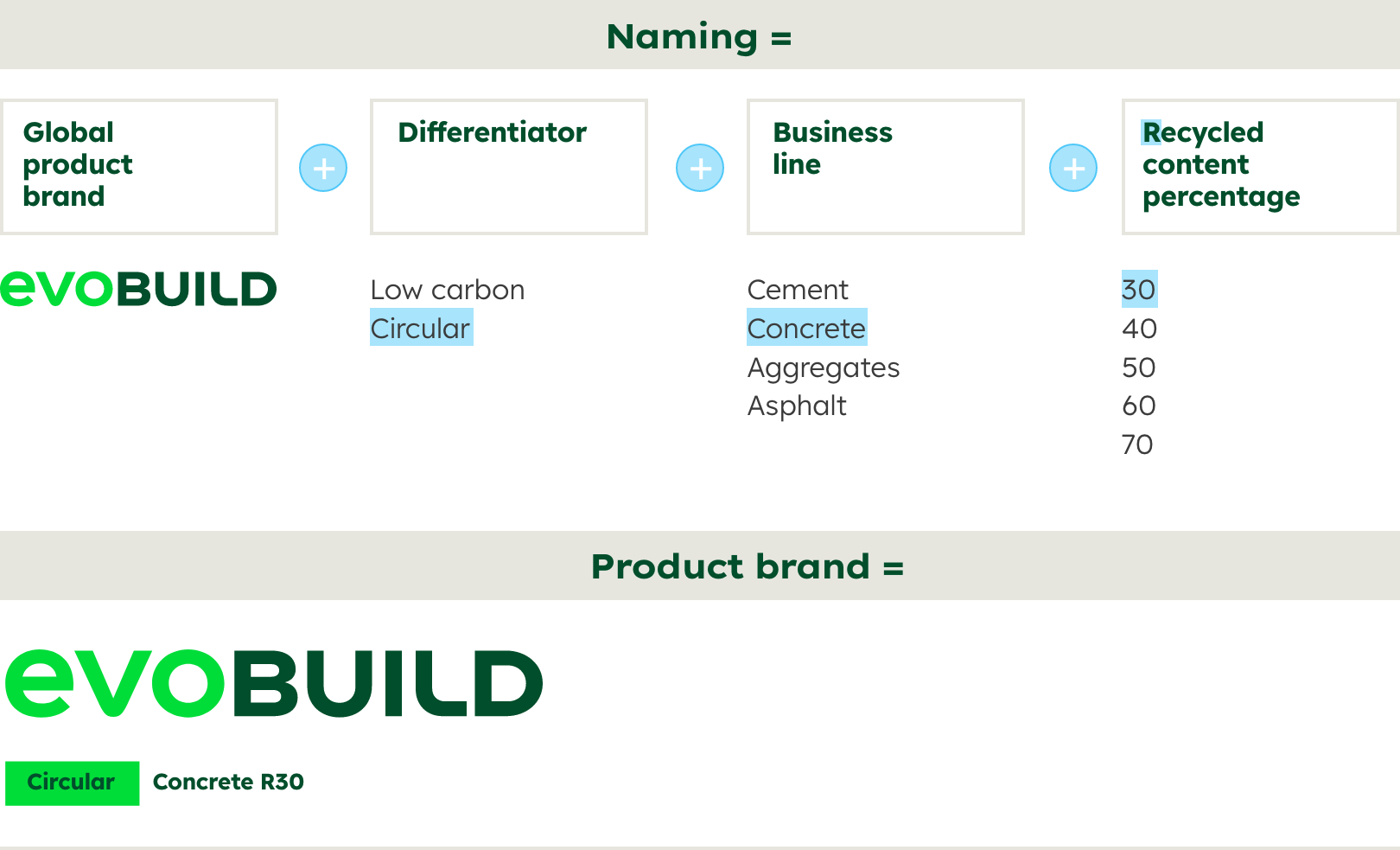
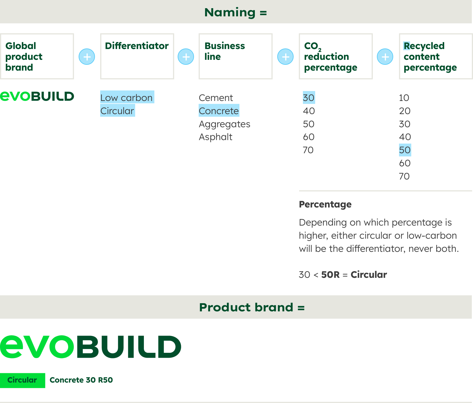
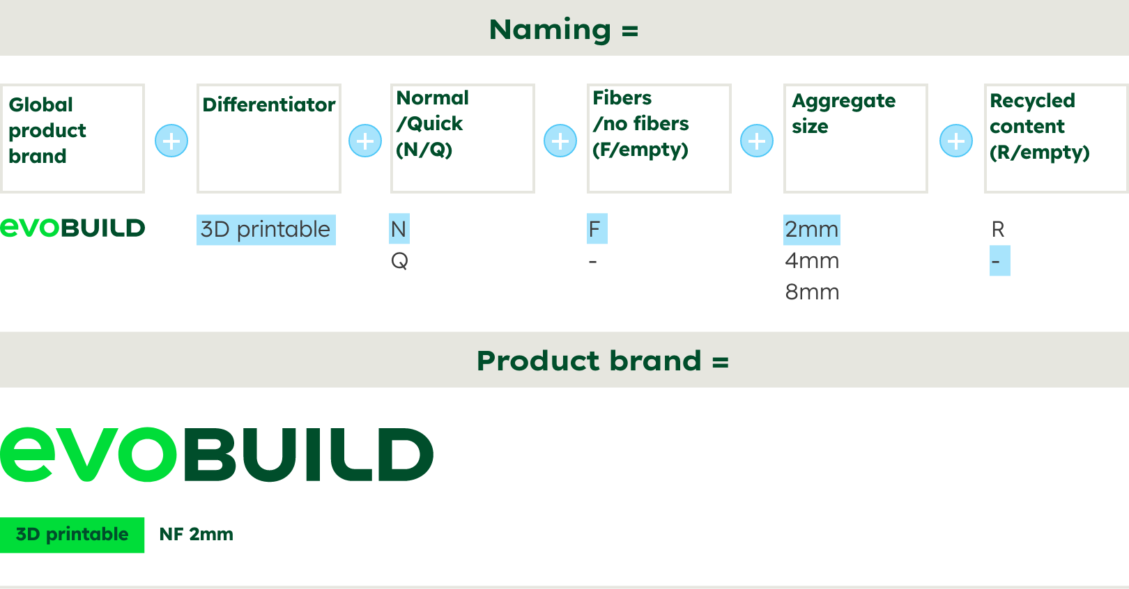
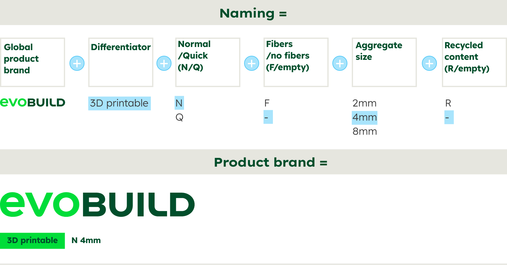
The purpose of the descriptor is to make products under the same brand distinguishable from each other. The descriptor should emphasise the benefit for the customer.
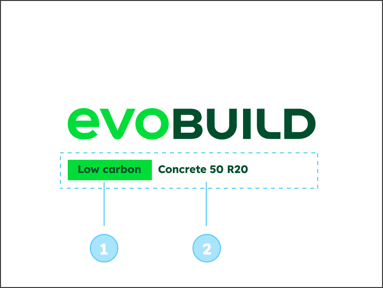

The descriptor contains further product information about the product brand and consists of the differentiator (1) and the tiering (2).
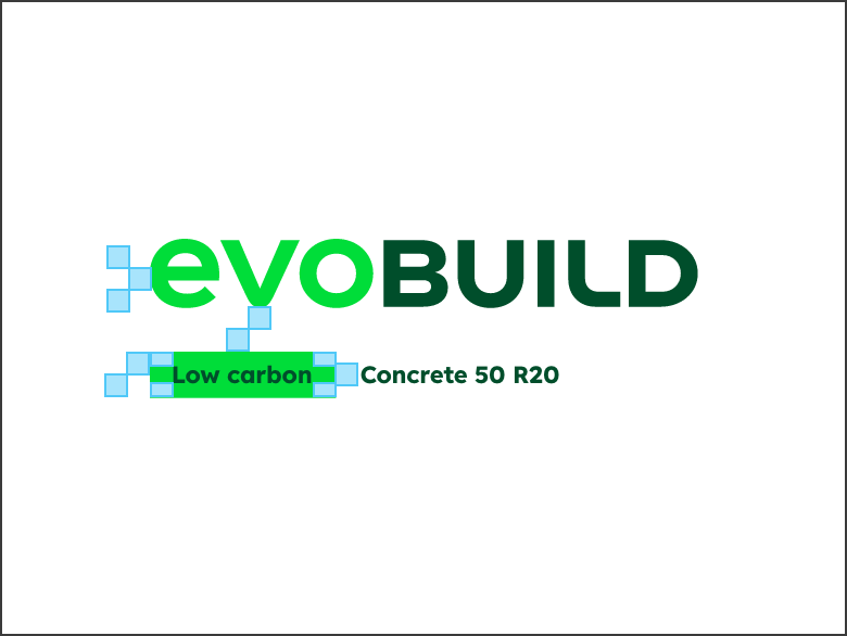

The building blocks define distances and sizes for all elements in the descriptor area.
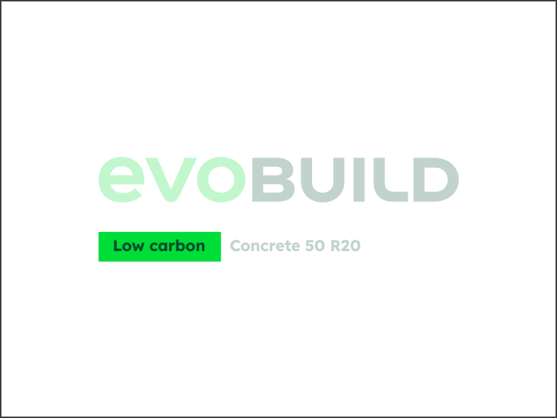

The differentiator
– describes the technology or composition of the product. It appears as Deep Green text on a Bright Green rectangle.
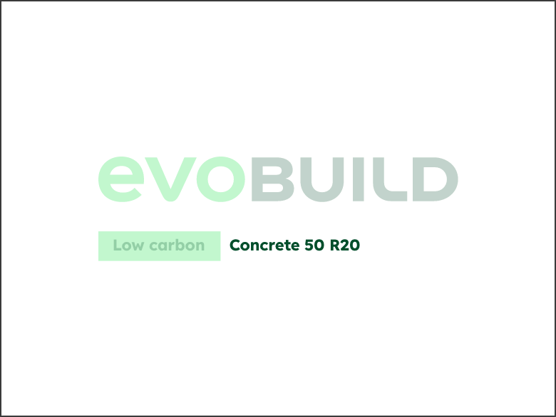

The tiering
– contains additional product information, specification or where the product was manufactured. It appears as Deep Green text.
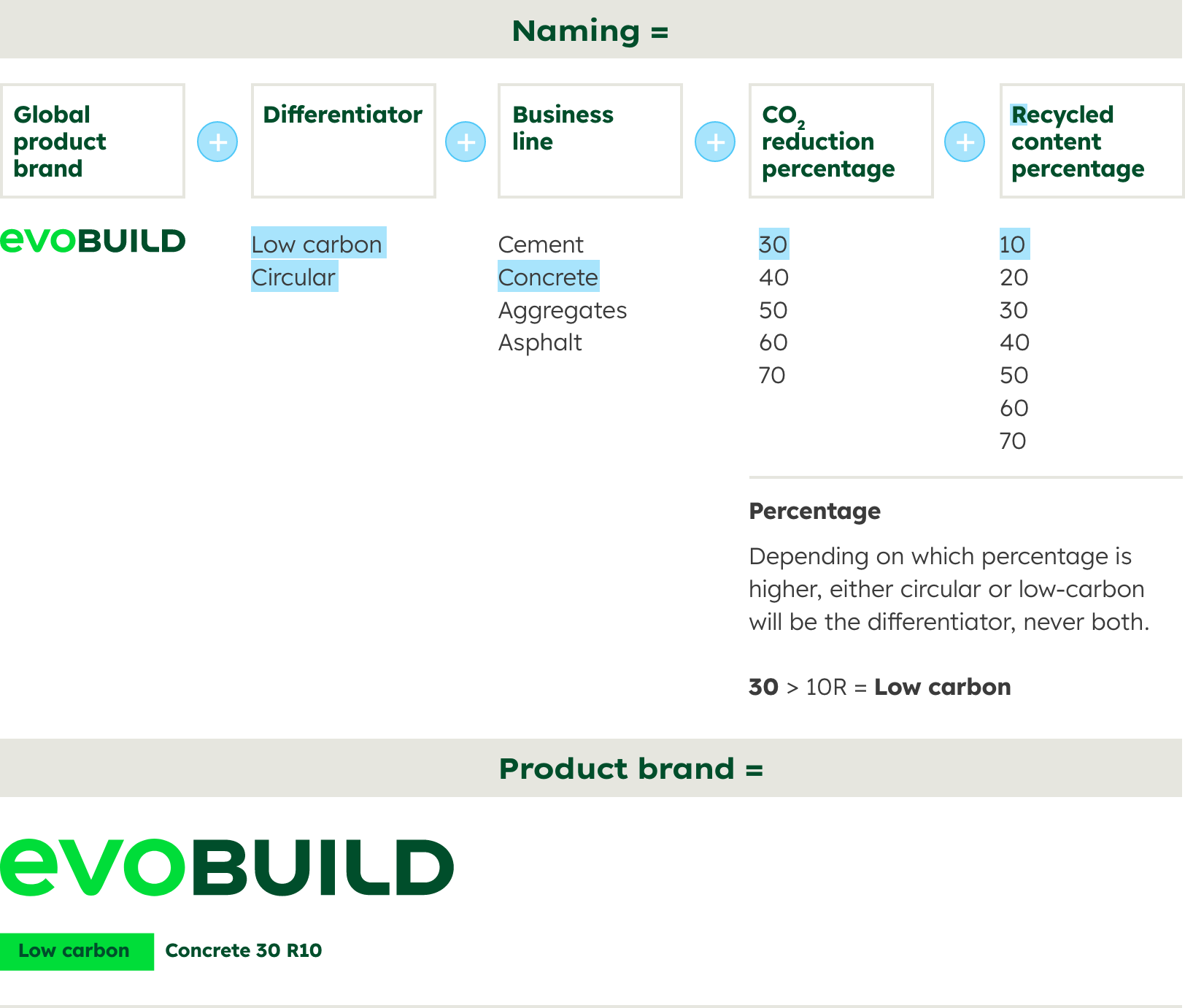
The tiering states the type of material, the CO2 reduction in percentage (50 = 50% CO2 reduction compared to the reference product) and the percentage of recycled material (if applicable) marked with an R (R20 = 20% recycled material).
Usage


Use the evoBuild logo on its own wherever quick perception and recognition is required.
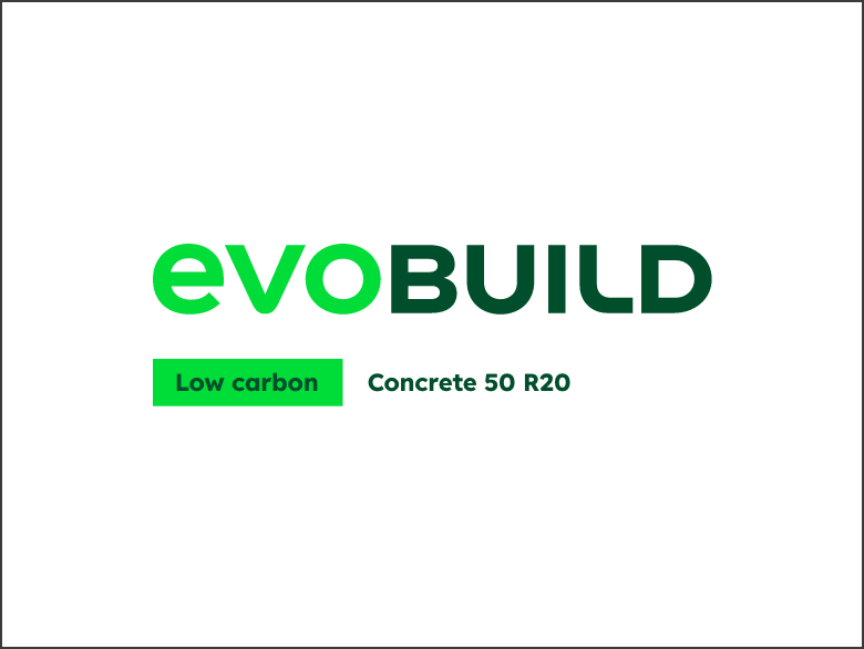

Use the evoBuild logo in with the descriptor wherever it is important to communicate the special feature of a product.
Colours
Colours

HEX: #00DD39
RGB: 0 | 221 | 57
CMYK: 68 | 0 | 98 | 0
Usage:
- „evo“ in the word mark
- background-colour for the
differentiator

HEX: #004E2B
RGB: 0 | 78 | 43
CMYK: 77 | 0 | 72 | 70
Usage:
- „build“ in the word mark
- Headlines, Sublines
- Text colour for the differnatiator
- Text colour for Tiering

HEX: #3B3B3B
RGB: 59 | 59 | 59
CMYK: 0 | 0 | 0 | 80
Usage:
- Copy text
Imagery


The visual language of the evoBuild product brand is always based on the content of the respective sub-category. This can be a concrete reference object, a detailed view of the result or an abstract CGI that communicates the material, the process or the underlying technology.
For special content purposes, such as campaigns, it is possible to expand the image guidelines. For specific requests that go beyond the guidelines, please contact the Brand Communication Team.
Email banners
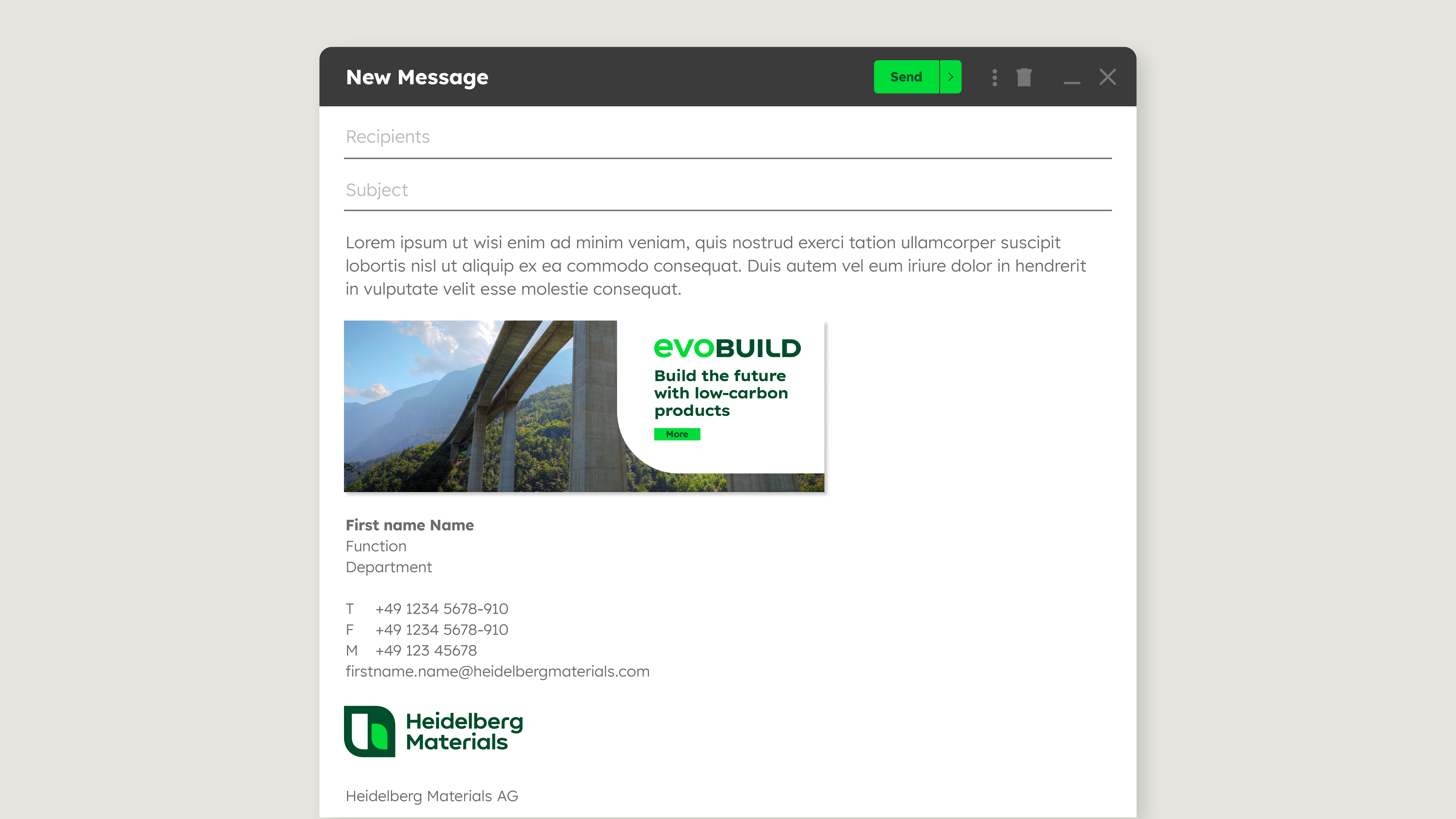

Professional email banners serve as powerful B2B marketing resources. Strategically placed in your signature, you effectively promote upcoming events, offers, new products or features while driving traffic to websites or landing pages. Examples and templates can be found within the Brand Touchpoints section.
Inspiration
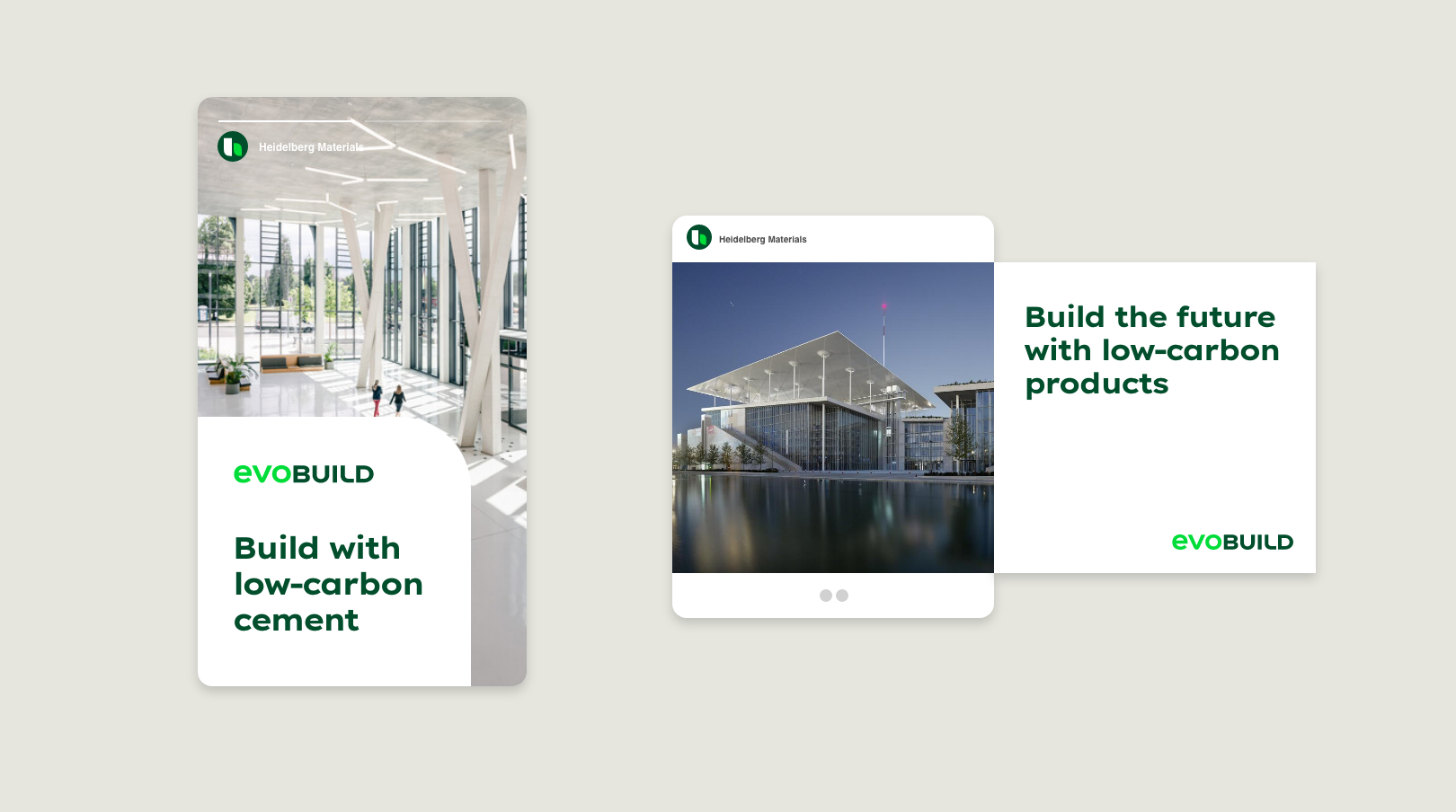

Examples – Social Media
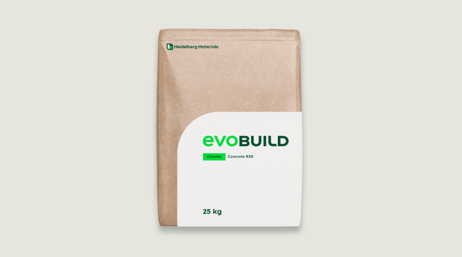

Examples – Cement Bag
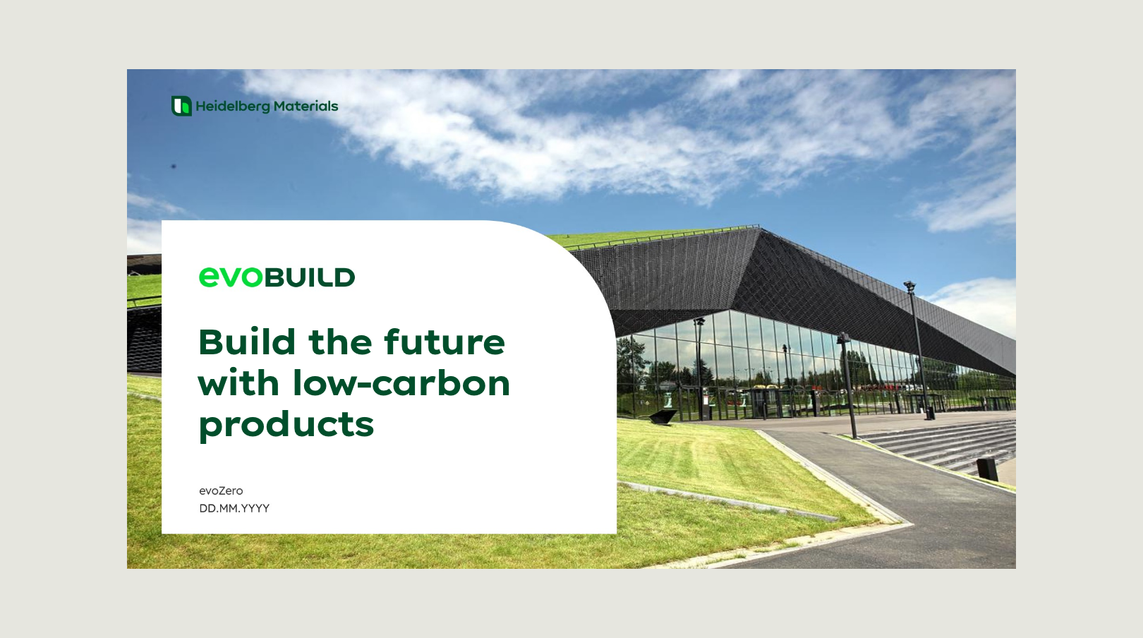

Examples - PPT Title
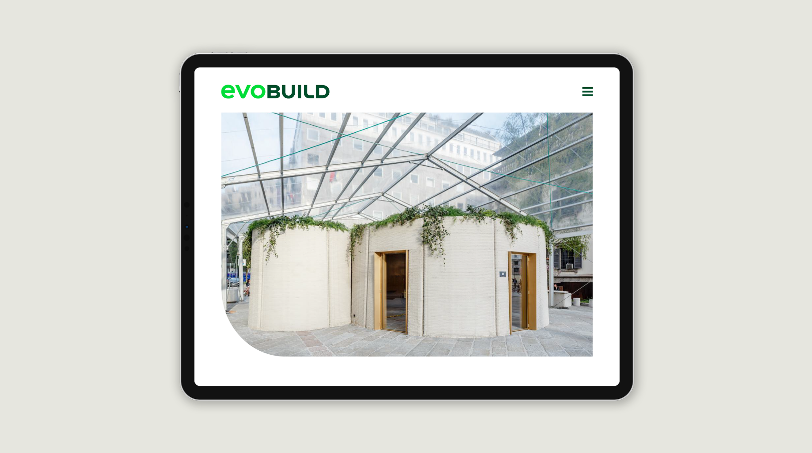

Examples - Microsite
Requirements for an evoBuild product
Sustainable products must fulfill one or more of the following criteria to be part of the evoBuild family.
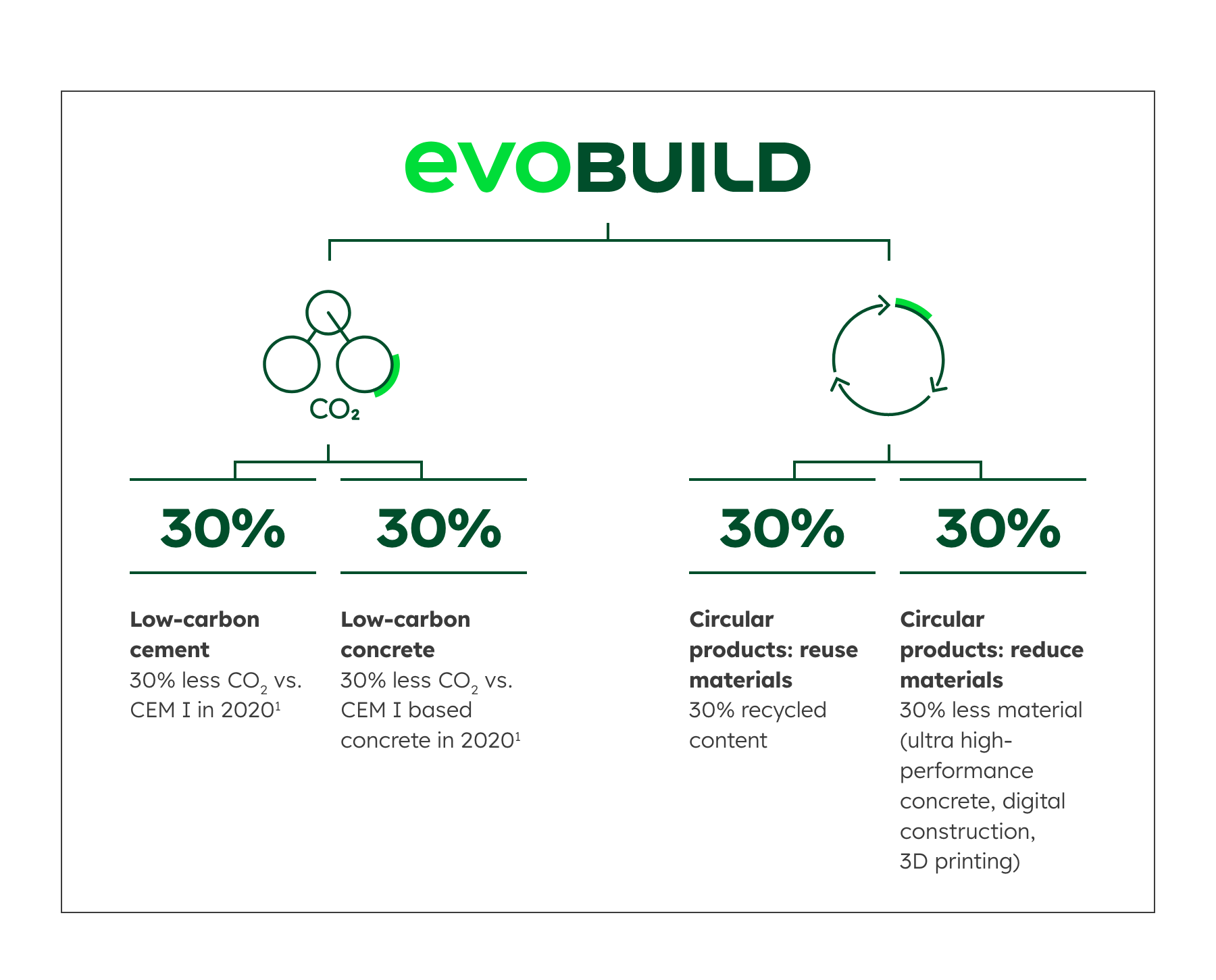

Please note: The differentiator and tiering should remain in English and not be translated into other languages. If this seems unavoidable, the translated wording needs to be validated by Legal and ESG as there are very subtle differences to consider (e.g. between low carbon, decarbonised or near zero).
evoBuild for low-carbon products
Below you find the composition of the descriptor (consisting of differentiator and tiering) for the evoBuild low-carbon product range as well as an example of the final product brand.


evoBuild for circular products
Below you find the composition of the descriptor (consisting of differentiator and tiering) for the evoBuild circular product range as well as an example of the final product brand.


evoBuild for 3D printable products
Below you find the composition of the descriptor (consisting of differentiator and tiering) for the evoBuild 3D printable product range as well as an example of the final product brand.


Third-party usage evoBuild Label
Our sustainable cement will also be an ingredient in other suppliers’ concrete products. Therefore, we provide a label that communicates the product advantage that comes with the benefits of our evoZero cement.
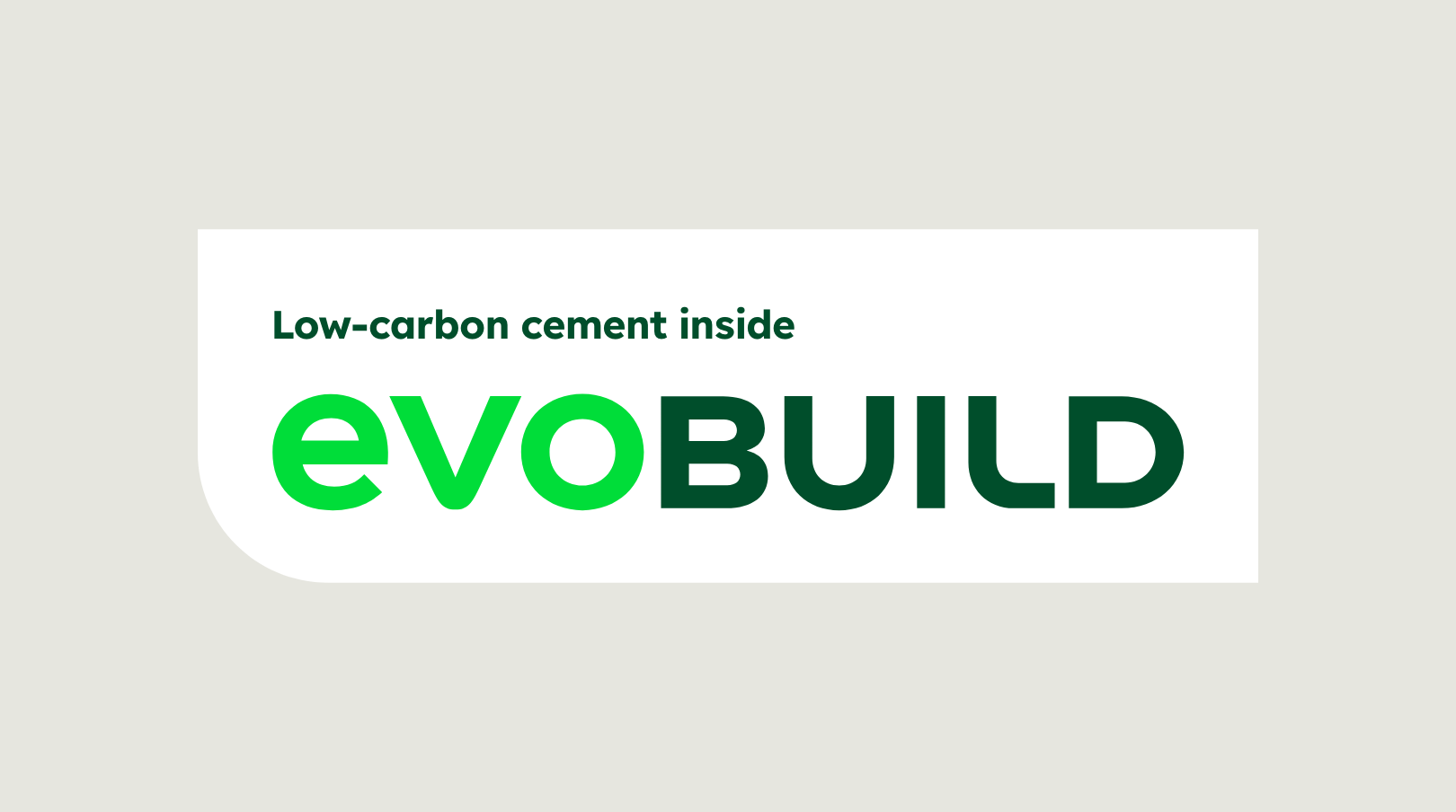

The label is available in RGB and CMYK for digital and print applications.
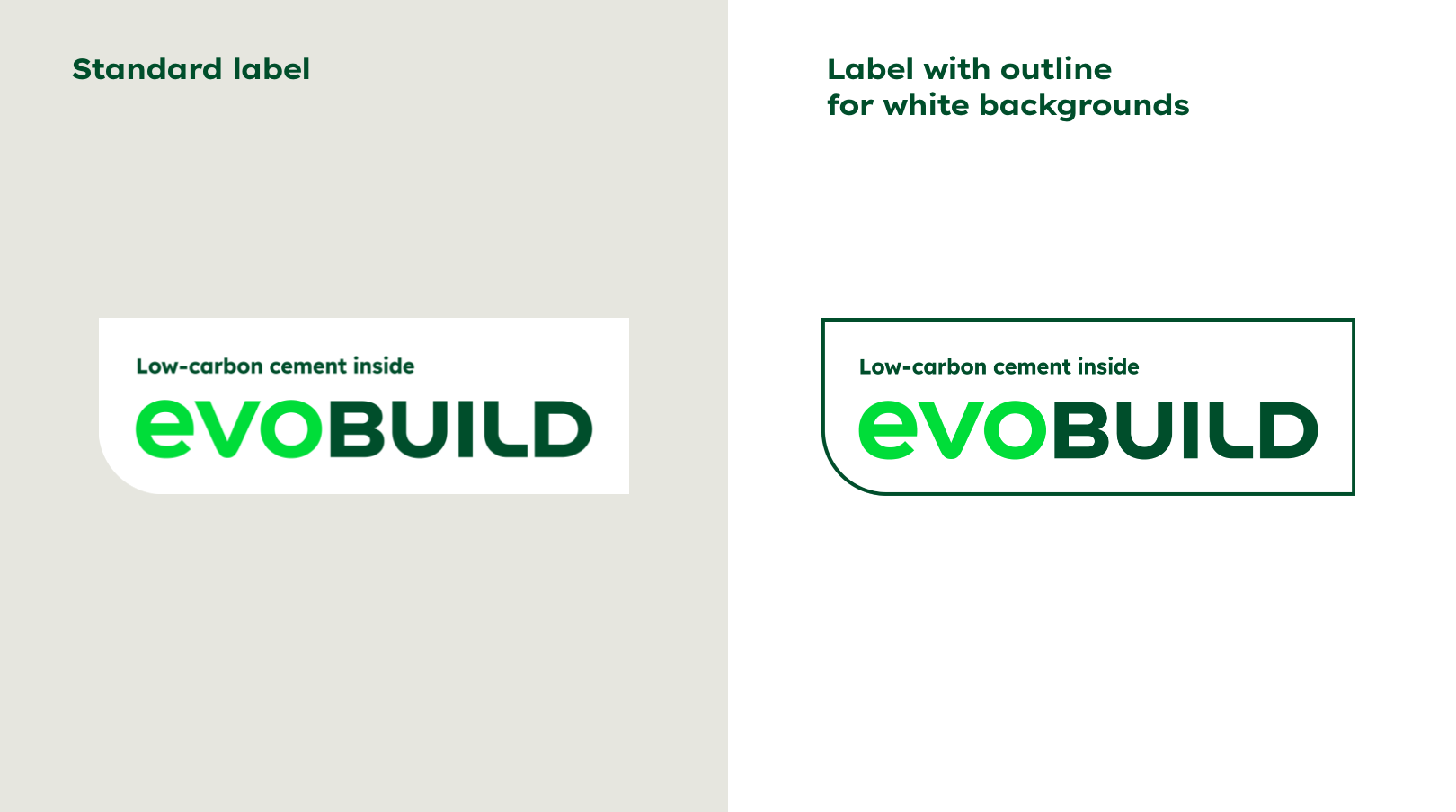

There are different label colour options for different touchpoints and backgrounds.
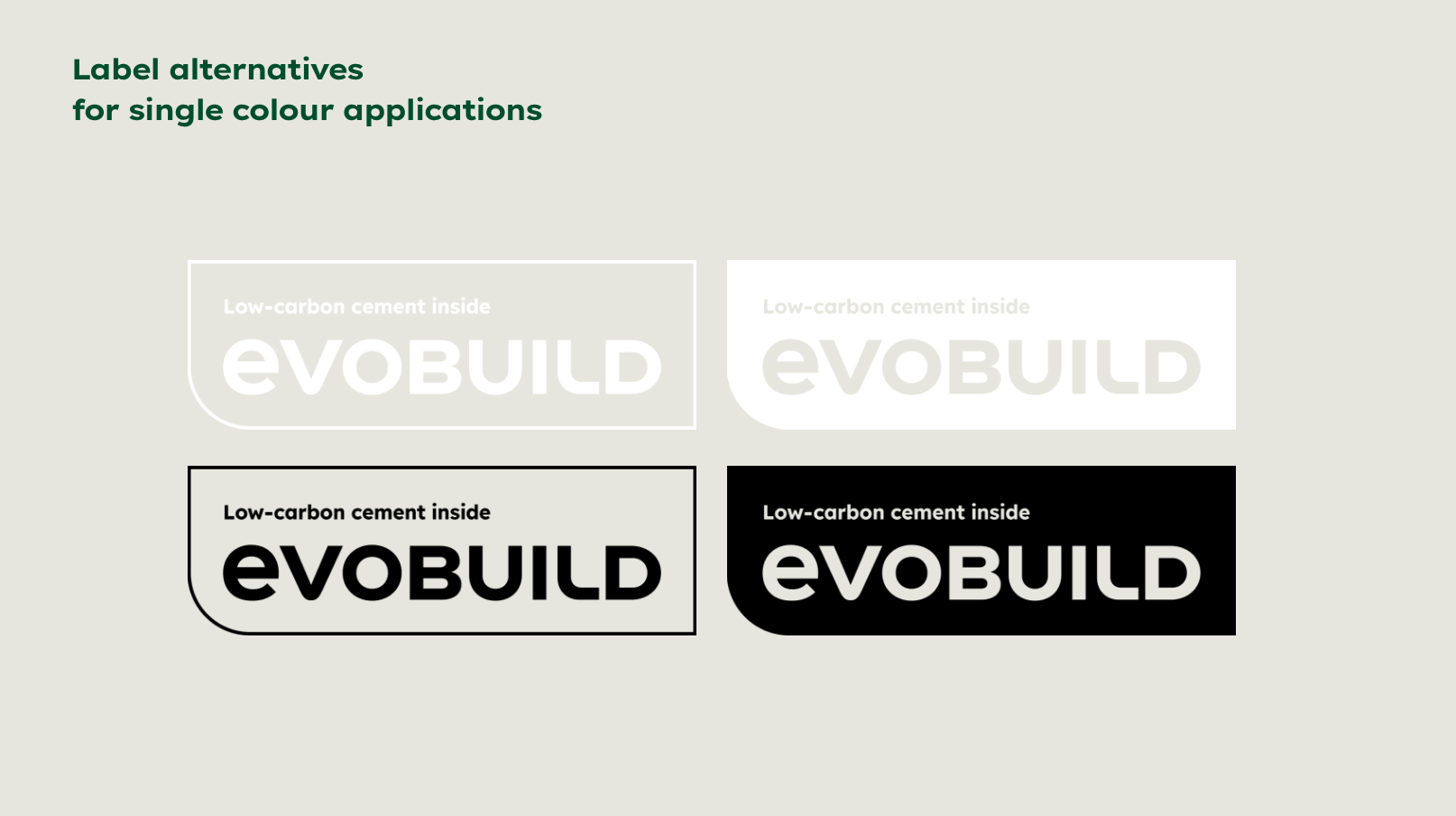

There are different label colour options for different touchpoints and backgrounds.
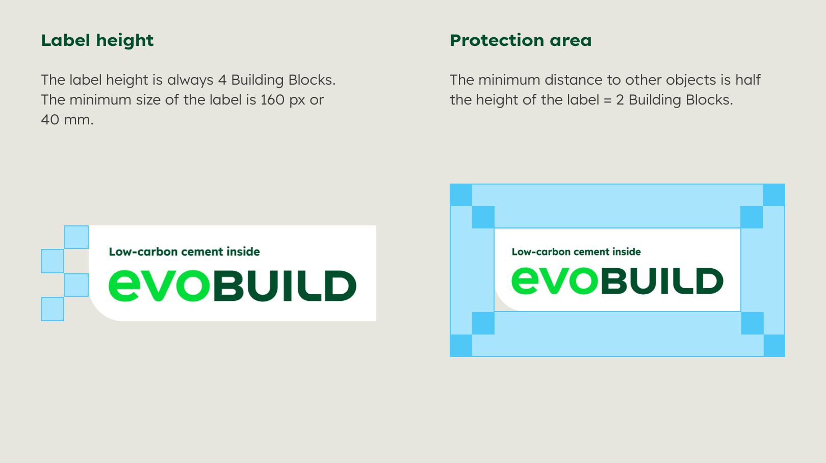

The label needs adequate space and a minimum size to be effective and legible
Any questions about our guidelines? Contact us.
- N Support
- T + 49 211 690787-200
- E support@Brandhub.heidelbergmaterials.com